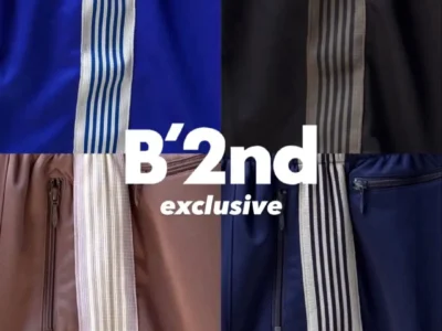
KAP Company Turns the Baseball Cap Into the Most Collectible Object in Streetwear
June 28, 2026
recall
- The Best KAP in the World
- Vision KAP × Gisiger.ltd: Sunglasses Built Into the Crown
- Vacation KAP × Chiara Frenzel: Two Sunsets, One Lenticular Patch
- Tabloid KAP 2 × Ehsan Morshed: A Cap That Ships With Its Own Magazine
- Never KAP, Car KAP, Lol KAP, Character KAP: The Rest of the Lineup
- The Constants: SimCard Buckles and Scratch-Card Fortunes
- Where to Find KAP Company Right Now
stir
Every brand statement is supposed to oversell. KAP Company’s undersells on purpose. Pull up the Paris label’s site and the entire mission reads like a press release written by committee for a company that doesn’t exist: a “multinational corporation dedicated to the design, development, manufacturing, and worldwide distribution of KAP,” structured as “a venture for collaboration” where “every new edition is conceived and produced in close association with a devoted contributor.” The Instagram bio is blunter. It just says: “Possibly The Best KAP In The World.”
That deadpan corporate cosplay is the whole bit, and it’s a good one. Strip away the bureaucratic language and KAP Company is, materially, a six-panel cap label — cotton twill, unstructured crown, the most generic object in the entire history of headwear — that has spent the past few years using that blank canvas as a vehicle for a rotating cast of artists, graphic designers, and photographers to do something genuinely strange with it. The archive going back to late 2023 reads like a group show: an “Art KAP” line, a “Gallery KAP,” a “Fun KAP” with collaborator Nico, an “LA Art World” edition that just says “Vape Cough” across the back. None of it is trying to be a definitive cap. All of it is trying to be a specific, slightly absurd idea, executed at a level of craft that makes the joke land.
The 2026 lineup — now live across eight active collections — pushes the format further than anything in the archive, and it’s the reason a hat company registered out of a small office on Rue Tronchet in Paris is now sitting on shelves at Dover Street Market in three cities. Here’s what’s actually in the current drop, what it costs, and where to find it.
There’s also no clear answer, anywhere on the site, to who’s actually running KAP day-to-day. The legal entity behind the storefront is listed simply as “KAP group,” and the public-facing identity belongs entirely to the collaborators — Gisiger.ltd, Chiara Frenzel, Ehsan Morshed, Bruno Sontheimer — rather than a named founder or creative director. That’s either a deliberate brand choice or a gap in the brand’s press presence; either way, it means the story of KAP gets told almost entirely through what it makes, not who’s making it.
View this post on Instagram
flow
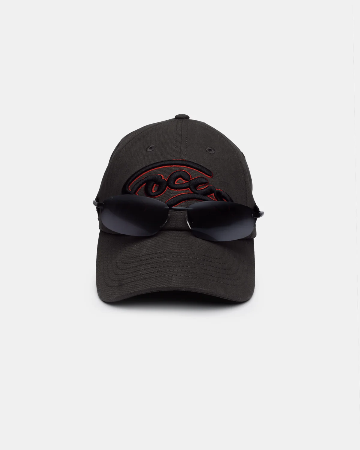
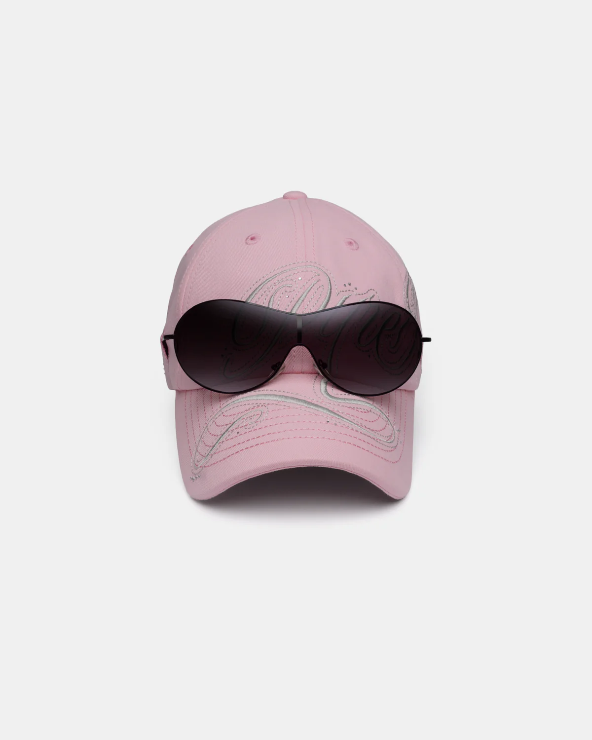
The collection most likely to stop someone mid-scroll is Vision KAP, a collision with the Paris graphic design studio Gisiger.ltd that treats the cap as a delivery mechanism for eyewear. Lateral slits are cut directly into the crown panels, and a pair of deadstock sunglasses frames slots into them — securely enough to stay put, loose enough to pull out and wear separately if the mood calls for it. It’s presented as a three-character series: “Focus,” “4 Sight,” and “Pure Vision,” each rendered in 3D puff embroidery across the front panel in a contrasting outline, with the word repeated on the reverse alongside small motivating one-liners.
Construction is 300 GSM 100% cotton twill across the board, and the colorways split cleanly by name — Focus in asphalt and burgundy, 4 Sight in navy and beige, Pure Vision in black and pink. Every version runs €95, and every version ships with the frames already mounted, not bagged separately as an accessory. Because the frames are sourced as deadstock rather than produced to order, no two production runs are guaranteed to use identical eyewear — the cap is the constant, the glasses are effectively found objects bolted onto it. It’s a strange thing to hold — half hat, half optical display case — and that strangeness is exactly the point Gisiger.ltd and KAP seem to be making about how arbitrary the boundary between “garment” and “accessory” actually is once you start cutting into the construction.
two
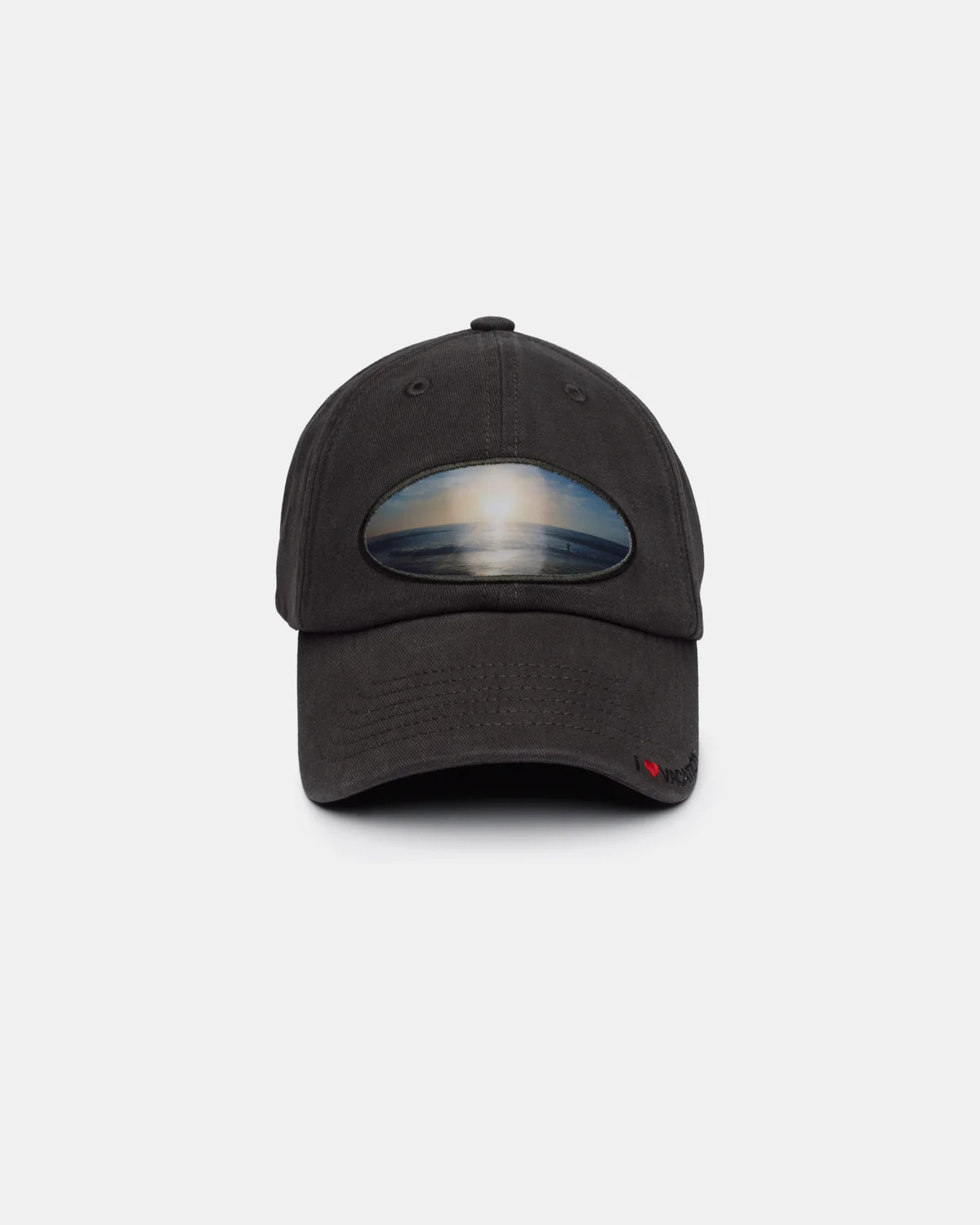
Vacation KAP is the label’s second collide with artist Chiara Frenzel, and the concept is small enough to undersell in a product description: a lenticular patch on the front panel that shifts between two different sunsets depending on the angle you’re holding it. One photograph is Frenzel’s own, shot at home in California in 2008. The other belongs to a collaborator named Valter, taken on holiday in Spain in 2010. Same sun, different coastline, twelve years and one ocean apart — compressed into a single patch that flickers between the two images as you tilt it.
The cap itself is built in the same 300 GSM cotton twill, finished in asphalt, beige, and navy, with “I ❤ Vacation” embroidered in satin script across the visor and back. At €85, it’s priced a tier below the Vision and Tabloid lines, which tracks — there’s no hardware integration here, just the patch and the embroidery — but the sentiment is doing more work than the price point suggests. It’s a nostalgia object built from two strangers’ photographs, sold as a hat.
scope
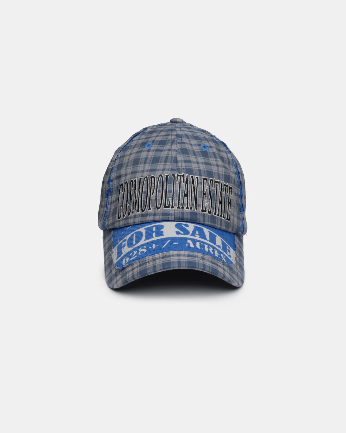
If Vision KAP is the collection built to be photographed, Tabloid KAP 2 is the one built to be read. It’s the second pairing between KAP and graphic artist Ehsan Morshed, whose ongoing practice pulls from found graphics, print debris, and what the brand describes as “dislocated material sourced from flea markets and estate liquidations.” Each cap is constructed from a doubled layer of cotton tartan — grey-and-yellow or blue, depending on colorway — overlaid on a cotton twill base with the edges deliberately left raw, like a sample that never got finished.
Three versions are currently available, each named and embroidered like a found object pulled from a different decade’s junk drawer: “Divine Moves” with “Cruise Control” on the reverse and a screen-printed “Cars For Rent” sign on the visor; “Self-Winding” paired with “All Day Every Day” and a “24/7” graphic; “Cosmopolitan Estate,” reading “Welcome Home” on the back with a “For Sale” sign up front. Real estate listings, classified ads, watch advertising copy — all of it lifted, recombined, and embroidered onto a hat.
The genuinely unusual part is what’s in the box. Every Tabloid KAP 2 ships with a physical copy of O Mankind! Gallop Off!, the second volume of a tabloid-format print zine (130 × 210mm, 180 pages) featuring new collage work by Morshed alongside short texts from a list of contributors that includes Sam van Gool, Alberto Dapporto, Linda Engelhardt, Rafaela Figurski, Antony Tyskin, Andrew Pasquier, Prem Sahib, and Karl Holmqvist. At €95, you’re not just buying a cap — you’re buying a small-run print publication with a hat attached to the order, or possibly the reverse. KAP doesn’t clarify which one is the primary object, and that ambiguity feels deliberate.
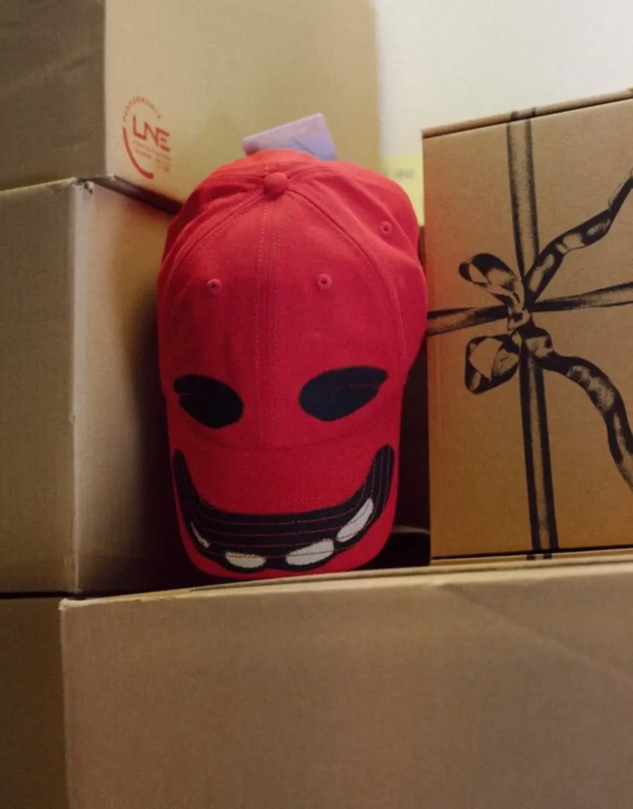
Red smiley cap straight from the fresh shipment — bold and playful streetwear energy.
lineup
Four more collections round out the current slate, each built around a single, tightly executed idea rather than a layered concept.
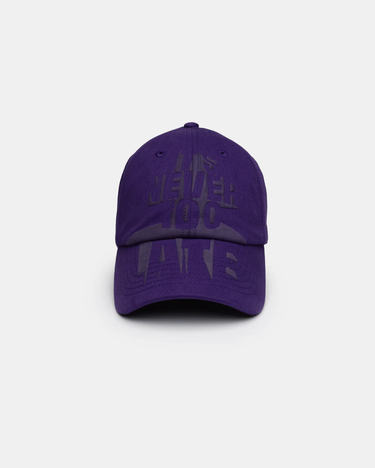
Never KAP, a collaboration with graphic designer Bruno Sontheimer, runs “Its Never Too Late” across the crown and visor in an abstracted 3D puff screenprint — available in navy and a deep purple the brand calls “Grape,” priced at €75.
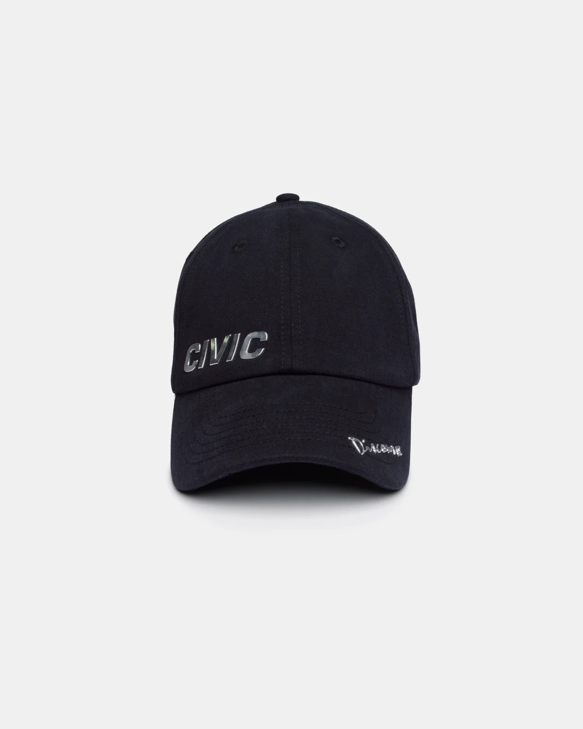
Car KAP borrows its construction logic straight from automotive trim: 3D-molded chromed lettering, the same hardware used on car boots and body panels, hotfixed directly onto cotton twill. “Civic” sits on the front panel, “Discourse” runs along the visor, and “Auto Matic” splits across the back — three colorways named Lacquer, Seat, and Tire, each at €85, treating the cap like a small panel of bodywork rather than a textile.
Lol KAP is the most straightforwardly fun entry, a dual-tone construction with a varsity-style interlocked “LOL” monogram in 3D puff embroidery across the front, repeated on the back. It comes in three crown-and-visor combinations — pink-and-red, gray, and green-and-beige — each at €75, with no underlying concept beyond the joke of putting internet shorthand through a collegiate letterman treatment.
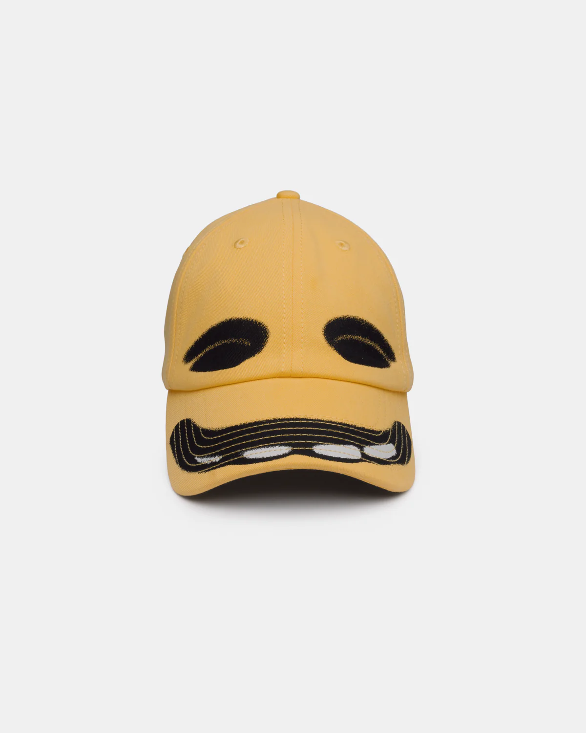
Character KAP, also €75, is the simplest premise of the eight: screen-printed brows and eyes span the front panels, and a wide smile runs across and under the visor, turning the cap itself into a face. It comes in red and yellow.
constant
What ties all eight collections together isn’t a house logo — there isn’t really one to speak of — it’s a set of construction details that repeat across every SKU regardless of collaborator or concept. Every cap is built from the same 300 GSM 100% cotton twill, finished with a 3mm stainless steel strap buckle that KAP calls a “SimCard” buckle, and every single order ships with a “Fortune SIM card Scratch Card” tucked inside. None of the product pages explain what the scratch card actually does or reveals, which feels consistent with a brand that built its entire identity around corporate language describing an object nobody would mistake for a real corporation’s output.
It’s a small thing, but it’s the kind of small thing that turns a cap brand into a release calendar worth tracking rather than a single product worth buying once. The buckle hardware and the scratch card are the closest thing KAP has to a signature, present whether you’re buying a €75 Character KAP or a €95 Tabloid KAP 2 with a 180-page zine in the box.
The pricing ladder tracks complexity almost exactly. The €75 tier — Never KAP, Lol KAP, Character KAP — covers single-idea graphics executed in embroidery or screenprint on a standard build. The €85 tier — Car KAP, Vacation KAP — adds a second material process, whether that’s hotfixed chromed hardware or a lenticular patch. The €95 tier — Vision KAP, Tabloid KAP 2 — is reserved for the two collections with a genuine secondary object attached, deadstock sunglasses or a print publication. None of the collections undercut that logic with a discount SKU, which suggests the pricing is tied to actual production cost rather than positioned as an entry point versus a flagship.
where
KAP Company sells direct through kap.company, with worldwide shipping, but the physical stockist list is where the brand’s actual positioning becomes clear. In Europe, it’s carried at Voo Store in Berlin, Tres Bien in Malmö, Renaissance/Princess in Antwerp, Bassal in Barcelona, Maxim in Rimini, MDE in Rome, Boysloft in Brescia, and Giselle’s Books in Marseille. In Asia, the brand has a notably dense Tokyo footprint — Gr8 in Shibuya, The Four-Eyed in Kabukicho, Edition at Omotesando Hills, Midwest in Jinnan, and Forget-me-nots in Sarugakucho — plus Starling in Maebashi and Road Sign in Taipei.
The headline placement, though, is Dover Street Market, which carries KAP across its Paris, New York, and Los Angeles locations. For an independent cap label with a roughly five-figure Instagram following and a print run small enough that most colorways sell out and move straight to “Sold Out” on the product page rather than restocking, landing simultaneous DSM placement on two continents is a real signal of how the wholesale side reads the brand — not as novelty merch, but as a genuine accessories line worth a rail.
What makes KAP worth watching past this particular drop is that none of it depends on a logo doing the recognition work. No swoosh, no monogram, no consistent silhouette beyond “six-panel cap” — just a rotating list of collaborators and a set of construction tics (the buckle, the scratch card, the cotton twill) repeated closely enough that the whole catalog reads as one project even though no two releases look alike. That’s a harder trick to pull off than it sounds, and it’s the reason a Paris hat brand with eight active SKUs and an Instagram bio that reads like a joke is currently sharing shelf space with the labels that built the wholesale model it’s quietly bending.
Related Articles
ENNOY Opens the Odds Again: Eight New Colorways of the Professional S/S Tee
recall The Drop, In Brief Eight Colorways, One Formula Anatomy of the Tee Sizing Guide […]