review — Adidas Asterisks SS26: The Return of Clothing as Cultural Surface
May 19, 2026
There is a particular brand of dishonesty embedded in most printed shirts. The print exists to signal taste — a vintage Rothko reference here, a Basquiat-adjacent squiggle there — without actually committing to anything. The shirt says I am cultured while costing the designer almost nothing in creative risk. This is the territory Adidem Asterisks has always refused to occupy. With the SS26 camp collar shirts from the collection titled Sounds Like It Looks, the Brooklyn-based label makes its most persuasive argument yet that clothing can be a genuine culture surface, not just a decorative one.
The two shirts at the center of this collection — the Faces print and the Red abstract — are not, strictly speaking, shirts that happen to have images on them. They are paintings that have been architecturally resolved into garments. The distinction matters enormously. When a painting becomes a shirt, the image is subordinated: scaled, tiled, cropped to serve the silhouette. What Adidem Asterisks does is the reverse. The silhouette — a boxy, open-collar camp cut with wide short sleeves and a single chest pocket — is designed to maximise the image’s field of operation. The proportions exist to give the print room to breathe, to be read, to mean something.
“The proportions exist to give the print room to breathe, to be read, to mean something.”
View this post on Instagram
stir
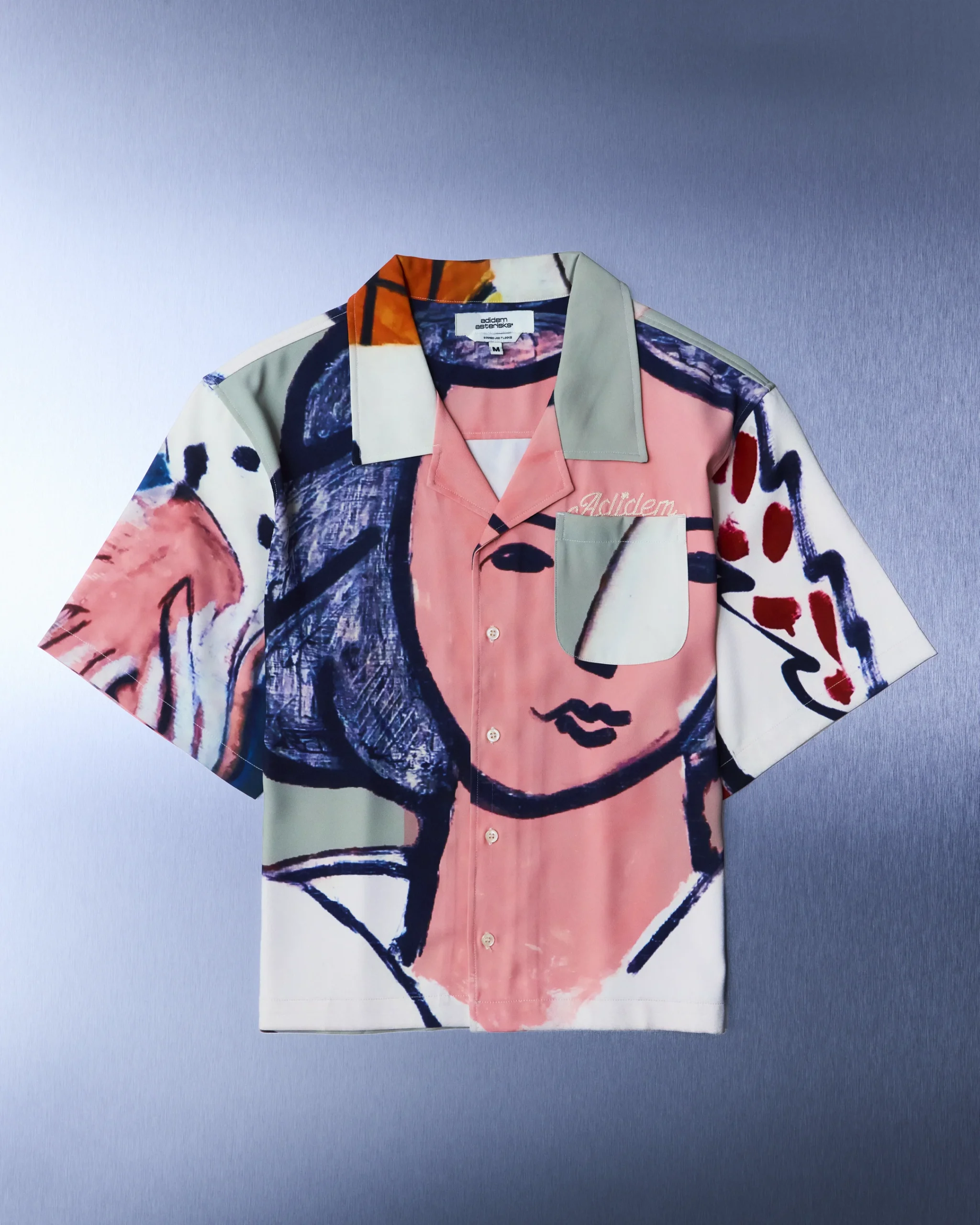
Consider the Faces shirt first. Laid flat, it is unmistakably figurative: a large, gestural portrait — loose brushwork in deep navy, blush pink, and cream — occupies nearly the entire front panel, with the face only partially resolving as legible depending on how the viewer positions themselves. The sage-coloured notch collar floats atop a field of ochre and white at the back, creating a tonal discontinuity that forces the eye around the garment rather than settling on any single point. Worn open, as the campaign image makes clear it was intended, the shirt fragments further — the chest panel parts, the face splits, the image becomes something more like a memory of a painting than the painting itself. This is not an accident. It is choreography.
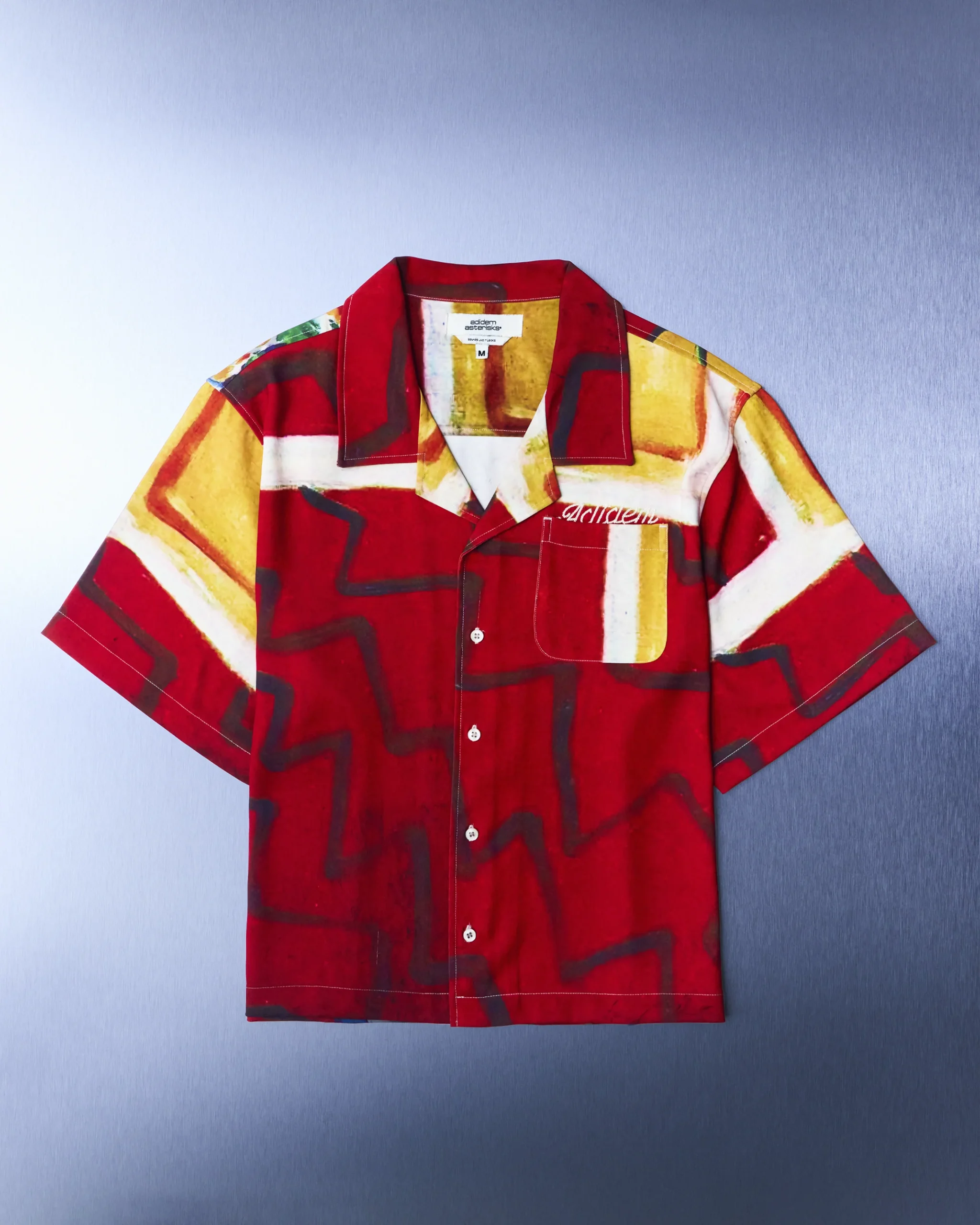
The Red shirt operates through a different logic, and it is perhaps the more daring piece. Where the Faces shirt invites the viewer into a recognisable figurative tradition — portraiture, expressionist painting, the lyrical abstraction of mid-century American art — the Red shirt refuses easy cultural anchoring. Its surface is built around a field of deep crimson interrupted by dark, wavering linear forms that read as graffiti, as circuitry, as damaged film. A panel of raw yellow-gold at the collar and shoulder acts as a kind of internal light source, illuminating the red from within.
The embroidered adidem script on the chest pocket is the only typographic intrusion, and its script quality — loose, handwritten, slightly imperfect — feels continuous with the painted surface rather than superimposed on it. This is a garment that looks, depending on the light and the angle, either deeply historical or entirely contemporary. It is, in short, timeless in the way that only something deeply rooted in its own moment can be.
flow
The campaign image, shot against a flaking crimson wall that rhymes with both the shirt’s palette and the abraded textures of the prints themselves, is instructive about how these garments perform on a body in motion. The Faces shirt, worn open over bare skin with wide-leg cream trousers and black slip-ons, ceases to be fashion in the conventional sense. It becomes something closer to an attitude.
The model’s stillness is not incidental — it allows the viewer time with the image, time to trace the brushwork from collarbone to hem, to notice how the blue of the painted figure’s hair echoes in the veins of his forearms, to feel the relationship between the warmth of his skin and the blush undertones of the shirt’s ground. The styling understands that these shirts ask something of the wearer: not performance, but presence.
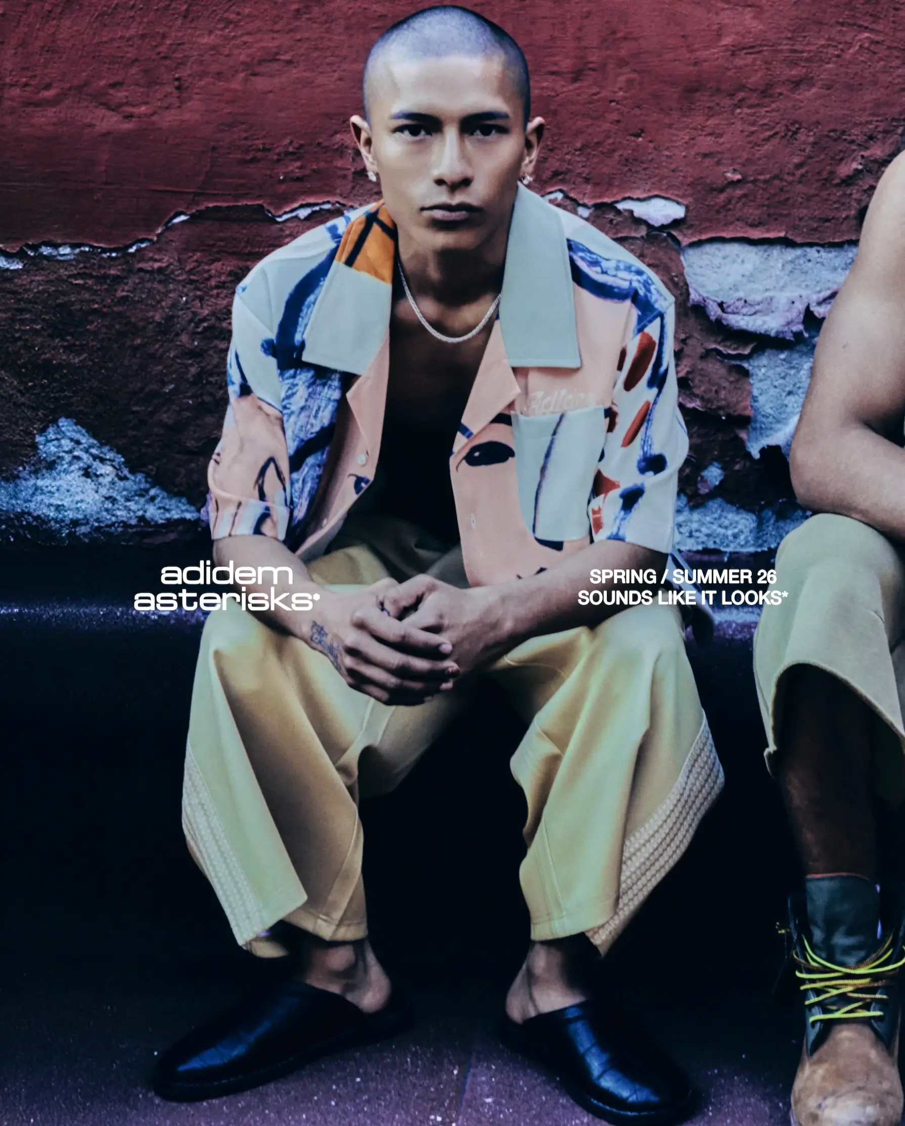
The cut itself deserves more credit than it typically receives in discussions of printed shirts, where the garment construction is usually treated as a neutral delivery mechanism. The boxy silhouette — cropped but not truncated, with sleeves hemmed mid-bicep — is close enough to a workwear or souvenir-shirt reference that it carries a kind of democratic credibility. These are shirts that could be worn anywhere. But the wide revere collar, constructed with more structure than a typical camp collar, holds its shape in a way that frames the neck and chest with quiet intention. The single welt pocket, bearing the brand script, is exactly wide enough to be architecturally present without competing with the print. None of this is accidental. Adidem Asterisks has always been precise in its constructions, but here the construction and the image-making feel fully fused.
“These shirts ask something of the wearer: not performance, but presence.”
scope
The collection title — Sounds Like It Looks — is not a throwaway phrase. It is an entire aesthetic manifesto compressed into four words. The idea that appearance and sound might have a structural relationship, that clothing might be as immediate and affective as music, that fashion at its best produces a sensory experience that bypasses language — this is the intellectual territory that the label has been circling for some time. With these shirts, they have arrived at it. The prints have tempo. The Faces shirt is slow, melodic, full of sustained tones. The Red shirt is percussive, rhythmic, built on recurring motifs that never quite resolve.
What Adidem Asterisks has achieved with these two pieces is rarer than it might appear. The fashion industry produces thousands of printed garments every season, and almost none of them ask to be read. They ask to be recognised — as luxurious, as directional, as belonging to a particular cultural bracket. These shirts ask to be looked at. They ask for the kind of attention that we extend to paintings in galleries, to album covers, to images that we carry with us long after we have seen them. That this attention is being solicited by a short-sleeve button-front shirt is, in the end, the point. The surface doesn’t have to be monumental to carry real weight. It just has to mean it.
Garment Notes — Spring/Summer 2026
Collection — Sounds Like It Looks
Label — Adidem Astericks
Silhouette — Camp Collar / Boxy / Short Sleeve
Print Story — Faces / Red Abstract
Signature Detail — Tonal Embroidered Chest Script
Season — SS26
Related Articles
NEEDLES x UNION Return for a New Chapter in Their Longest-Running
NEEDLES and UNION TOKYO reunite for a new capsule releasing July 10, continuing one of […]