DRIFT AUDIO
Listen to this story
Choose a voice, then press play.
Among our series on enduring American design motifs, Snoopy is perhaps the most endearing — and still a hot shot, 75 years after his first appearance.
In This Story
- A Dog Named Almost Sniffy
- From Four Legs to Two
- The Doghouse as a Design Problem
- Snoopy in Space
- A Uniform for Every Occasion
- The Making of a Commercial Icon
- Why the Design Endures
Charles M. Schulz introduced Snoopy on October 4, 1950, two days after the first Peanuts strip ran in seven newspapers nationwide. He was one of four original characters alongside Charlie Brown, Patty, and Shermy, and at the outset he was barely a character at all — a fairly ordinary-looking beagle, based loosely on Schulz’s own childhood dog, Spike, and drawn without a name for over a month. Schulz had considered calling him Sniffy before landing, on his mother’s suggestion, on Snoopy; the name was first used in the strip on November 10, 1950.
The dog himself wasn’t entirely new. Peanuts had a direct predecessor in Li’l Folks, a weekly one-panel cartoon Schulz drew for the St. Paul Pioneer Press from 1947 to 1950, which included a dog that already looked much like the early-1950s version of Snoopy, alongside the first use of the name Charlie Brown. When Schulz brought his strip to United Feature Syndicate, the earlier design carried over largely intact — proof that even the character who would go on to define the strip’s visual identity started as background material in an entirely different, much smaller cartoon.
For its first several years, the design followed the logic of an actual dog: four legs, a doghouse, simple loyalty to his owner. Snoopy’s thoughts weren’t even visible to readers until March 16, 1952, when Schulz first used a thought balloon to let him speak silently to the audience — a small technical shift that quietly set up everything that came after, since it gave Schulz a way to develop Snoopy as an interior character rather than just an illustrated pet.
Care Bears kids’ shoe combines colorful character artwork, iridescent details, and playful design elements inspired by the beloved franchise.
huh
The design shift that turned Snoopy into an icon happened gradually across the mid-1950s. Schulz began experimenting with anthropomorphism early — Snoopy’s first impersonation, of a bird, appeared on August 9, 1951 — but the more consequential change was physical. On January 9, 1956, Snoopy first appeared upright on his hind legs, sliding across a sheet of ice after Shermy and Lucy had done the same; by June 28, 1957, walking on two legs had become a repeatable pose rather than a one-off gag.
Schulz was characteristically blunt about how strange this evolution felt from the inside. Speaking to Leonard Maltin in 1985, he described Snoopy as having “started off as simply a cute little dog, a cute little puppy,” before growing “into a very grossly caricatured dog with a long neck,” adding, half-joking, that a more careful syndicate might have fired him for the redesign. What actually happened was closer to the opposite: the caricature is what unlocked the character. Once Snoopy could stand upright, his snout lengthened, his body elongated, and his ears took on the loose, expressive shape that would define him for the rest of the strip’s run — and once he had a body built for performance rather than realism, Schulz could put him into an ever-expanding wardrobe of personas: novelist, hockey player, attorney, World War I Flying Ace.
cept
Schulz once said the best idea he ever had in the strip was moving Snoopy from inside his doghouse to on top of it — a shift first drawn on December 12, 1958. It’s a small design decision with outsized consequences: a dog lying flat on a rooftop reads clearly at almost any size, silhouettes well against open sky, and gives an illustrator a single, endlessly reusable pose to build an entire universe of daydreams on top of.
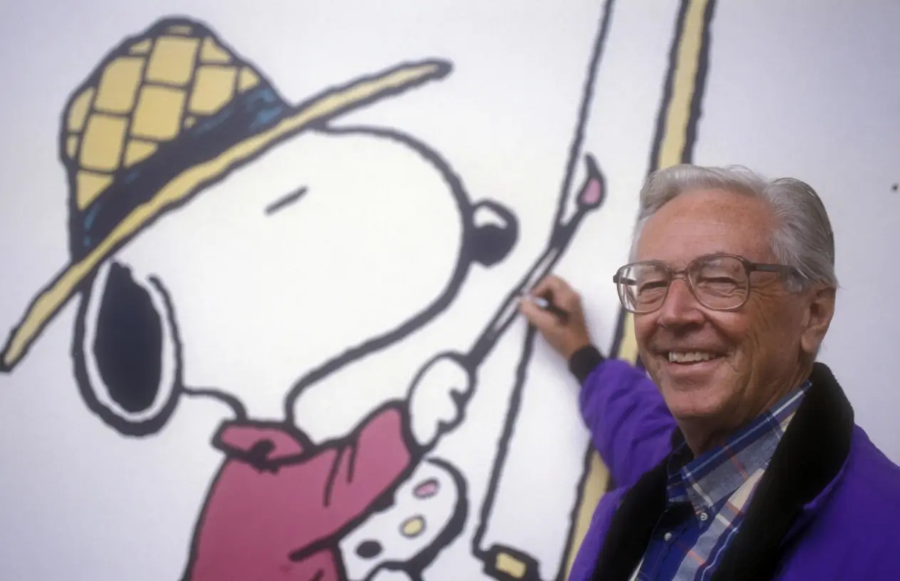
Charles M. Schulz poses beside a colorful Snoopy mural, celebrating the enduring legacy of the Peanuts creator and his world-famous beagle.
The doghouse itself became a design object in its own right, deceptively simple on the surface — a peaked roof, an arched doorway, Snoopy’s name lettered above the entrance in the strip’s early years — while functioning as whatever Snoopy needed it to be: a Sopwith Camel doing battle with the Red Baron, a lunar landing module, a novelist’s writing studio. Later adaptations have paid close attention to keeping that design flexible in exactly this way; the production team behind the 2015 Peanuts Movie rigged the doghouse with a “hero” pure red distinct from any other object on screen, reserving the color specifically so it would keep reading as Snoopy’s own the way it always had on the page.
That red wasn’t even the original choice. Snoopy’s doghouse appeared blue in the 1965 television special A Charlie Brown Christmas, and it was later adaptations, along with decades of merchandise, that cemented red as the doghouse’s defining color — a reminder that even a design as settled-feeling as Snoopy’s now took several passes to lock into place.
flow
Few licensed characters have accumulated a stranger, more varied set of institutional footholds than Snoopy, and much of it traces back to a single 1960s partnership. In March 1969, four months ahead of Apollo 11’s moon landing, Schulz drew a six-strip sequence sending Snoopy into an imaginary version of space, doghouse serving as his lunar module. Two months later, the crew of Apollo 10 — the dress-rehearsal mission for the moon landing — adopted “Charlie Brown” and “Snoopy” as call signs for their command and lunar modules, with the Snoopy module coming within roughly 50,000 feet of the lunar surface.
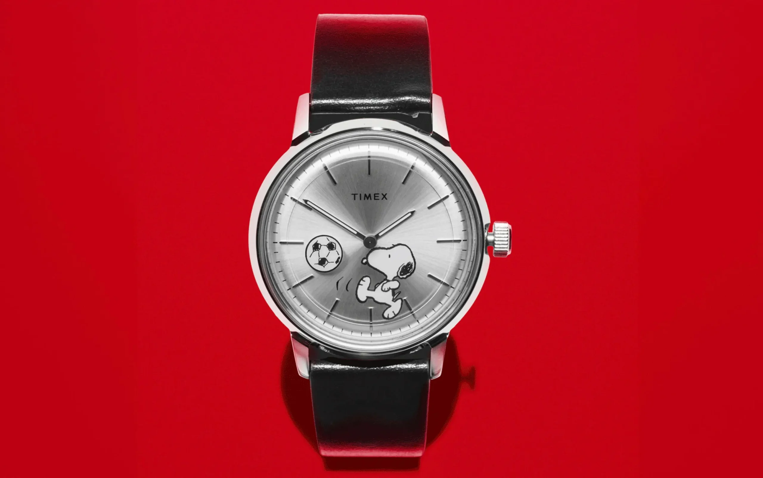
Following the Apollo 1 fire, NASA had already adopted Snoopy as an unofficial mascot for aerospace safety, a relationship formalized in 1968 with the creation of the Silver Snoopy Award, still given by astronauts to NASA employees and contractors for outstanding contributions to flight safety and mission success. The black-and-white communications caps worn inside NASA spacesuits are, to this day, universally nicknamed “Snoopy caps” for their resemblance to the shape of his head. It’s a design legacy built almost entirely on silhouette: a simple black-and-white head shape, recognizable enough to lend its name to unrelated hardware decades later.
uni
Space wasn’t the only institution to adopt Snoopy’s sil as its own. The character has spent decades as an unofficial uniform for organizations that had nothing to do with comic strips or insurance, almost always for the same reason: his shape reads instantly, even reduced to a patch or a nose-art stencil. Snoopy piloting his doghouse “Sop with Camel” appears in the logo of the Charles M. Schulz–Sonoma County Airport in California, a fitting tribute given how much of Snoopy’s mythology as the World War I Flying Ace was built around exactly that image. He’s also the mascot of the 26th Squadron of the United States Air Force Academy, appearing on the unit’s official patch, and versions of Snoopy served as nose art on aircraft during the Gulf War — a practice that continues informally in air forces that still allow crews to personalize their planes.
The recognition runs both ways: in November 2015, Snoopy received his own star on the Hollywood Walk of Fame, becoming only the second Peanuts-related figure honored there after Schulz himself. Whatever institution ends up borrowing him — a military squadron, a regional airport, a museum, an insurance company — the underlying reason tends to be identical. A dog lying flat on a red roof, or a black-and-white head shape stitched onto a patch, doesn’t need context to be legible. That’s a rare property for a character this expressive to still hold onto.
grad
Snoopy’s move into corporate branding followed a similarly long arc. In 1985, Metropolitan Life Insurance — later MetLife — adopted Snoopy and the wider Peanuts cast as its spokes-characters, using them across advertising, sales literature, premium items, and, most visibly, the side of the company’s own branded blimp. The relationship proved durable: MetLife extended its North American rights in 2002 and signed an international agreement in 2006, giving it exclusive worldwide use of the Peanuts characters within the financial-services category. At its peak, the company was reportedly paying between $10 million and $15 million per year to license Snoopy’s image.
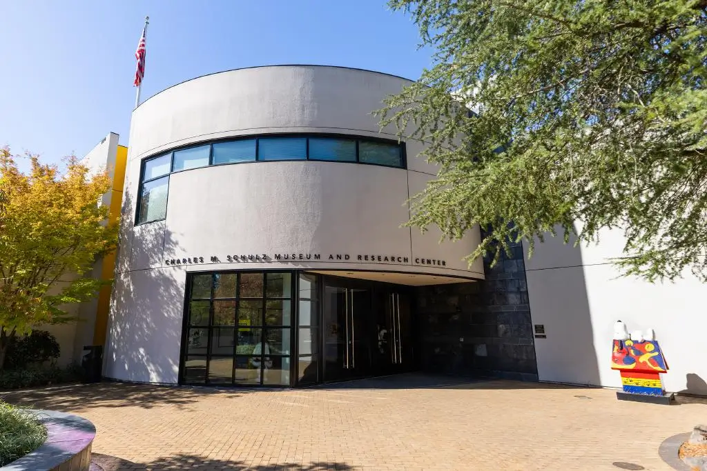
The Charles M. Schulz Museum and Research Center, home to the legacy of the Peanuts creator and his beloved characters like Snoopy.
That three-decade run ended in October 2016, when MetLife announced it was retiring Snoopy and the Peanuts gang as part of a broader rebrand tied to spinning off its U.S. retail life-insurance business to focus on corporate clients. The company’s own framing at the time was notable for a design publication to sit with: MetLife’s global chief marketing officer credited Snoopy with having made the company “more friendly and approachable during a time when insurance companies were seen as cold and distant” — crediting a fictional beagle, in other words, with having done real brand-trust work for over thirty years. Snoopy returned to MetLife’s marketing briefly in 2023, this time fronting a campaign for the company’s new pet insurance line — a neat, if unplanned, bit of thematic symmetry.
endure
What makes Snoopy durable as a piece of design isn’t polish so much as flexible. The character has been redrawn, cross-licensed, launched into orbit by name, and hired and fired by a Fortune 500 insurer, and the underlying shape has absorbed all of it without losing legibility: a black-and-white silhouette simple enough to read from a spacesuit patch or a blimp at a football stadium, built on a pose — flat on the roof of a red doghouse — that Schulz himself considered his single best idea across nearly fifty years of drawing the strip.
Part of that durablecomes down to restraint. Schulz never gave Snoopy a fixed costume or a single defining prop the way many licensed characters rely on; instead, the design supplied a blank enough canvas — a dog on a rooftop — that any costume could be layered on top without breaking the read. Flying goggles and a scarf turn him into the World War I Flying Ace. A tuxedo turns him into Joe Cool. A typewriter turns him into a struggling novelist. None of these personas required altering Snoopy’s underlying proportions, which meant Schulz, and later generations of licensees, animators, and marketing departments, could reinvent his context indefinitely without ever having to redesign the character from scratch.
That combination of a rock-simple silhouette and an almost limitless internal life is, in the end, the whole design lesson. Snoopy works on a NASA patch and on an insurance blimp and in a museum retrospective for the same reason: the shape does the work of recognition, and the character’s constant reinvention — flying ace, novelist, astronaut, brand mascot — does the work of staying interesting. Seventy-five years on, that’s still a difficult trick for any piece of design, corporate or otherwise, to pull off twice, let alone continuously.
From the DRIFT archive: PANTONE’s 2026 Color of the Year Takes Shape With Play-Doh and Post-It Editions
Related Articles

Blown Spheres On An Extruded Bar
Luce Sferica by Ronan Bouroullec for Flos. Modular suspension. Glass spheres ~180 mm. Dual LED strips. Touch dimmer. Three lengths.