DRIFT AUDIO
Listen to this story
Choose a voice, then press play.
A pasta sauce brand and the world’s color authority team up, and the punch line is that it actually works.
In This Story
- A Sauce With Its Own Swatch
- The Campaign This Color Is Riding On
- What the Partnership Actually Includes
- Why
- The Bigger Bet Hiding Inside a Pasta Jar
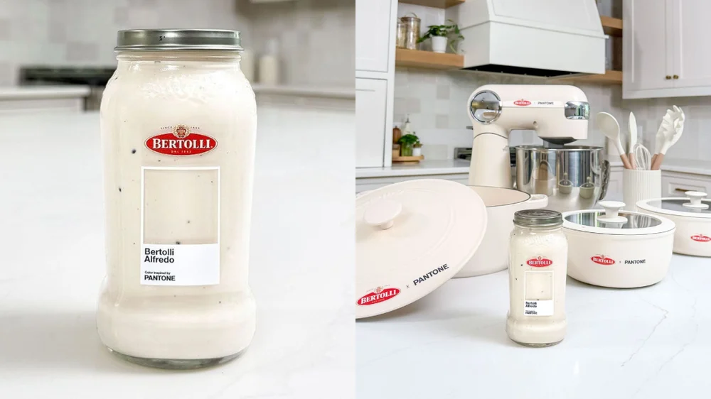
It takes a specific kind of confidence to look at a jar of Alfredo sauce and decide it deserves a color credential. Bertolli and Pantone have done exactly that, pairing up to designate the brand’s signature Alfredo hue as an official Pantone reference shade, and rolling out limited edition packaging built around it. The pitch, in Bertolli’s own marketing language, is that the sauce’s off white, buttery tone is now a defined color in its own right, one that a shopper should recognize on sight in the pasta aisle the way they might recognize Tiffany blue or Barbie pink.
It sounds like a punch line until you notice how deliberately the campaign avoids being one. The packaging does not lean on humor or irony. It leans on design conventions borrowed straight from Pantone’s own color chip format, presenting the sauce’s shade with the same visual authority a paint company or a fashion house would use to launch a new seasonal color. According to trend coverage of the rollout, the initiative frames the sauce’s appearance, rather than its taste, as the defining product feature, with limited run jars built around Pantone style packaging and a supporting push of giveaways and social content under the banner of Bertolli’s “Take the Alfredo” messaging.
Pantone itself has spent the better part of two decades lending its color chip format out to categories well beyond its original home in printing and design. The company built its reputation as a standardization system, the reference point designers, manufacturers, and printers use to make sure a specific shade of blue looks the same whether it is printed in New York or manufactured in a factory overseas. Its annual Color of the Year announcement long ago outgrew the design trade press and became a mainstream media event in its own right, covered by fashion and lifestyle outlets the same way a runway show might be. That crossover appeal is presumably what made Pantone an attractive partner for a food brand in the first place. Lending its name to a jar of pasta sauce is a relatively low lift way for Pantone to reach an audience that has nothing to do with swatch books, while giving Bertolli a credibility signal it could never manufacture on its own.
View this post on Instagram
stir
The Pantone tie in did not appear out of nowhere. It sits on top of a broader creative relaunch that Bertolli and its agency, Fallon, had already put in motion earlier in 2026 called “Take the Alfredo.” That campaign was built around a fairly simple observation about home cooking habits. Most households default to red sauce on pasta night almost automatically, and Bertolli wanted to interrupt that reflex. Rather than shooting the usual slow motion pour of cream sauce over noodles, the campaign’s two spots, titled “Flock” and “Rose,” reach for cinematic visual metaphors instead, using imagery about standing apart from a crowd to argue that Alfredo is the more distinctive choice.
The two ads mark Bertolli’s first significant creative investment in some time, according to trade press covering the launch, which is notable in itself for a brand that has spent most of its recent marketing budget on straightforward product shots and recipe content rather than any kind of brand storytelling. Choosing to skip the category’s usual playbook of glistening, slow motion sauce pours in favor of metaphor driven imagery is a meaningfully different bet, one that treats Alfredo less like a commodity ingredient and more like a lifestyle choice a shopper is making about themselves. That shift in tone matters for understanding the Pantone partnership, because a color designation only works as a marketing device if the audience has already been primed to think about the product in more elevated, design conscious terms. Fallon appears to have built that groundwork first, with the color tie in arriving as a second act rather than the campaign’s centerpiece.
Soledad Querol, executive director of marketing at Mizkan, the company that owns Bertolli, described the thinking behind the push directly. She said the goal was to move past simple awareness and “challenge the red sauce routine head on.” It is a modest, almost obvious insight, that a category leader can still feel like the default backup rather than the first choice, and the campaign’s entire visual strategy is built to reposition Alfredo as the more premium pick for a Tuesday night dinner rather than a fallback when nobody feels like deciding.
The Pantone color designation reads as a natural next chapter for that same repositioning effort. If “Take the Alfredo” argues that the sauce deserves more respect than it gets, assigning it an official color is a way of making that argument visual and tangible, giving shoppers something concrete to point at on a shelf. Circana sales data cited in Bertolli’s own marketing around the launch backs up the underlying claim that there is something to build on. The company’s Alfredo line topped Total US Multi Outlet sales by pound in 2025, effectively making Bertolli’s version of the sauce the most purchased Alfredo in the country, which is presumably part of why Bertolli felt entitled to claim a whole color as its own instead of just a flavor.
inclu
Beyond the branding exercise, the union comes with an actual consumer facing promotion attached to it. Bertolli and Pantone launched a sweepstakes running from June 24 through June 30, 2026, administered through promotional platform Fooji, with entries collected through calls to action on Bertolli’s Instagram, Facebook, and TikTok accounts. The mechanics are straightforward. A participant needed to respond to a designated post on one of those three platforms, limited to one entry per platform per person, during the entry window.
The prize structure breaks into two tiers. Ninety four first prize winners each received a Bertolli x Pantone pasta kit, pairing a Pantone branded pasta jar with a matching cooking utensil set valued at around thirty dollars. Six grand prize winners received a larger kitchen equipment bundle, with prize packages built around a stand mixer, a set of pots and pans, or a Dutch oven, each paired with the same pasta kit, and individual prize values ranging from roughly $293 to $572 depending on which equipment package a winner landed. Official rules list Fooji, based in Lexington, Kentucky, as the promotion’s administrator, with Mizkan America named as sponsor, and eligibility restricted to legal residents of the fifty states and DC who are eighteen or older.
View this post on Instagram
Bertolli’s own social messaging around the giveaway leaned into the same color first pitch as the packaging itself, framing the sauce as something understood on sight before it is ever tasted. One promotional post described the product as “understood before you even taste it,” tying the flavor description directly back to the visual identity the Pantone partnership was built to reinforce. It is worth noting explicitly, as Bertolli’s own materials do, that Pantone LLC is not itself a sponsor of the sweepstakes and holds no responsibility for administering it, despite lending its name and color system language to the packaging design.
why
None of this happens in a vacuum. Food brands borrowing the view lang of design and fashion has become a fairly reliable as part of manuscript over the last several years, and Pantone in particular has leaned into licensing its tincture authority out to categories that have nothing to do with paint chips or textile swatches. The show for a company like Mizkan is obvious. Pantone carries decades of built in credible as the arbiter of what a tincture officially is, and borrowing that credible instantly elevates a product that otherwise competes on a fairly narrow set of attributes, namely how creamy it looks in a jar and how it tastes over noodles.
There is also a more practical branding logic at play. Grocery aisles are visually crowded, and a shopper scanning a shelf of pasta sauces is mostly making split second decisions based on color and packaging before they ever read an ingredient label. By explicitly naming and owning its own shade, Bertolli is trying to shortcut that recognition process, turning what would otherwise be a generic off white sauce color into something the brand can claim exclusive visual ownership over, at least in marketing terms. Whether a jar’s contents can genuinely function as a proprietary color in the way a fashion house’s signature hue does is a separate question, but the attempt itself fits a pattern of consumer brands treating their most mundane physical attributes as design assets worth protecting and promoting.
View this post on Instagram
That pattern extends well beyond pasta sauce. Paint companies, apparel labels, and even automakers have spent years releasing branded colors tied to specific products, betting that a named shade generates more press coverage and social conversation than a straightforward product update ever could. What makes the Bertolli case slightly different is the category. Paint and fashion already live inside the visual design conversation, so a color launch from either feels native to the space. A pasta sauce brand borrowing that same language is a more unusual crossover, and it only works if the underlying product genuinely has a distinct enough appearance to justify the claim in the first place. Bertolli’s bet is that an off white, buttery cream color, closely tied to a dish most people already associate with a specific visual texture, clears that bar more easily than a more generic product might.
The timing also lines up with Bertolli’s broader creative reset this year. A brand that has not put significant marketing weight behind a new campaign in some time chose 2026 to do both a full agency relaunch through “Take the Alfredo” and a design forward color partnership within the same several month window. That is not an accident. It reads as a coordinated attempt to make an established, somewhat sleepy category leader feel newly relevant, using two very different tools, cinematic advertising on one side and design world credibility on the other, aimed at the same underlying goal of getting Alfredo out from under the sil of red sauce.
in
Strip away the novelty of a food brand claiming a Pantone color, and what is left is a fairly conventional marketing bet dressed up in fresh packaging. Bertolli already holds the top selling position in its category, according to the company’s own cited sales data, and the entire Pantone partnership functions as a way of defending that position rather than chasing a new one. Category leaders in mature grocery segments do not usually need a rebrand. What they need is a reason for existing customers to keep reaching for the same jar instead of drifting toward a private label alternative or a newer competitor with sharper packaging, and giving a familiar product a design credential is a low risk way of manufacturing that reason.
If shoppers actually internalize “the tincture of Alfredo” as a meaningful marketing claim, or simply register it as a clever bit of packaging around a giveaway, is likely to matter less to Mizkan than whether the campaign moves sales volume during the promotional window and keeps the brand in front of the same social audiences the “Take the Alfredo” campaign was built to reach. Judged purely as a piece of design thinking, though, the collaboration is a reasonably sharp answer to a specific problem. A jar of white sauce is genuinely hard to differentiate on a shelf using shape or typography alone, and naming the color itself is one of the few remaining levers a brand in that position has left to pull.
It is also worth sitting with how unlikely the pairing looks on paper. Pantone’s client list has typically skewed toward interior paint, apparel, and consumer electronics, categories where color genuinely functions as a primary purchase driver. A pasta sauce, by contrast, is chosen mostly on flavor, price, and brand familiarity, with tincture acting as a secondary cue at best. That gap is exactly what makes the partnership worth paying attention to as a piece of marketing craft rather than dismissing outright. It suggests food brands are increasingly willing to borrow credibility from adjacent industries that have nothing to do with what actually goes into the jar, betting that the audience will extend the same trust in Pantone’s authority to a product Pantone had no hand in formulating. Whether that borrowed authority holds up under scrutiny is a fair question, but the fact that Bertolli was confident enough to ask it in the first place says something about where food marketing is headed next.
From the DRIFT archive: Tactical Elegance: Inside Bramford London Aqua Blue Three-Pocket Watch Roll
Related Articles

Blown Spheres On An Extruded Bar
Luce Sferica by Ronan Bouroullec for Flos. Modular suspension. Glass spheres ~180 mm. Dual LED strips. Touch dimmer. Three lengths.