SSC Napoli P-N0471UB1: A Study in Modern Chronograph Design
April 17, 2026
The stainless steel chronograph from SSC Napoli does not arrive with spectacle. It resists it. In a category where sports-branded watches often exaggerate allegiance—oversized crests, loud color blocking, graphic saturation—this piece works differently. It compresses identity into a surface language that is measured, almost architectural.
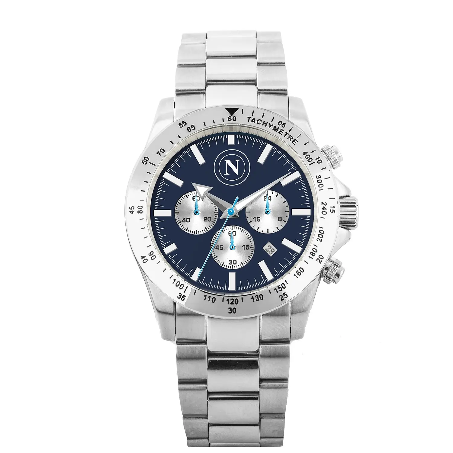
The deep Napoli blue dial is not decorative in the casual sense. It behaves like a field condition. Everything placed upon it—indices, subdials, hands, the crest—must negotiate that depth. The result is not a fan object that announces itself immediately, but one that reveals its affiliations through proximity and use. The closer you look, the more it aligns.
(Despite its official licensing under SSC Napoli, the P-N0471UB1 chronograph exists outside the club’s primary media language. Napoli’s social ecosystem remains anchored in football—players, matches, and the lived rhythm of the city—while objects like this move through quieter channels. There is no campaign, no teaser, no orchestrated reveal. Instead, the watch circulates through retail spaces, documented rather than narrated. It carries the crest and the blue, but not the spotlight—functioning less as a promoted product and more as a dispersed extension of club identity, encountered rather than announced.)
This is where the chronograph complication matters. It introduces function as structure, not just utility. The subdials segment the dial into zones of attention, breaking the surface into a grid of timing, tracking, and calibration. The watch becomes less about telling time and more about organizing it.
frame
The case is stainless steel, but that description alone doesn’t capture its role. Steel here operates as a stabilizing frame—cool, reflective, neutral. It offsets the emotional density of the blue dial with something rational, something engineered.
Polished edges catch light in sharp intervals, while brushed surfaces absorb it. This contrast is deliberate. It creates rhythm along the case, echoing the internal rhythm of the chronograph itself. Nothing is overly softened; the transitions remain crisp, controlled.
On the wrist, the steel bracelet continues this logic. Links articulate with a mechanical clarity that avoids unnecessary ornamentation. The bracelet is not an accessory to the watch—it is an extension of its system. Together, case and bracelet form a continuous structure, one that prioritizes cohesion over flourish.
tincture
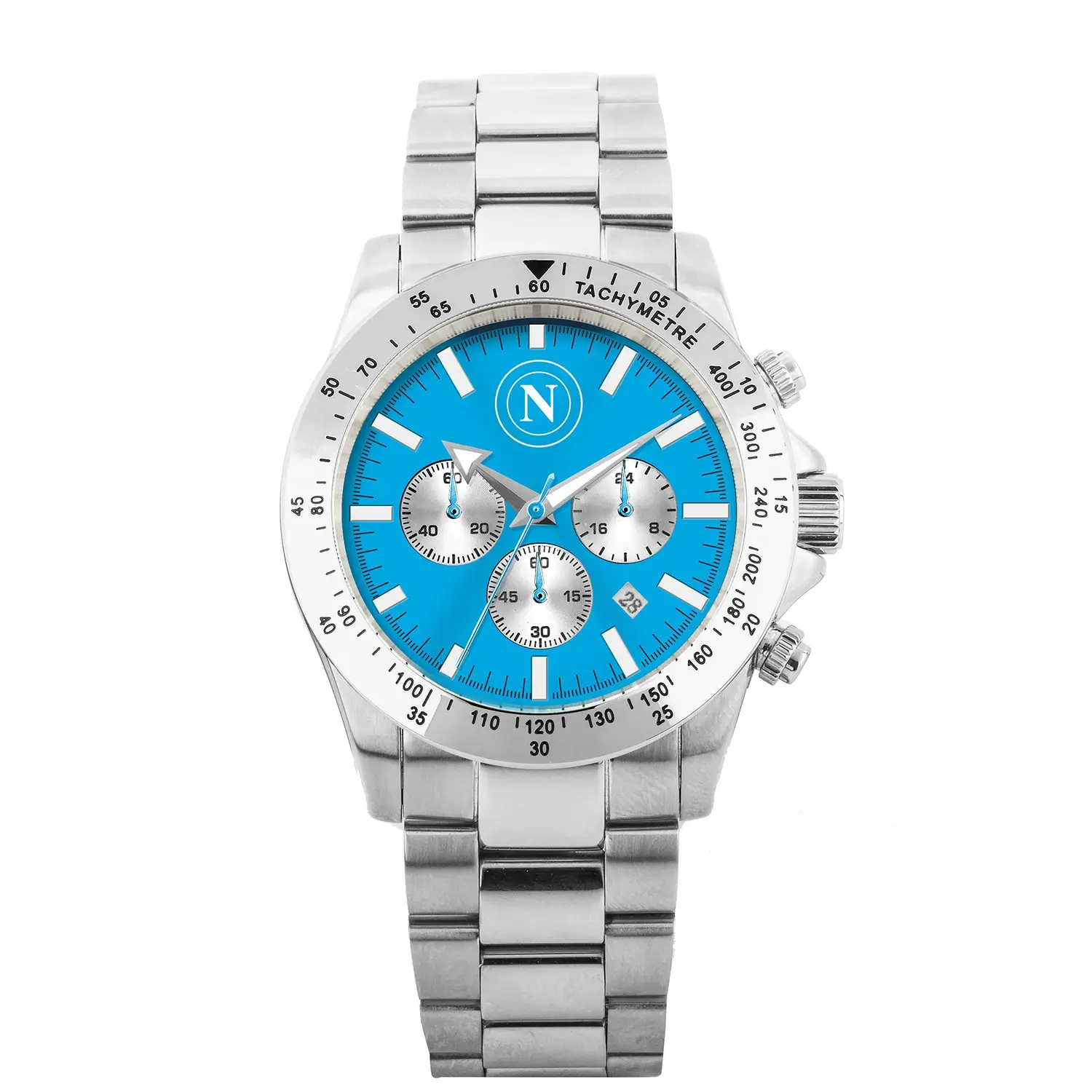
The deep blue dial is where the watch resolves its identity. Napoli’s blue—often referred to as Azzurro—is not just a color but a cultural marker. It carries the weight of stadiums, seasons, and memory. Here, it is rendered darker, more concentrated, shifting from the bright energy of match-day kits into something closer to midnight.
This tonal shift changes how the watch communicates. Instead of immediate recognition, it offers depth. The dial absorbs light, creating a sense of quiet gravity. Against this surface, the applied indices stand out with precision. They are not decorative markers but instruments—clean, legible, aligned.
The subdials introduce a secondary geometry. Typically arranged in a tri-compax or bi-compax layout, they create internal symmetry while maintaining functional clarity. Each subdial tracks a different measure—seconds, minutes, sometimes 24-hour time—yet visually they behave as a unified system.
The club crest sits within this arrangement without overpowering it. Its placement is deliberate, scaled to integrate rather than dominate. This is where the watch distances itself from merchandise. The branding is present, but it is disciplined.
style
A chronograph is, at its core, a tool for measuring intervals. But in this context, it becomes something else—a behavioral device. Pressing the pushers, starting and stopping the central seconds hand, resetting the subdials to zero—these actions introduce a tactile rhythm.
The pushers themselves are engineered for feedback. There is a resistance, a click, a return. Each action is felt as much as it is seen. This is where the watch moves beyond visual design into physical experience.
The central chronograph hand sweeps across the dial with controlled motion. It cuts through the blue field, tracing time as a line rather than a number. When reset, it snaps back to its origin, restoring the dial’s symmetry. This reset is not just functional—it is visual closure.
In this way, the chronograph transforms the watch into a small system of cycles: start, measure, stop, reset. Repeat. It mirrors the structure of sport itself—periods, halves, added time—without explicitly referencing it.
wear
At approximately 41 millimeters, the case size situates the watch within a contemporary standard. It is large enough to assert presence but restrained enough to avoid excess. The thickness accommodates the chronograph movement without becoming cumbersome.
On the wrist, the watch sits with balance. The weight of the steel is noticeable but not overwhelming. It anchors the watch, giving it a sense of permanence. This is not a piece that disappears—it remains present, integrated into movement.
The dial’s legibility is immediate. High contrast between hands and markers ensures clarity in varying light conditions. Luminous elements, where present, extend this usability into low-light environments, though they remain secondary to the overall design language.
flow
What defines this SSC Napoli chronograph is not what it adds, but what it withholds. There is no attempt to simulate luxury beyond its means. No unnecessary complications, no exaggerated finishes. Instead, it operates within a controlled vocabulary: steel, blue, symmetry, function.
This restraint aligns with a broader shift in sports-affiliated objects. Rather than producing overtly branded merchandise, there is a move toward integration—objects that can exist within everyday contexts while still carrying affiliation.
The watch becomes a subtle marker. It signals connection to Napoli not through volume, but through alignment. For those who recognize the crest, the color, the configuration, the meaning is clear. For others, it remains simply a well-composed chronograph.
access
Within the broader watch market, this chronograph sits in an accessible tier. It uses a quartz movement—reliable, accurate, low-maintenance. This choice is practical. It prioritizes usability over mechanical prestige.
For some, this may place the watch outside the traditional hierarchy of horology. But that hierarchy is not the point here. The watch is not competing with Swiss mechanical chronographs. It is operating in a different space—one where design, identity, and function intersect at a more attainable level.
This accessibility is part of its appeal. It allows a wider audience to engage with a well-constructed object that carries cultural significance without requiring deep investment.
View this post on Instagram
idea
Wearing the watch over time introduces repetition. The daily glance at the dial, the occasional use of the chronograph, the feel of the bracelet against the wrist—these actions accumulate.
Repetition is where objects gain meaning. The watch becomes associated with routines, with moments, with durations. It tracks not just measured intervals, but lived ones.
In this sense, the SSC Napoli chronograph extends beyond its initial design. It becomes part of a personal system, one that overlays the structured time of the watch with the subjective time of experience.
ctrl
The Stainless Steel Chronograph — Deep Napoli Blue Dial is not an object of excess. It is an object of control. Every element—material, color, function—is calibrated to maintain balance.
It does not attempt to redefine watchmaking. It does not need to. Instead, it refines a specific idea: that a sports-affiliated watch can operate with discipline, that identity can be expressed through reduction, that timekeeping can be both functional and cultural.
In the end, the watch holds its position quietly. Steel framing blue. Hands moving across a measured field. A crest integrated into structure. Time passing, recorded, reset, and begun again.
Related Articles

Did UK Civil Servants Really “Waste” Taxpayer Money Playing GTA Online? Here’s What Actually Happened
recall What the Telegraph Reported Where the Story Actually Came From What Policy Lab Says […]