
DRIFT AUDIO
Listen to this story
Choose a voice, then press play.


In the ever-evolving landscape of streetwear, where self-expression meets sartorial storytelling, the Takeout Tee in White by Fried Rice offers more than just a visual pun—it delivers an aesthetic that is both disarmingly simple and richly symbolic. Designed by the New York-based brand Fried Rice, known for fusing multiculturalism with artistic urban design, this garment exemplifies the label’s playful seriousness and cross-cultural fluency.
The Takeout Tee is built on a crisp white base—classic and versatile, yet intentionally minimal to serve as a canvas for the standout graphic emblazoned across the chest. At first glance, the imagery appears lighthearted: a hand-drawn rendition of a Chinese takeout box, complete with red pagoda artwork, exaggerated chopsticks, and steam lines dancing upward like cartoon heatwaves. But what Fried Rice offers here is more than nostalgic kitsch—it’s a cultural mirror held up to the diasporic experience of countless Asian Americans whose heritage was both preserved and caricatured through the ubiquity of takeout containers.
The illustration is not mass-manufactured or vector-perfect. It retains a raw, sketched-out quality that feels as though it was taken directly from a sketchbook—an intentional nod to the DIY roots of underground art and the hand-touched spirit of zine culture. Below the box, the Fried Rice logo is cleverly printed in a contrasting typeface that mimics fortune cookie fonts, sealing the thematic resonance of the piece without ever overstating it.
Constructed from 100% heavyweight cloth fabric, the tee offers structure and drape that flatter the body without clinging. It has a slightly oversized silhouette—a nod to ‘90s hip-hop influences and the Japanese streetwear aesthetic, both of which are integral to Fried Rice’s cross-border design language. The drop-shoulder cut and roomy sleeves echo comfort, ease, and the kind of confidence found in garments that refuse to shout but always spark conversation.
Every element—from its stitching to the understated branding—whispers intentionality. The neckline is ribbed for durability, while the hem falls just below the waistline, making it ideal for layering or standing alone. A small woven label, stitched inconspicuously into the bottom hem, carries the Fried Rice insignia—a red rice grain motif—that acts as a signature flourish for those in the know.
Beyond its material form, the Takeout Tee functions as a cultural critique wrapped in humor. It references a food tradition that became a shorthand for “Asian” in the American cultural imagination, reclaims that iconography, and reframes it through a contemporary lens—one rooted in pride, irony, and self-awareness. It doesn’t mock the symbol; it repositions it, empowering wearers to reclaim everyday emblems that have long been flattened into stereotype.
In its simplicity, the Takeout Tee is a wearable manifesto. It’s streetwear with a soul, style with a story—soft to the touch but sharp in its message. In the hands of Fried Rice, even a takeout box becomes a vessel of heritage, humor, and quiet resistance.
Related Articles
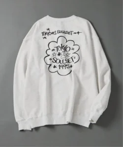
Eric Haze Stitches a Nineties Friend Into TOKYO Capsule
Five pieces carry Eric Haze's embroidered tagging for TOKYO No.1 SOUL SET, sold online and in Osaka around the band's Oct 25 BAYCREW'S FESTIVAL set.