The Acne Studios Logo Cap: Minimalism with an Edge
April 26, 2025
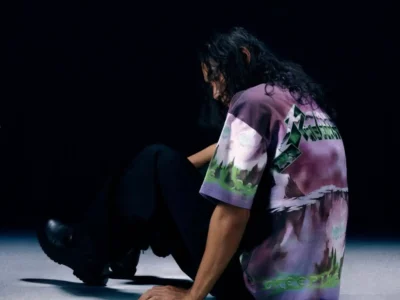
In the realm of contemporary fashion, few brands embody the art of subtle provocation quite like Acne Studios. The Stockholm-based label, known for its careful balancing act between minimalist austerity and avant-garde flair, has long understood that true style often whispers rather than shouts. It’s no surprise, then, that the Acne Studios Logo Cap exemplifies this philosophy with effortless precision — a simple object elevated into a quiet statement piece.
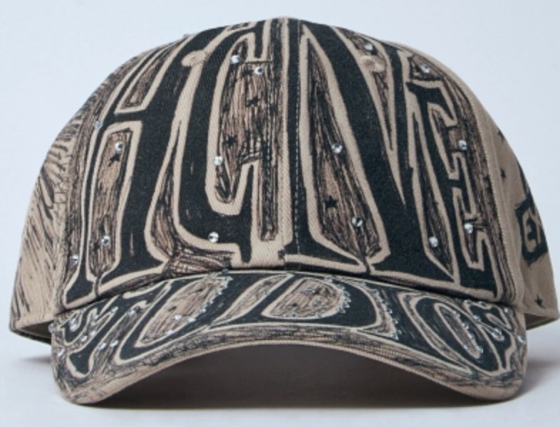
At first glance, the cap seems almost disarmingly straightforward. Constructed from durable cotton twill and embroidered with the brand’s modest yet unmistakable logo, it eschews bombast in favor of refined restraint. There are no loud graphics, no contrived distressing, no gimmicky add-ons vying for attention. Instead, the cap relies on careful proportion, premium materials, and a knowing sense of confidence that speaks directly to those who understand fashion as a language of suggestion rather than declaration.
The fit is another element of its understated success. The silhouette adheres to the classic six-panel baseball cap structure — slightly curved brim, adjustable back strap, low-profile crown — but with Acne’s characteristic precision. It sits snugly without clinging, structured enough to maintain shape but soft enough to feel broken-in from the first wear. There is a subtle art to making something feel “just right” immediately, and Acne Studios achieves this with disarming ease.
Yet what truly sets the Logo Cap apart is its versatility. In an era where accessories are increasingly treated as extensions of identity, this cap resists easy categorization. It can be styled with relaxed tailoring for a nonchalant, urban sophistication; thrown on with a distressed hoodie and sneakers for an air of curated indifference; or paired with an oversized trench for a look that straddles the line between normcore and high fashion. Its neutrality becomes a canvas, allowing wearers to project their own mood and message.
The embroidery itself is a study in restraint. The Acne Studios logo, stitched cleanly across the front, neither dominates nor fades into obscurity. It serves as a small nod — a wink rather than a shout — to those fluent in the semiotics of fashion, where branding operates more as texture than as centerpiece. In this way, the cap achieves what many others attempt but few accomplish: it becomes both visible and invisible, a signature and a blank slate simultaneously.
In a marketplace saturated with statement accessories, the Acne Studios Logo Cap feels like a breath of fresh air — an object that refuses to pander to trends yet remains perfectly attuned to the spirit of its time. It is a piece for those who appreciate the luxury of discretion, the sophistication of understatement, and the enduring power of simplicity when rendered with care.
With the Logo Cap, Acne Studios once again reminds the fashion world that in the right hands, even the most ordinary object can become quietly extraordinary.
Related Articles

Two Bags, One Habit: JJJJound and Porter Return to the Basics That Made Them
JJJJound and Porter are back for a fourth round, and this time the entire pitch […]