VERDY x Wu-Tang Clan Collection: A Mature Flex of Japanese Streetwear Rebel and Hip Legacy
May 24, 2026
In May 2026, the streets of Osaka buzzed with a rare culture crossover. Japanese graphic artist VERDY teamed up with the legendary Wu-Tang Clan for a limited-edition apparel collection, unveiled through a pop-up at Henry’s Pizza—VERDY’s own New York-style pizzeria and creative hub. Dropping online the following day, this collaboration bridges East Coast boom-bap grit with Tokyo-Osaka streetwear flair, punk energy, and cool illustration. It’s more than merch; it’s a statement on how subcultures transcend borders.

Who is VERDY? From Osaka Roots to Global Streetwear Icon
Born in 1987 in Osaka Prefecture, VERDY (real name often kept low-key) emerged as one of Japan’s most influential graphic artists and designers. He studied at Osaka Design School and co-founded the visual design collective VK Design Works in 2008. By 2012, he had relocated to Tokyo, where his career exploded.
VERDY’s work draws heavily from skateboarding, punk/hardcore music, and youth culture. His breakthrough projects—Wasted Youth and Girls Don’t Cry—became global phenomena. Wasted Youth channels raw, unapologetic teenage energy: bold graphics, rebellious slogans, and a DIY ethos rooted in punk and skate scenes. Girls Don’t Cry, started as a personal project/gift for his wife, emphasizes emotional resilience with softer, more approachable vibes.

Verdy, the Man Behind Brands “Wasted Youth” and “Girls Don’t Cry”
His signature character Vick—a black-and-white panda-rabbit hybrid born on Awajishima Island—embodies positivity, longevity, punk anarchy (complete with an “A” symbol on its belly), and rebellion. Vick loves music and has appeared in collaborations with Nike SB, Human Made, Swatch, and more. A colorful counterpart, Visty, adds contrast during tougher times like the pandemic.
Beyond clothing, VERDY opened Henry’s Pizza in Osaka’s Tanimachi district (near Osaka Castle Park). Named after Black Flag’s Henry Rollins, it’s a New York-style pizzeria that doubles as a community space and gallery (Rise Above on the upper floor). It reflects his love for American counterculture while rooting it in hometown pride. Affordable, vibrant, and authentic, Henry’s became a celebrity hotspot and creative nexus.


VERDY’s philosophy—“Friends Over Money,” organic creativity, and staying true to youthful passions—defines his output. He’s collaborated with Undercover, Union, Carrots, Disney, and high-profile names, proving streetwear can be both accessible and artistic.
Wu-Tang Clan: The Shaolin Hip-Hop Empire
Formed in 1992 in Staten Island, New York (self-styled “Shaolin”), Wu-Tang Clan revolutionized hip-hop. Core members include RZA (de facto leader and producer), GZA, Method Man, Raekwon, Ghostface Killah, Inspectah Deck, U-God, Masta Killa, and the late Ol’ Dirty Bastard. Their 1993 debut Enter the Wu-Tang (36 Chambers) blended kung-fu film samples, gritty street narratives, complex lyricism, and innovative production.
Wu-Tang’s business model was revolutionary: individual solo deals allowed creative freedom while protecting the group brand. They built a vast empire—albums, affiliates (Killa Bees), clothing (Wu-Wear), and cultural influence that spans generations. Their logo, the iconic “W” (often yellow on black), symbolizes unity, power, and martial arts philosophy.
In 2026, Wu-Tang remains active with residencies, tours, Supreme collabs, and legacy projects. Their appeal to global audiences, including Japan’s hip-hop scene, makes this VERDY partnership natural.
The Collection: Details, Designs, and Drop Info
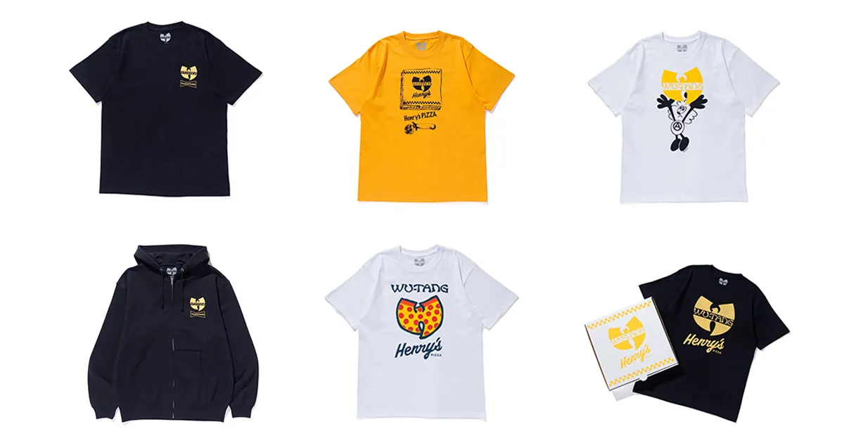
The VERDY x Wu-Tang Clan x Henry’s Pizza collection blends Wu-Tang’s iconic graphics with VERDY’s illustrative style, Wasted Youth branding, and pizza-themed twists. Key pieces include:
Verdy’s Wu-Tang Clan x Henry’s Pizza collection is now on sale
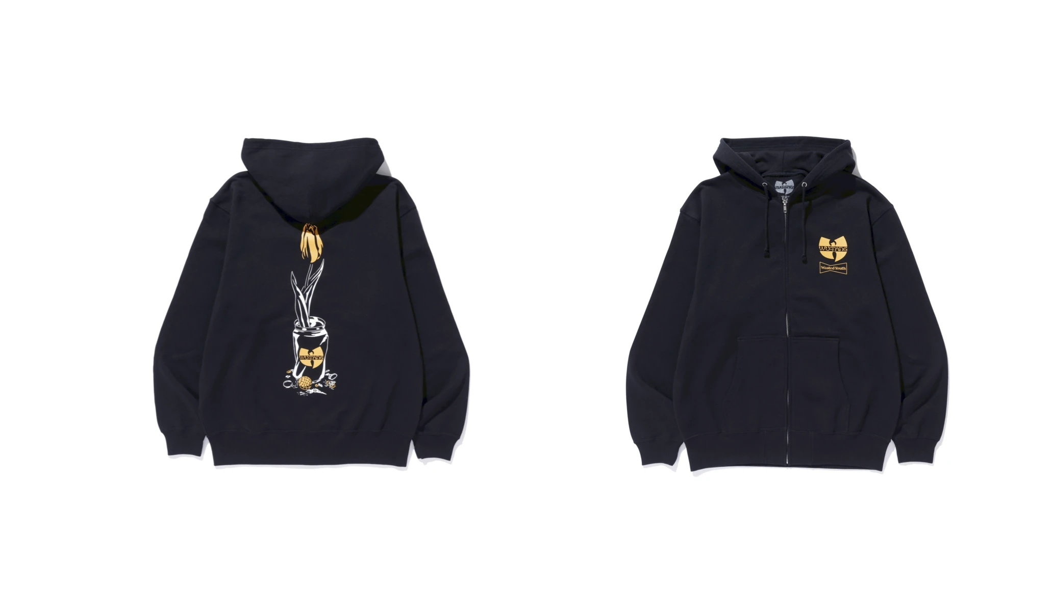
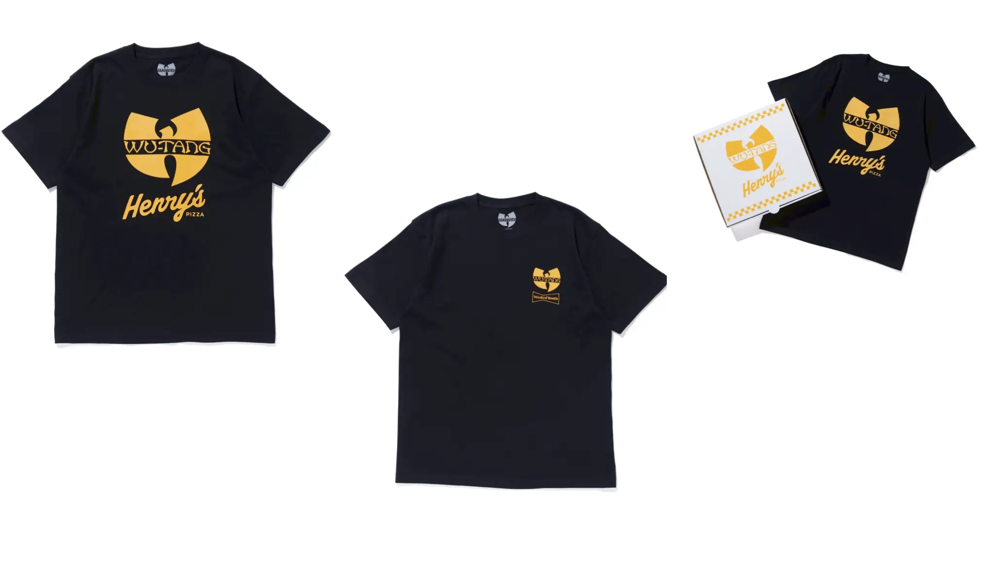
- Double-name Zip-Up Hoodie and T-Shirt (Wasted Youth collab): Premium black pieces featuring the Wu-Tang “W” alongside Wasted Youth motifs. The hoodie’s back shows creative twists like a wilting flower in a Wu-branded can.
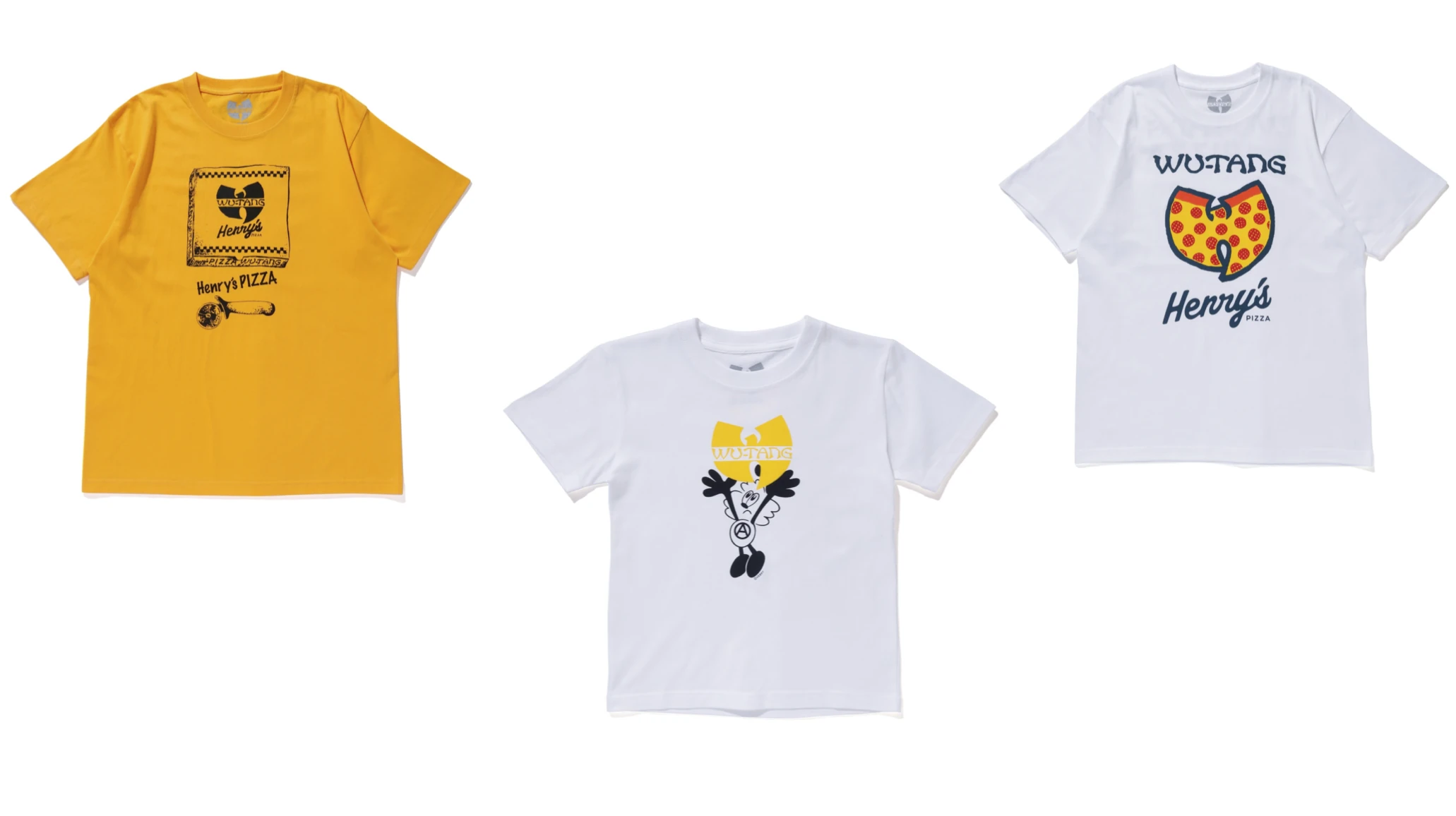
- Boxed T-Shirt and Graphic Tees (Henry’s Pizza collab): Pizza-box packaging for one tee. Designs blend Wu-Tang logos with Henry’s branding—yellow “W” on black, pizza-slice integrations, and playful graphics.
Verdy’s Wu-Tang Clan x Henry’s Pizza collection is now on sale
- Vick x Wu-Tang T-Shirt: Merges VERDY’s panda-rabbit character with the “W” logo. Vick’s anarchic punk energy meets hip-hop swagger.
Verdy’s Wu-Tang Clan x Henry’s Pizza collection is now on sale
The color palette leans black, yellow/gold, and white—nodding to Wu-Tang’s classic look while incorporating VERDY’s bold, graphic pop. Materials emphasize comfort and quality for everyday streetwear. Prices were accessible for a hype drop (e.g., tees around 5,500–11,000 yen, with kids’ sizes available).
View this post on Instagram
Drop Details: Pop-up at Henry’s Pizza on May 23–24, 2026 (12:00–19:00). Online release via Verdy’s Gift Shop on May 25 at 9am JST, while supplies last. It sold out quickly, as expected for such a targeted, authentic collab.
flow
This collaboration exemplifies globalization of subcultures. Japan has long embraced hip-hop— from 80s/90s B-boy scenes to artists like RIP SLYME or Teriyaki Boyz. Wu-Tang’s kung-fu mysticism and raw authenticity align with Japanese punk/skate rebellion that VERDY channels.
VERDY brings a whimsical, character-driven Japanese kawaii-punk lens to Wu-Tang’s serious street mythology. Vick humanizes (or “animalizes”) the Clan’s energy, making it approachable yet edgy. Henry’s Pizza adds a literal “slice of New York in Osaka” layer—pizza as metaphor for culture flow.
In 2026, streetwear thrives on storytelling and community. Limited drops like this combat fast fashion, rewarding fans who engage with the lore. It also highlights artists as entrepreneurs: VERDY’s pizzeria/gallery and Wu-Tang’s ongoing merch empire.
Broad context: Supreme x Wu-Tang (Fall 2025) showed continued mainstream interest. VERDY’s drop feels more intimate—hyper-local to Osaka yet globally aspirational.
straddle
VERDY’s style—clean lines, high-contrast, narrative elements—perfectly complements Wu-Tang’s bold iconography. The “W” logo, reimagined with pizza toppings or Vick’s anarchy “A,” creates fresh hybrids without diluting originals.
Themes include:
- Youth and Wasted Potential: Wasted Youth + Wu-Tang’s “from the slums to success” narrative.
- Rebellion: Punk anarchy meets hip-hop defiance.
- Unity: Clan brotherhood + VERDY’s community-focused spaces.
- Playfulness: Vick softens the hardcore edge, broadening appeal.
Quality-wise, pieces use durable fabrics suitable for layering in Osaka’s variable climate or global streets. Packaging (pizza boxes) adds experiential value—unboxing feels like grabbing a pie from Henry’s.
Verdy’s Wu-Tang Clan x Henry’s Pizza collection is now on sale
impression
Early reactions on social media and streetwear forums hailed it as “fire” and a dream collab. Osaka locals lined up at the pop-up; international resellers moved fast. It reinforces VERDY’s position as a bridge-builder and Wu-Tang’s timeless relevance.
For collectors, it joins a lineage of Wu collabs (Nike, Crocs, Supreme, etc.) while standing out for its Japanese specificity. For casual fans, it’s wearable art celebrating two icons of DIY creativity.
why
Streetwear evolves, but authentic cross-cultural stories endure. In an era of algorithm-driven trends, this drop reminds us of the power of personal vision—VERDY’s Osaka roots meeting Staten Island legends.
It celebrates how music, art, food, and fashion intersect. Henry’s Pizza isn’t just a venue; it’s the heart. Vick isn’t just a mascot; he’s an avatar for youthful defiance. Wu-Tang isn’t just a group; they’re a philosophy.
As VERDY continues painting, designing, and feeding the culture—and Wu-Tang keeps “bringing da ruckus”—expect more fusions. This collection isn’t the end; it’s another chamber in an ongoing saga.
Related Articles
NEEDLES x UNION Return for a New Chapter in Their Longest-Running
NEEDLES and UNION TOKYO reunite for a new capsule releasing July 10, continuing one of […]