A Plastic Bottle Becomes a Warning: New Era Puts Yusuke Hanai’s Ocean Illustrations on Its Summer Caps

July 17, 2026
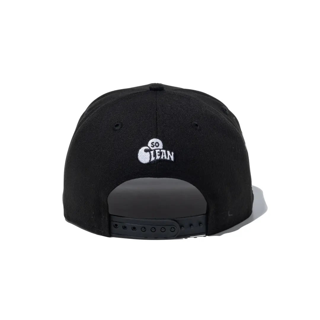
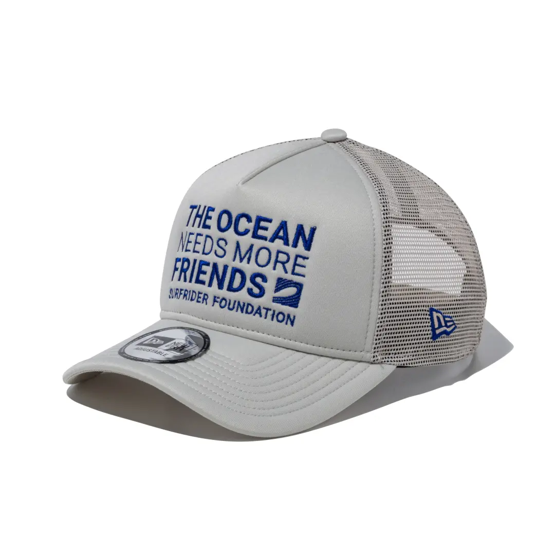
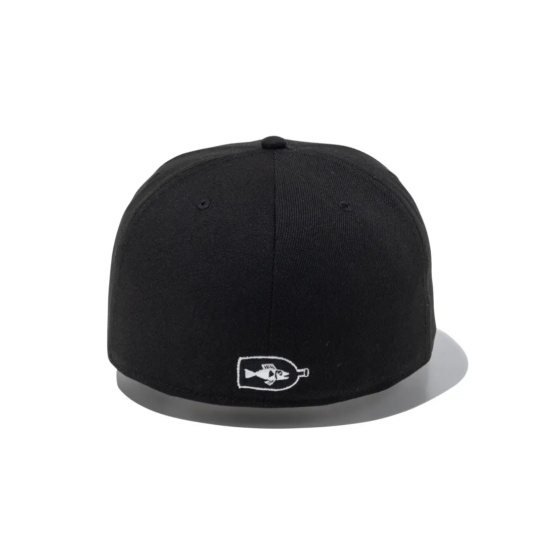
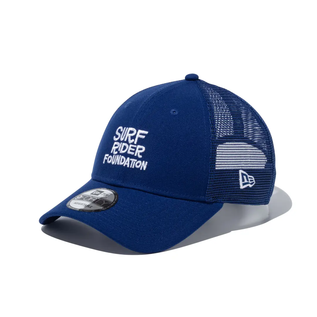
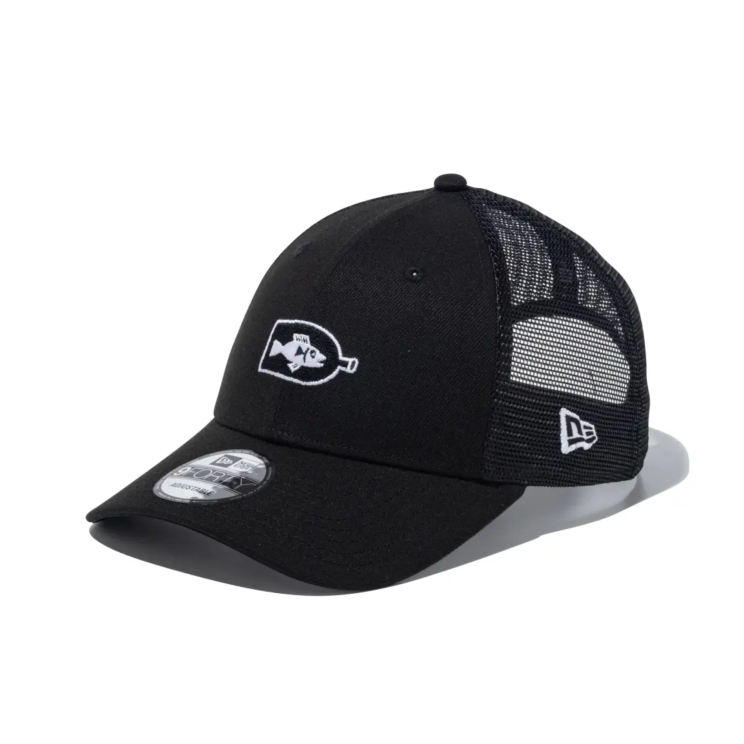
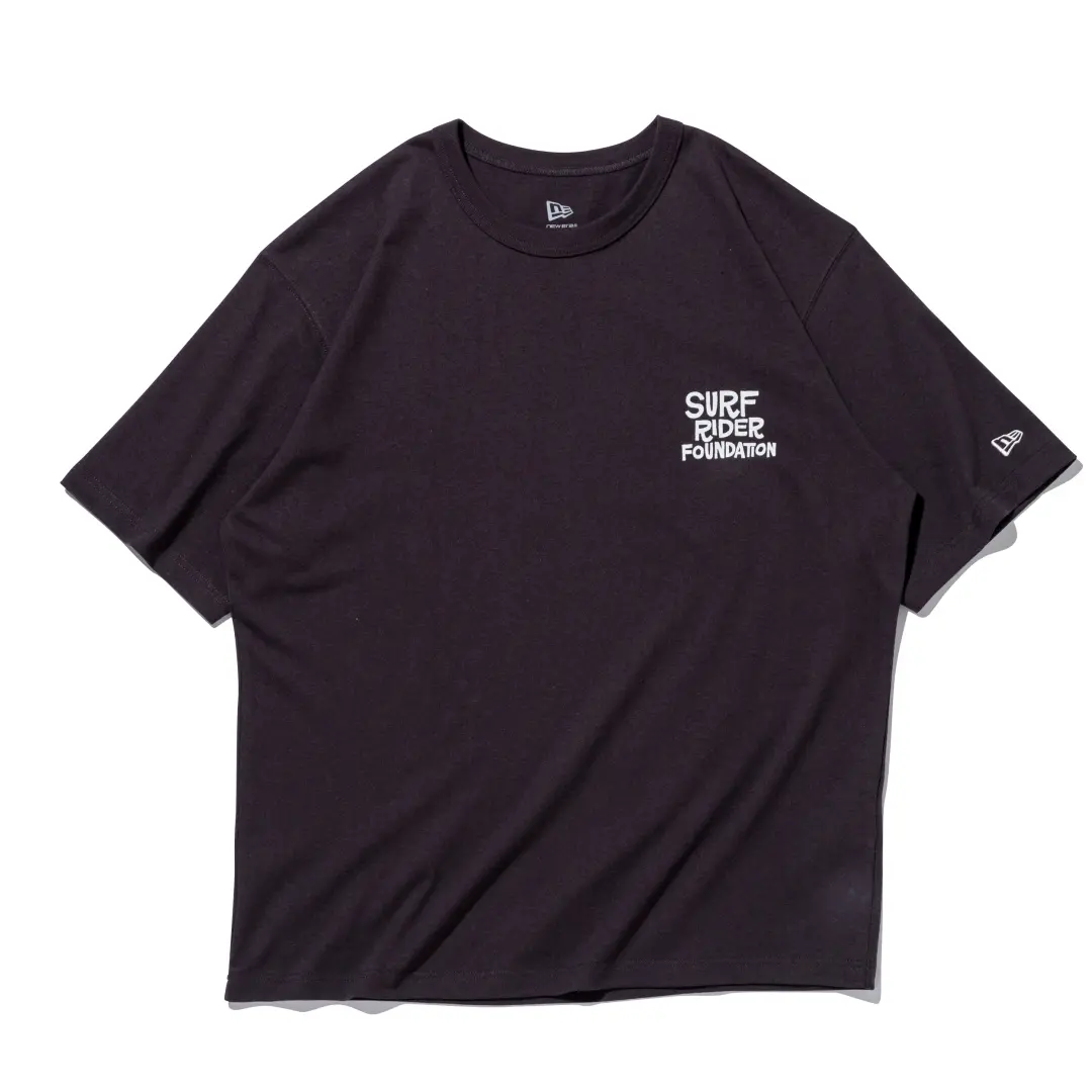
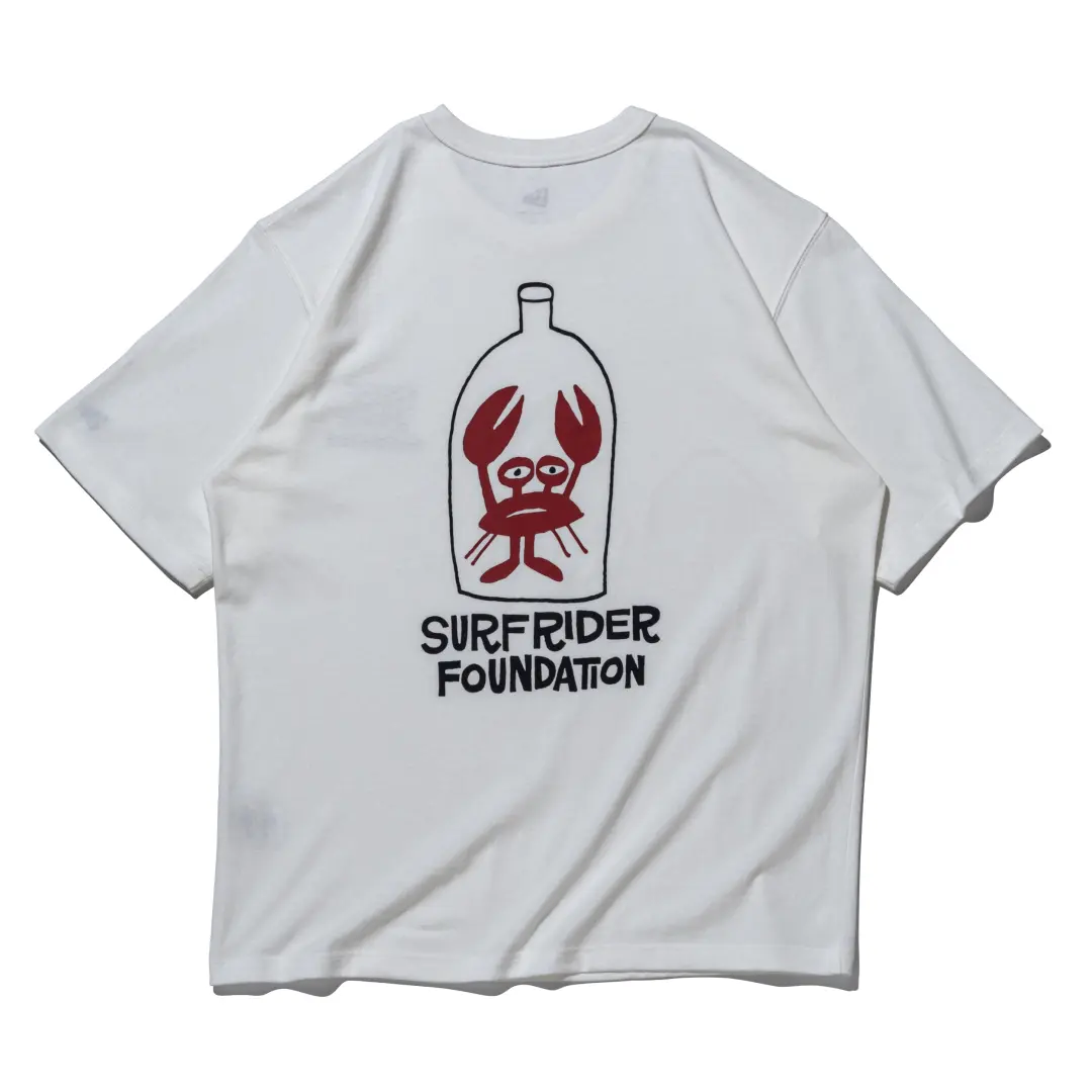
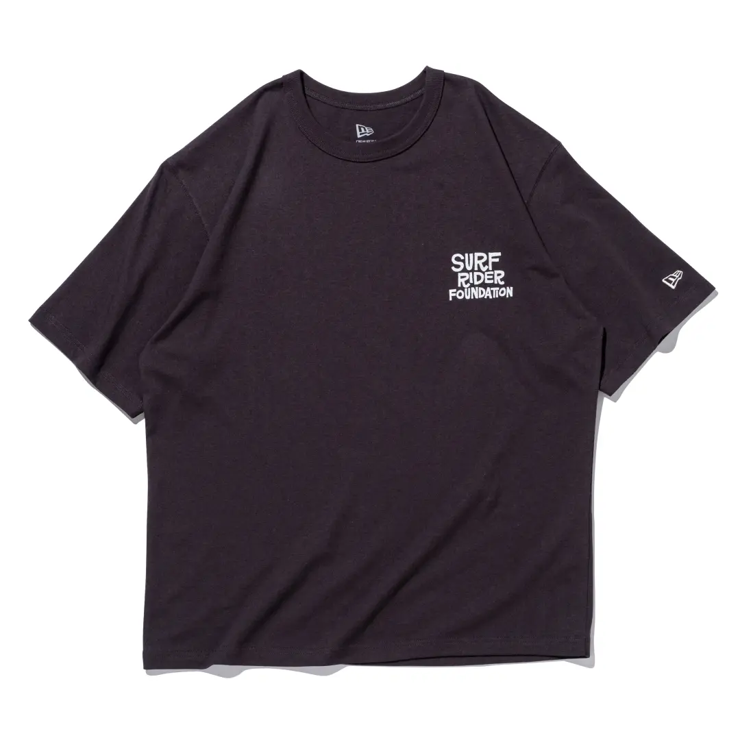
Seventeen models, one message about waste, and a Bay Area logo artist sharing shelf space with a Tokyo painter known for slacker characters and shh dread.
recall
- The Rel
- Two Collections, One Cause
- Who Is Behind the Ink
- Where the Money and Message Go
- Avail
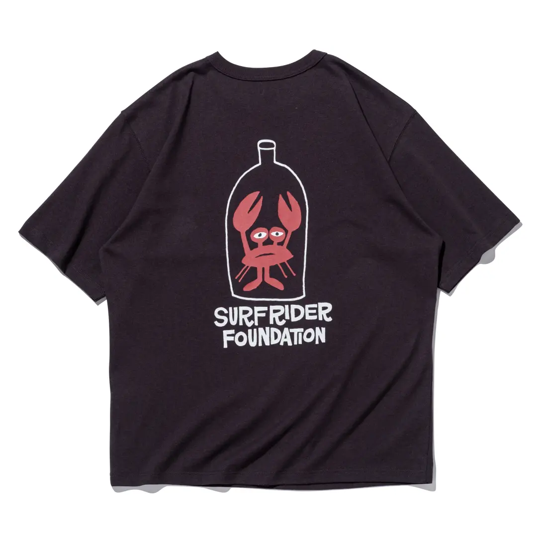
On the morning of July 17, New Era opened its Japanese online store to a lineup built entirely around a plastic bottle. Not the product itself, but its aftermath: a sea creature drawn as though trapped inside one, floating through artwork stitched onto the crown of a baseball cap. That image comes from Yusuke Hanai, the Tokyo based painter whose scratchy, melancholic characters have spent two decades shh narrating the anxieties of modern life, and it anchors the second half of a two part release built around the environmental nonprofit Surfrider Foundation.
There is nothing especially loud about the rollout. No teaser countdown, no limited raffle mechanics, no hype cycle engineered to sell out in ninety seconds. Seventeen items landed on the New Era Japan online store at 10:00 a.m. local time, split across two distinct capsules, and they will likely still be available next week. That restraint is, in a way, the point. Surfrider has never operated like a streetwear label chasing scarcity. It operates like what it is: a coastal water quality watchdog that started in California in 1984 and has been running chapters in Japan since 1993.
View this post on Instagram
two
The release breaks into two separate collaborations, both live on New Era’s Japanese storefront under the umbrella of the Surfrider partnership.
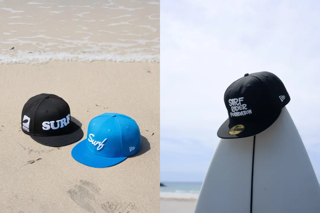
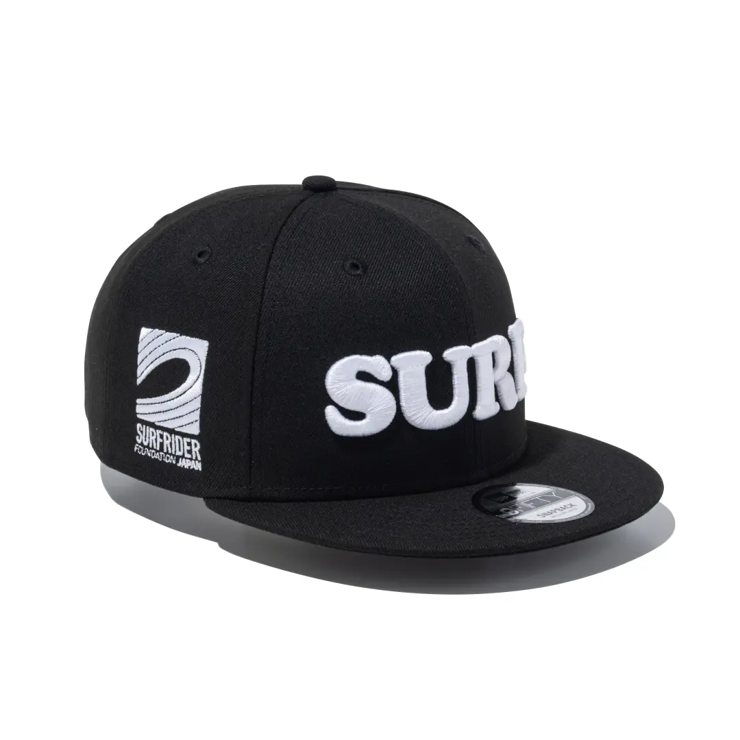
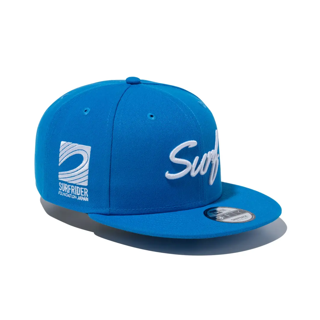
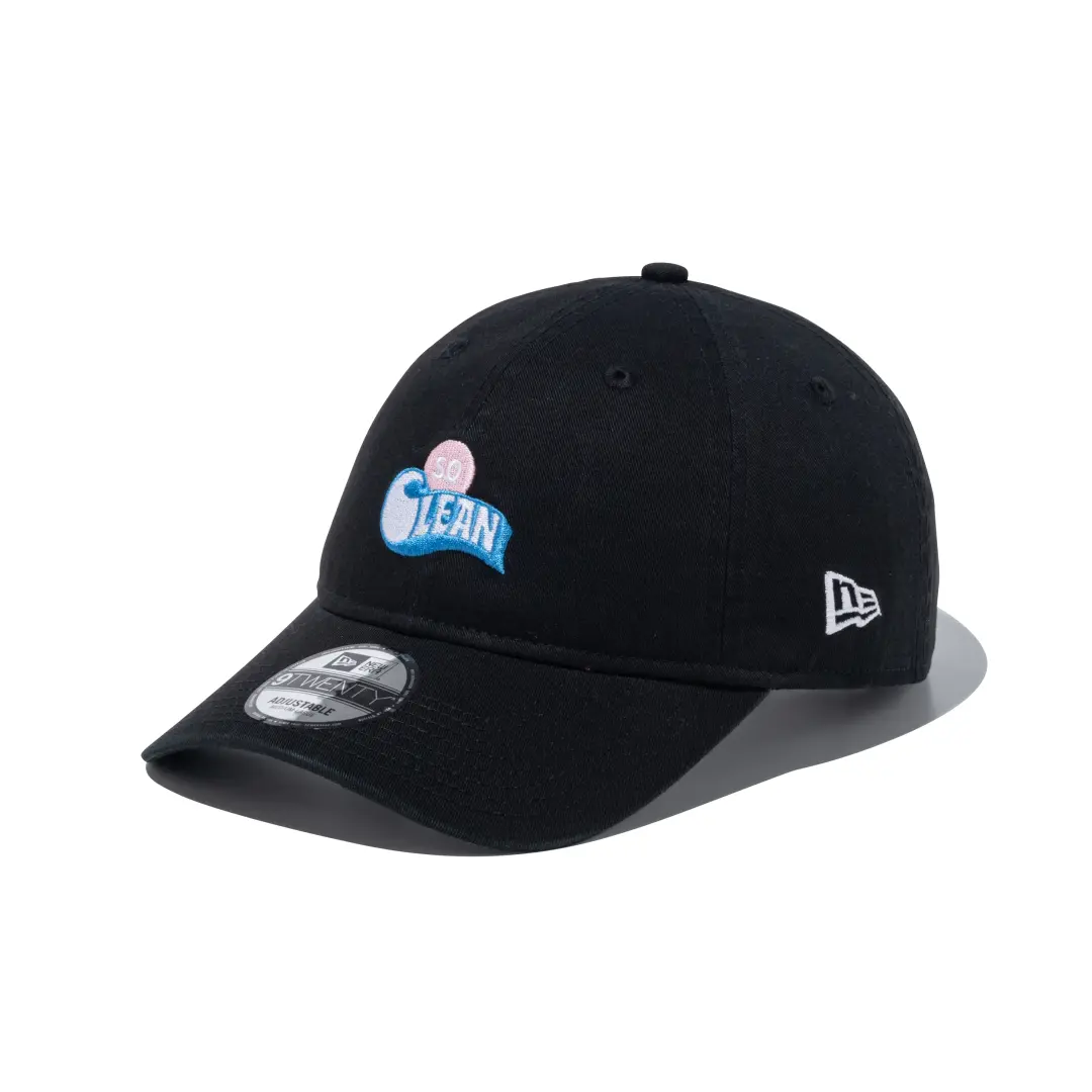
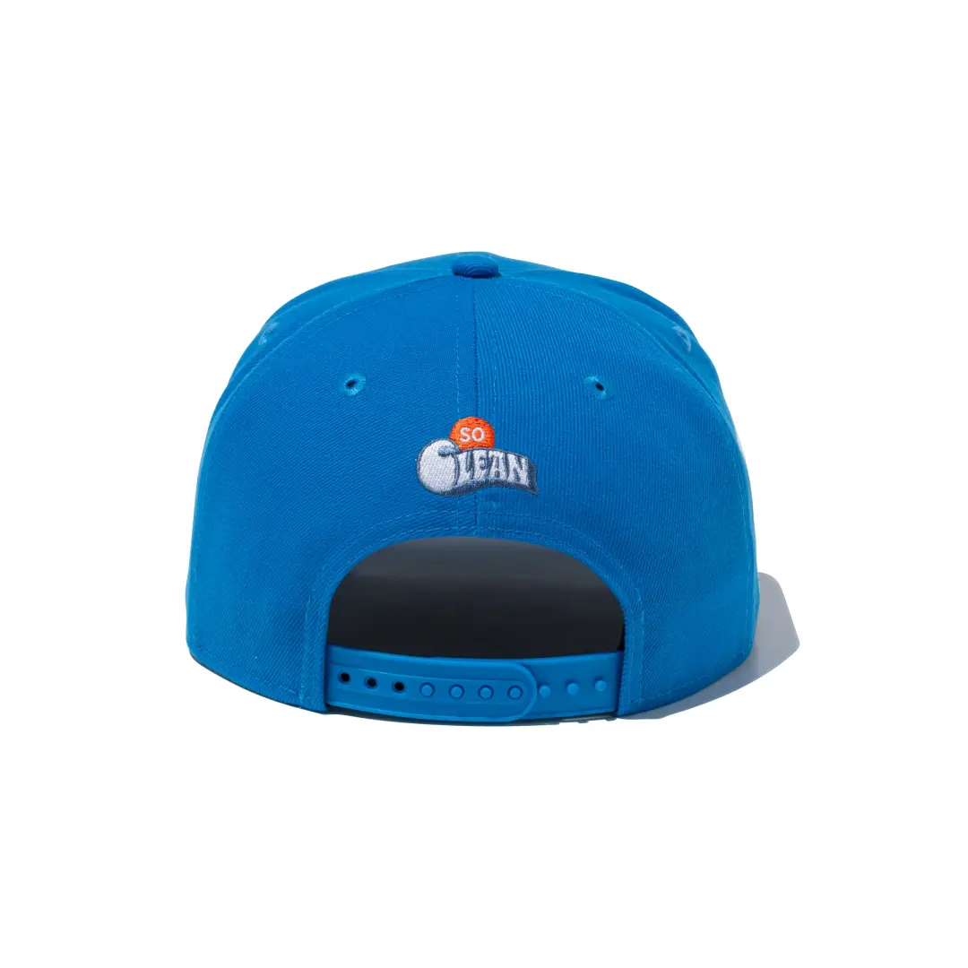
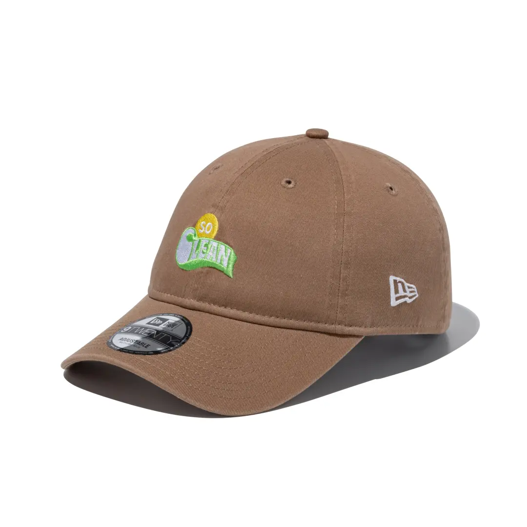
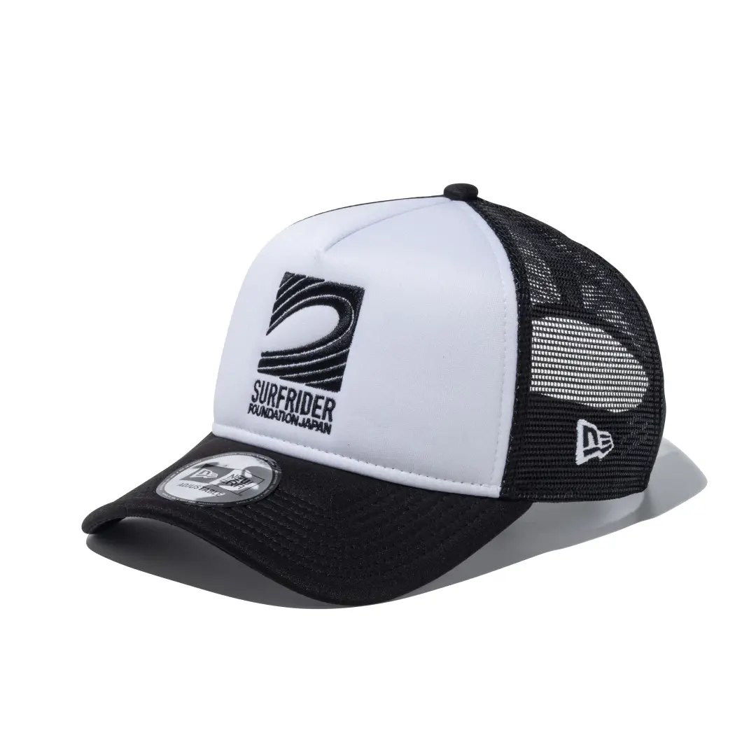
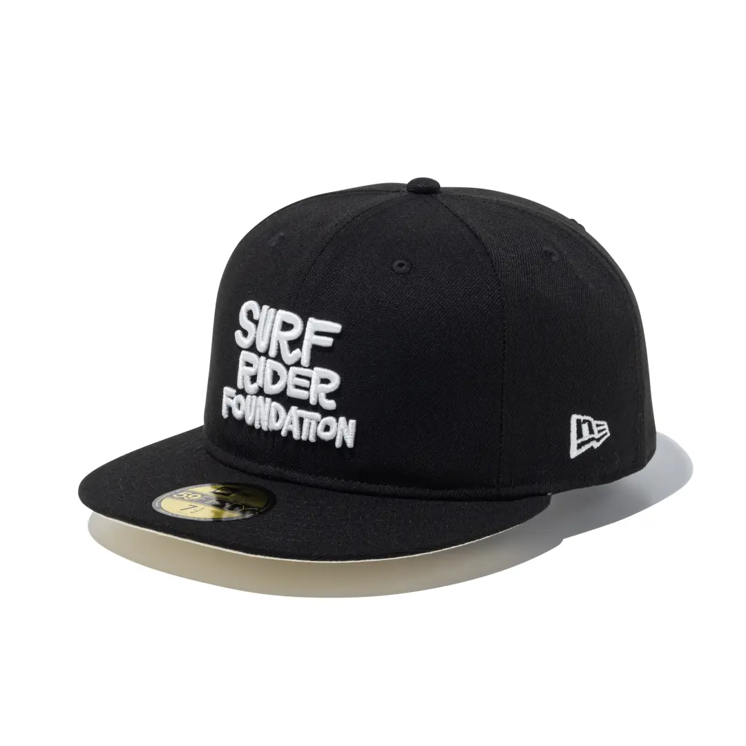
The first is a six piece cap collection built entirely around typography and a logo designed by Jeff Canham, a San Francisco based artist and longtime art director for Surfer Magazine. Canham’s contribution keeps things plain on purpose. Clean wordmarks, no illustration, the kind of design that reads as a gear brand’s collaboration with an advocacy group rather than a fashion statement. It comes in 9FIFTY, 9FORTY, and 9TWENTY silhouettes, giving the collection a spread across structured, unstructured, and lower profile cap styles.
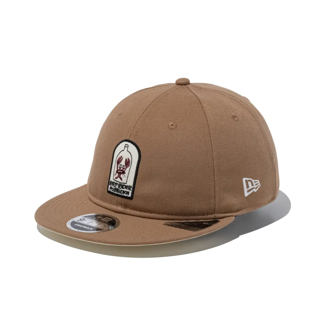
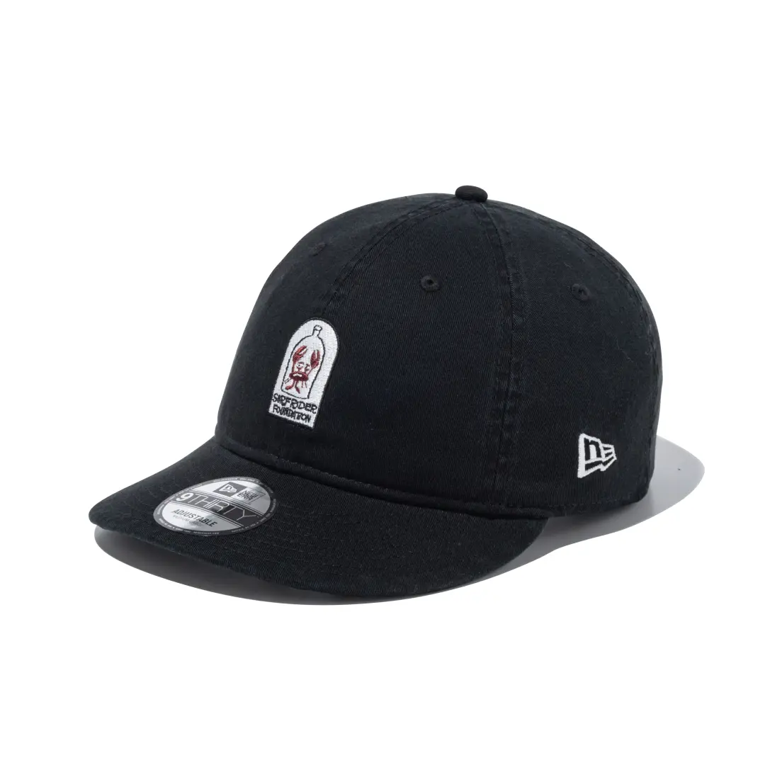
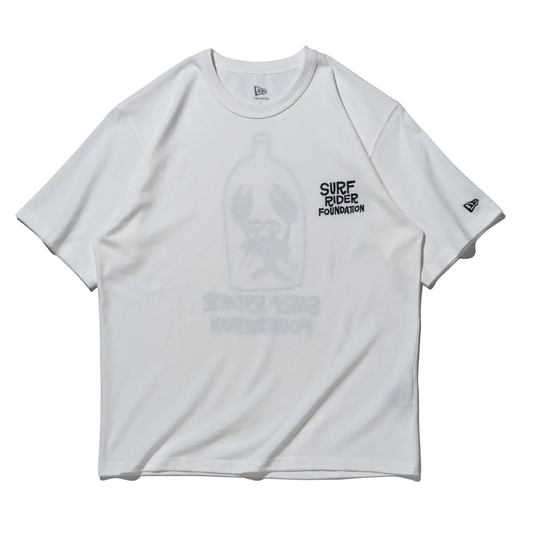
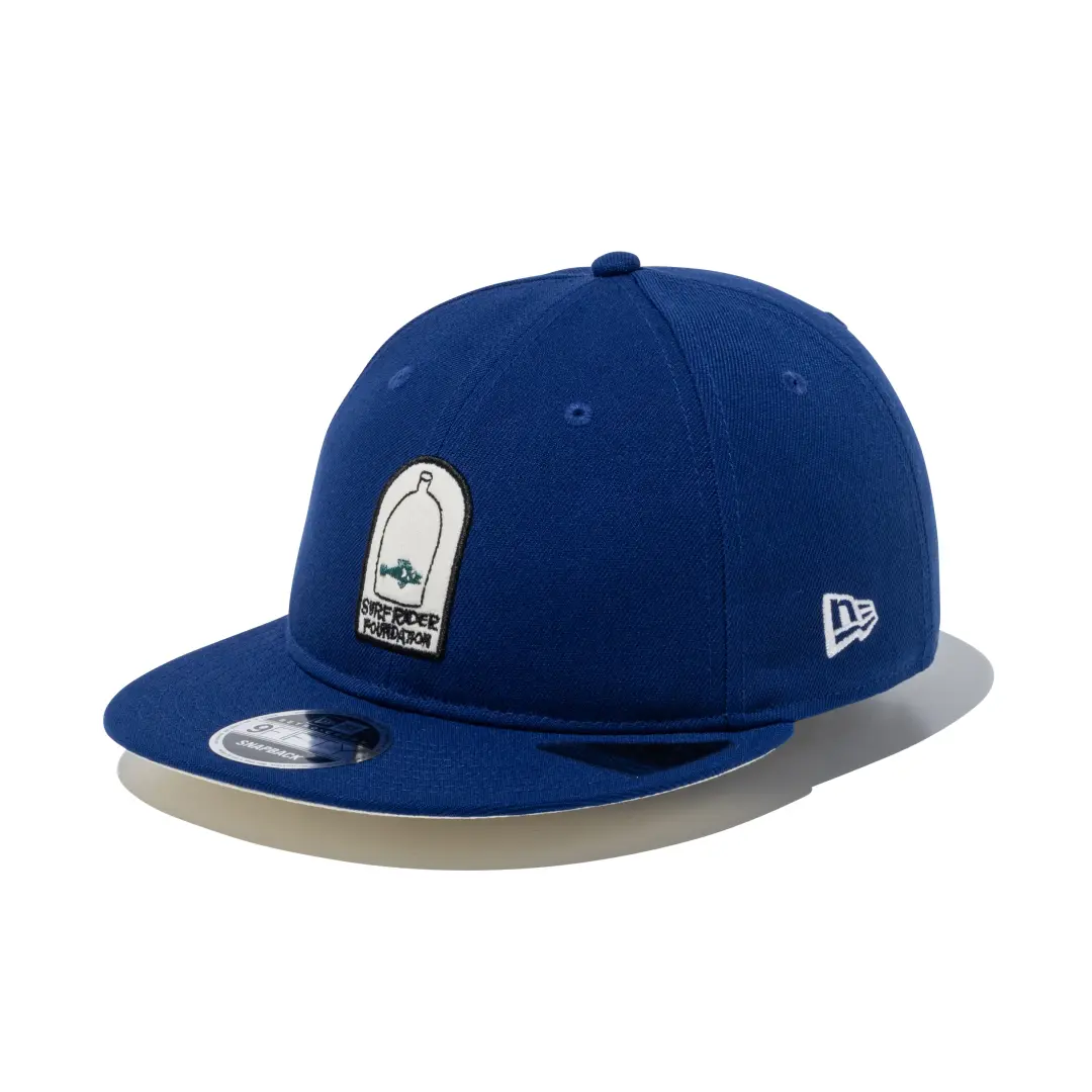
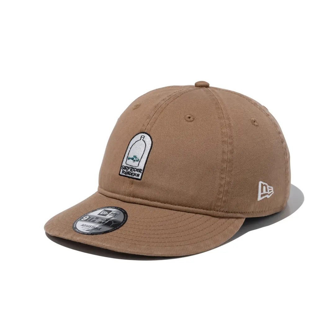
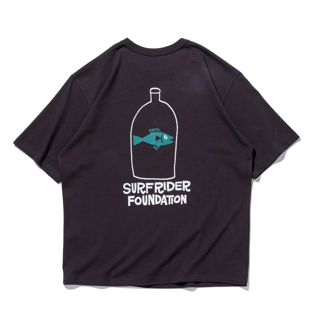
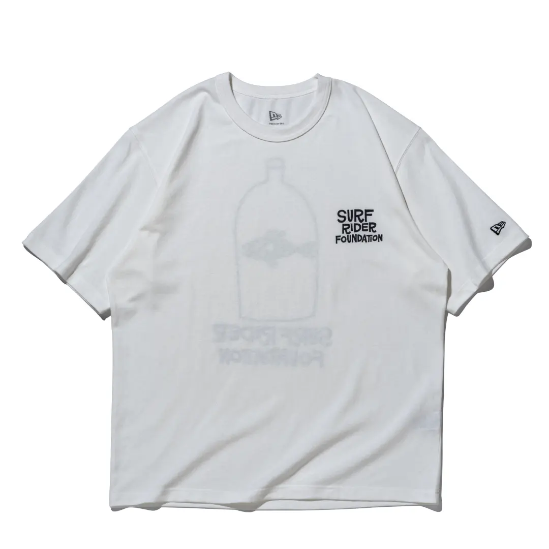
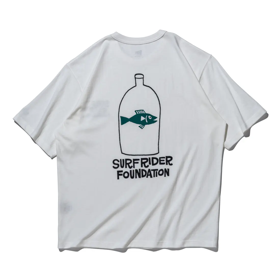
The second collection is where Hanai enters, and where the release picks up its emotional register. Working across five silhouettes, including the 59FIFTY in both Soft Buckram and Retro Crown builds, the 9FORTY Trucker, the 9THIRTY, and a pair of short sleeve washed cotton t-shirts, Hanai contributes the illustration that gives the whole capsule its reason for existing: a marine animal rendered as though sealed inside a discarded bottle. New Era’s own material around the release frames the image plainly, describing it as a way of visualizing what happens when litter, dropped without a second thought, ends up doing lasting damage to ocean environments.
It is a blunt piece of environmental messaging, but Hanai’s line work keeps it from tipping into after school special territory. His figures have always carried a kind of tired, faraway expression, whether he is painting stoners on a beach or, in this case, a creature that did not choose its situation. The bottle motif repeats across the caps and tees in slightly different compositions, front panel on some pieces, back panel on others, giving the capsule enough internal variation that it does not read as a single graphic copied across a product line.
who
Hanai was born in Japan in 1978 and found his way into art relatively late by industry standards, discovering Rick Griffin‘s Grateful Dead album covers as a teenager and following that thread west. He left for San Francisco in 2003 to study illustration at the Academy of Art College, absorbing the city’s counterculture history, Jack Kerouac’s prose, and the visual language of 1960s surf culture along the way. A sign painting demonstration at the 2006 Green Room Festival in Yokohama caught the attention of a Laguna Beach gallery owner, which led to a New York exhibition the following year, and Hanai’s practice has been expanding outward from that point since: shows in London, Paris, Los Angeles, and Tokyo, plus prior collaborations with brands including Vans, Burton, and ACME Furniture.
What makes Hanai a fitting choice for a Surfrider collaboration specifically is not just the surf iconography he trades in, but the tone underneath it. His characters rarely look triumphant. They look tired, distracted, occasionally haunted, which happens to be exactly the register an environmental warning needs if it wants to avoid sounding like a public service announcement. A cartoon fish trapped in a bottle drawn by an artist with a lighter touch could read as cute. Drawn by Hanai, it reads more like an accusation delivered quietly.
Canham, meanwhile, brings institutional credibility rather than illustration. His decades long run as art director for Surfer Magazine put him at the center of American surf media’s visual identity for a generation, and his contribution to this release stays in that lane: logo work and typography rather than narrative imagery, a deliberate contrast to Hanai’s half of the release.
View this post on Instagram
huh
Surfrider Foundation’s origin story is almost aggressively unglamorous for an organization whose name now sits on a fashion collaboration. It began as a volunteer water quality testing effort among California surfers in 1984, checking whether the breaks they were paddling out to were actually safe. That grassroots monitoring model expanded into a full international NGO, and the Japan chapter, active since 1993 and formally incorporated as a general incorporated association in 2011, now operates as part of a network spanning roughly ten countries.
The organization has stayed close to that original mandate: coastal water quality, beach cleanup coordination, and public education, carried out largely through local chapters rather than centralized campaigns. A cap collaboration is a strange vehicle for that kind of grassroots environmental work, admittedly, but it is also a familiar one. Surf brands have leaned on Surfrider’s name for years precisely because the organization’s low key, chapter based structure gives corporate partners something to point to that still reads as authentic rather than manufactured.
fin
All seventeen pieces are live now through New Era’s Japanese online store, priced in yen and inclusive of tax.
There is no indication in New Era’s release materials of a limited run or numbered production, which tracks with the collection’s overall low pressure presentation. This appears to be a standard retail drop rather than a scarcity driven event.
Related Articles
Convenience Store Eyewear Grows Up: Famima’s UV Sunglasses Line Adds a Square Sil
A pair of sunglasses that started as a novelty checkout item has turned into one […]