DRIFT

The Vatican’s final tribute meets a typographic reckoning

When images of Pope Francis’ tombstone began circulating online last month, the discourse wasn’t about the stone’s solemn design, the papal seal, or the theological resonance of its Latin text. It was about the kerning.

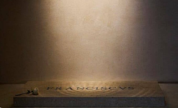
“F R A NCISC VS,” the name etched across the tomb’s face in all-caps serif type, was enough to send typographers—and a surprising number of designers outside the Church—into collective aesthetic shock. The issue? Irregular letterspacing that rendered the name of one of the most influential religious leaders of the 21st century nearly unreadable to the typographically inclined.

“This is an abomination unto design,” wrote one prominent type designer on X (formerly Twitter). Others chimed in: “Looks like it was set by someone with a blindfold on,” and “Papyrus would’ve been better. And that’s saying something.” The reactions were visceral, humorous, but also layered with something deeper: a sense that design, even on a papal tomb, should mean something—and that bad spacing was more than a style issue. It was symbolic.

Sacred Space, Secular Standards

To be clear, Pope Francis is not dead. The tomb in question is a mockup, part of a larger exhibit previewing papal burial arrangements for Vatican dignitaries, which are updated regularly behind closed doors. Someone, likely working under centuries of bureaucratic inertia and ecclesiastical tradition, approved the design as part of the display.

But it didn’t stay in the archive. Photos leaked. The name, carved into polished marble in oddly spaced Trajan-style capitals, quickly went viral.

At first glance, “F R A NCISC VS” seems like an ordinary inscription—Latin, elegant, and in keeping with Church tradition. But designers noticed something was off. The spacing between letters was uneven: too wide between “F” and “R,” uncomfortably tight between “C” and “I,” and a jarring chasm between “C” and “V.” The overall effect felt unsettling—like an ancient monument designed in Microsoft Word with no kerning adjustments.

In a field where spacing is precision, this was sacrilege.

Trajan’s Ghost

To understand the backlash, you have to understand the context.

Much of the typographic language used in Catholic inscriptions comes from classical Roman epigraphy—particularly the Trajan column, the iconic first-century monument whose capital letters form the blueprint for countless modern serif typefaces. Trajan (the font) is ubiquitous: used on movie posters (Gladiator, Titanic), luxury branding, even memorials. It’s dignified. Timeless. And extremely easy to mess up.

“Trajan isn’t forgiving,” says Maya Linetti, a London-based stonecutter and type historian. “It relies on optical balance, not math. Each space has to feel right. It’s not just about measuring. It’s about harmony.”

In Roman capitals, spacing isn’t mechanically equal—it’s visually weighted. A space between an “A” and “V” differs from that between an “N” and “C.” The carver—or designer—must adjust spacing by eye, balancing the negative space to create rhythm and cohesion.

The Pope Francis tombstone ignores that. The result is a jumbled aesthetic, where the eye trips rather than flows.

“It’s not just ugly,” Linetti says. “It’s distracting. And on something this symbolically loaded, that matters.”

Design in Devotion

The Catholic Church, historically, has understood the power of visual design. From Michelangelo’s Sistine Chapel to the golden geometry of a Gothic cathedral, Catholicism has long used image and structure to speak to the divine. Inscriptions, too, were part of this language. The Roman Church carried forward the tradition of classical stone carving, using it to sanctify space.

But somewhere along the way—particularly in the last century—typographic craftsmanship fell out of step with its theological counterpart. Mass production, budget constraints, and a reliance on digital templates led to shortcuts. Type became functional. Often, clumsy.

“What you’re seeing on this tomb is the fallout of that shift,” says David Rangel, a Vatican art advisor turned design lecturer. “They’re still using the forms of classical design, but without the skill behind them. It’s aesthetic without understanding.”

He compares it to singing a Latin hymn phonetically, without knowing the meaning. “The surface is there. But the soul’s missing.”

Why the Kerning Matters

It’s easy to dismiss the outrage as designer snobbery. After all, does bad kerning really matter—especially on a mockup?

To professionals, yes. But even beyond that, there’s something more profound happening here. Typography isn’t just decoration. It’s language. And how language appears affects how we read, absorb, and respect it.

“Spacing is structure,” says Ruth Levin, a typographer who teaches at Parsons. “It tells the eye what belongs together. It creates cadence. When it’s wrong, your brain feels it—even if you can’t explain why.”

In sacred contexts, where text often carries spiritual or historical weight, that visual rhythm becomes even more important. Poor design can break the reverence.

“People spend hours perfecting tombstones for loved ones,” Levin continues. “So to see something this globally significant, this public, treated with such carelessness—it’s jarring.”

The Vatican’s Design Problem

The typography on Pope Francis’ mock tomb isn’t an isolated case. The Vatican has struggled for years with its relationship to contemporary design. Its websites are often clunky. Official branding tends to lean on outdated fonts and default layouts. Even papal encyclicals, when released in PDF, sometimes arrive typeset in Times New Roman with no typographic finesse.

There are exceptions, of course—some Vatican architects and artists remain deeply committed to visual excellence. But on the whole, the Church has not prioritized typographic literacy.

“In a way, it makes sense,” Rangel notes. “The Church still sees itself as timeless. But that can turn into resistance to professionalization in design. And then you get things like this.”

The Stonecutters Speak

Interestingly, many of the harshest critics weren’t digital designers but traditional stonecutters, a small global community devoted to preserving hand-carved lettering.

“This hurts to look at,” one wrote in a carving forum. “It’s like the stone is fighting the message.”

They weren’t mocking the Vatican—they were grieving what felt like a lost art. For stonecutters, letterspacing is intimate, physical, slow. Every cut matters. Every inch of spacing is considered. To see a tomb—especially one meant to honor a spiritual leader—marred by lazy kerning was a betrayal of the craft.

“There’s no excuse,” said Linetti. “Even if it’s machine-etched, someone designed it. Someone approved it. And that person should’ve known better.”

Design as Legacy

Tombstones are, by nature, final. They’re statements meant to last centuries. What’s carved into stone carries permanence—not just in material, but in meaning.

That’s why this mockup hit a nerve. For many designers, it wasn’t just about Pope Francis. It was about how we mark history. About whether we respect the tools we use to remember the dead.

“Design tells future generations who we were,” Levin says. “If we treat that casually, what does that say about us?”

In a world drowning in fast content, bad kerning might seem trivial. But on a papal tomb, it becomes metaphor.

A metaphor for the gap between form and function. Between intention and execution. Between reverence and routine.

The Future of Church Typography?

In response to the criticism, no official Vatican statement has been made. That’s not surprising. The Church rarely comments on aesthetics unless prompted by internal theology.

But the reaction may prompt reflection. After all, Pope Francis himself has often spoken about the need for clarity, humility, and care in Church communication. He understands, perhaps better than most, that how you say something matters as much as what you say.

If design is communication, then typography is part of that mission.

Related Articles

Modern data center facility with a solar-panel-clad exterior, bright green administrative offices, and secure perimeter fencing, showcasing sustainable digital infrastructure and renewable energy integration

Lombardy’s Data Center Boom: Balancing Digital Ambition with Environmental Responsible

Lombardy has emerged as Italy’s primary hub for new digital infrastructures, particularly data centers—vast complexes […]

In a highly anticipated reunion after 24 years, Adidas Originals and Coca-Cola have joined forces once again to celebrate the FIFA World Cup 2026™. The collaboration revives their iconic 2002 partnership from the Japan-South Korea tournament, now reimagined for the biggest global sporting event of 2026, co-hosted by the United States, Canada, and Mexico. Set to launch on June 6, 2026, this collection masterfully blends Adidas' streetwear heritage with Coca-Cola's timeless branding, creating a vibrant fusion of football culture, nostalgia, and modern style. The drop arrives at a perfect moment. With the World Cup kicking off on June 11, 2026, fans worldwide are gearing up for a summer of football excitement. This collaboration isn't just merch—it's a cultural statement that merges two legendary brands under the banner of "Originals are the Real Thing," a clever twist on Coca-Cola's famous slogan. Historical Context: A Reunion 24 Years in the Making Adidas and Coca-Cola first collaborated during the 2002 FIFA World Cup, producing limited-edition pieces that captured the era's energy. That partnership helped define early 2000s football-streetwear crossover culture. Fast-forward to 2026, and the brands are back with fresh energy, leveraging Adidas' deep FIFA ties (as an official partner) and Coca-Cola's long-standing sponsorship of the tournament. The 2026 edition promises to be historic as the first 48-team World Cup, spanning three countries and generating unprecedented global hype. This collab taps into that momentum, offering fans wearable pieces that celebrate both brands' legacies while looking forward to the future of football fashion. Collection Overview and Design Philosophy The Adidas Originals x Coca-Cola collection fuses 2000s street style with classic sporting aesthetics. Expect bold reds, creams, whites, and silver accents inspired by Coca-Cola's iconic packaging—think classic script logos, droplet detailing, and can-inspired motifs. The lineup spans footwear, apparel, and accessories, divided into two visual directions: one logo-heavy and graphic-forward, the other drawing from vintage advertising aesthetics. Designs pay homage to Coca-Cola's visual language while staying true to Adidas Originals' archival roots. High-quality materials, attention to detail, and versatile silhouettes make these pieces suitable for both match-day wear and everyday street style. The campaign, featuring young football star Lamine Yamal and a diverse cast in everyday scenes building anticipation for the tournament, reinforces themes of originality and shared cultural moments. Footwear Highlights Footwear takes center stage in this collaboration, with reimagined takes on iconic 2000s Adidas silhouettes: Samba and Superstar Models: These classics get Coca-Cola treatment with white/cream/red colorways and prominent script branding. The Samba blends street heritage with football roots, while the Superstar II features weathered bases and bold side panels. Expected pricing around $110–$130. Adistar Control 5: A standout with droplet detailing mimicking condensation on a cold Coke can. This model brings performance-inspired design into lifestyle territory. Predator Sala: Indoor/hybrid style with silver-and-red accents, nodding to predatory precision on the pitch and Coca-Cola's bold energy. Climacool 1: Revived with breathable tech and Coke-inspired graphics, perfect for warm summer days. Megaride F50: A highlight paying tribute to the iconic Coca-Cola glass bottle, with unique contours and refreshing design cues. Each pair incorporates thoughtful details like embroidered logos, custom insoles, and packaging that mimics vintage Coke crates or cans. These shoes are built for durability and comfort, appealing to sneakerheads, football fans, and casual wearers alike. Apparel and Accessories Beyond kicks, the collection offers a full lifestyle range: Track Tops and Jerseys: Standout jerseys fuse retro Coca-Cola advertising from different eras into cohesive football designs. Track jackets feature signature three stripes alongside Coke branding, in vibrant reds and classic whites. Shorts and T-Shirts: Relaxed fits with graphic prints, ideal for casual wear or layering. Expect motivational football motifs blended with refreshing beverage references. Accessories: A bright red airliner bag stands out as a functional statement piece. Additional items may include caps, socks, and tote bags carrying the collaborative spirit. The apparel emphasizes comfort with premium cotton blends, mesh panels for breathability, and oversized silhouettes popular in contemporary streetwear. Unisex sizing and inclusive fits make the collection accessible to a broad audience. Cultural Impact and Fan Appeal This collaboration resonates on multiple levels. For football fans, it represents national pride and global unity ahead of the 2026 tournament. Sneaker enthusiasts will appreciate the nostalgic 2000s revival mixed with modern execution. Streetwear collectors see it as a prime example of how heritage brands can innovate through partnerships. In an era where sports and fashion increasingly intersect, Adidas and Coca-Cola deliver pieces that transcend the pitch. Wear them to watch matches at home, attend watch parties, or hit the streets in any host city—New York, Los Angeles, Toronto, or beyond. The designs are versatile enough for gym sessions, festivals, or daily commutes. The timing aligns perfectly with rising interest in football in North America, boosted by the co-hosting nations. Young talents like Lamine Yamal in the campaign help bridge generational gaps, attracting newer fans while satisfying longtime supporters. Where to Buy and Release Details The collection launches globally on June 6, 2026, via: Adidas CONFIRMED app (for early access and raffles) Adidas.com Select retailers and flagship stores worldwide Some regions may see staggered drops, with Japan and other markets getting early access. Prices are expected to range from $50–$150 depending on the item, making it relatively accessible compared to ultra-limited drops. Pro Tips for Copping: Enable notifications on the CONFIRMED app. Check local stock at Adidas stores in major cities. Monitor resale platforms post-drop for exclusive colorways, but be wary of markups. Size up slightly for oversized apparel fits. Given the World Cup hype, popular items like the Sambas and jerseys are likely to sell out quickly. International shipping is available, but factor in potential customs delays. Styling Suggestions Match Day Look: Pair a collaborative jersey with classic black shorts and Samba sneakers for effortless fan style. Streetwear Rotation: Layer a track top over a graphic tee with wide-leg pants and the Megaride F50 for a bold urban ensemble. Casual Summer: White Superstar with denim shorts and the airliner bag for a refreshing, vacation-ready vibe. These pieces mix seamlessly with existing Adidas or neutral wardrobes, maximizing versatility. Broader Context in 2026 Fashion and Sports The Adidas x Coca-Cola drop is part of a larger wave of high-profile collaborations tied to the World Cup. Adidas continues its dominance in football kit design, while Coca-Cola leverages its sponsorship with collectibles, bottles, and experiential activations like the Trophy Tour. In the sneaker industry, this collab exemplifies the ongoing trend of lifestyle reinterpretations of performance silhouettes. It also highlights how global brands use major events to drive cultural conversations around unity, originality, and joy—core values for both companies. Sustainability notes (based on Adidas' broader initiatives) suggest some pieces may incorporate recycled materials, aligning with modern consumer expectations. Looking Forward: Legacy and Excitement As the countdown to kickoff continues, this collection serves as the perfect prelude to an unforgettable summer of football. Whether you're a die-hard supporter, a fashion-forward collector, or someone seeking motivation through style, the Adidas Originals x Coca-Cola FIFA World Cup 2026 lineup delivers. Expect potential restocks, special event exclusives in host cities, and continued campaign content featuring more athletes. This isn't just clothing—it's a ticket to participate in the global celebration of the beautiful game. Mark your calendars for June 6, 2026. Refresh your wardrobe, lace up those Sambas, and get ready to cheer on your team in style. The "Real Thing" meets the Originals in what promises to be one of the most talked-about releases of the year. This collaboration captures the essence of football's universal appeal: bringing people together through shared passion, iconic brands, and unforgettable moments. As the world prepares for 2026's expanded tournament, Adidas and Coca-Cola remind us that some partnerships are truly timeless.

Adidas Originals x Coca-Cola Collection: FIFA World Cup 2026

In a highly anticipated reunion after 24 years, Adidas Originals and Coca-Cola have joined forces […]

Loewe shoulder bag crafted in brown and black leather with minimalist lion face detailing and a matching fur tail charm

180 Years Unfolded: The Full Story Behind Loewe’s New Campaign

The year was 1846. Queen Victoria was on the British throne and the telephone, the […]