DRIFT AUDIO
Listen to this story
Choose a voice, then press play.
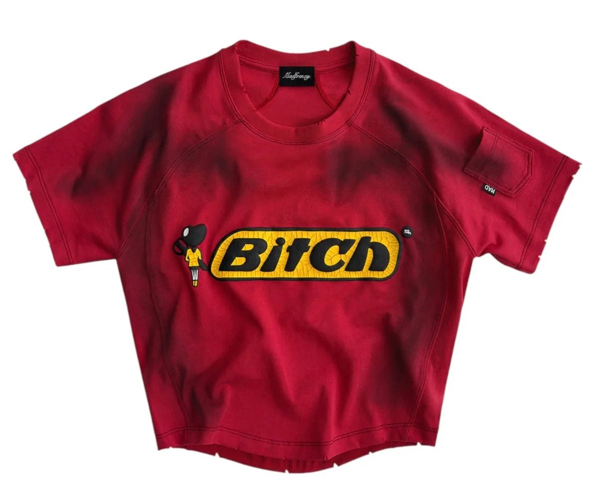
Streetwear thrives on rebellion, but few newcomers step into the arena as unapologetically as MADFRENZY. Born from the undercurrents of DIY punk graphics and the unruly chaos of late-90s skate culture, MADFRENZY positions itself not as a brand, but as a manifesto. Its first season emerges with a striking declaration: the “Bitch” Tee, a garment designed to disrupt, provoke, and ultimately claim space in a crowded fashion landscape.
Origins of MADFRENZY
The brand traces its roots to a group of independent designers and cultural agitators who started customizing thrifted clothing in cramped studios, using distressed fabrics and oversized silhouettes as their visual vocabulary. Their goal was never to make something “pretty” or “safe” but to capture the raw, electric pulse of a generation disillusioned with overproduced luxury fashion.
MADFRENZY’s philosophy is carved into its very name: a nod to the chaotic energy of creativity that refuses to be boxed in. It’s about embracing mess, noise, and imperfection as symbols of authenticity. The “Bitch” T-eeis among its first official releases, instantly setting the tone for the brand’s trajectory.
A Visual Manifesto
At first glance, the Tee makes its stance clear. The crimson body, faded and distressed, calls to mind vintage sportswear, while its cropped, boxy silhouette reflects the influence of reconstructed DIY cuts. Across the chest, the bold yellow patch emblazoned with the word “Bitch” in inflated black typography announces itself without apology.
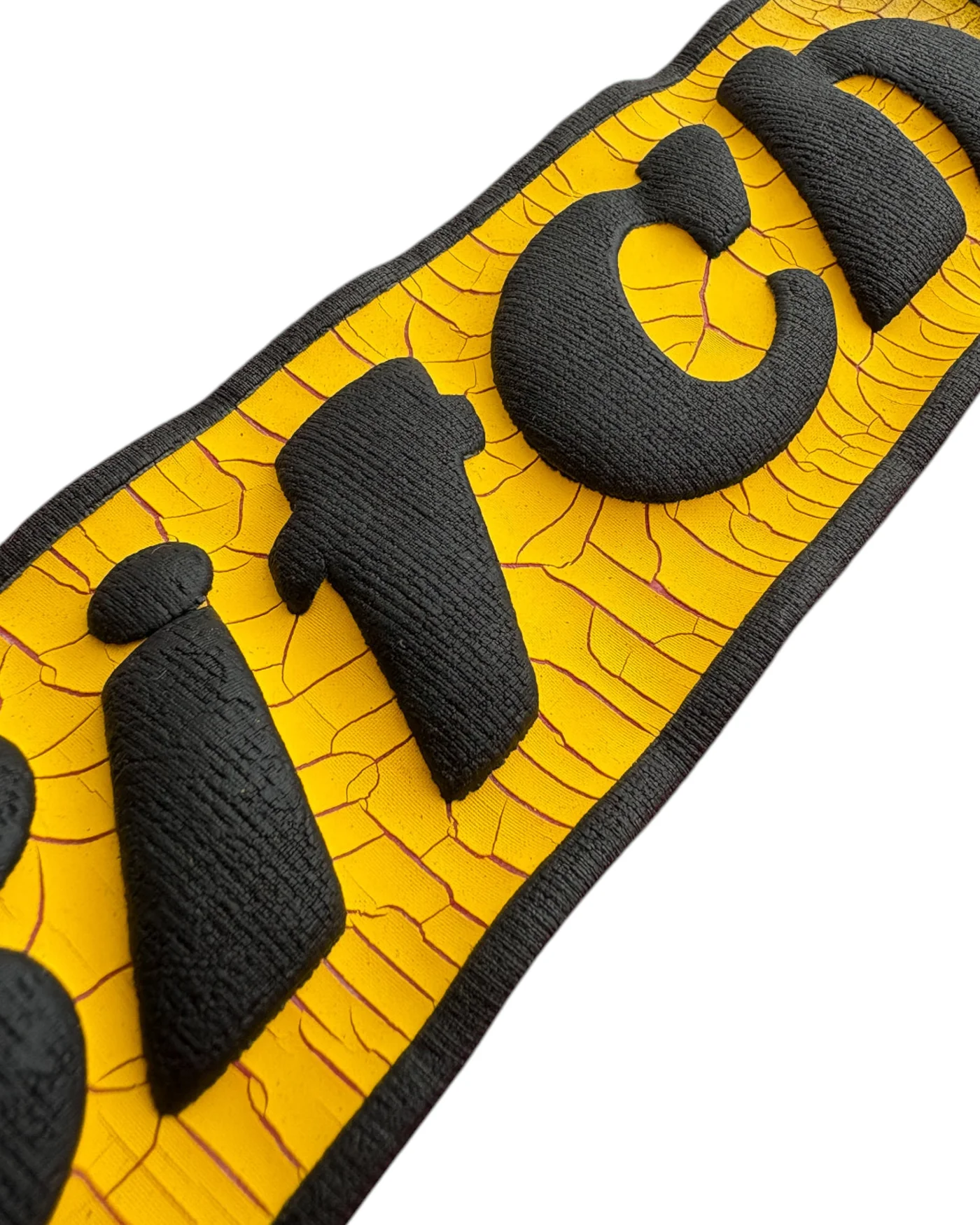
But MADFRENZY’s design choices go beyond shock value. The lettering is puffed and tactile, almost cartoonish in its approach, while the cracked yellow underlay mimics weathered paint. A small illustrated female figure next to the text adds a layer of irony, nodding to retro pin-up graphics while reinterpreting them through a lens of parody. These elements come together to highlight the brand’s larger ethos: that fashion should be coltish, messy, and sharp enough to cut through societal noise.
Cultural Disruption
In debuting with a piece like the “Bitch” T-shirt, MADFRENZY positions itself as an inheritor of streetwear’s most disruptive traditions. Where punk in the 1970s used safety pins and ripped denim as protest, and hip-hop in the ’90s co-opted logos to create new cultural meanings, MADFRENZY is using language itself as a battleground. The reclaiming of the word “Bitch”—a term historically used to belittle—into an emblem of confidence reflects the brand’s embrace of contradiction.
This calculated confrontation makes the shirt more than a fashion piece: it becomes a statement of cultural ownership, flipping insult into identity. In doing so, MADFRENZY draws the line between mainstream streetwear and its own uncompromising stance.
Flow
The “Bitch” Tee is intentionally versatile, its cropped cut and bold front patch designed for layering. It pairs as easily with shredded denim as with oversized cargos or leather trousers, inviting wearers to construct their own version of rebellion.
As a debut, it encapsulates MADFRENZY’s mission: not to blend in, but to strike out loudly. By reclaiming harsh words, reworking vintage aesthetics, and leaning into imperfection, MADFRENZY proves itself ready to occupy the disruptive corner of contemporary streetwear. The “Bitch” Tee is more than an introduction—it’s a warning shot that the brand intends to stay loud, fearless, and impossible to ignore.
Related Articles
Eric Haze Stitches a Nineties Friend Into TOKYO Capsule
Five pieces carry Eric Haze's embroidered tagging for TOKYO No.1 SOUL SET, sold online and in Osaka around the band's Oct 25 BAYCREW'S FESTIVAL set.