DRIFT AUDIO
Listen to this story
Choose a voice, then press play.
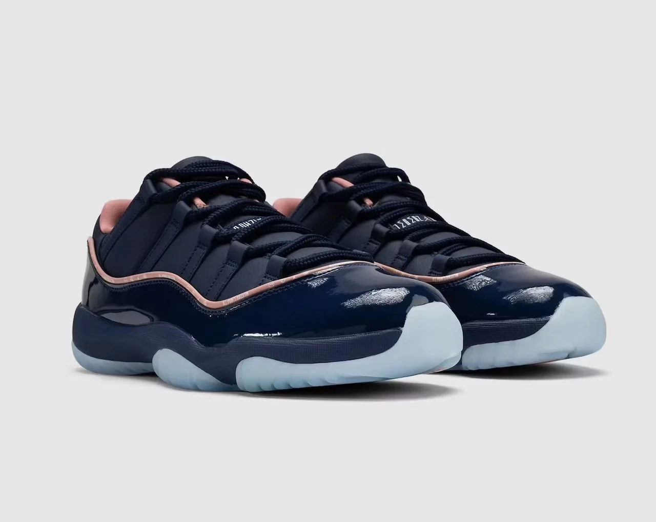
Navy patent leather and pink piping meet a neighborhood-market campaign, with an October 23 release and a draw already advertised.
Navy shoes share a display with oranges, wooden crates and a small chalkboard. In the campaign currently on APB’s own website, the Air Jordan 11 Low is arranged like something encountered at a neighborhood counter rather than isolated behind glass. That setting gives “Made for Locals” a concrete starting point: the day places where people meet, browse and recognize one another.
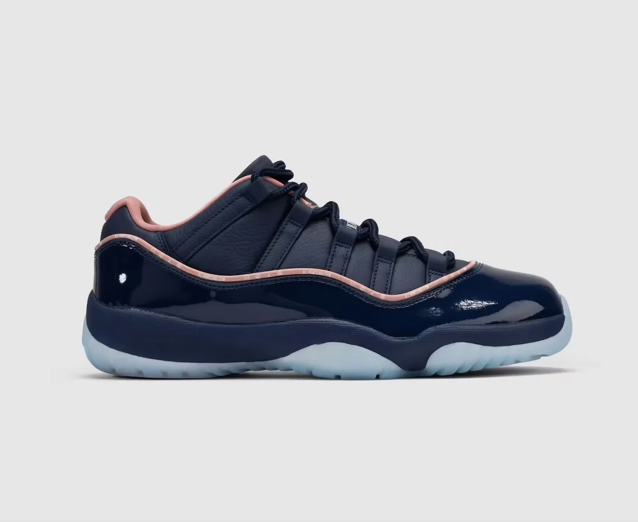
The collide rel October 23, 2026, according to the launch reporting, with APB already directing visitors to its official draw. The complete style code is IU8266-400. The news is the named campaign and purchasing opportunity, not the first appearance of a blue Jordan 11. The colorway was being reported in June. What now becomes clearer is the nar accompanying its arrival and how customers can participate.
Signal. What happened: APB opened the campaign and advertised a draw for its Jordan collide. Exact object: Air Jordan 11 Low “Made for Locals,” style IU8266-400. When and where: October 23, 2026, through The Whitaker Group’s participating stores and websites; Japanese domestic rel details remain unconfirmed. Source: APB’s campaign and draw pages, with Sports Illustrated’s launch report supplying the date. Why it matters: The rel connects a neighborhood-market setting with subtle co-branding and a purchasing process whose displayed fee sits outside the headline price.
stir
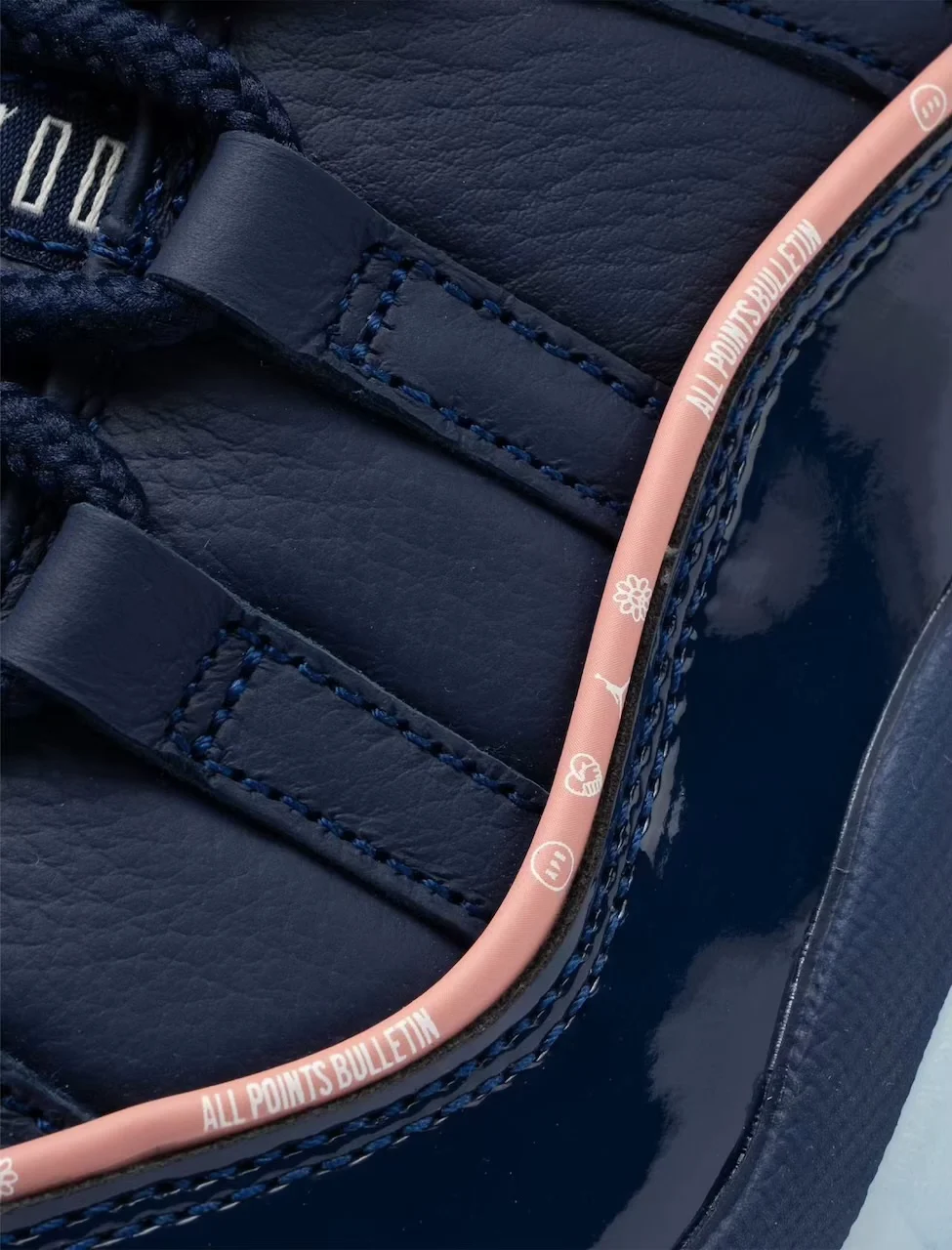
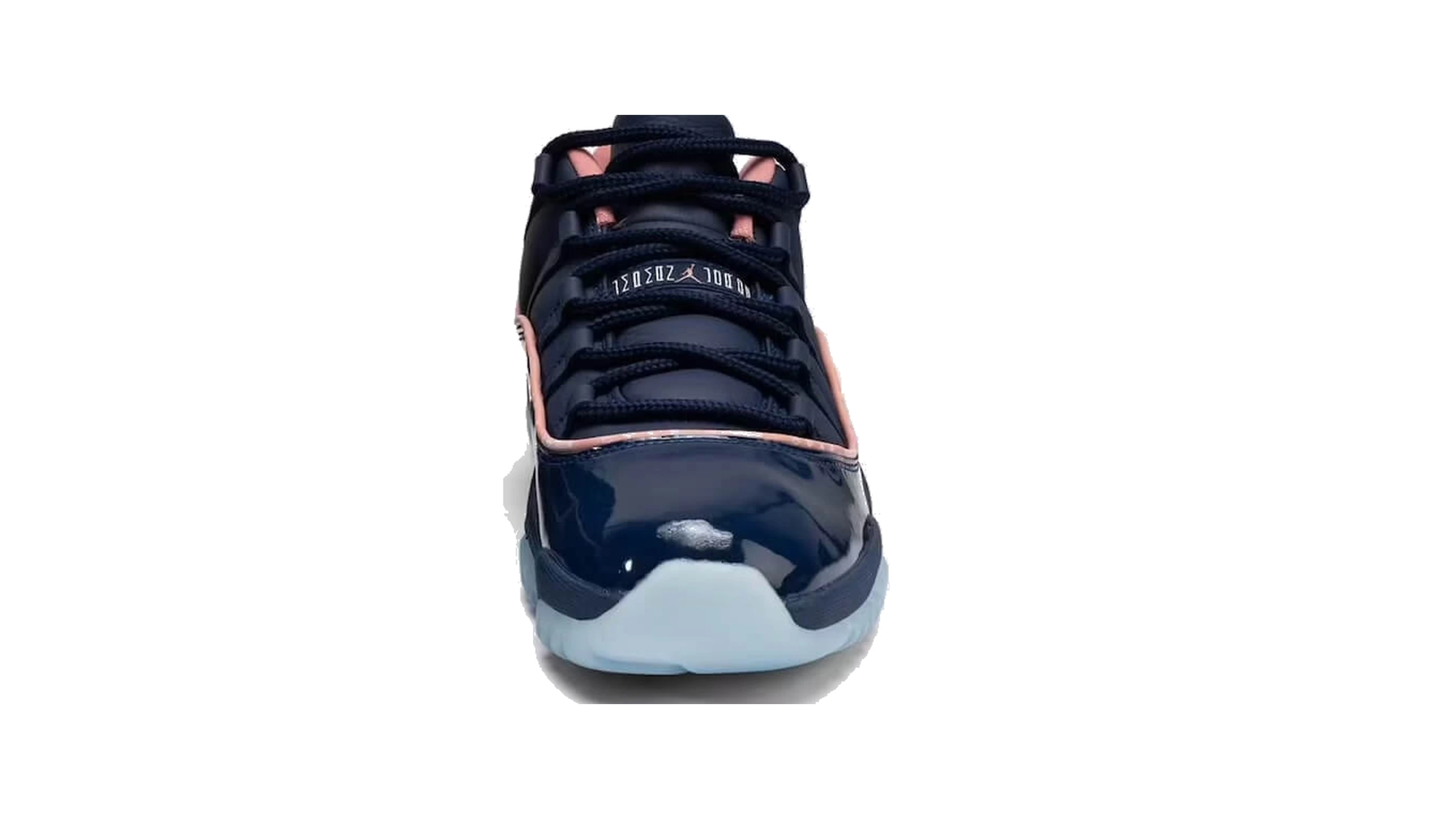
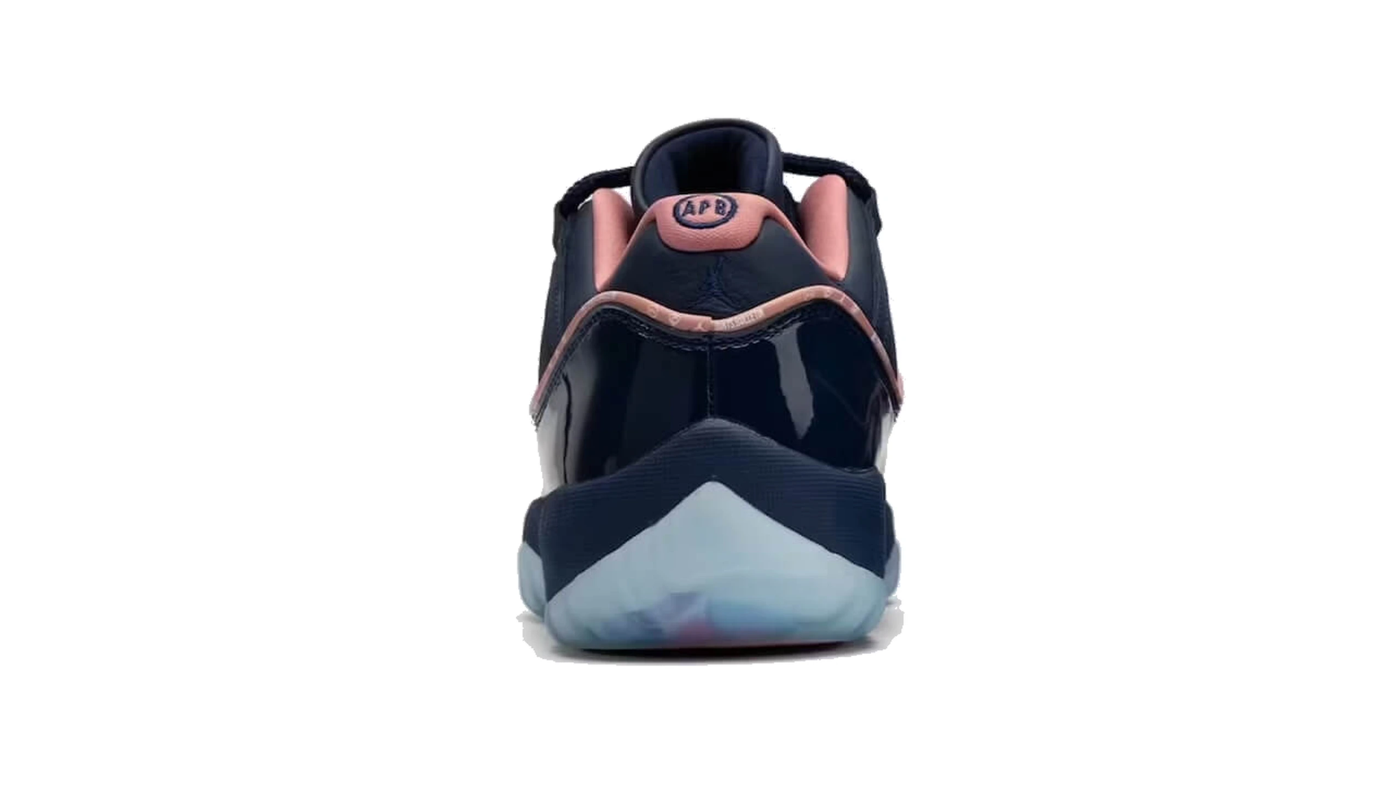
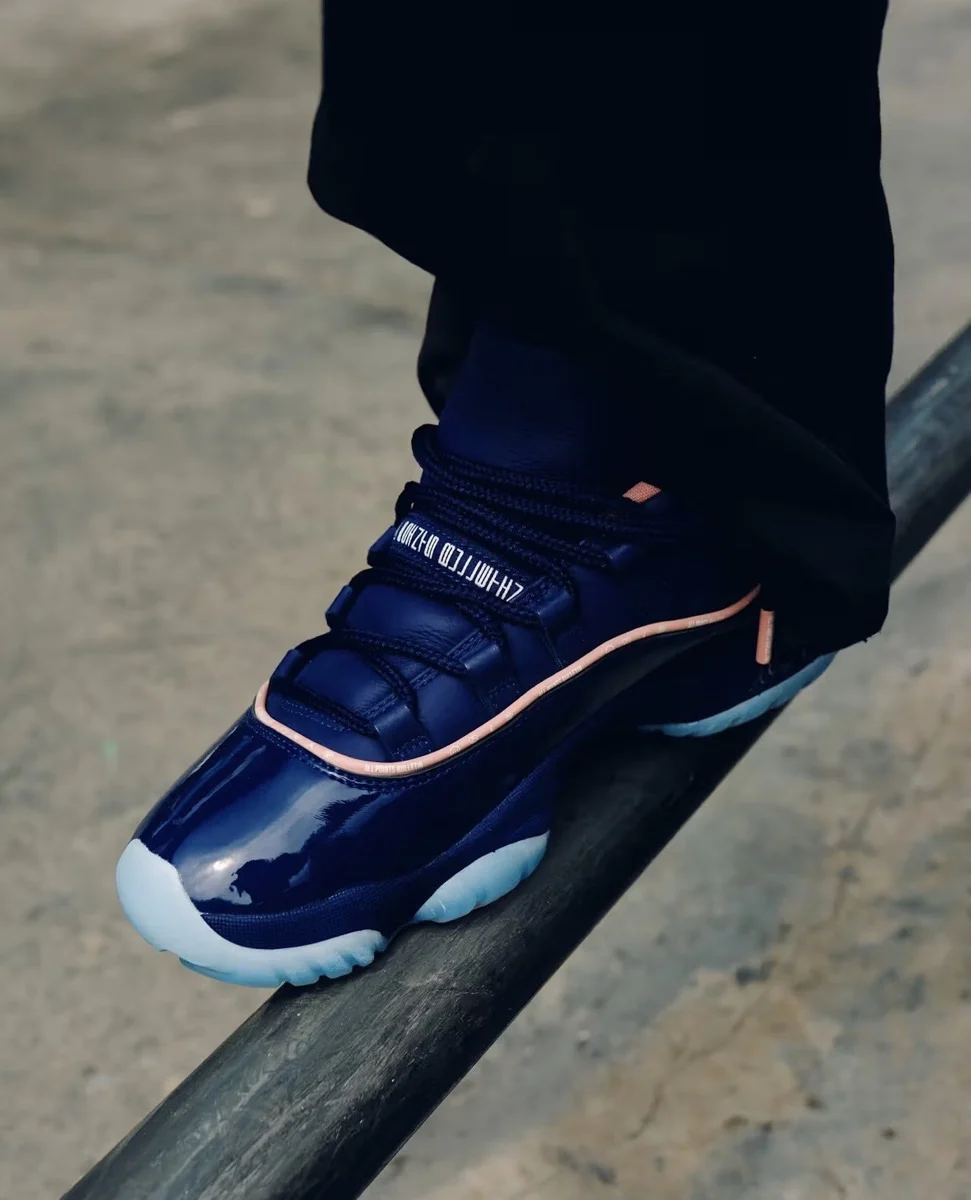
Binary Blue covers both the leather upper and the glossy patent leather that wraps around the lower portion. Rust Pink piping follows their meeting point and continues around the collar. APB’s official launch listing adds a detail easily lost in a distant view: the piping itself carries Jordan x APB branding. The contrasting line is therefore also a place where the convincers identify themselves.
That is an economical intervention. With both major panels in blue, the eye reads differences in finish before it reads a dramatic color change. The reflective lower band catches a different kind of light from the material above it. Pink makes their boundary easier to follow, tracing the familiar curve without needing another large panel to compete with it.
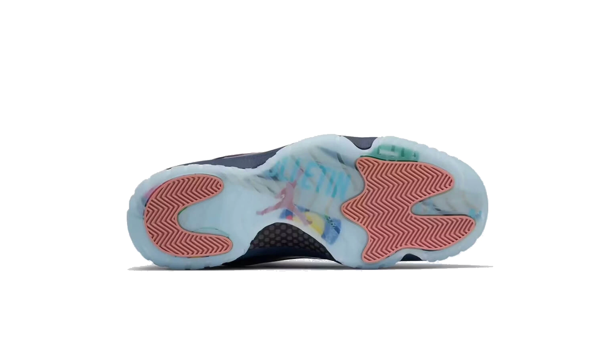
The branding continues through embroidered APB heels and a hangtag, while the listing specifies a foam midsole and translucent rubber outsole with multicolor details. Those elements spread the connect across the shoe rather than concentrating everything on its tongue. They also make the complete product more informative than a single photograph taken from the side.
Seen against the campaign’s orange surroundings, the blue becomes more pronounced. The pale piping provides a smaller transition between those stronger areas of color. This is a visual relationship in the photograph, not evidence that citrus inspired the palette. The distinction matters because a campaign can show how a finished product looks in a setting without explaining every decision made during its design.
flow
APB stands for All Points Bulletin. In its company account, the retailer places itself within The Whitaker Group alongside A Ma Maniére, Social Status and JAIDE. It describes stores across the Southeast, including locations near historically Black colleges and universities. That supplies a real retail context for the neighborhood language, rather than leaving “locals” as an unnamed audience in an advertising slogan.
APB’s website also places “Book An Event” and “Attend An Event” within its APB YOU navigation, alongside separate music and skate sections. That is a useful detail beyond the launch caption: the store presents gathering as part of its everyday operation, not solely as scenery for a collaboration. The campaign’s market setting extends that identity into a photograph, while the existing website gives visitors other reasons to engage with the retailer between successive footwear releases.
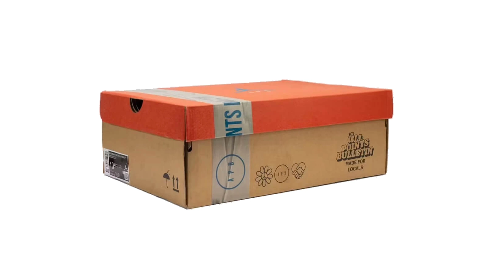
The campaign display offers another direct observation. An orange shoebox bearing a blue Jumpman sits inside an open wooden crate, while a handwritten-style board carries the release name nearby. Packaging becomes part of the display alongside the shoes and fruit. The scene borrows the organization of a small market, where objects share surfaces rather than receiving separate, immaculate plinths.
That arrangement supports the idea of repeated visits more effectively than a generic skyline would. A neighborhood is experienced through routines, not just landmarks: entering a shop, seeing a familiar face, stopping long enough for a conversation. The photographs illustrate that proposition; they do not establish that the set is a functioning grocery store or document a particular resident’s daily route.
Nor does the name establish a residency requirement. The collaboration’s local reference concerns its story, while eligibility belongs to the actual launch terms. Confusing the two would turn a creative theme into an access rule that the available announcement does not state.
extend
Nike’s Air Jordan 11 archive dates the original model to 1995 and credits Tinker Hatfield. Its account emphasizes the patent leather finish, which remains the strongest visual connection between that basketball design and APB’s low-top interpretation. The collaboration does not need to reproduce an original colorway to keep the model recognizable.
Nike’s historical Concord rel page also identifies the combination of patent leather and a translucent sole at the shoe’s 1995 playoff debut. APB retains that broad contrast while changing the palette and branding. What survives is a relationship between surfaces: a polished upper band above a sole that looks less opaque than the material resting on it.
This is design continuity, not proof of identical performance across three decades. No wear test was conducted for this feature, and the launch description does not support a claim about improved cushioning, exceptional grip or a particular fit. The documented changes are already substantial enough to discuss without borrowing conclusions from another Jordan 11 review.
fin
The US draw lists $200 plus a $9 Run Fair fee. That makes the displayed shoe-and-fee subtotal $209 before any additional checkout charges. The fee is not the cost of entering: EQL’s own guidance says entry is free and payment applies when an entrant is selected. The distinction is more useful than repeating the retail price alone.
The platform also advertises EQL+ membership with waived Run Fair fees, so the displayed surcharge should not be treated as universal across every account. Shipping, taxes and fulfillment instructions require their own check. A launch page can establish a product’s price without establishing the final amount paid by every customer in every location.
The announced retail network includes APB, A Ma Maniére, Social Status and JAIDE. Their online participation does not independently confirm an October 23 domestic release in Japan. A Japanese launch time, yen price and local allocation were not established in the materials checked. For this release, the confirmed product identifier remains IU8266-400, attached to the navy pair with pink piping.
Related Articles
Pewter Grey, College Navy, And No Hoya On The Heel
FV5029-004. Air Jordan 4, Pewter Grey / College Navy-White. 27 February 2027. $220. School tincture, […]