DRIFT AUDIO
Listen to this story
Choose a voice, then press play.
adidas and the Royal Belgian Football Association built the Red Devils’ 2026 away kit around a single Magritte painting, a smuggled pipe reference, and a shirt that just helped carry Belgium to the World Cup quarter-finals.
In This Story
- The Match That Introduced the Shirt
- Reading the Design
- The Home Shirt’s Quieter Companion Piece
- A Track Record of Cultural Kits
- Magritte, Briefly
- Why This Reference, and Why Now
- How the Shirt Has Been Received
- Where the Shirt Stands Now
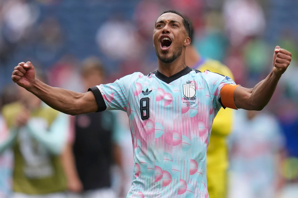
Belgium’s Red Devils wore their René Magritte–inspired away kit into their Round of 32 clash with Senegal on July 1st in Seattle, coming through a dramatic 3–2 extra-time win to reach the knockout stage. It was a tense, back-and-forth affair that went to extra time before Belgium found the breakthrough, and the away kit’s blue-and-pink pattern was visible across nearly every replay clip and post-match photograph that circulated afterward, giving the design its first real moment in front of a worldwide broadcast audience.
The Red Devils then wore the same kit into a Round of 16 meeting with co-host USA on July 6th at Seattle Stadium, a match Belgium won 4–1 behind a Charles De Ketelaere brace, a Hans Vanaken strike, and a stoppage-time goal from Romelu Lukaku. De Ketelaere opened the scoring in the ninth minute, and after Malik Tillman briefly equalized for the US just past the half-hour mark with a direct free kick, De Ketelaere restored Belgium’s lead barely two minutes later. Vanaken made it 3–1 in the 57th minute, and Lukaku, the Red Devils’ all-time leading goalscorer, capped the result with a stoppage-time finish that effectively ended any hope of a US comeback. The win eliminated the Americans and sent Belgium through to face Spain in the quarter-finals on July 10th in Los Angeles.
The result closed out the tournament for all three World Cup co-hosts — the United States, Canada, and Mexico were each knocked out at the Round of 16 stage, a symmetry that became its own storyline across World Cup coverage that week. But for Belgium, the win did something else: it put the country’s most conceptually ambitious kit in a decade front and center on the pitch during one of the highest-profile matches of the tournament so far, turning what could have been a straightforward knockout result into a design story that traveled well beyond the usual boundaries of soccer coverage and into art press, fashion outlets, and general culture desks.
stir
The away kit sits on a pale, sky-toned base color that adidas calls Frozen Blue, layered with a repeating pattern of small spherical blocks rendered in pink, blue, and white, alongside thin horizontal lines running through the print. Those lines do double duty: they reference the markings of a football pitch while also breaking up the spherical pattern so it reads less like a repeating textile motif and more like a loosely constructed scene. The spheres themselves are the shirt’s most direct nod to Magritte’s own visual vocabulary — round forms recur constantly across his body of work, whether as apples, moons, suns, or simply floating orbs suspended in open sky, and the jersey borrows that repetition wholesale.
More specifically, the design is understood to draw on Magritte’s 1931 painting Voice of Space (La voix des airs), currently held in the Peggy Guggenheim Collection, which depicts three large spheres suspended against a sky-blue backdrop. Translating a single, meditative gallery painting into a repeating textile pattern for a mass-produced piece of matchday apparel is a genuinely unusual design brief, and it’s one adidas appears to have approached fairly literally — the spacing and scale of the spheres across the shirt echo the composition of the original canvas rather than abstracting it into something more generic.
View this post on Instagram
The shirt’s most pointed reference, though, sits quietly inside the collar rather than across the chest: a small script line reading “Ceci n’est pas un maillot” (“This is not a jersey”), a direct rework of the caption beneath the pipe in Magritte’s 1928–29 painting The Treachery of Images, which famously reads “Ceci n’est pas une pipe.” It’s a small joke with real conceptual weight behind it. Magritte’s original was built around the idea that a painted object is never the object itself, only a representation of it — the pipe on the canvas cannot be smoked, no matter how convincingly it’s rendered — and adidas’s designers folded that exact logic into a piece of clothing that is, undeniably, an actual jersey. The joke only works because it’s hidden; printed somewhere more visible, it would read as a slogan rather than a genuine art-historical wink.
The rest of the shirt’s construction is far more functional than conceptual. A black V-neck collar, black cuffs, and black adidas shoulder stripes frame the surrealist print, with the adidas Trefoil logo placed on the right chest — notably the first time in the modern era that the Trefoil, rather than adidas’s standard performance branding, has appeared on a Red Devils away shirt — and the Royal Belgian Football Association crest positioned on the left. The kit is constructed using adidas’s AEROREADY moisture-wicking fabric system, meaning it’s held to the same performance specifications as every other national team’s tournament shirt this cycle, regardless of how much conceptual ambition sits on top of the base construction.
shh
The away kit isn’t operating alone within Belgium’s broader 2026 kit program, and understanding the home shirt helps clarify just how deliberate adidas’s overall concept for the country actually is. The home shirt, released back in November 2025 alongside adidas’s main World Cup kit rollout, draws on an entirely separate strand of Belgian visual heritage: Gothic stained glass. Rendered in Belgium’s traditional red, the home shirt carries a repeating icon pattern referencing both the men’s national team, the Red Devils, and the women’s national team, the Red Flames, worked into a design language that echoes the leaded, geometric patterning found in Belgian cathedral windows.
Read side by side, the two shirts reveal that adidas built the entire Belgium 2026 collection around two distinct pillars of national culture rather than a single unified theme — architectural and religious heritage on the home shirt, secular fine art and surrealism on the away. That’s a more ambitious brief than most countries received this cycle, where away kits have often leaned on color variations or minor pattern tweaks rather than genuinely separate conceptual foundations. It also means the Magritte reference isn’t a standalone marketing gimmick attached to one shirt, but part of a wider effort to treat the entire kit program as a occasion to showcase different facets of Belgian identity.
culture
This is not Belgium’s first attempt at building an away kit around a piece of national identity beyond football. This is the fourth cycle in a row where Belgium’s away shirt has been used this way: a cycling-heritage design at the 2016 UEFA European Championship, a collision with the Belgian music festival Tomorrowland at the 2022 World Cup, and a shirt built around Hergé’s Tintin at Euro 2024.
Each of those editions pulled from a different corner of Belgian culture, sport, music, comics — while the 2026 away kit is the first in the sequence to reach specifically for fine art, and the first to build its central joke around one named painting rather than a broader aesthetic mood board. Cycling, Tomorrowland, and Tintin are all reference points with near-universal name recognition, even outside Belgium; Magritte is world-famous as an artist, but The Treachery of Images and Voice of Space require a level of familiarity with mid-century Surrealism a general football audience won’t necessarily bring to the shirt on sight which is precisely why so much of the coverage around this kit has taken the form of explainers rather than simple product announcements.
The Royal Belgian Football Association has described the shirt as one designed to “spark the imagination and invite conversation,” language that lines up closely with how the design has actually been received. Coverage of the kit has run through art-focused outlets like Artsy and design-oriented sport publications with roughly as much attention as it’s received through conventional match reporting, which is a fairly unusual split for a national team shirt to achieve. Authentic versions are sold through adidas and the RBFA’s own shop at $150 USD, with UK retail pricing the authentic cut at roughly £120 and the replica version at around £85 — positioning it at standard price parity with other 2026 tournament jerseys despite the added conceptual complexity behind the print.
René Magritte was born in 1898 and died in 1967, spending the bulk of his working life in and around Brussels. After a brief period working in a Cubist idiom, he settled into the style he’s best known for from the late 1920s onward: realistically rendered scenes disrupted by a single impossible or displaced element. A green apple obscures a well-dressed man’s face in one of his most reproduced paintings; pedestrians in bowler hats float, suspended mid-air, over a city street in another; a carefully rendered pipe insists, in its own caption, that it is not a pipe at all. That tension between an image and the language used to describe it runs through nearly all of his major works, and it’s specifically that tension adidas’s designers borrowed for the shirt’s collar detail.
Magritte’s late-afternoon and evening skies — rendered in a specific, slightly muted blue that recurs across dozens of his canvases — are also widely cited as the direct source of the jersey’s dominant tone, meaning the shirt’s base color is less a generic “Belgium blue” than a fairly literal lift from the artist’s own recurring palette.
why
For a country whose football federation has spent three prior tournament cycles reaching for cultural touchstones with broad, general recognition — cycling, a music festival, a beloved cartoon character — turning instead to a specific, art-historical reference point marks a genuine shift in ambition. It’s a bet that a knockout-stage audience, many of whom are encountering the shirt for the first time via a broadcast camera angle or a still image on social media, will engage with a joke this specific rather than find it too niche to register at all.
cept
Reaction to the kit has split fairly cleanly along two lines. Design and art press has treated the shirt as a genuine curiosity worth unpacking in detail, running explainers that walk through the specific Magritte works being referenced and the mechanics of the collar joke. General sports coverage, by contrast, has tended to frame the shirt more as a passing talking point alongside match analysis rather than a subject in its own right, which tracks with how most tournament kits are typically covered.
That said, the shirt’s connection to the “blue and pink instead of national tinctures” frame that circulated widely around the USA–Belgium Round of 16 match suggests the design has cut through to casual audiences too. A shirt that departs this visibly from Belgium’s traditional red home identity was always going to prompt questions, and the Magritte concept gave broadcasters a ready-made, genuinely interesting answer rather than a vague appeal to “fashion,” which is often as far as away-kit explanations go.
stance
With Belgium’s Round of 16 win over the USA, the away kit’s association with this tournament is only growing. The Red Devils will wear it again, if selected for the match, in their quarter-final against Spain on July 10th in Los Angeles, a fixture that will put the design in front of one of the largest single audiences of the tournament’s remaining rounds. Belgium enters that match unbeaten in its last 18 outings, per pre-match reporting, and a run to the semi-finals would only extend the shirt’s visibility further, potentially carrying it through to the tournament’s final broadcasts if results continue to break Belgium’s way.
Whatever happens against Spain, the kit has already accomplished something unusual for a piece of team apparel: it’s made a credible case, mid-tournament, for reading a national team’s away shirt with the same attention one might bring to a gallery wall label — down to the smuggled art-historical joke printed shh inside the collar, waiting for exactly the kind of close reading a football shirt almost never receives.
Read Drift’s related feature, René Magritte’s L’État de veille (1958): A Masterpiece of Surrealism.
Related Articles
Where the Face Should Be, Rafael Silveira Paints Open Sky
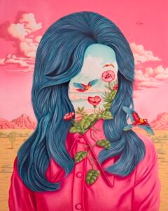
A pink shirt, shoulder-length hair, then no face at all: in “Surprise,” Rafael Silveira lets flowers and a clear blue sky stand in for the person.