
DRIFT AUDIO
Listen to this story
Choose a voice, then press play.
Cj Hendry has always worked at the edge of believability. Her drawings do not interpret objects—they reconstruct them. Texture becomes image. Surface becomes structure. The eye is convinced not through illusion alone, but through insistence.
With juju, that insistence remains. What changes is where it lands.
The work moves off the page, but it does not abandon its origin. It carries the same logic—only now the question is no longer how something looks, but how it exists.
The drawing was always trying to become something physical.
Here, it finally does.
flow
In Hendry’s hyperrealist works, softness has always been implied. Fur, fabric, gloss—each rendered with such exactness that the viewer almost feels it.
But that sensation was always deferred. You could see it, but never touch it.
Juju removes that distance.
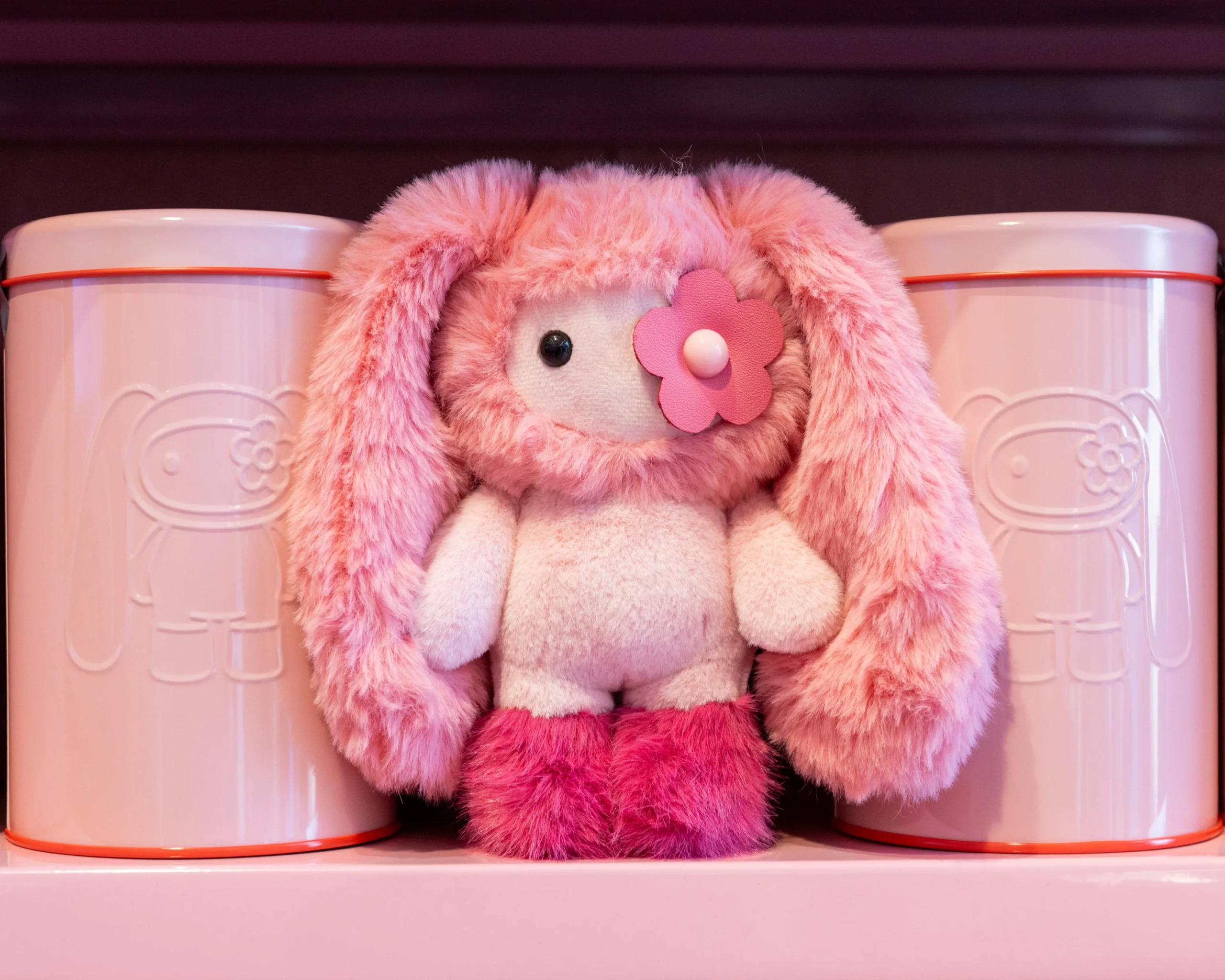
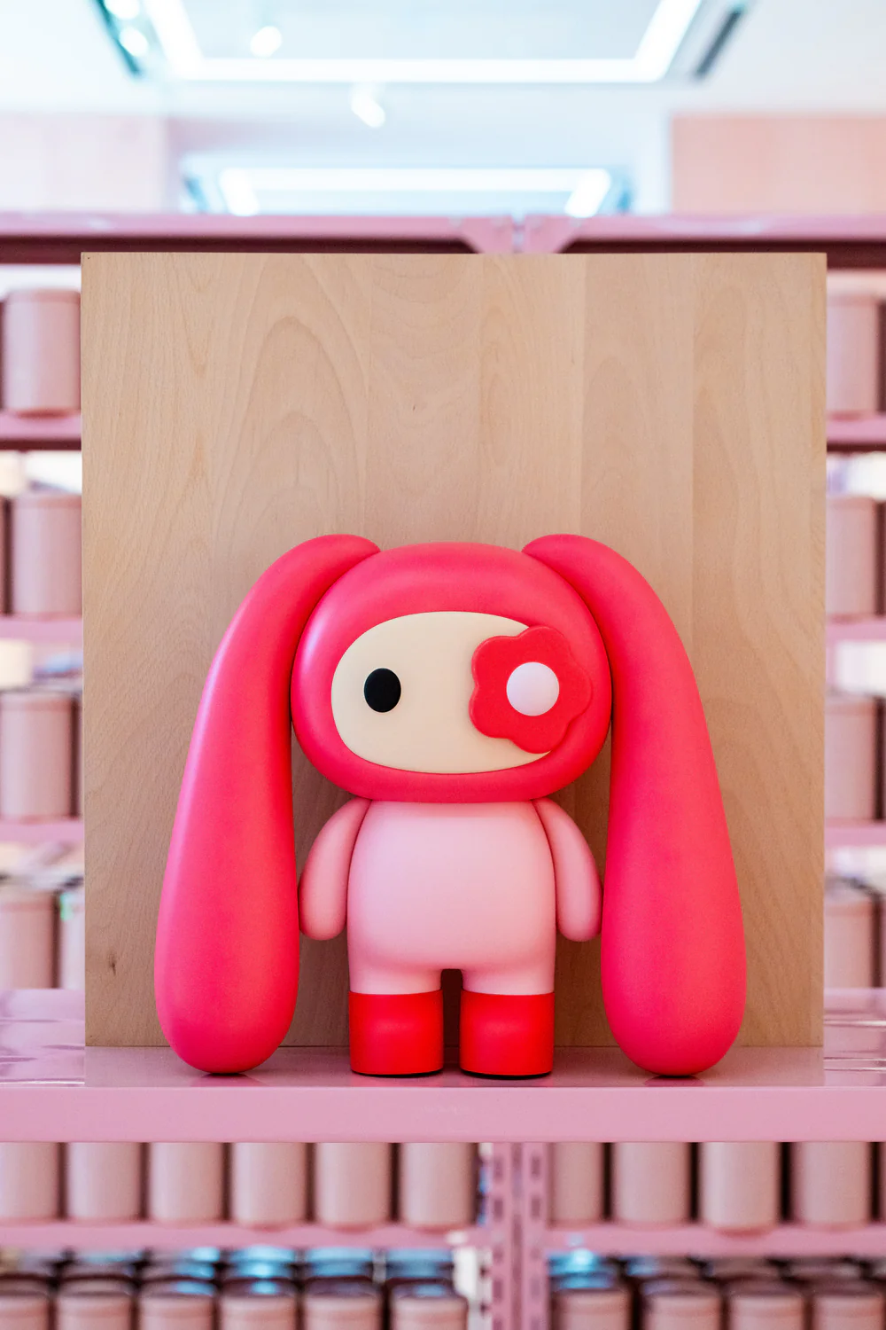
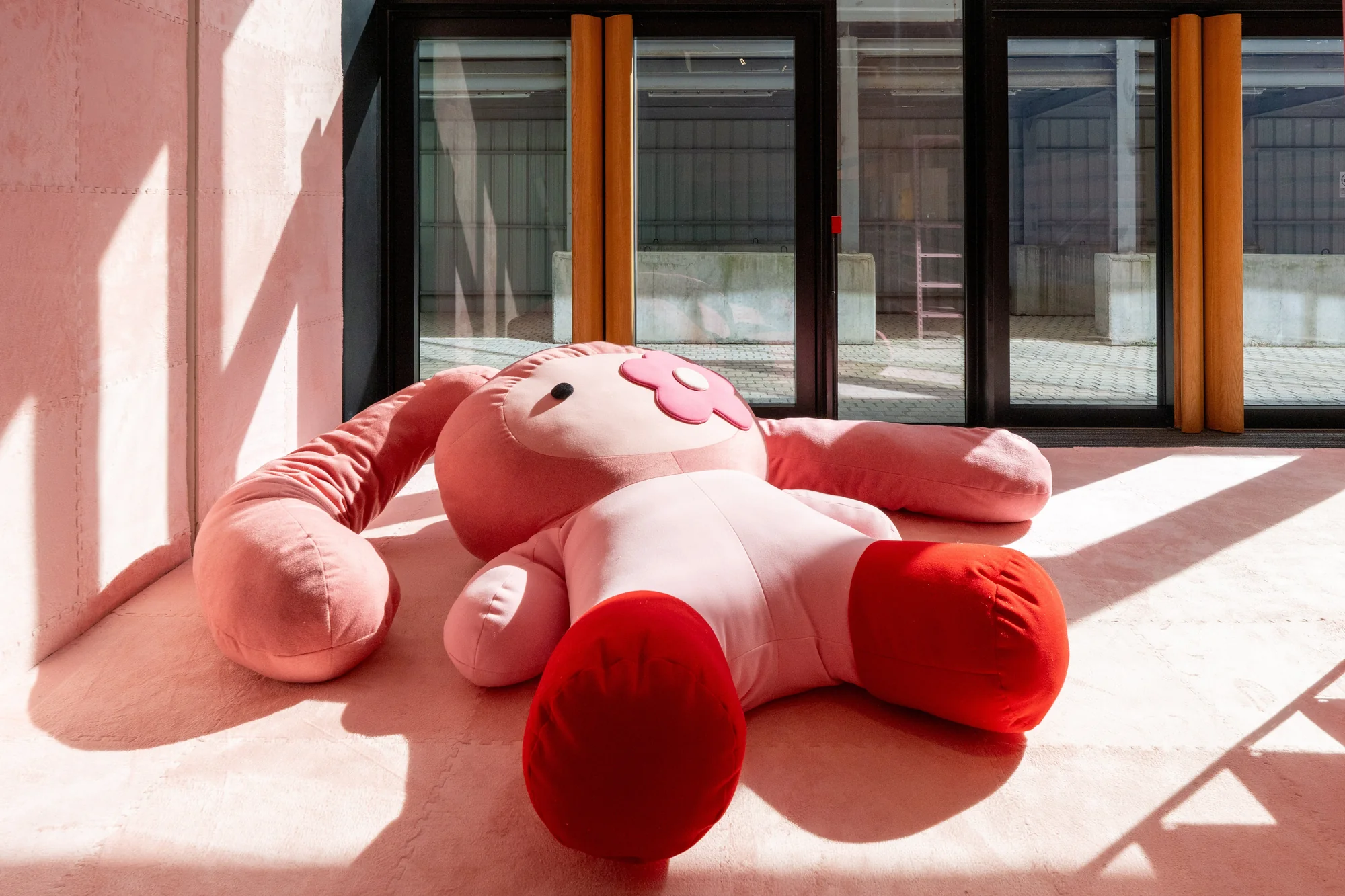
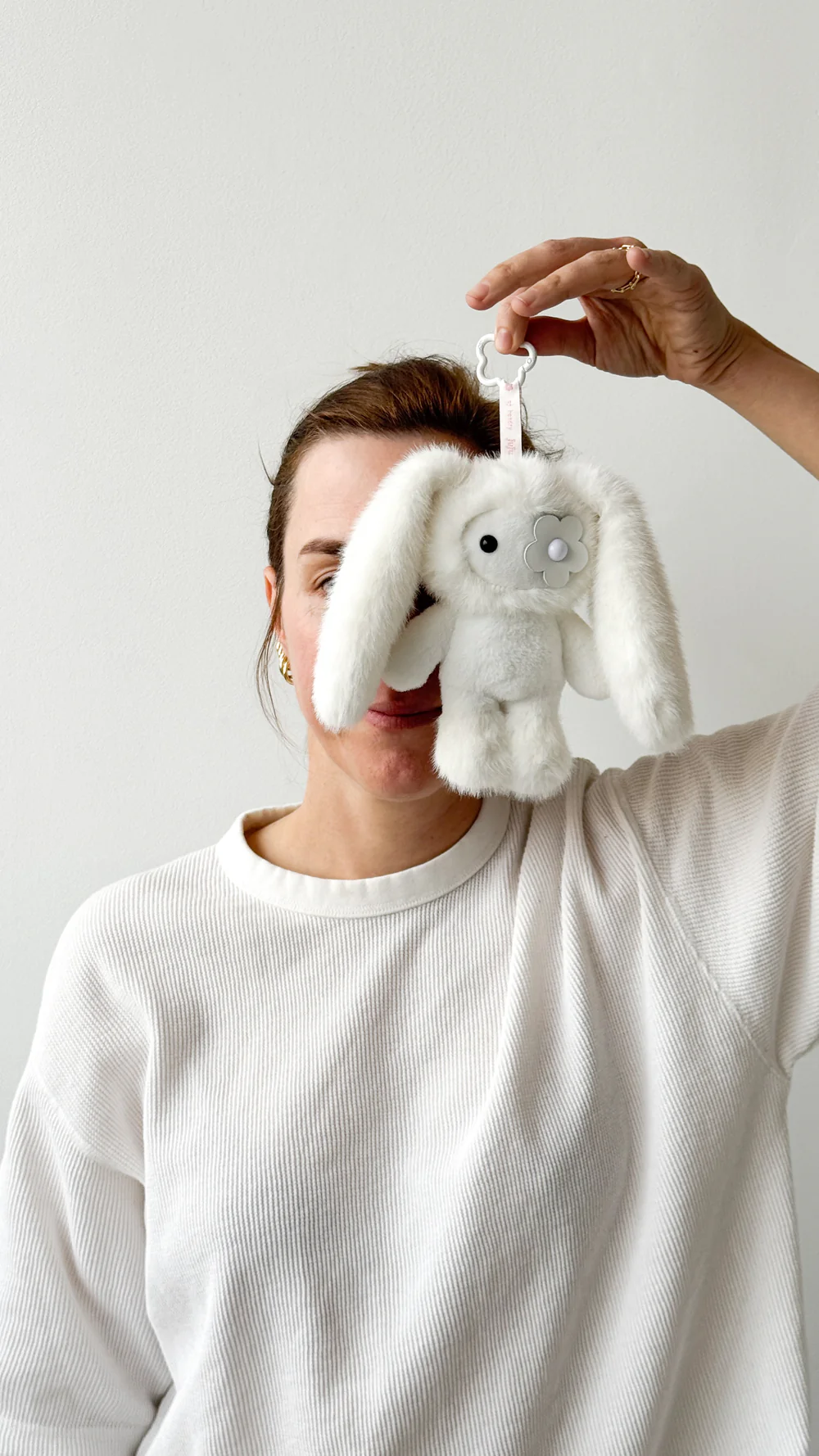
The plush forms are not interpretations of softness—they are softness. The rounded bodies, the exaggerated ears, the simplified face punctuated by a single flower detail: these are not ornamental decisions. They are reductions. Compressions of visual information into something immediate.
The complexity of the drawing collapses into form.
And yet, nothing essential is lost.
stir
The juju figure reads first as character. It invites recognition—almost familiarity. A face, a body, a gesture of presence.
But it resists narrative.
There is no story attached. No defined personality. The figure exists as a form before it becomes anything else. Its identity is visual, not descriptive.
This matters.
Because it aligns with Hendry’s drawing practice, where objects are not symbols so much as subjects of attention. The juju figure holds that same position. It does not represent something beyond itself. It insists on being seen as it is.
Shape. Color. Texture. Repetition.
scale
Across the exhibition, juju does not remain fixed in size.
It shifts—from keychain to handheld object, from display piece to oversized installation that stretches across the floor. This movement through scale is not decorative. It is structural.
Scale determines how the body relates to the work.
A small juju can be held, carried, almost absorbed into daily movement. A large juju cannot be ignored. It interrupts space. It alters how you move around it.
Hendry has always worked with scale as a way of intensifying perception. In drawing, this meant enlarging detail until it became immersive. In juju, scale operates more directly.
The object meets the body at different points—hand, eye, environment.
And in each case, the relationship shifts.
enviro
The exhibition space does not function as a neutral container. It is part of the work.
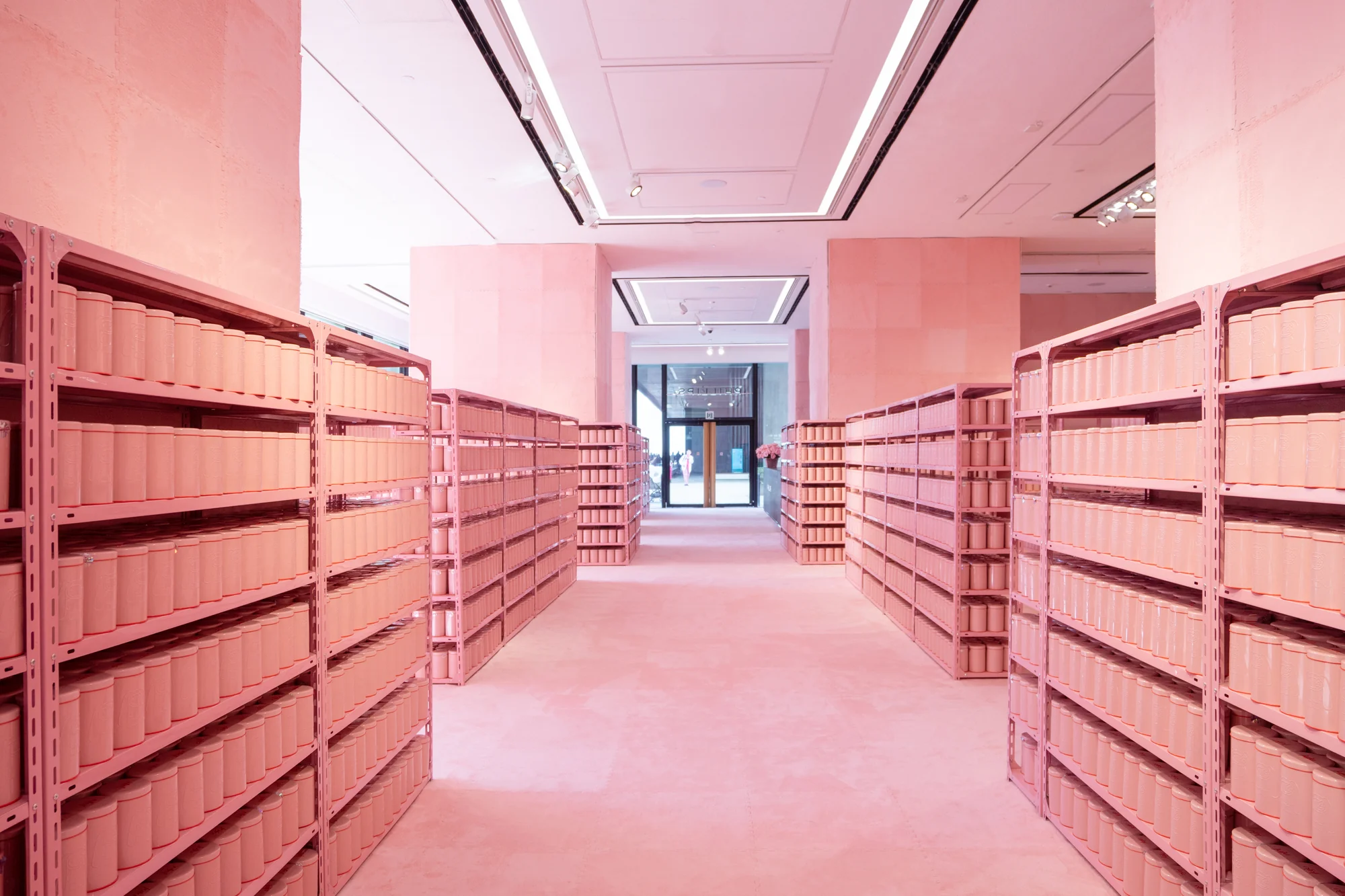
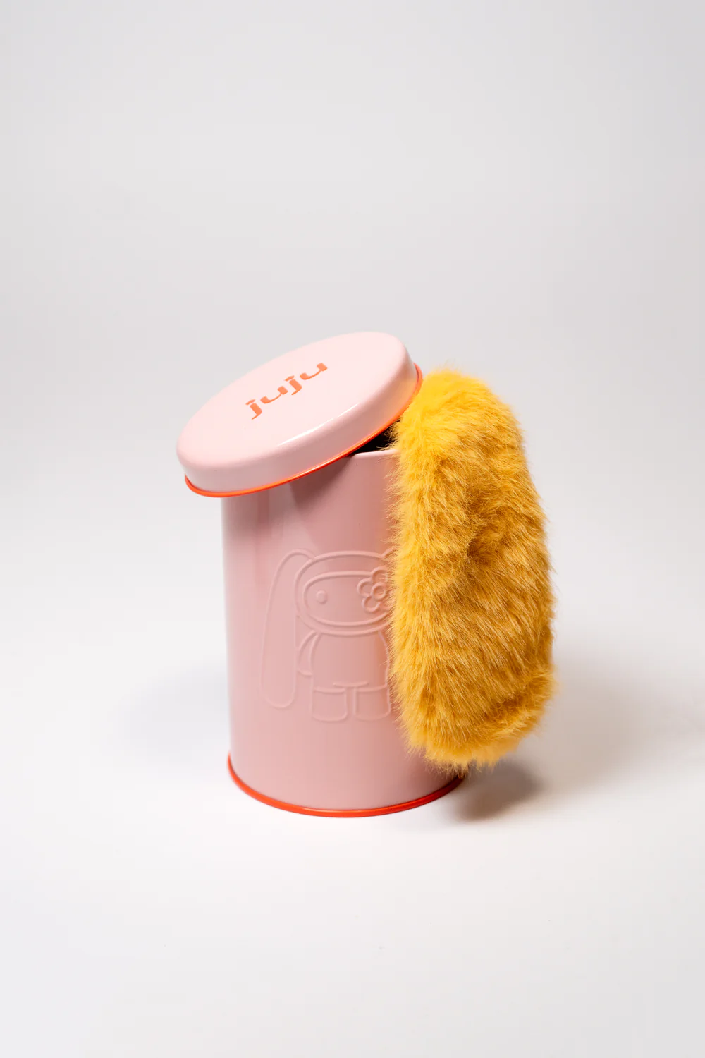
Rows of uniform containers line pink shelving, repeating with a precision that mirrors the logic of Hendry’s mark-making. The environment is not chaotic—it is controlled, almost to the point of quiet tension.
Repetition becomes spatial.
Walking through the space is less about moving from one object to another and more about entering a field. The objects do not stand alone. They accumulate.
The eye adjusts. The body adjusts.
The work is not located in a single point—it is distributed across the entire environment.
idea
Repetition often risks flattening meaning. The more something appears, the less distinct it becomes.
Hendry avoids this by allowing repetition to build density rather than redundancy.
Each juju object is similar, but not identical. Small shifts—color, proportion, detail—create variation within consistency. The differences are not announced. They are discovered.
This is the same logic that governs her drawings.
A single mark does not define the image. Thousands do. And it is in their accumulation that the work gains force.
Juju extends that principle into three dimensions.
shh
There is a quiet but significant change in how the work is experienced.
Hendry’s drawings ask the viewer to look closely—to slow down, to examine surface, to recognize the labor embedded in detail.
Juju asks for something else.
Not just looking, but handling.
The object is not complete at a distance. It resolves in the hand. Its scale, its softness, its weight—these are part of the work, not secondary attributes.
This does not make it more accessible in a simplified sense. It makes it more immediate.
The viewer is no longer separate.
theory
Even in the absence of the physical drawing, its structure persists.
You can see it in the edges of the form. In the clarity of the silhouette. In the way the object holds itself—clean, defined, without excess detail.
The hyperrealism is not visible in the same way, but it is still operative.
It has been distilled.
Reduced to what is necessary for the object to hold presence.
fwd
It would be easy to describe juju as a departure—something lighter, more playful, less exacting.
But that reading misses the continuity.
The discipline is still there. The control. The insistence on form.
What changes is the mode of encounter.
The work is no longer something you stand in front of. It is something that exists alongside you. Around you. In your hand.
The distance collapses.
close
Precision, in Hendry’s work, has never been about perfection. It has been about attention—about staying with a surface long enough for it to become something else.
Juju carries that attention forward, but redirects it.
Not toward the illusion of texture, but toward the fact of it. Not toward the image of an object, but toward the object itself.
It is still exact.
Just no longer confined to the page.
And in that shift, the work does not become less rigorous.
It becomes harder to separate from.
Related Articles
Modigliani’s Limestone ‘Tête’
Carved from a single block of limestone in Montparnasse more than a century ago, one of Modigliani's rare stone heads goes to auction for the first time…