Jean-Michel Basquiat, Made in Japan II (1982)

October 12, 2025
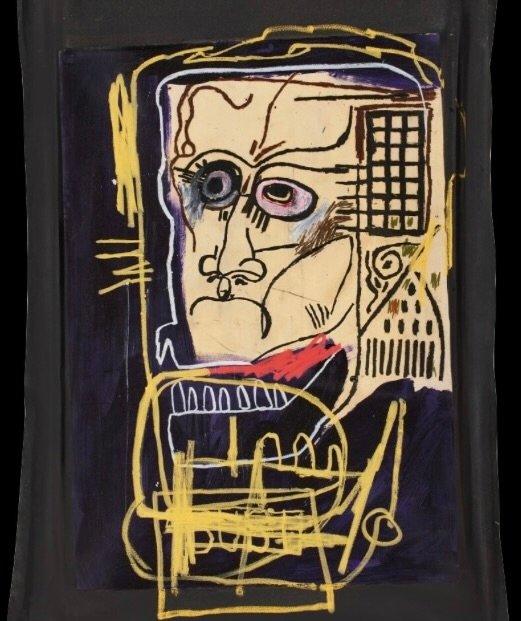
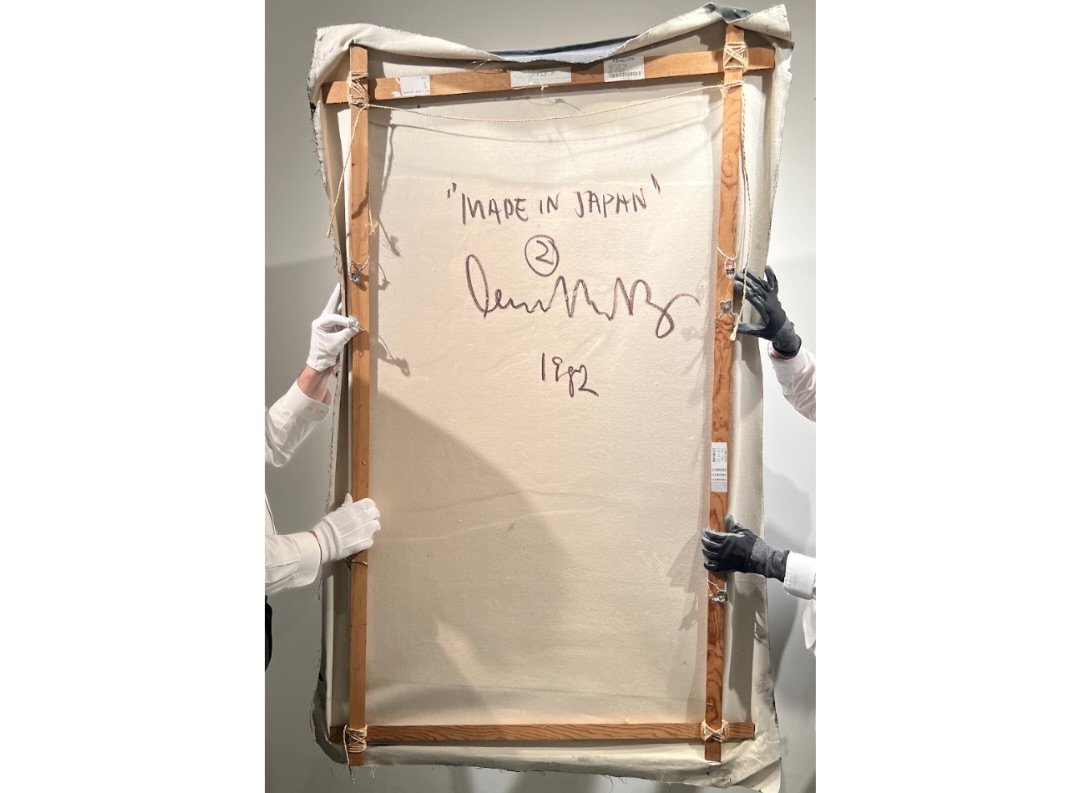
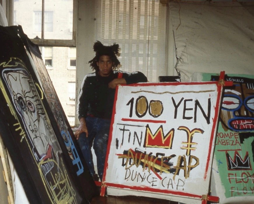
Jean-Michel Basquiat’s Made in Japan II (1982) stands as one of the artist’s sharpest meditations on language, identity, and global circulation. Executed in acrylic and oilstick on paper mounted on canvas, the composition captures the raw, spontaneous energy of Basquiat’s most fertile year. 1982 was the point at which his visual vocabulary—crowns, skeletal heads, improvised text, and rhythmic color—achieved full fluency. Made in Japan II sits within that momentum, a work that fuses graffiti immediacy with art-historical weight and reveals Basquiat’s fascination with the crosscurrents between New York and the world beyond.
The title functions as both label and riddle. “Made in Japan” was a phrase that appeared on countless consumer goods in the postwar era, stamped onto radios, cameras, and toys as proof of manufacturing origin. For Basquiat, whose art often turned the detritus of mass culture into lyrical code, the phrase became a ready-made poem. It evokes trade, authorship, and displacement—suggesting that identities, like commodities, are produced and exported. The addition of “II” doesn’t imply a sequel so much as a reverberation, echoing the earlier Made in Japan I from the same year and underscoring Basquiat’s interest in serial repetition, in returning to the same linguistic loop to find new inflections.
Materially, the work reflects Basquiat’s love of speed and resistance. The paper, later mounted to canvas, allowed him to draw and write at the pace of thought. The oily sticks scrape and smear, producing a surface that alternates between matte hush and glossy urgency. Words emerge half-formed, hovering between legibility and abstraction, while color patches pulse beneath them like beats in a track. Basquiat’s language of marks feels improvised yet deeply deliberate, an orchestration of tempo where words act as percussion and color carries melody.
Made in Japan II maps a moment when Japan occupied a charged space in the Western imagination—a symbol of technological prowess, design precision, and exoticized modernity. Basquiat’s painting does not illustrate Japan; it absorbs the idea of “Japan” as a sign moving through global circuits. In doing so, it mirrors his own condition as a young Black artist navigating systems of fame and consumption. The irony of the phrase—asserting origin in a work made in downtown Manhattan—folds neatly into Basquiat’s critique of authorship and authenticity.
The painting’s provenance amplifies its transnational resonance. It once belonged to fashion designer Kenzō Takada, whose humile inject of Japanese and Western aesthetics parallels Basquiat’s hybrid visual language. Both artists collapsed boundaries between cultures, proving that synthesis could be a radical act. When Made in Japan II surfaced in Sotheby’s catalogues decades later with an eight-figure estimate, it was less an object of haute than a mirror of Basquiat’s prophetic understanding of culture existential.
Ultimately, Made in Japan II is a portrait of movement—of words, colors, economies, and identities crossing borders. It takes a phrase of global commerce and transforms it into a pulse of human expression, a reminder that art, like language, is always in translation.
View this post on Instagram
Related Articles
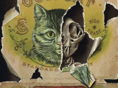
Jason Limon Rips Open Vintage Packaging to Find a Skeleton Waiting Underneath
San Antonio painter Jason Limon’s latest trompe l’oeil work turns torn matchbooks, tins and biological […]