
KATSEYE x GAP Present a Member-Led Take on the Classic Hoodie
April 15, 2026

A hoodie is one of the most familiar pieces in modern wardrobes. It rarely changes in any dramatic way, and that consistency is part of its appeal. With the new collaboration between KATSEYE and Gap, that familiarity stays intact—but the way it is interpreted shifts noticeably.
The limited-edition collection, released on April 14, centers on a simple idea: take Gap’s classic Arch Logo Hoodie and allow each of the six members of KATSEYE to redesign it. The result is a lineup of six distinct hoodies that share the same foundation while reflecting individual perspectives through material, color, and detail.
All styles are priced at $100 and are available in sizes XS through 2XL. The collection launched through Complex’s online shop and app, with additional availability in select Gap stores in London. The release is concise, focused, and clearly structured—six designs, one base model, and a defined distribution strategy.
View this post on Instagram
stir
At the core of the collection is the Arch Logo Hoodie, one of Gap’s most recognizable items. Instead of replacing it, the collection keeps its essential structure intact—fleece construction, relaxed fit, and front-facing logo—while allowing variation in execution.
The “GAP” lettering is replaced with “KAT,” referencing the group, but the treatment of that logo changes from one hoodie to the next. In some cases, it’s bold and graphic; in others, it’s subtle or textured. This approach allows the collection to feel connected without being repetitive.
The silhouette also plays a role. Several of the hoodies use a cropped, boxy fit, which slightly alters how the piece sits on the body. It’s a small shift, but it brings a more contemporary feel to an otherwise classic garment.
her
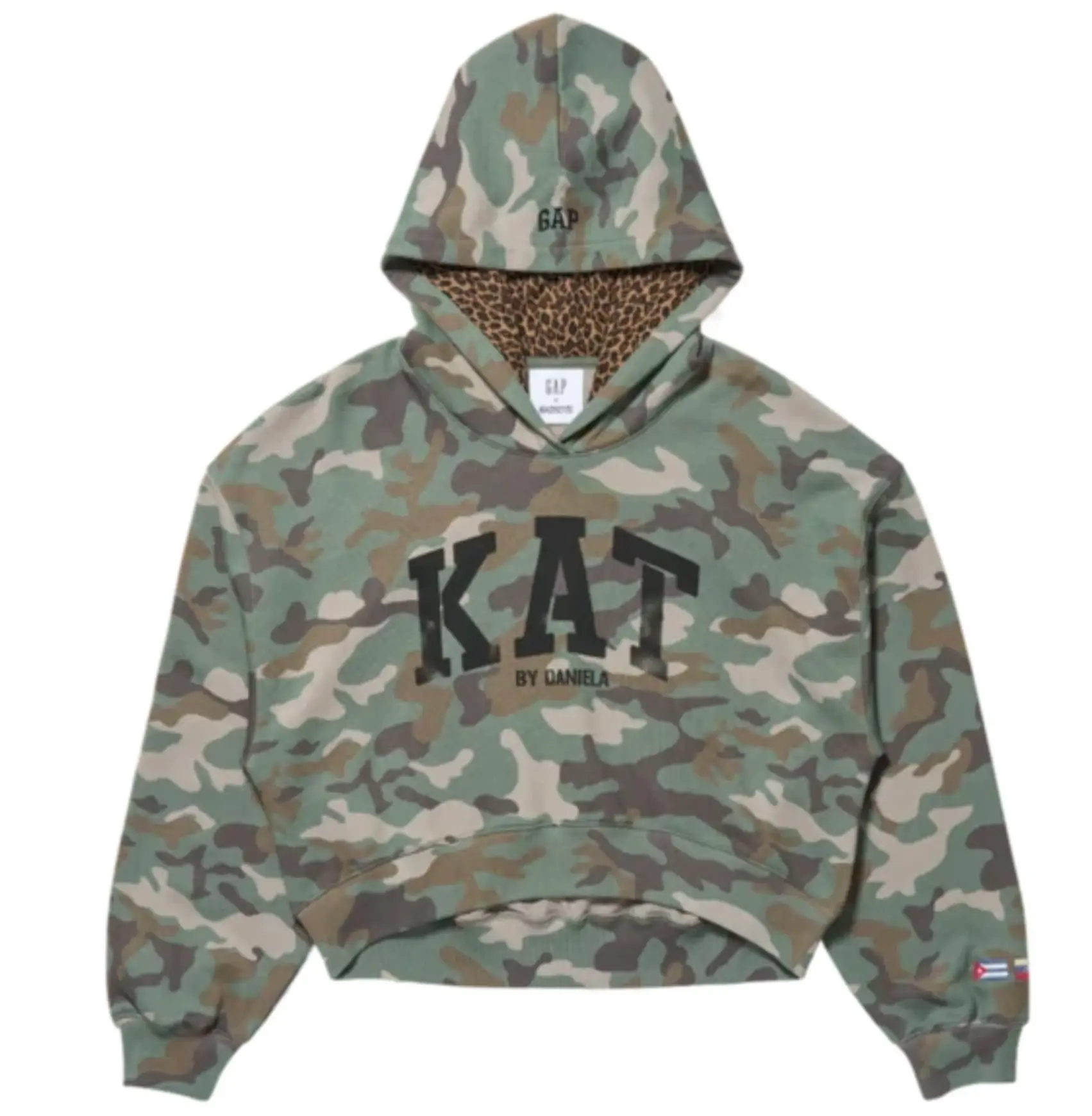
Daniela’s hoodie stands out immediately through its use of pattern. The base is a green camouflage pullover, giving it a more visual presence than the other styles.
Inside the hood, a cheetah-print lining adds contrast. This detail isn’t visible at first glance but becomes noticeable in motion, adding another layer to the design. The mix of camouflage and animal print creates a combination that feels bold but still wearable.
Her hoodie also includes flags representing Cuba, Venezuela, and the United States. These appear as small details rather than dominant graphics, adding context without overwhelming the design.
her
Lara’s hoodie leans into a more relaxed, oversized look. The washed-black fleece gives it a slightly faded, worn-in appearance, which contrasts with the silver-glitter “KAT” logo across the chest.
The use of glitter adds a reflective element, but it’s balanced by the muted base color. This combination keeps the hoodie from feeling overly loud while still giving it a distinct identity.
Flags representing India and the United States are included, again as small accents. The overall design feels rooted in familiar streetwear references while adding just enough variation to stand apart.
her
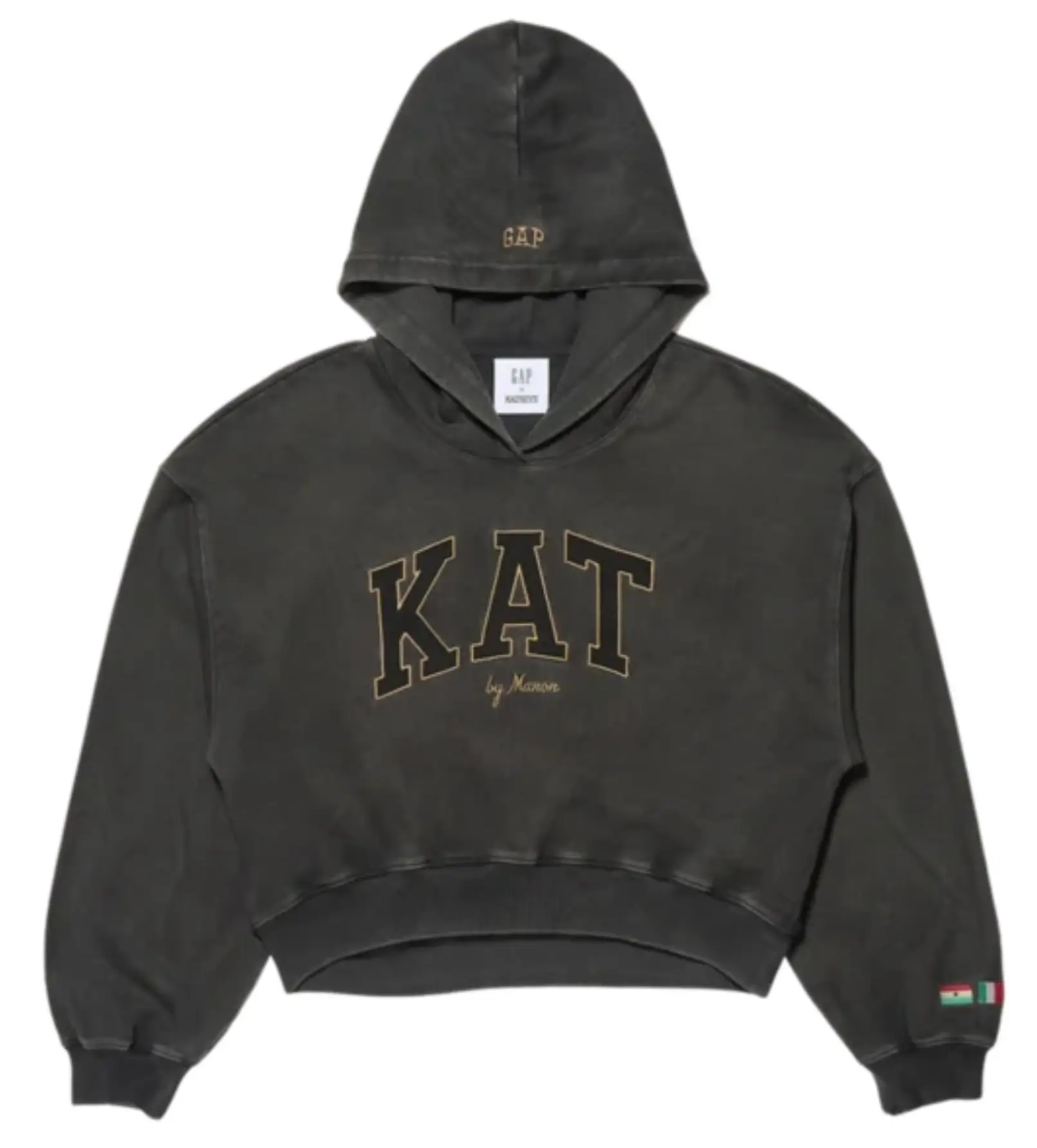
Manon’s version is more understated. The defining feature is the gold-trimmed stitching outlining the “KAT” lettering, which adds a refined detail without changing the overall structure of the hoodie.
The approach is minimal but intentional. Rather than introducing bold prints or heavy modifications, the design focuses on precision—small changes that elevate the base piece.
Her hoodie includes flags representing Ghana, Italy, and Switzerland. Like the others, these are integrated in a way that complements the design rather than competing with it.
her
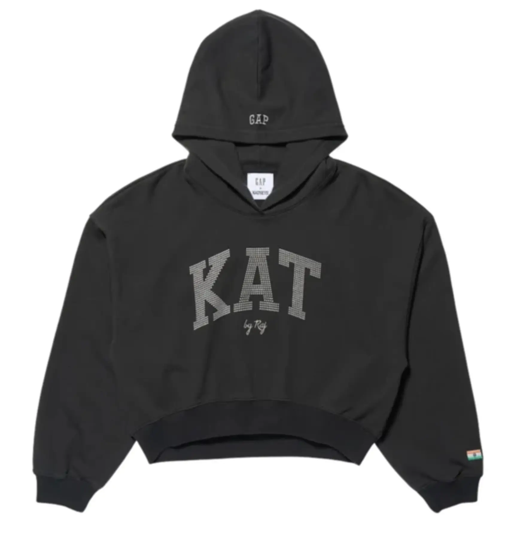
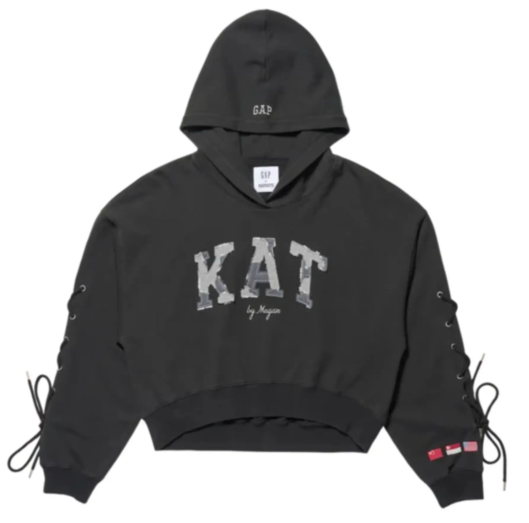
Megan’s hoodie introduces one of the more noticeable changes in construction. The sleeves feature lace-up detailing with metal grommets, adding a structured element to the otherwise soft fleece.
This modification changes how the hoodie looks and feels. It brings a slightly more constructed appearance, setting it apart from the other styles.
The “KAT” logo appears in a patchwork format, reinforcing the idea of assembly and variation. Flags representing China, Singapore, and the United States are included, continuing the theme seen across the collection.
her
Sophia’s hoodie takes a more minimal approach. The base is a monochrome black zip-up, which immediately gives it a cleaner and more streamlined look compared to pullover styles.
The standout feature is the rhinestone “KAT” logo. It adds a subtle shine without changing the overall simplicity of the hoodie. The effect is noticeable but controlled.
A Philippines flag is included as a small detail, keeping the design aligned with the rest of the collection while maintaining its minimal aesthetic.
her
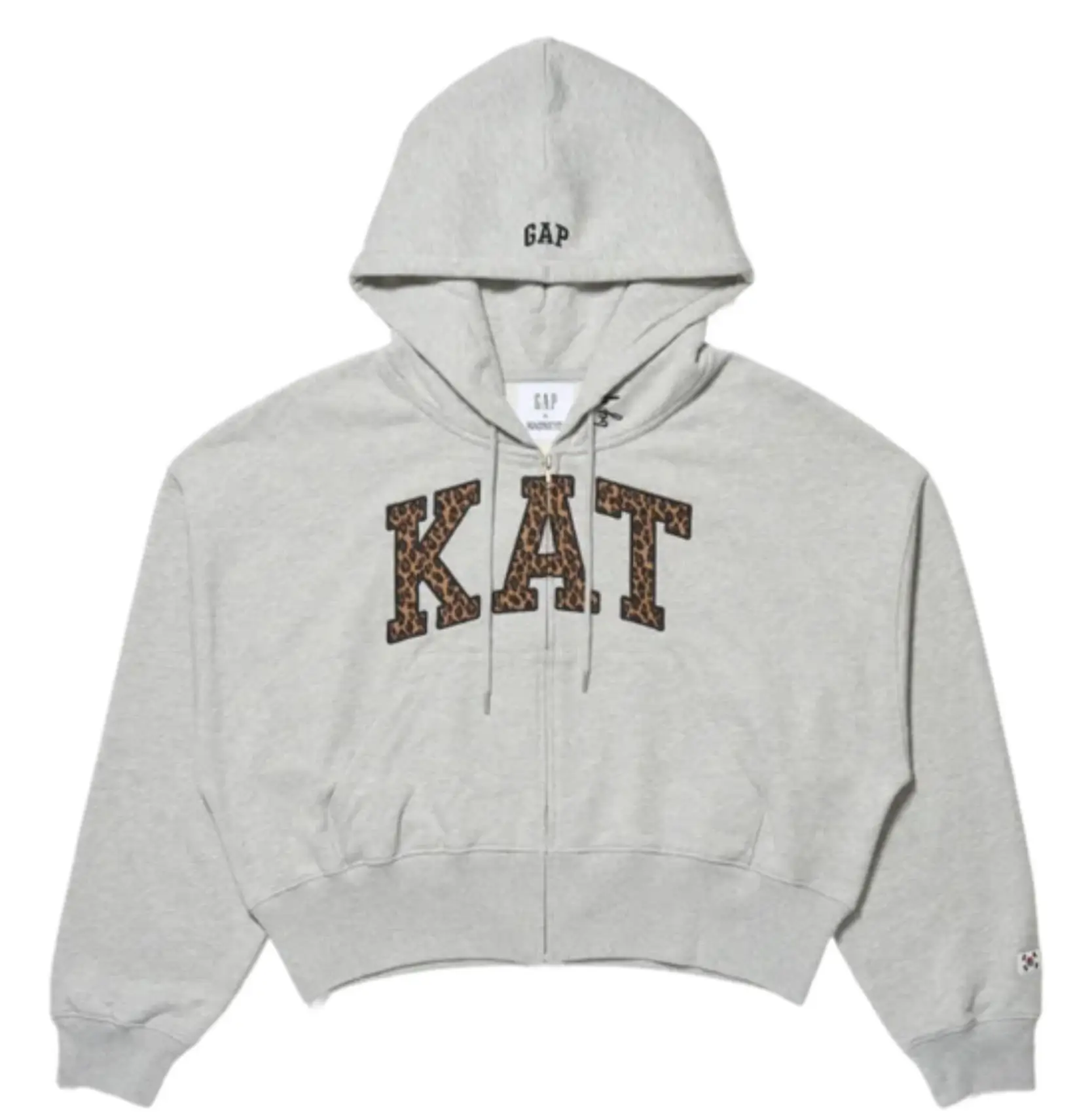
Yoonchae’s hoodie uses texture in a different way. The heather-grey zip-up features a leopard-print “KAT” logo, turning the lettering itself into a visual focal point.
In addition to the front design, a back graphic adds another layer, giving the hoodie a more complete visual identity from multiple angles.
The inclusion of the South Korea flag connects the design to her background while maintaining consistency with the other pieces in the collection.
why
One of the most noticeable details across all six hoodies is the use of flags. These are not random additions or attempts to redefine the brand.
Instead, they serve a simple purpose: they indicate the background of each member who designed the hoodie.
Because the collection is built around individual contributions, the flags act as small identifiers. They help distinguish each design while keeping a consistent element across all six pieces.
They don’t dominate the design or change the meaning of the hoodie. They simply provide context.
straddle
What makes the collection work is the balance it maintains. All six hoodies are clearly related—they share the same base, the same general structure, and the same “KAT” branding.
At the same time, each design introduces enough variation to feel distinct.
- Some focus on pattern
- Others on texture
- Others on construction or detail
This balance keeps the collection cohesive without making it repetitive.
idea
The release strategy is straightforward. The collection is available through Complex’s online shop and app, which positions it within a more culture-focused retail space.
Select Gap stores in London also carry the collection, offering a physical retail presence without making it widely available everywhere.
This approach keeps the drop limited while still accessible.
stance
For Gap, this collide fits into a broader pattern of working with cultural figures to reinterpret classic pieces.
The Arch Logo Hoodie remains unchanged at its core, but collaborations like this allow it to be seen in a new way. Instead of introducing entirely new products, the brand builds on what it already has.
This strategy keeps the identity consistent while allowing room for variation.
clue
The KATSEYE x Gap hoodie collection doesn’t aim to completely redefine the hoodie. Instead, it focuses on variation within a familiar structure.
Each member brings a different perspective, but all six designs remain connected through the same base concept. The result is a collection that feels both unified and individual.
It’s straightforward in its approach: one classic piece, redesigned six times.
And sometimes, that’s enough.
Related Articles

Rose Byrne and Mary Bronstein Are Doing It Again, and This Time They Brought Jenna Ortega
A coach and her prodigy are about to become the most dangerous relationship in a […]