New Balance for BEAMS 50th Anniversary 2010 “Navy”: A Masterful Celebration of Heritage and Innovation
May 18, 2026
0
In the increasingly overstimulated terrain of contemporary shoe culture, where collection often rely on maximalist storytelling or algorithmic hype to generate relevance, the New Balance x BEAMS 2010 “Navy” arrives with a far more disciplined proposition. Released on May 23, 2026, as part of BEAMS’ ongoing 50th anniversary program, the silhouette doesn’t attempt to overpower the conversation through spectacle. Instead, it refines it.
What makes the connection compelling is not merely the product itself, but the restraint embedded into its execution. BEAMS approaches the New Balance 2010 not as a blank canvas for loud reinterpretation, but as a structural object already rich with possibility. The result is a sneaker that feels deeply considered — one that transforms tonal variation, asymmetry, and material layering into an editorial statement about modern taste.
frame
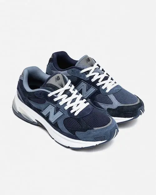
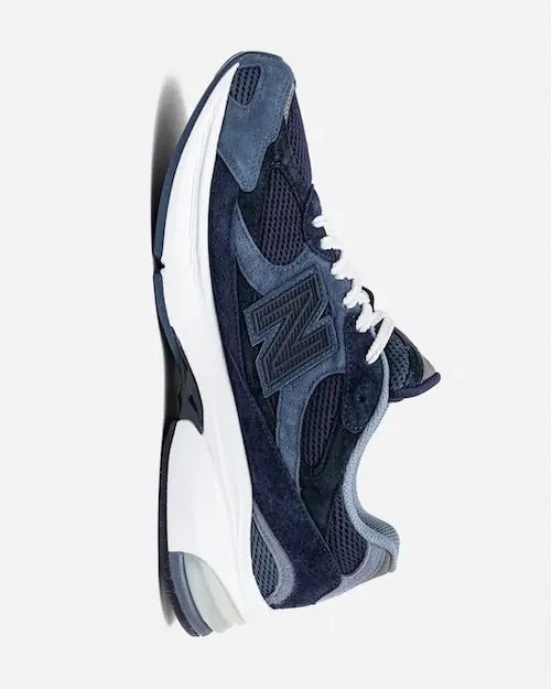
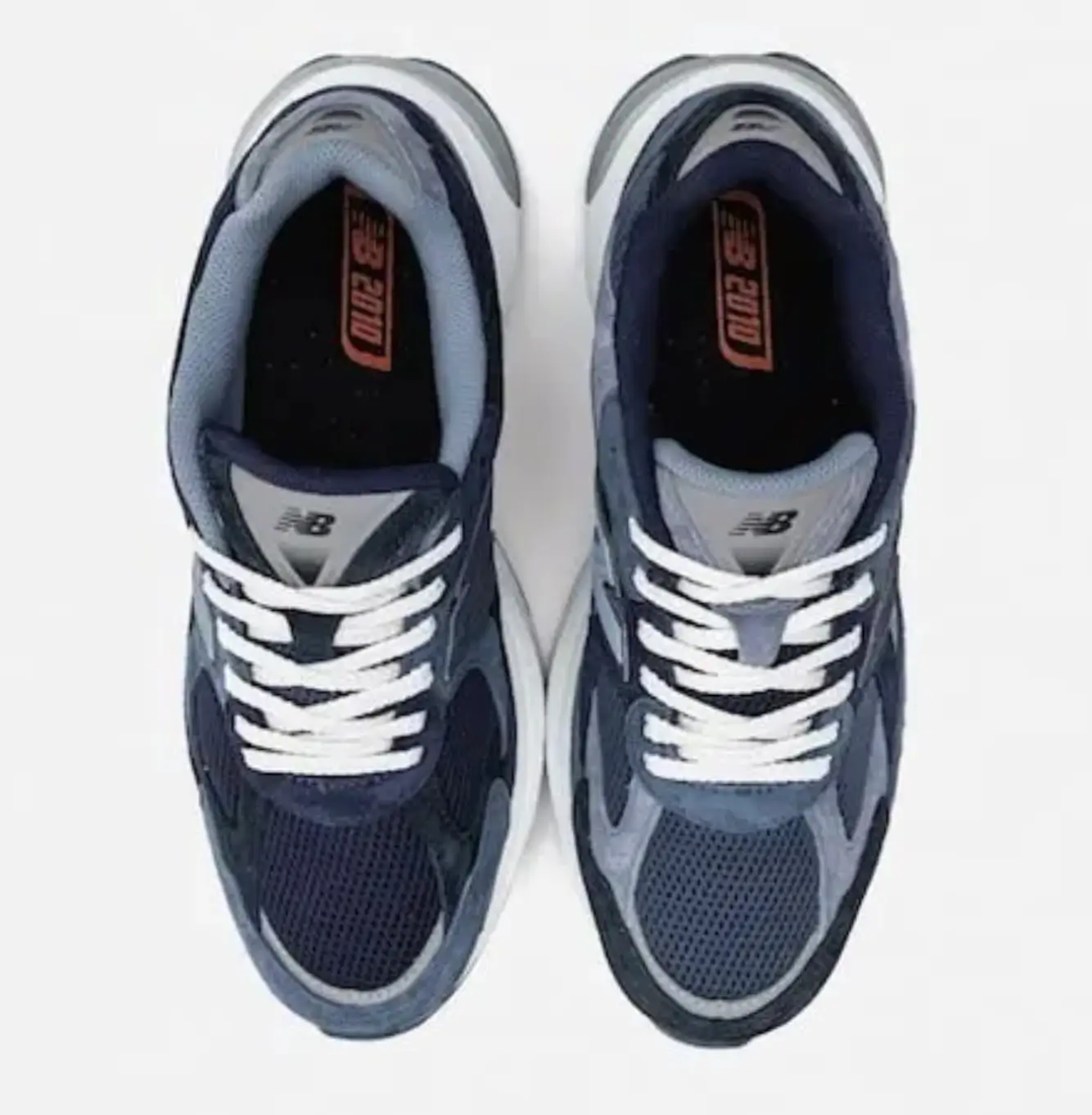
The New Balance 2010 has quietly emerged as one of the brand’s more interesting contemporary lifestyle silhouettes. Built from the visual language of early-2000s performance runners, the model combines retro athletic proportions with modern cushioning architecture, creating a sneaker that feels simultaneously nostalgic and future-facing.
Its layered construction already lends itself to experimentation. Diamond-knit mesh panels introduce breathability and movement, while suede and synthetic overlays provide structural contrast across the upper. Underneath, ABZORB cushioning and the Stability Web system maintain New Balance’s longstanding commitment to comfort engineering rather than purely aesthetic design.
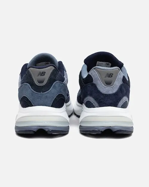
BEAMS understood that the silhouette did not require dramatic reconstruction to feel new. Instead of introducing aggressive graphics or disruptive branding, the retailer focused on tonal manipulation. Four separate navy shades move across the upper in asymmetrical succession, creating a visual rhythm that changes depending on angle, lighting, and wear.
That decision becomes the defining gesture of the collaboration. Navy, often treated as conservative or utilitarian within footwear design, is elevated into something architectural. Deep indigos transition into slate-infused blues with enough restraint to avoid visual noise, yet enough contrast to reward close inspection. The sneaker becomes less about immediate impact and more about prolonged observation.
flow
Many connection use asymmetry as a gimmick — a quick route toward perceived uniqueness. BEAMS applies it differently. The mismatched “N” logos and subtle left-right variations feel controlled rather than chaotic, integrated into the overall design language instead of competing against it.
This approach reflects a broader philosophy that has defined BEAMS for decades. Since its founding in 1976, the Japanese retailer has excelled at balancing Americana, workwear, tailoring, streetwear, and contemporary fashion into something cohesive rather than fragmented. The retailer rarely chases trends directly; instead, it reframes familiar cultural codes through proportion, fabrication, and context.
That sensibility carries into the 2010 “Navy.” The asymmetry never interrupts wearability. It exists as a subtle disruption — enough to distinguish the sneaker from inline releases without collapsing into novelty. This is where the collaboration becomes especially successful: it understands the difference between personality and performance.
Dual lace options in white and navy further reinforce that flexibility, allowing wearers to adjust the visual balance according to styling preference. Meanwhile, BEAMS branding inside the insole remains understated, functioning less as advertisement and more as archival signature.
evolve
The release also operates as a larger reflection of BEAMS’ cultural position at fifty years old. Over the last half-century, the retailer has become one of Japan’s defining fashion institutions, not simply through commerce, but through curation.
Unlike many global retailers that aggressively centralize brand identity, BEAMS built its influence through selective coexistence. It created environments where American sportswear, European tailoring, Japanese streetwear, and emerging independent labels could interact fluidly. That retail philosophy helped shape broader international perceptions of Japanese fashion culture itself.
The anniversary collaborations released throughout 2026 — including partnerships with Polo Ralph Lauren, Timberland, and Clarks — reinforce that legacy. Yet the New Balance project feels particularly aligned with BEAMS’ strengths because both brands share an interest in iterative refinement rather than constant reinvention.
Previous BEAMS x New Balance collaborations already explored mismatched detailing and nuanced palettes across models like the 550, 920, and 1000. The 2010 “Navy” extends that lineage while feeling more mature in execution. There is confidence in its restraint.
Rather than announcing itself loudly, the shoe trusts the wearer to notice its details over time.

art
An especially thoughtful dimension of the release comes through the accompanying artwork created by California-based artist Jereme Brian Mendez. Instead of producing literal campaign imagery, Mendez translated the sneaker’s layered navy palette into abstract compositions emphasizing movement, texture, and overlapping structure.
This matters because it reframes the collaboration as more than product marketing. The artwork extends the conceptual logic of the sneaker itself. Much like the layered overlays across the 2010 upper, Mendez’s visual language relies on accumulation rather than singular focal points.
Photographer Justin Chung’s documentation of the process further grounds the release within contemporary creative culture rather than traditional sneaker advertising. The collaboration becomes interdisciplinary without feeling artificially expanded into “art-world” territory.
There is no forced intellectualization here. Instead, the creative ecosystem surrounding the release mirrors the same design philosophy present in the footwear: layered, controlled, and quietly expressive.
wear
One of the collab’s strongest achievements lies in its practicality. In an era where many hyped sneakers become difficult to style outside curated social-media contexts, the 2010 “Navy” remains genuinely wearable.
The tonal execution allows the shoe to transition naturally across wardrobes and environments. Tailored trousers, washed denim, technical outerwear, relaxed hoodies, oxford shirting — the silhouette adapts rather than dominates. Its chunky proportions nod toward the ongoing “dad shoe” lineage, yet the refined color treatment prevents it from feeling cartoonish or overly trend-dependent.
This adaptability is central to why New Balance continues outperforming many competitors culturally. The brand increasingly understands that longevity matters more than temporary virality. Comfort, material quality, and understated styling versatility have become forms of luxury in themselves.
The ABZORB cushioning system reinforces that philosophy physically. The sneaker performs as an everyday object, not merely as collectible memorabilia. That distinction feels increasingly important as sneaker culture matures beyond peak resale obsession.
reason
The broader significance of the release comes from how effectively it captures several contemporary shifts within fashion and footwear simultaneously.
First, it reflects the continued dominance of refined retro-running aesthetics. New Balance has become exceptionally skilled at translating archival performance language into modern lifestyle products without stripping away functional credibility.
Second, it demonstrates the growing influence of retailer-led storytelling. Collaborations are no longer driven exclusively by celebrity affiliation or disruptive graphics. Increasingly, consumers respond to projects grounded in cultural identity, curatorial perspective, and thoughtful design continuity.
Third, the sneaker reinforces the global power of Japanese retail sensibilities. BEAMS approaches product development with a level of nuance that many larger Western retailers often overlook. Rather than forcing constant novelty, it prioritizes texture, proportion, subtle differentiation, and emotional longevity.
That know aligns uniquely with current shifts toward quieter forms of luxury and consumption. The 2010 “Navy” does not ask to become the loudest sneaker in the room. It asks to become the most enduring.
fin
The New Balance x BEAMS 2010 “Navy” succeeds because it understands restraint as a design strength rather than a limitation.
The Shoe avoids the common pitfalls of anniversary condition — overbranding, unnecessary storytelling inflation, or exaggerated exclusivity mechanics. Instead, it delivers a product that feels grounded in actual design consideration.
Its layered navy construction, controlled asymmetry, premium material composition, and understated cultural references create a sneaker that feels emotionally durable. It is the kind of collide that becomes more interesting over time precisely because it resists immediate exhaustion.
In many ways, that may be the most accurate reflection of BEAMS at fifty years old. Not reactive. Not performative. Simply experienced enough to know that true relevance rarely needs to shout.
Related Articles
The Air Jordan 14 “Last Shot” Is Coming Back — And Nobody Asked For an Anniversary
Jordan Brand is bringing the black-and-red “Last Shot” 14 back in Summer 2027, full family […]