DRIFT

Language shapes the way we see the world, influencing not just how we communicate but also how we categorize and perceive reality. One particularly intriguing example of this phenomenon can be found in Japan, where the phrase “blue apple” might seem peculiar to English speakers. While the idea of an apple being “blue” may initially sound odd, this linguistic quirk highlights the fascinating differences in how cultures and languages classify colors.

The Japanese language’s approach to color categorization differs significantly from that of English, leading to instances where objects that English speakers would describe as green, such as apples or traffic lights, are often referred to using the term for blue. To understand this phenomenon, it is essential to explore the linguistic, historical, and cultural roots that have shaped Japan’s unique color perception.

Linguistic Roots: Understanding the Term “Ao” (青)

In Japanese, the term “ao” (青) encompasses a broader range of colors than the English word “blue.” While “ao” is often translated as “blue,” it is frequently used to describe objects that English speakers would categorize as green. The historical evolution of color terminology in Japan is key to understanding this linguistic nuance.

Originally, the Japanese language did not differentiate between blue and green in the same way that English does today. Instead, “ao” was used as a general term to describe a wide spectrum of shades, including those that English speakers would perceive as green. Over time, the word “midori” (緑) emerged as a separate term for green, but “ao” continued to be used for certain green objects, particularly those that had traditionally been described as “blue” before “midori” gained widespread use.

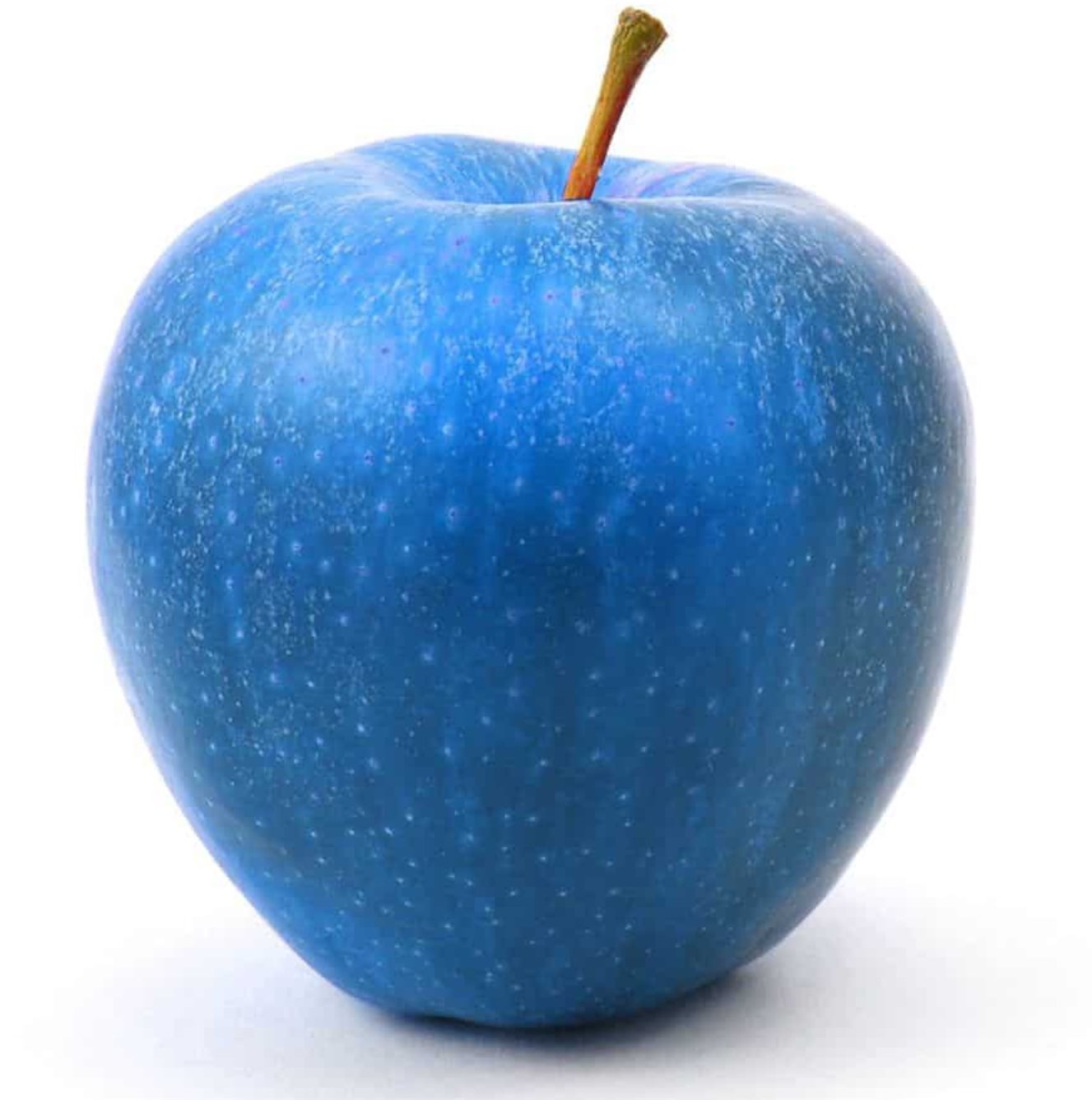
For instance, in Japan, fresh vegetables, unripe fruit, and even traffic lights are still commonly referred to as “ao,” even though they are visibly green. The term “ao ringo” (青りんご) directly translates to “blue apple,” but it actually refers to green apples. Similarly, a green traffic light is called “ao shingō” (青信号), despite its apparent green color.

The Historical Evolution of Color Categorization

The way different cultures develop color categories is deeply connected to historical, environmental, and social factors. In many ancient societies, languages initially had only a few basic color terms, usually starting with black and white (or dark and light), followed by red. Green and blue often emerged as distinct colors later in linguistic development.

Linguistic studies have shown that in cultures where vegetation played a significant role in daily life, there was often a stronger need to distinguish green from other colors, leading to the early development of separate terms for green. However, in societies with a focus on the sea and sky, blue often encompassed a broader range of hues, including shades that English speakers would now call green.

Japan’s historical and cultural emphasis on nature, along with its close relationship to the sea, may have influenced how colors were categorized. In earlier periods, “ao” was used to describe both the blue sky and the green of plants. The gradual introduction of “midori” as a distinct color term occurred much later, with its use becoming more common in the 20th century.

Despite this shift, linguistic habits tend to persist. Many traditional terms remain unchanged, leading to the continued use of “ao” for objects that are technically green. This linguistic continuity is evident in everyday Japanese expressions, reinforcing the connection between language and perception.

The Role of Language in Color Perception

The case of the “blue apple” in Japan is not an isolated linguistic anomaly; rather, it is part of a broader phenomenon observed in languages worldwide. The way different cultures and languages classify colors can influence perception, making color recognition and categorization a deeply cultural experience.

Research in linguistic relativity, also known as the Sapir-Whorf hypothesis, suggests that the language we speak can shape our cognitive processes, including how we perceive colors. Studies have demonstrated that speakers of languages with fewer distinct color terms may perceive colors differently than those whose languages have more extensive color vocabularies.

For example, some indigenous languages have a single term encompassing both blue and green, leading speakers to perceive the boundary between these colors differently than English speakers do. Similarly, Russian, which distinguishes between two different shades of blue—“goluboy” (light blue) and “siniy” (dark blue)—may make native speakers more attuned to subtle differences in shades of blue.

In the case of Japanese, the historical overlap of “ao” and “midori” may have influenced how native speakers categorize green and blue hues. While Japanese speakers can clearly distinguish between green and blue visually, their language groups certain green objects under the term “ao” due to longstanding linguistic conventions.

Other Examples of Color Categorization Across Cultures

The way color is categorized varies widely across languages and cultures. Some languages have fewer basic color terms than English, while others have more, leading to significant differences in how colors are perceived and described.

Ancient Greek – The ancient Greeks did not have a distinct word for blue; instead, they used words that described lightness or darkness, leading to interpretations of Homer’s descriptions of the “wine-dark sea” as possibly not referring to blue at all.

Himba (Namibia) – The Himba people of Namibia have a different way of categorizing colors, with some distinctions that do not align with English color terms. Studies have shown that they can distinguish certain shades of green more easily than English speakers but struggle to differentiate between some shades of blue and green.

Welsh – In the Welsh language, the term “glas” can refer to both blue and certain shades of green, similar to the Japanese “ao.”

Chinese – Traditional Chinese color classification includes “qing” (青), which historically covered both blue and green, similar to the Japanese “ao.” While modern Mandarin differentiates between blue (“lán” 蓝) and green (“lǜ” 绿), “qing” is still used in some contexts.

These examples demonstrate how language influences perception and categorization, highlighting the complexity of human cognition.

Cultural and Practical Implications

The way colors are described in different languages is not just a linguistic curiosity—it has practical implications as well. In international marketing, product design, and cross-cultural communication, understanding how different cultures categorize colors can prevent misunderstandings.

For instance, companies creating products for the Japanese market must be aware of linguistic differences in color perception. A product advertised as “blue” in English might be perceived as green in Japan, leading to potential confusion in branding and packaging.

Additionally, color terminology plays a role in education and cognitive development. Studies have shown that children acquire color terms differently depending on their native language, influencing how they learn to categorize and distinguish colors.

Thoughts

The case of the “blue apple” in Japan serves as a compelling example of how language, culture, and perception are deeply interconnected. While it may seem unusual to English speakers, the Japanese use of “ao” for objects that appear green highlights the complexities of linguistic evolution and cultural influence.

By recognizing these nuances, we gain a deeper appreciation for the diversity of human communication and perception. Understanding how different languages categorize colors can enhance cross-cultural understanding and encourage us to rethink the assumptions we make about language and reality.

Ultimately, the “blue apple” is more than just a linguistic curiosity—it is a testament to the richness and diversity of human thought, reminding us that the way we see the world is often shaped by the words we use to describe it.

Related Articles

Modern data center facility with a solar-panel-clad exterior, bright green administrative offices, and secure perimeter fencing, showcasing sustainable digital infrastructure and renewable energy integration

Lombardy’s Data Center Boom: Balancing Digital Ambition with Environmental Responsible

Lombardy has emerged as Italy’s primary hub for new digital infrastructures, particularly data centers—vast complexes […]

In a highly anticipated reunion after 24 years, Adidas Originals and Coca-Cola have joined forces once again to celebrate the FIFA World Cup 2026™. The collaboration revives their iconic 2002 partnership from the Japan-South Korea tournament, now reimagined for the biggest global sporting event of 2026, co-hosted by the United States, Canada, and Mexico. Set to launch on June 6, 2026, this collection masterfully blends Adidas' streetwear heritage with Coca-Cola's timeless branding, creating a vibrant fusion of football culture, nostalgia, and modern style. The drop arrives at a perfect moment. With the World Cup kicking off on June 11, 2026, fans worldwide are gearing up for a summer of football excitement. This collaboration isn't just merch—it's a cultural statement that merges two legendary brands under the banner of "Originals are the Real Thing," a clever twist on Coca-Cola's famous slogan. Historical Context: A Reunion 24 Years in the Making Adidas and Coca-Cola first collaborated during the 2002 FIFA World Cup, producing limited-edition pieces that captured the era's energy. That partnership helped define early 2000s football-streetwear crossover culture. Fast-forward to 2026, and the brands are back with fresh energy, leveraging Adidas' deep FIFA ties (as an official partner) and Coca-Cola's long-standing sponsorship of the tournament. The 2026 edition promises to be historic as the first 48-team World Cup, spanning three countries and generating unprecedented global hype. This collab taps into that momentum, offering fans wearable pieces that celebrate both brands' legacies while looking forward to the future of football fashion. Collection Overview and Design Philosophy The Adidas Originals x Coca-Cola collection fuses 2000s street style with classic sporting aesthetics. Expect bold reds, creams, whites, and silver accents inspired by Coca-Cola's iconic packaging—think classic script logos, droplet detailing, and can-inspired motifs. The lineup spans footwear, apparel, and accessories, divided into two visual directions: one logo-heavy and graphic-forward, the other drawing from vintage advertising aesthetics. Designs pay homage to Coca-Cola's visual language while staying true to Adidas Originals' archival roots. High-quality materials, attention to detail, and versatile silhouettes make these pieces suitable for both match-day wear and everyday street style. The campaign, featuring young football star Lamine Yamal and a diverse cast in everyday scenes building anticipation for the tournament, reinforces themes of originality and shared cultural moments. Footwear Highlights Footwear takes center stage in this collaboration, with reimagined takes on iconic 2000s Adidas silhouettes: Samba and Superstar Models: These classics get Coca-Cola treatment with white/cream/red colorways and prominent script branding. The Samba blends street heritage with football roots, while the Superstar II features weathered bases and bold side panels. Expected pricing around $110–$130. Adistar Control 5: A standout with droplet detailing mimicking condensation on a cold Coke can. This model brings performance-inspired design into lifestyle territory. Predator Sala: Indoor/hybrid style with silver-and-red accents, nodding to predatory precision on the pitch and Coca-Cola's bold energy. Climacool 1: Revived with breathable tech and Coke-inspired graphics, perfect for warm summer days. Megaride F50: A highlight paying tribute to the iconic Coca-Cola glass bottle, with unique contours and refreshing design cues. Each pair incorporates thoughtful details like embroidered logos, custom insoles, and packaging that mimics vintage Coke crates or cans. These shoes are built for durability and comfort, appealing to sneakerheads, football fans, and casual wearers alike. Apparel and Accessories Beyond kicks, the collection offers a full lifestyle range: Track Tops and Jerseys: Standout jerseys fuse retro Coca-Cola advertising from different eras into cohesive football designs. Track jackets feature signature three stripes alongside Coke branding, in vibrant reds and classic whites. Shorts and T-Shirts: Relaxed fits with graphic prints, ideal for casual wear or layering. Expect motivational football motifs blended with refreshing beverage references. Accessories: A bright red airliner bag stands out as a functional statement piece. Additional items may include caps, socks, and tote bags carrying the collaborative spirit. The apparel emphasizes comfort with premium cotton blends, mesh panels for breathability, and oversized silhouettes popular in contemporary streetwear. Unisex sizing and inclusive fits make the collection accessible to a broad audience. Cultural Impact and Fan Appeal This collaboration resonates on multiple levels. For football fans, it represents national pride and global unity ahead of the 2026 tournament. Sneaker enthusiasts will appreciate the nostalgic 2000s revival mixed with modern execution. Streetwear collectors see it as a prime example of how heritage brands can innovate through partnerships. In an era where sports and fashion increasingly intersect, Adidas and Coca-Cola deliver pieces that transcend the pitch. Wear them to watch matches at home, attend watch parties, or hit the streets in any host city—New York, Los Angeles, Toronto, or beyond. The designs are versatile enough for gym sessions, festivals, or daily commutes. The timing aligns perfectly with rising interest in football in North America, boosted by the co-hosting nations. Young talents like Lamine Yamal in the campaign help bridge generational gaps, attracting newer fans while satisfying longtime supporters. Where to Buy and Release Details The collection launches globally on June 6, 2026, via: Adidas CONFIRMED app (for early access and raffles) Adidas.com Select retailers and flagship stores worldwide Some regions may see staggered drops, with Japan and other markets getting early access. Prices are expected to range from $50–$150 depending on the item, making it relatively accessible compared to ultra-limited drops. Pro Tips for Copping: Enable notifications on the CONFIRMED app. Check local stock at Adidas stores in major cities. Monitor resale platforms post-drop for exclusive colorways, but be wary of markups. Size up slightly for oversized apparel fits. Given the World Cup hype, popular items like the Sambas and jerseys are likely to sell out quickly. International shipping is available, but factor in potential customs delays. Styling Suggestions Match Day Look: Pair a collaborative jersey with classic black shorts and Samba sneakers for effortless fan style. Streetwear Rotation: Layer a track top over a graphic tee with wide-leg pants and the Megaride F50 for a bold urban ensemble. Casual Summer: White Superstar with denim shorts and the airliner bag for a refreshing, vacation-ready vibe. These pieces mix seamlessly with existing Adidas or neutral wardrobes, maximizing versatility. Broader Context in 2026 Fashion and Sports The Adidas x Coca-Cola drop is part of a larger wave of high-profile collaborations tied to the World Cup. Adidas continues its dominance in football kit design, while Coca-Cola leverages its sponsorship with collectibles, bottles, and experiential activations like the Trophy Tour. In the sneaker industry, this collab exemplifies the ongoing trend of lifestyle reinterpretations of performance silhouettes. It also highlights how global brands use major events to drive cultural conversations around unity, originality, and joy—core values for both companies. Sustainability notes (based on Adidas' broader initiatives) suggest some pieces may incorporate recycled materials, aligning with modern consumer expectations. Looking Forward: Legacy and Excitement As the countdown to kickoff continues, this collection serves as the perfect prelude to an unforgettable summer of football. Whether you're a die-hard supporter, a fashion-forward collector, or someone seeking motivation through style, the Adidas Originals x Coca-Cola FIFA World Cup 2026 lineup delivers. Expect potential restocks, special event exclusives in host cities, and continued campaign content featuring more athletes. This isn't just clothing—it's a ticket to participate in the global celebration of the beautiful game. Mark your calendars for June 6, 2026. Refresh your wardrobe, lace up those Sambas, and get ready to cheer on your team in style. The "Real Thing" meets the Originals in what promises to be one of the most talked-about releases of the year. This collaboration captures the essence of football's universal appeal: bringing people together through shared passion, iconic brands, and unforgettable moments. As the world prepares for 2026's expanded tournament, Adidas and Coca-Cola remind us that some partnerships are truly timeless.

Adidas Originals x Coca-Cola Collection: FIFA World Cup 2026

In a highly anticipated reunion after 24 years, Adidas Originals and Coca-Cola have joined forces […]

Loewe shoulder bag crafted in brown and black leather with minimalist lion face detailing and a matching fur tail charm

180 Years Unfolded: The Full Story Behind Loewe’s New Campaign

The year was 1846. Queen Victoria was on the British throne and the telephone, the […]