Blenke 3 by BlenketheGoblin
June 2, 2025
A Goblin-Girl, Two Cats, and the Kingdom That Forgot It Was Hers
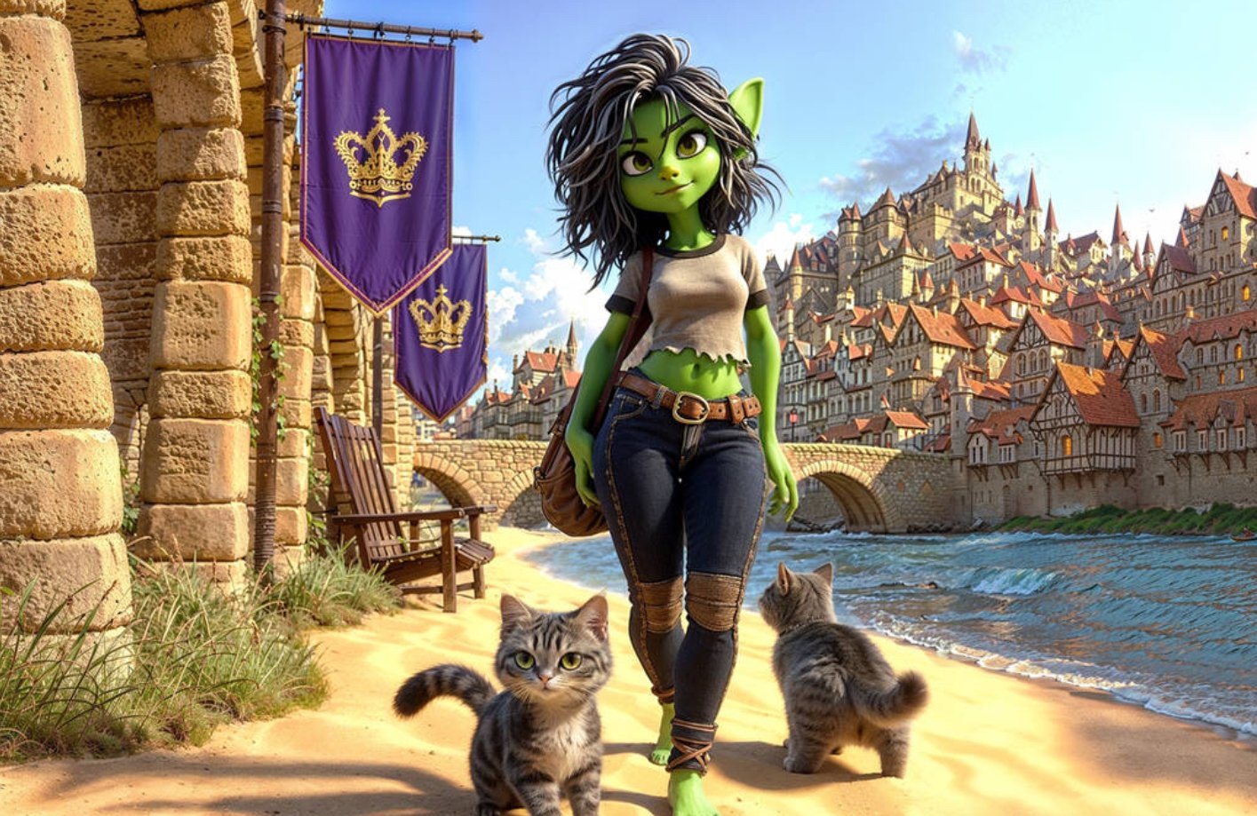
Before a word is read, before a page is turned, Blenke 3 introduces itself visually. The artwork—crafted with precision and affection—renders not just a character but a world: sun-baked, stone-laced, and steeped in reclaimed authority. Created with an eye for fantasy and grounded emotion, the image is more than a scene. It’s a declaration.
The artist behind this piece—whose stylistic vision brings together softness, whimsy, and sovereign strength—sets the tone long before BlenketheGoblin’s text takes over. The colors speak. The posture of the character speaks. The cats speak.
And what they all say is: this story belongs to her.
EMBODYING BLENKE: THE CHARACTER IN CONTEXT OF THE CANVAS
Look at Blenke.
Not in battle gear. Not cloaked in prophecy. She is barefoot, casual, and confident. She walks the border between wilderness and civilization with no armor but presence. Her green skin, sharp ears, and tousled hair mark her unmistakably goblin—but her denim and cropped tee declare something more radical: goblinhood can be modern, can be whole, can be unapologetically now.
This isn’t cosplay. This is a character lived-in.
The visual motif of torn cloth, relaxed stride, and dual feline companions says everything about the world this artist and author co-create: there is power in softness, dominance in subtlety, and defiance in comfort.
THE CATS: WITNESSES, NOT ACCESSORIES
In many fantasy visuals, animals are decoration—cute or threatening or symbolic. Here, they are none of those. They are actors. They witness Blenke’s return. They participate in her movement.
Their expressions mirror complexity—curiosity, calm, readiness. This is part of the artist’s motif: everyone in the frame has agency, even the smallest creatures. The cats walk with Blenke not as pets but as peers. They don’t follow. They walk alongside.
They are part of the kingdom too—and they remember things people have forgotten.
THE BACKDROP: A KINGDOM SEEN FROM THE BEACH
The city looms behind her, but never overpowers. In the artist’s framing, the architecture is majestic, sure—but Blenke’s scale in the foreground makes her the narrative center. She has distance from the crown-bearing towers. She is not beholden to them. Yet they still wave their banners, as if unsure whether to salute or surrender.
It’s subtle, but crucial: the kingdom is not the threat. It’s the context. The memory. The place that could have broken her—but didn’t.
The choice to place her in sunlight, mid-stride, next to banners that reference power but don’t demand her approval? That’s deliberate visual storytelling. The artist isn’t just painting; they’re narrating without narration.
A WORLD BUILT IN MOTIF: TEXTURE, COLOR, LIGHT
This world doesn’t shine with the cold polish of cinematic fantasy. It glows. The soft yellows of sand, the weathered stone, the purple royal banners, the blue-green river—this is a coastal palette of memory and motion.
The artist clearly builds a space that feels lived-in, not staged. The chair by the wall. The creeping ivy. These details invite the viewer to imagine life outside the frame. Who else walks these paths? Who watches from those windows?
This kind of inclusion is rare. It doesn’t say “look at this world.” It says “join it.”
TEXT MEETS ART: BLENKETHEGOBLIN’S WORDS IN THE FRAME’S WAKE
Once you enter the book, BlenketheGoblin’s prose echoes everything the image has already hinted at:
“She didn’t steal the crown. She walked past it, barefoot, and the wind told the banners to stand down.”
This isn’t accidental resonance. This is intentional synthesis between artist and author.
The book and the artwork don’t just coexist—they co-compose. The image is not illustration. It is prologue.
REDEFINING THE GOBLIN ARCHETYPE THROUGH COLLABORATIVE DESIGN
The classic goblin trope: hunched, chaotic, grotesque. But in this visual? We get something else entirely: beauty without compromise. Goblinhood reimagined as intelligence, independence, and softness worn like steel.
The artist doesn’t humanize Blenke by erasing her goblin identity. They empower her by centering it. Her green skin isn’t exoticized. Her ears aren’t a joke. Her proportions aren’t stylized to please. She is designed for herself.
This is what inclusive, character-forward visual work looks like: not adapting for comfort, but expanding comfort zones.
VISUAL SYMBOLISM: FLAGS, CATS, STEPS, SEA
Each visual element connects back to deeper themes in the text:
- Purple Banners with Gold Crowns – Royal legacy as static relic, unclaimed and unfeared.
- The River – Time, memory, and change—always present but never still.
- Barefoot Stride – Sovereignty without performance. Power that doesn’t need elevation.
- Cats – Archives. Audience. Anchors.
- Sunlight and Shadow – The interplay of past pain and present autonomy.
All of it tells the same story BlenketheGoblin tells in words—only faster, and wordlessly.
ART AND LITERATURE AS CO-AUTHORS
In most books, art is supplemental. Decorative. Here, it is narrative-critical.
The connection—or inspired parallel creation—between the artist and BlenketheGoblin results in something rare: a story you feel before you understand.
This isn’t a cover for a book. It’s a portal into the book’s thesis:
“You don’t have to win the world. You just have to walk into it like it already belongs to you.”
Blenke 3 isn’t just fiction. It’s folk mythology in motion, given form by pen and brush, by rhythm and color.
The image stands not as an accessory, but as equal authorship in a shared vision:
- A goblin who doesn’t fight for a seat at the table, because she’s building her own beside the sea.
- A city that doesn’t crown her, but can’t look away.
- An aesthetic that doesn’t beg for fantasy tropes, but teaches them a new language.
This is a visual/literary dialogue at its most potent. A story told across senses. A world that includes you—if you’re brave enough to walk barefoot beside it.
Related Articles
Inside the Red: What Jonathan Yeo’s Portrait of Charles III Actually Argues
Jonathan Yeo spent three years painting a king who was still a prince when the […]