DRIFT AUDIO
Listen to this story
Choose a voice, then press play.
In the midst of Milan’s Porta Venezia district stands an architectural masterpiece that encapsulates the city’s embrace of modernity at the turn of the 20th century—Casa Galimberti. Designed by architect Giovanni Battista Bossi and commissioned by the Galimberti brothers, this striking residence, completed between 1903 and 1905, remains one of the most vivid expressions of Italian Art Nouveau, known locally as Stile Liberty. Ornamental, audacious, and exuberant, Casa Galimberti continues to inspire architects, designers, and travelers alike, offering an enduring lesson in the expressive power of architecture.
The Visionaries Behind the Facade
At the center of this creative endeavor were the Galimberti brothers—Carlo and Ettore—entrepreneurs and developers with a keen eye for urban expansion and artistic innovation. Having already overseen the construction of Casa Campanini, another iconic Liberty-style residence, they sought to leave a more audacious imprint on Milan’s streetscape. To do so, they turned to Giovanni Battista Bossi, an architect versed in eclecticism but who embraced the emerging Liberty style with unparalleled enthusiasm.
Bossi’s work on Casa Galimberti would not only showcase his talents for decorative composition but also demonstrate how architecture could function as both a dwelling and a visual manifesto of cultural values.
An Ornamental Triumph: The Façade
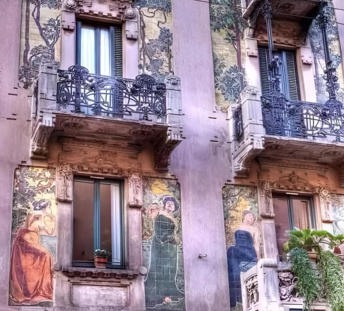
Casa Galimberti’s defining feature is undoubtedly its spectacular façade, which turns the building into a public artwork. It is not merely decorative but communicates a narrative about aesthetics, identity, and Milan’s place in a modernizing Europe. A key element is the use of ceramic tiles and wrought iron, materials that were hallmarks of Art Nouveau design yet handled here with an Italian twist.
The façade is clad with vividly colored majolica panels, created by artist Ferdinando Brambilla, featuring allegorical female figures, sinuous vegetal forms, and scenes that blend mythology with domestic romanticism. These figures—semi-clad women draped in flowing robes—exude both sensuality and serenity, embodying the Liberty ideal of merging art, nature, and life.
Each panel is framed by intricately carved stone pilasters, with window cornices that shift in size and detail as they ascend, guiding the eye upward in a lyrical movement. The balconies, constructed with ornate wrought iron railings, feature floral motifs that echo the ceramic imagery behind them. This unity of form and detail across materials is a signature of Bossi’s design strategy.
Structural Composition and Layout
While the façade is the building’s most talked-about element, the structure of Casa Galimberti is equally sophisticated. It was designed not merely as a single residence but as an apartment building—a nod to Milan’s urban expansion and the need for modern housing that could simultaneously serve bourgeois functions and aesthetic ideals.
The building comprises several floors arranged around a central courtyard, typical of Milanese residential design. However, Bossi refined this layout with advanced ventilation, natural light optimization, and innovative use of space. The interiors originally featured Liberty-style detailing, such as floral ceiling medallions, stained glass, and mosaic floors—many of which have been carefully preserved or restored.
Casa Galimberti also exemplifies a unique Milanese typology where residential buildings assume the grandeur of civic architecture. It projects opulence without being overbearing, a balance that reflects the ambitions of its creators and the tastes of the city’s elite at the time.
A Synthesis of Art and Craft
What truly distinguishes Casa Galimberti is its seamless integration of multiple crafts—architecture, ceramics, metalwork, and painting—into a unified aesthetic. This synthesis echoes the total work of art (Gesamtkunstwerk) philosophy that underpinned much of Art Nouveau across Europe, from Gaudí’s Barcelona to Horta’s Brussels.
The building was a collaboration between architect, artisans, and developers, and it stands as a testament to a moment when architecture was not just a utilitarian pursuit but a form of civic and artistic expression. The ceramic panels alone involved a painstaking process of hand-painting and glazing, requiring not only artistic vision but technical mastery.
Meanwhile, the ironwork, likely crafted by local blacksmiths, transformed structural components into lyrical expressions—balustrades become vines, balcony railings become flowering branches. Every element, down to the door handles and window latches, was designed in harmony with the Liberty aesthetic.
Casa Galimberti and Its Context
Casa Galimberti must be understood within the broader context of Milan’s urban and cultural evolution in the early 20th century. The city was undergoing a transformation driven by industrial growth, rising middle-class affluence, and a desire to position itself as a cosmopolitan center. Art Nouveau was not simply a style—it was a statement of modernity and aspiration.
Located in what is today the Libertà neighborhood, the building was part of a wave of artistic experimentation that included not only residential architecture but also cafes, shops, and civic buildings. Casa Campanini, also associated with the Galimberti brothers, and Palazzo Castiglioni by Giuseppe Sommaruga, form a triumvirate of Milanese Liberty at its most expressive.
In this context, Casa Galimberti stands out for its overt theatricality. Where others chose restraint or symbolic allegory, Bossi and the Galimberti brothers opted for visual exuberance. The building seems to perform for its street—its beauty designed to arrest the passerby, to engage, to provoke.
Related Articles
Modigliani’s Limestone ‘Tête’
Carved from a single block of limestone in Montparnasse more than a century ago, one of Modigliani's rare stone heads goes to auction for the first time…