Coca-Cola CokeSticks Turn the Iconic Contour Bottle Into Function
June 3, 2026
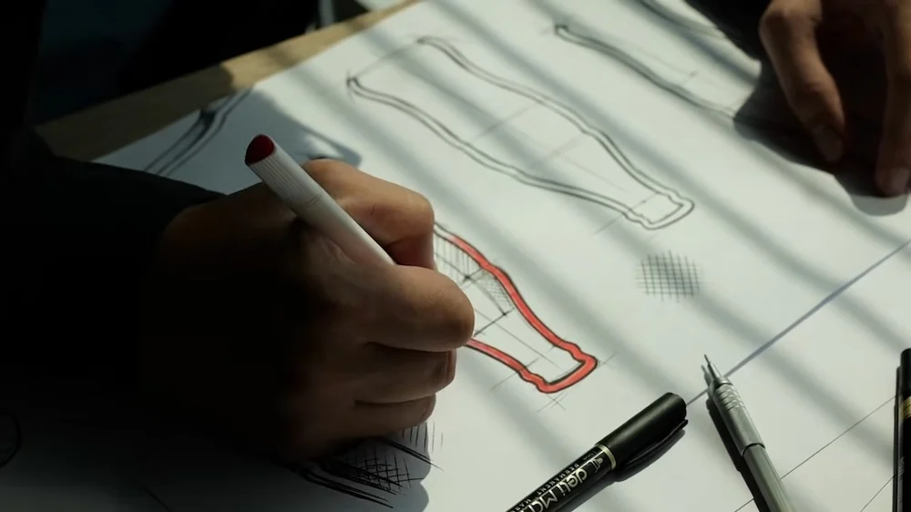
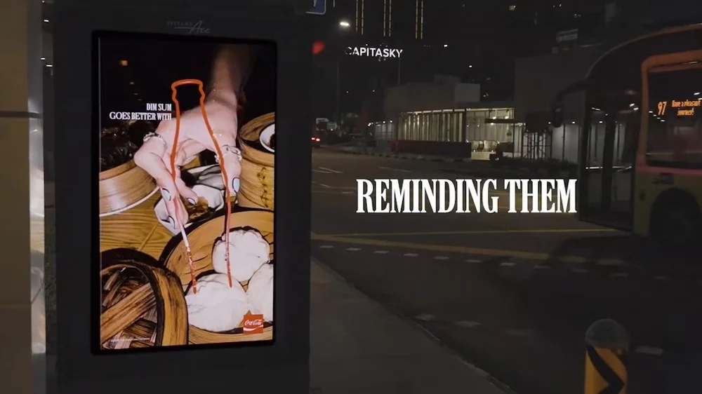
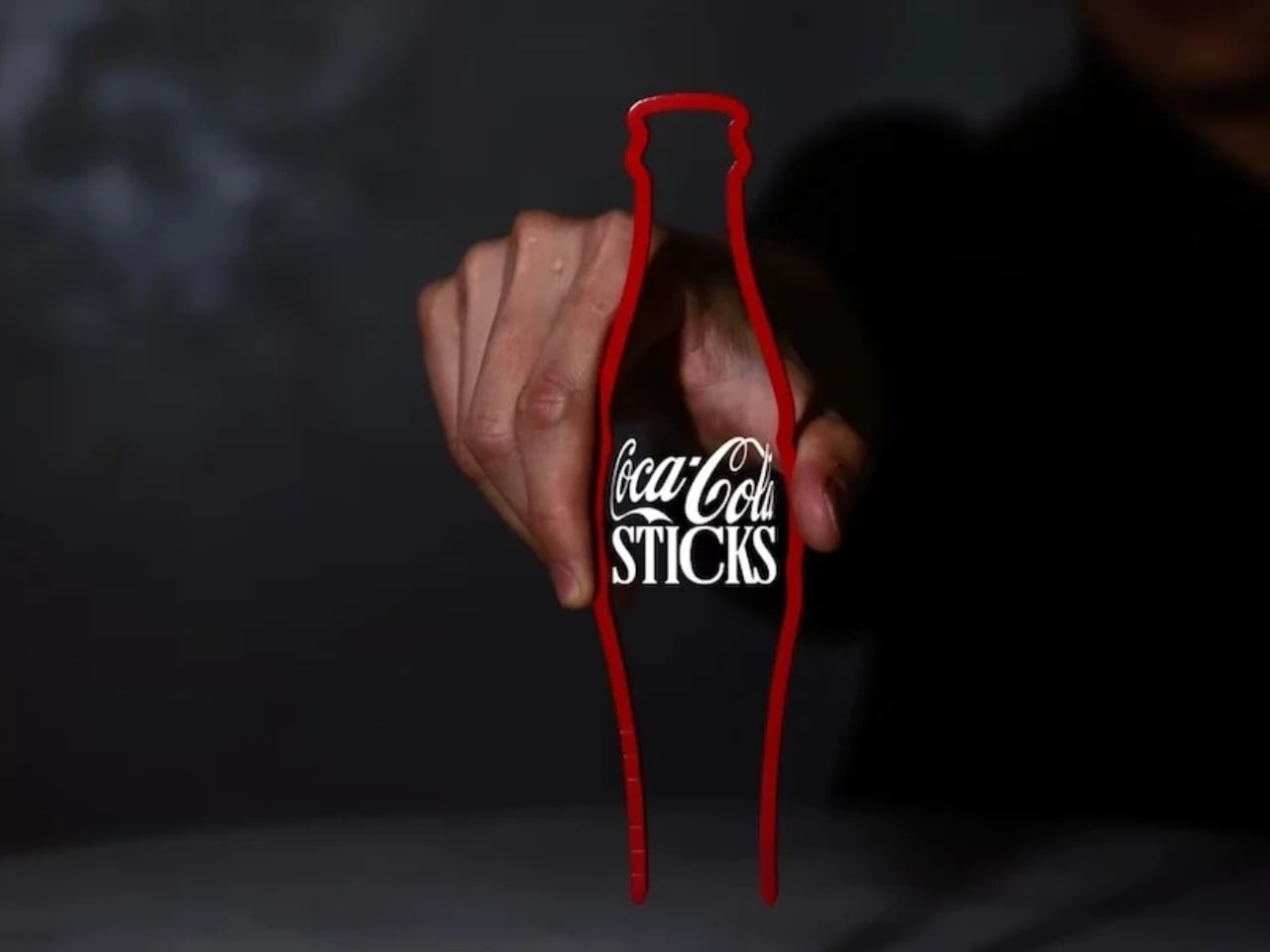
Coca-Cola has once again proven why its iconic contour bottle remains one of the most brilliant pieces of design in commercial history. This time, the brand has transformed that unmistakable silhouette into something entirely new and culturally resonant: CokeSticks — functional chopsticks shaped like the legendary Coca-Cola bottle.
In a clever move developed in partnership with Ogilvy, Coca-Cola is inserting itself directly into the heart of Asian dining rituals. Rather than competing for space beside the plate, the brand has become part of the utensil itself. Launched in late May 2026 and targeted primarily at Southeast Asian markets, CokeSticks represent a masterclass in cultural intelligence, product innovation, and subtle branding.
stir
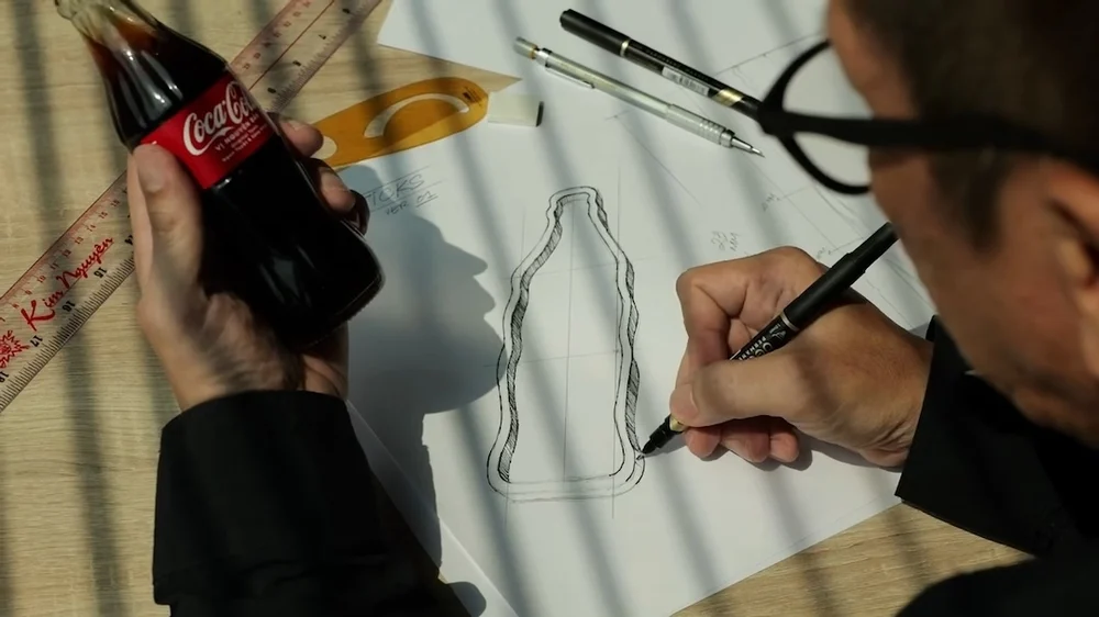
To understand the genius of CokeSticks, one must first appreciate the contour bottle itself. Designed in 1915 by Earl R. Dean of the Root Glass Company, the bottle was created to be instantly recognizable even in the dark or when touched — a necessity in an era when many beverages were sold without labels or in similar packaging. Inspired (somewhat mistakenly) by the curves of the cocoa bean and refined through multiple iterations, the final design features elegant fluted lines, a pinched waist, and a distinctive taper that has become synonymous with refreshment worldwide.
Over the decades, the contour bottle has transcended its function as mere packaging. It has been celebrated in art by Andy Warhol, referenced in music, featured in museums, and even granted trademark protection for its unique shape. It is, as legendary designer Raymond Loewy once described, the “perfect liquid wrapper.” Today, that same silhouette now doubles as a pair of chopsticks, extending its legacy into the realm of dining.
engine
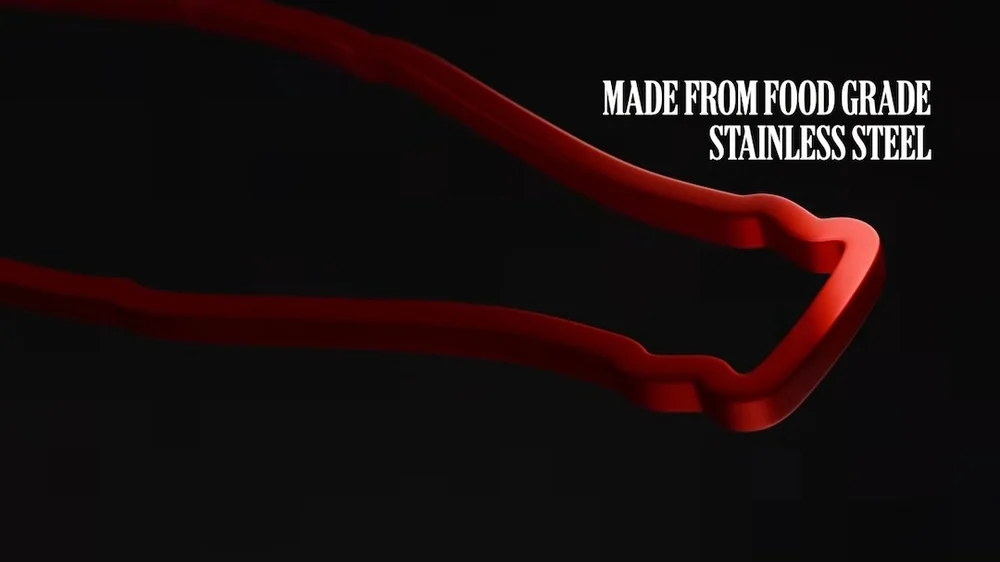
Creating CokeSticks was no simple feat. Every proportion, taper, and finish had to satisfy two competing demands: perfect functionality as chopsticks and faithful reproduction of the Coca-Cola contour bottle’s silhouette. The result is a pair of food-grade stainless steel utensils that capture the bottle’s iconic curves while delivering excellent balance and grip.
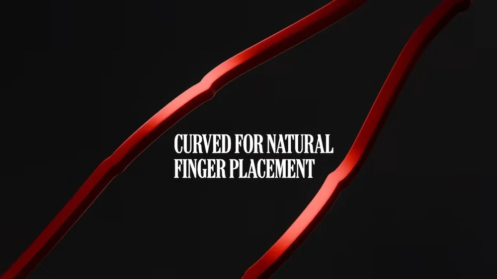
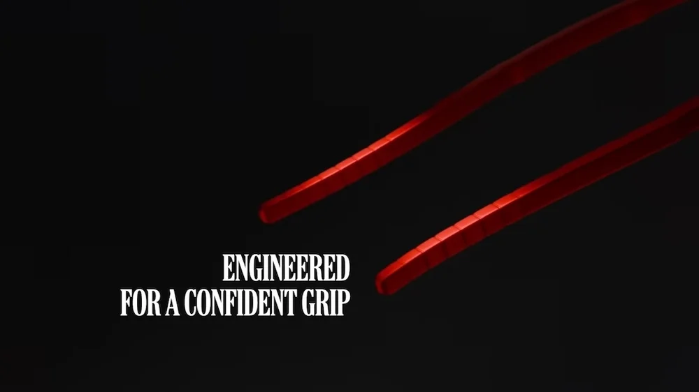
The wider “body” section of the bottle shape provides a natural, ergonomic hold for the fingers, while the tapered “neck” offers precision control at the tips. Subtle texturing mimics the original glass bottle’s fluting, enhancing both aesthetics and usability. The stainless steel construction ensures durability, easy cleaning, and a premium feel that elevates everyday meals. Available in the brand’s signature red, these chopsticks make a bold visual statement without needing any additional logos. The shape alone does the talking.
This isn’t just novelty — it’s thoughtful design. In testing, the CokeSticks reportedly perform exceptionally well with everything from delicate sushi and stir-fried noodles to hearty street food dishes. They bridge the gap between playful branding and practical utility.
innov
The idea behind CokeSticks stems from a sharp cultural observation: while Coca-Cola is enormously popular across Asia, it doesn’t always make it to the dining table during meals. In many Southeast Asian cultures, dining is deeply tied to chopsticks, rice, and shared plates. Soft drinks often remain on the side or are consumed separately.
Coca-Cola and Ogilvy identified this disconnect and turned it into an opportunity. Instead of pushing the beverage harder, they integrated the brand into the ritual itself. As one campaign insight put it: “The chopstick does [reach the table]. That gap between a globally iconic shape and the most culturally embedded dining utensil in the region is exactly where the brief was found.”
By becoming the chopsticks, Coca-Cola becomes part of the meal — not just the drink accompanying it. This subtle shift transforms passive consumption into active participation in one of the world’s most important cultural practices.
scope
CokeSticks fit perfectly into Coca-Cola’s long history of innovative, culturally relevant marketing. From personalized bottles to AR experiences and limited-edition collaborations, the company has consistently found ways to keep its brand fresh while honoring its heritage.
This project stands out for its elegance and restraint. There are no loud slogans or heavy-handed advertising. The product itself is the message. It demonstrates deep respect for Asian dining traditions while cleverly extending the brand’s visual equity.
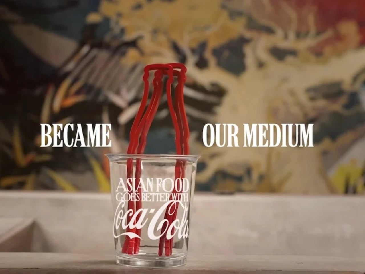
The campaign supporting the launch features beautiful cinematography showing people using CokeSticks during everyday meals — from bustling street food stalls to family dinners. The tagline plays on the transformation: the bottle “became our medium” for connection.

cept
Early reactions have been overwhelmingly positive. Design enthusiasts praise the clever fusion of form and function. Food lovers appreciate the practical innovation. Cultural commentators note how it smartly navigates the balance between global branding and local relevance.
For collectors and design aficionados, CokeSticks represent another must-have item in the Coca-Cola memorabilia universe — joining vintage bottles, glasses, and other iconic merchandise. Limited availability in select markets has already created buzz and demand.
From a business perspective, the move strengthens Coca-Cola’s position in key Asian growth markets. By embedding the brand more deeply into daily life, it fosters stronger emotional connections and habitual association with meals.
extent
In an era where brands constantly chase novelty through flashy collaborations or limited drops, Coca-Cola’s approach with CokeSticks feels refreshingly smart. It leverages one of its greatest assets — that timeless contour shape — in a completely unexpected way.
This project also sparks interesting conversations about the evolution of branding. How far can a brand’s visual identity stretch? Can a bottle become chopsticks? In this case, the answer is a resounding yes.
As sustainability conversations continue in the packaging world, there’s also something poetic about transforming the idea of the bottle into a reusable, durable utensil. While not solving single-use issues directly, it extends the life and meaning of the brand’s most famous form.
fin
Coca-Cola has always been more than a beverage — it’s a symbol of refreshment, togetherness, and shared moments. With CokeSticks, the brand ensures those moments include its unmistakable silhouette right in hand, from the first pick-up of noodles to the last bite of dumplings.
This isn’t just clever marketing. It’s brilliant product thinking that demonstrates a profound understanding of culture, design, and human behavior. The contour bottle, once revolutionary as packaging, now revolutionizes the dining experience in new markets.
In turning its famous bottle contours into chopsticks, Coca-Cola hasn’t just created a novelty item. It has crafted a cultural bridge — one pair of utensils at a time.
The next time you sit down for an Asian meal, don’t be surprised if a little piece of Coca-Cola history is right there beside your plate, ready to join the feast. After all, some shapes are simply too iconic to stay in the bottle.