DRIFT AUDIO
Listen to this story
Choose a voice, then press play.
A leather patch stitched onto work pants, a can of soup nobody redesigned in decades, and a heart drawn on a taxi ride: these are the kinds of everyday objects that quietly built American view culture.
New York City was staring down bankruptcy in the mid-1970s, and state officials needed something to pull tourists back before the fiscal situation got any worse. The job fell to Milton Glaser, who sketched the solution on a taxi ride between his home and his office, as he often did when an idea was forming. He drew a red heart, paired it with the letters I and NY, and set the type in American Typewriter, a slab serif with a distinctly 1970s feel. The rebus construction, a heart standing in for the word love long before emoji made that kind of substitution routine, worried some officials who thought it might confuse people. It did not. New York adopted it for the whole state within months, and copycats followed almost as quickly, prompting officials to secure copyright protection that has generated licensing income for the state ever since.
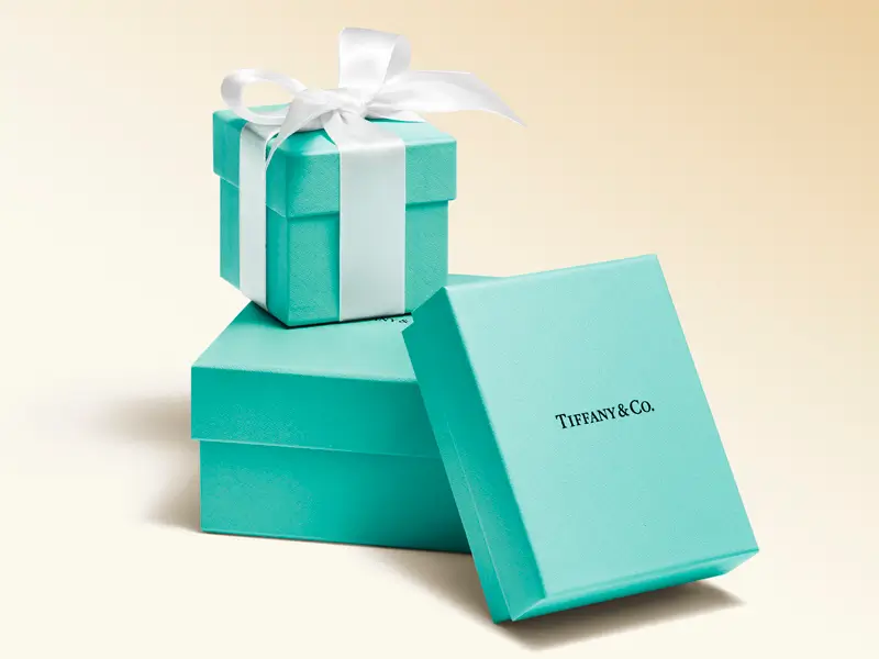
Tiffany & Co.’s iconic blue gift boxes, finished with a white satin ribbon, showcase the brand’s instantly recognizable packaging and timeless presentation.
Glaser’s other design work, decades of posters, album covers, and identities for outlets ranging from a Brooklyn brewery to an Italian gelato maker, never quite escaped the sil of that single doodle. He seemed to make peace with that, returning to the logo himself after the September 11 attacks to append the phrase More Than Ever and add a small burn mark to one corner of the heart, turning a tourism slogan into something closer to a civic pledge. The same image resurfaced in shop windows during the pandemic decades later. When New York City floated a rebrand of the logo in the early 2020s, the backlash was loud enough to make one thing clear: whatever else has changed about the city since 1976, people were not ready to let go of Glaser’s heart.
Baseball found its own civic shorthand a full fifteen years earlier. When the National League awarded New York an expansion franchise in 1961 to fill the gap left by the Dodgers and Giants leaving for California, illustrator Ray Gotto won a public competition to design the new team’s emblem. Rather than pick a single borough to represent, Gotto folded a whole skyline into the mark, working landmarks including the Woolworth Building, the Empire State Building, and the United Nations headquarters into a single silhouette, anchored by a suspension bridge across the bottom. The Mets logo originally ran in black and pink before settling into the blue and orange still used today, colors chosen in part because they echo the city’s own flag. Ownership groups, ballparks, and rosters have all turned over many times since, but the logo itself has remained close to Gotto’s original concept for well over sixty years.
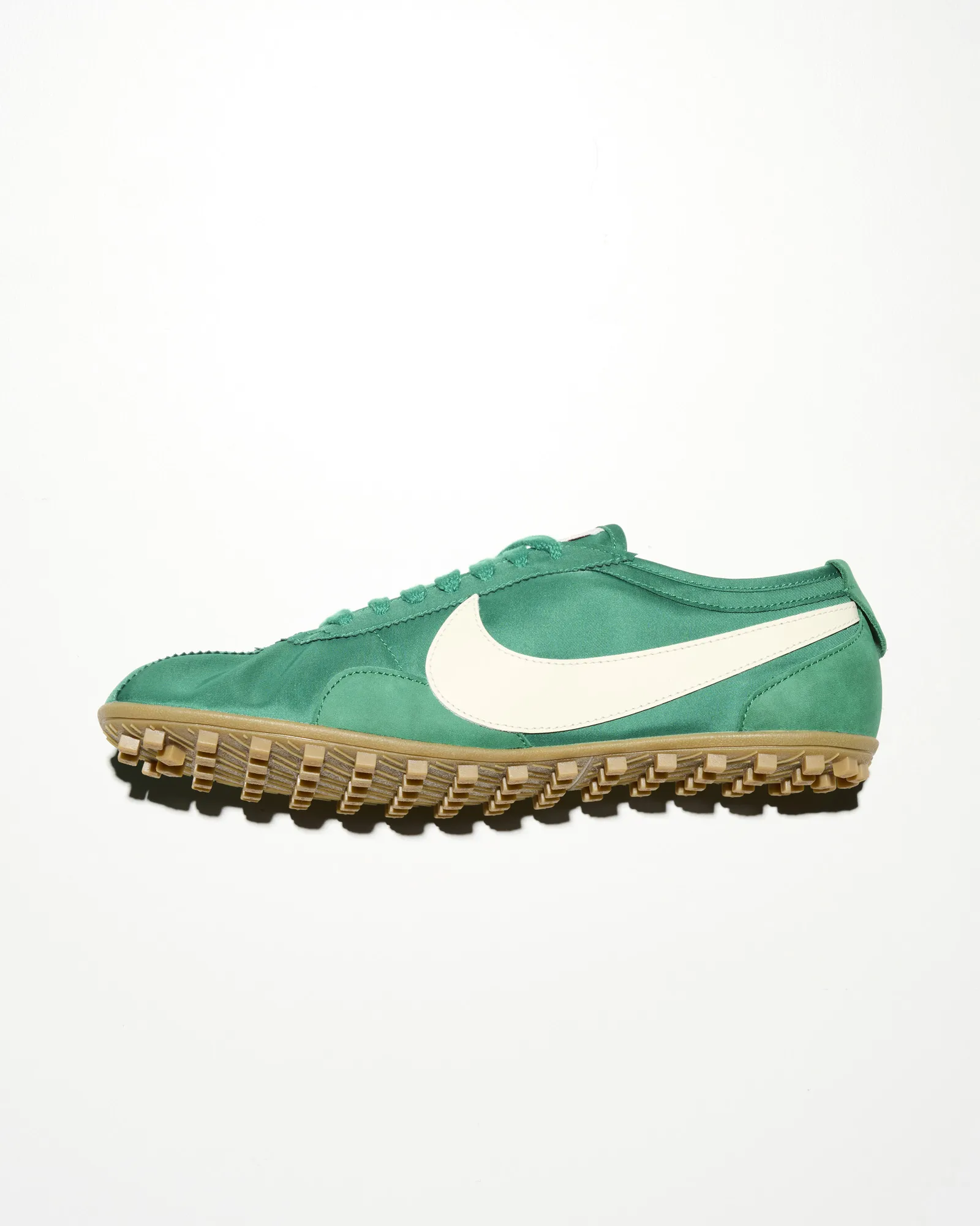
The Nike training shoe pairs a vibrant green upper with an oversized white Swoosh and rugged gum outsole, blending vintage track styling with everyday versatility.
flow
Charles Schulz never set out to design a corporate mark when he created Snoopy for his comic strip Peanuts. He was working from observation, watching how much patience dogs tend to show toward the games children invent, and the beagle he drew to embody that idea started out fairly literal, walking on all fours with realistic proportions. Over the run of the strip, Schulz kept simplifying him, stretching his ears, reducing his eyes to two dots, and eventually putting him upright on his doghouse roof more often than on the ground. That simplification is what allowed Snoopy to leave the newspaper page so easily, showing up on toys, apparel collaborations, and watch faces without ever losing the character’s basic silhouette. Timex became one of the earliest licensees of the Peanuts characters back in the 1960s, a partnership that has resurfaced periodically ever since with dedicated Snoopy watch faces built around the same dots-and-ears design logic Schulz landed on decades ago.
Few packaging designs have had as strange a second act as the Campbell’s soup can. The red and white label, capped with a gold medallion referencing an award the company won at an exposition around the turn of the twentieth century, had already been sitting on American shelves for six decades by the time Andy Warhol turned his attention to it in the early 1960s. Warhol reproduced the can with almost no alteration, and that lack of interpretation was the entire point. He was asking why a piece of commercial packaging, designed purely to move soup off a shelf, had become as visually familiar to Americans as any painting hanging in a museum, and whether that familiarity came from the artwork itself or simply from repetition. The resulting series became one of the defining images of Pop Art, and decades later it still shapes how designers and advertisers think about the line between packaging and art.
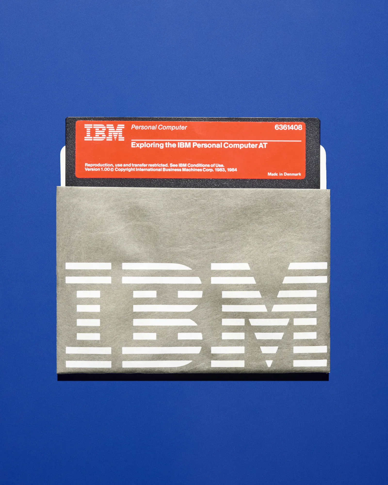
An original IBM floppy disk and branded paper sleeve capture the unmistakable graphic identity of the early personal computing era.
roll
Some logos exist to protect a feeling rather than sell a product directly. Chateau Marmont opened in 1929 as an apartment building modeled loosely on a French château, becoming a hotel a few years later and slowly accumulating a reputation as a discreet refuge for actors, musicians, and writers who wanted Los Angeles without the exposure. When new ownership took over in 1990, the priority was protecting that decades-old mystique rather than modernizing it, so the identity work leaned on Libra, a hand-drawn medieval-style typeface originally designed by a Dutch typographer in the 1930s. The lettering looks intentionally aged, almost hand-lettered, which suits a property that has always traded on feeling slightly outside of time.
IBM took the opposite approach entirely. In 1956, when the company was still building room-filling computers that ran on vacuum tubes, designer Paul Rand distilled the name down to three simple letters, giving a sprawling industrial company a single coherent mark that could scale from a business card to the entrance of a corporate campus without losing legibility. Rand revisited the design twice over the following two decades, eventually introducing the horizontal stripes that most people now picture when they think of the IBM logo. The company’s design ambitions extended well past its own logo during this period, since IBM also commissioned furniture, exhibitions, and architecture from figures including Charles and Ray Eames and Eero Saarinen, treating design itself as a competitive advantage rather than an afterthought.
what
Carolyn Davidson was still a design student at Portland State University in 1971 when Phil Knight, building a small athletic shoe company out of Oregon, asked her to design something for the side of a sneaker. She was paid thirty five dollars for the swoosh, an elongated curved shape meant to convey speed, built as a more dynamic alternative to the plain stripes other shoe brands were using at the time. Knight’s initial reaction was lukewarm at best, but the shape found its way onto the feet of top American finishers at the Boston Marathon within a year of Davidson turning in the design. Nike later thanked her retroactively with company stock and a diamond ring shaped like the swoosh, a modest first payment that became one of the more famous stories in design folklore precisely because of how small it started.
Calvin Klein built his own visual identity around restraint rather than illustration. The sans serif wordmark, introduced by the designer himself in 1968, stayed deliberately plain, a choice that let the brand’s marketing carry the emotional weight instead. That marketing found its most famous vehicle in underwear advertising through the 1980s and 1990s, photographed by names including Bruce Weber and Herb Ritts and fronted over the decades by figures ranging from Olympic athletes to musicians, all essentially selling the same idea, that the waistband peeking above a pair of jeans was recognizable enough on its own to double as advertising.
Nirvana’s logo has an origin story with almost no design intention behind it at all. In 1989, the Seattle label Sub Pop needed artwork for the band’s debut album Bleach, and the job went to designer Lisa Orth, then working at a local music paper closely tied to the city’s emerging grunge scene. According to the story that has circulated since, Orth simply asked a colleague what font had last been loaded onto their typesetting machine. It happened to be a blocky serif face called Onyx, and paired with a stark black and white photograph on the cover, it stuck, becoming the band’s default logo across records, shirts, and patches for the rest of their run. The lettering used on the band’s more provocative merchandise around the same period was a slightly different, more ornate serif, close enough to be mistaken for the same font but not quite it, a small inconsistency that has become its own minor point of trivia among longtime fans.
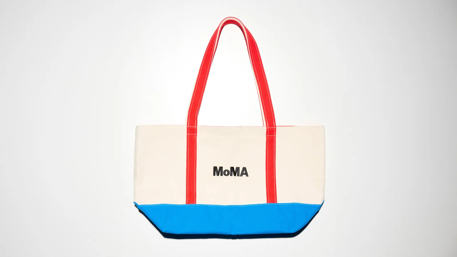
The MoMA canvas tote combines a natural cotton body with bold red handles and a bright blue reinforced base, turning an everyday carryall into a modern design statement.
oh
Few objects carry as much unspoken prestige as an empty box. Tiffany & Co’s particular shade of blue has been trademarked since the late 1990s and became an official Pantone color shortly after, named for the year the company was founded. For most of its history the identity stayed largely untouched, until Pentagram partner Paula Scher was brought in for a subtle refresh in the mid-2000s that centered the whole system around that blue box rather than any single logotype, extending the color across bags, advertising, and packaging interiors. The wordmark itself was redrawn to resemble hot-stamped letterpress type, a small technical detail meant to signal craft rather than mass production, even on a box that, by that point, needed no words at all to be recognized.
Levi’s solved a similar recognition problem almost a century and a half earlier, using an image instead of typography. When Levi Strauss patented the riveted work pant in 1873 during the California gold rush, the challenge was communicating durability to a customer base that, in mining camps across the American West, often could not read. The company’s answer was a leather patch showing two horses pulling a pair of jeans in opposite directions without tearing them apart, an image literal enough that a shopper could simply describe it out loud to a store clerk. The two horse patch has outlasted every other change to the Levi’s identity since, arguably because it was designed to demonstrate a product claim rather than to look fashionable, and demonstrations tend to age better than trends.
The Museum of Modern Art took a purely typographic approach when it commissioned its identity from designer Ivan Chermayeff in 1964, setting the museum’s initials in Franklin Gothic and leaving the rest of the visual system almost entirely alone for the next several decades. A custom typeface called MoMA Gothic arrived in 2004, and Pentagram was later brought in to build formal guidelines for using it consistently across signage and publications, working closely with the museum’s own creative director. Even with all of that additional structure layered on top, the underlying letters Chermayeff chose in 1964 have never really needed replacing, only new ways to be cropped, colored, and arranged around whatever the museum happens to be showing.
fin
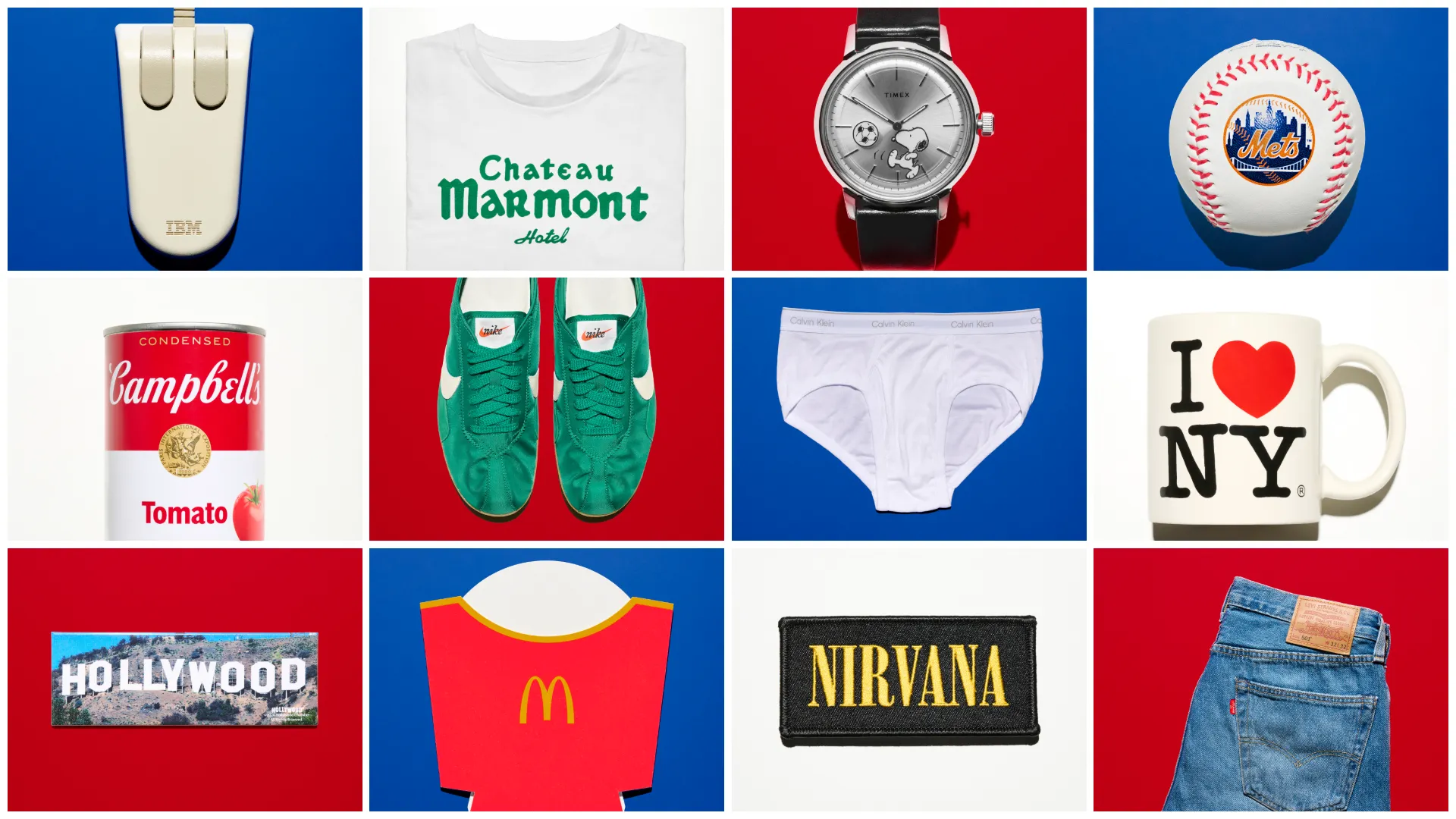
I Love NY, the New York Mets, Tiffany & Co, Chateau Marmont, IBM, Snoopy, Campbell’s, the Hollywood sign, MoMA, McDonald’s, the Nike swoosh, Levi’s, Calvin Klein, and Nirvana add up to fourteen very different origin stories, spanning a taxi ride, a public design competition, a comic strip, a leather patch, and a typesetting machine’s default font. None of them were engineered by a large internal branding department working through months of testing. Most were the work of one or two people solving a narrow, immediate problem, get tourists back to a bankrupt city, protect a hotel’s reputation, help an illiterate customer identify a pair of pants, and only became cultural shorthand afterward, almost as a side effect of doing the original job well. That gap between original intention and eventual meaning is what makes these particular objects worth revisiting. The people who made them were rarely trying to build a legend. They were mostly just trying to solve the assignment in front of them, and the legend showed up later, uninvited.
n
From the DRIFT archive: Cornell Team Develops Ultrablack: The “Darkest Fabric Ever” That Reflects Close to No Light · PANTONE’s 2026 Color of the Year Takes Shape With Play-Doh and Post-It Editions