DRIFT AUDIO
Listen to this story
Choose a voice, then press play.
Inside an emptied out lycee, the young Belgian designer stitched teenage uniforms and 16th century still life paintings into one restless, colorful hour.
The Lycee Carnot sits in the 17th arrondissement of Paris, a working high school that spends most of the year filled with teenagers rather than fashion editors. For one afternoon during Paris Fashion Week, it emptied out for France’s midwinter break and filled instead with a different crowd, one that came to watch Dries Van Noten present its Fall 2026 women’s collection. Rows of seats went up in a gymnasium style hall, and the building’s own fittings, chipped paint, notice boards, a scoreboard clock, were left in place rather than dressed over, so the set itself did half the storytelling before a single look came out.
View this post on Instagram
Julian Klausner, the house’s creative director since 2024, did not choose the venue for its architecture alone. He has said he was struck by it on a visit weeks earlier, when the halls were still full of students moving between classes in their own improvised uniforms, blazers layered over hoodies, scarves knotted for warmth rather than style. That image stuck with him, and it became the spine of a collection that spent an hour moving between two very different reference points: the disciplined dress code of a school hallway and the ornate clutter of a 17th century Flemish still life.
Klausner took over Dries Van Noten in the fall of 2024, stepping into a house that had operated under its founder’s name and eye for nearly four decades. The transition was watched closely by an industry curious if even a label was built so tightly around one designer’s instincts, an obsession with print, color and the friction between them, could survive a change of hands at all. Two years in, this show read as the clearest answer yet: Klausner has kept the house’s appetite for pattern and ornament while pushing its reference points somewhere younger and more autobiographical than his predecessor tended to go.
It is a pairing that sounds odd on paper and largely worked in the room. Klausner has built a reputation in his short tenure at the house for taking Dries Van Noten’s signature maximalism, its layered prints, its love of texture and its refusal to sit quietly, and giving it a slightly younger, slightly more restless energy. This show pushed that further than any collection he has shown since taking over from the house’s founder. The mood swung from polished tailoring to raw, unfinished edges within the same walk, and from the studied elegance the label is known for to something closer to teenage improvisation, a kid rifling through a parent’s closet and a museum gift shop on the same afternoon.
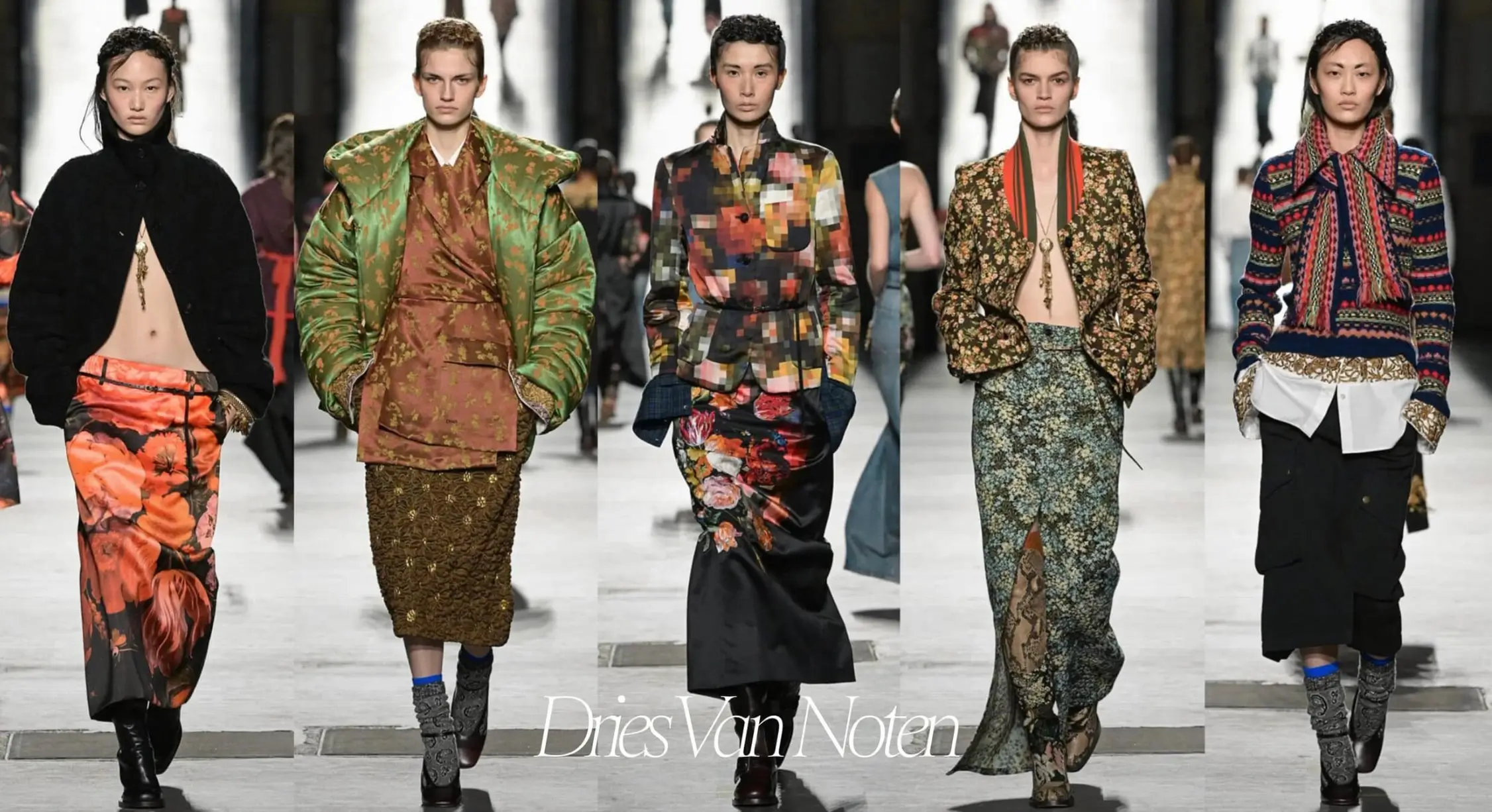
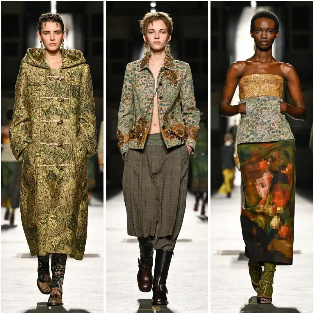
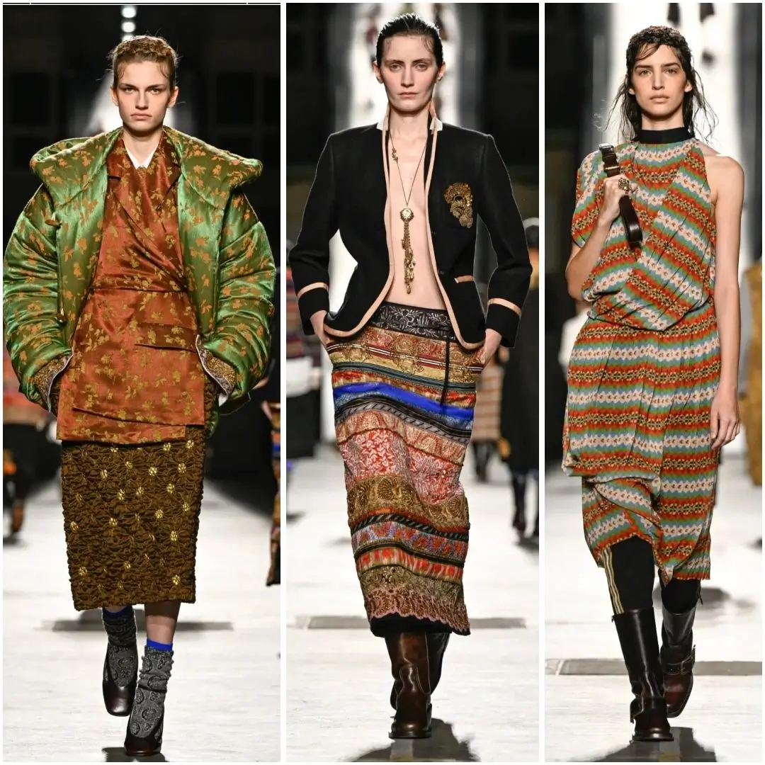
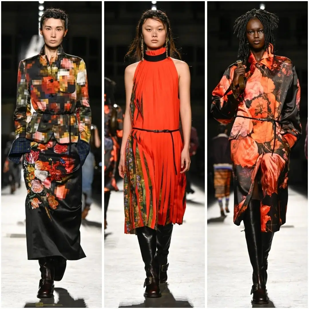
Dries Van Noten runway collage featuring five layered looks mixing oversized tailor, floral prints, brocade textures, colorful knits and patterned skirts.
stir
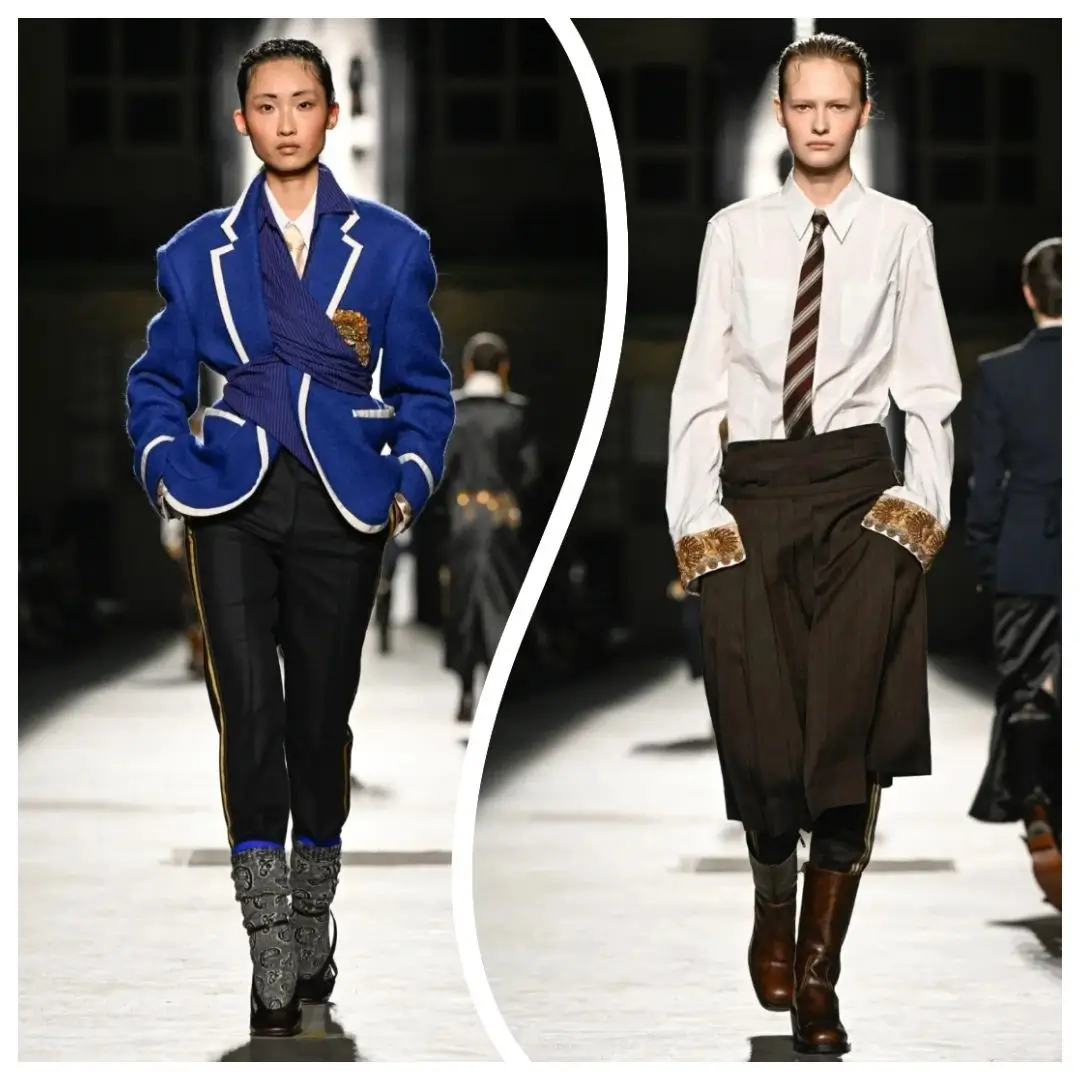
The schoolyard half of the collection arrived first and most literally. Colorful sweaters and vest tops came layered over each other in combinations that read as genuinely teenage rather than costume, some finished with rough edged woolly scarves that looked pulled from a lost and found bin rather than a fitting room. Oversize baseball jackets carried gold crests on the chest, the kind of detail that turns a varsity jacket into something closer to a coat of arms. Blazers, the most obvious nod to a dress code, were cut with broad shoulders and cinched waists and finished with contrast piping along the lapels and pockets, a tailoring move that gave the schoolwear reference a sharper, more grown up silhouette than the sweaters and scarves around it.
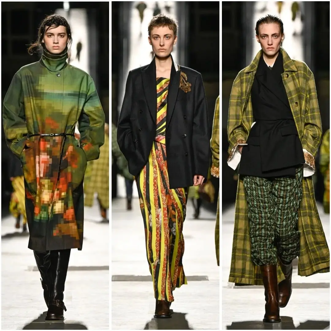
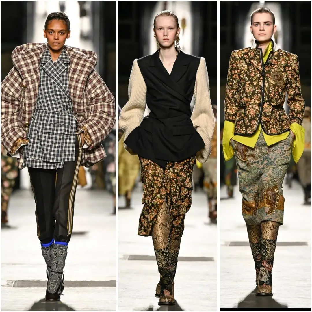
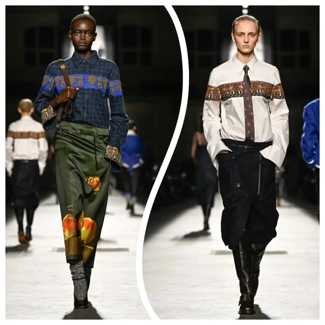
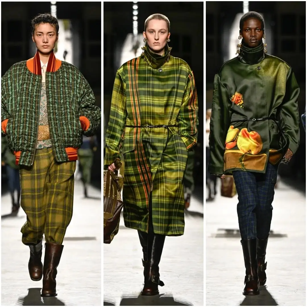
Plaid did the heaviest lifting in this part of the show. It is the fabric most associated with school uniforms the world over, and Klausner leaned into that association rather than away from it, using it across sleeveless dresses finished with high ruffle collars, padded coats and a run of trousers. The plaid pieces avoided the trap of reading as costume by pairing that most literal of schoolyard fabrics with silhouettes that had nothing childish about them, structured coats, fitted dresses, tailored trousers with real weight to the fabric.
The palette moved with the same logic. Early looks stayed close to a fairly conventional schoolwear range, navy, forest green, burgundy, before opening out into brighter combinations as the show went on, acid yellow against faded denim, a sharp orange plaid set against a muted olive coat. That widening color range tracked the show’s own internal argument, moving from the enforced sameness of a dress code toward the individual choices a student eventually makes once the uniform rules loosen. Footwear stayed comparatively shh by the label’s usual standards, chunky lace up shoes and knee socks doing the work of keeping the schoolyard reference legible even once the tailoring got more ambitious above the ankle.
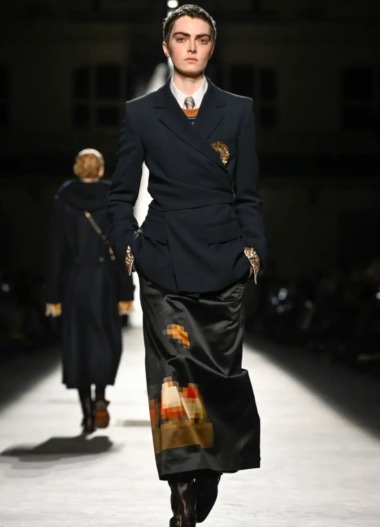
Dries Van Noten runway look featuring a structured navy wrap blazer over a white shirt and tie, paired with a black satin midi skirt decorated with pixelated orange and brown motifs and tall leather boots.
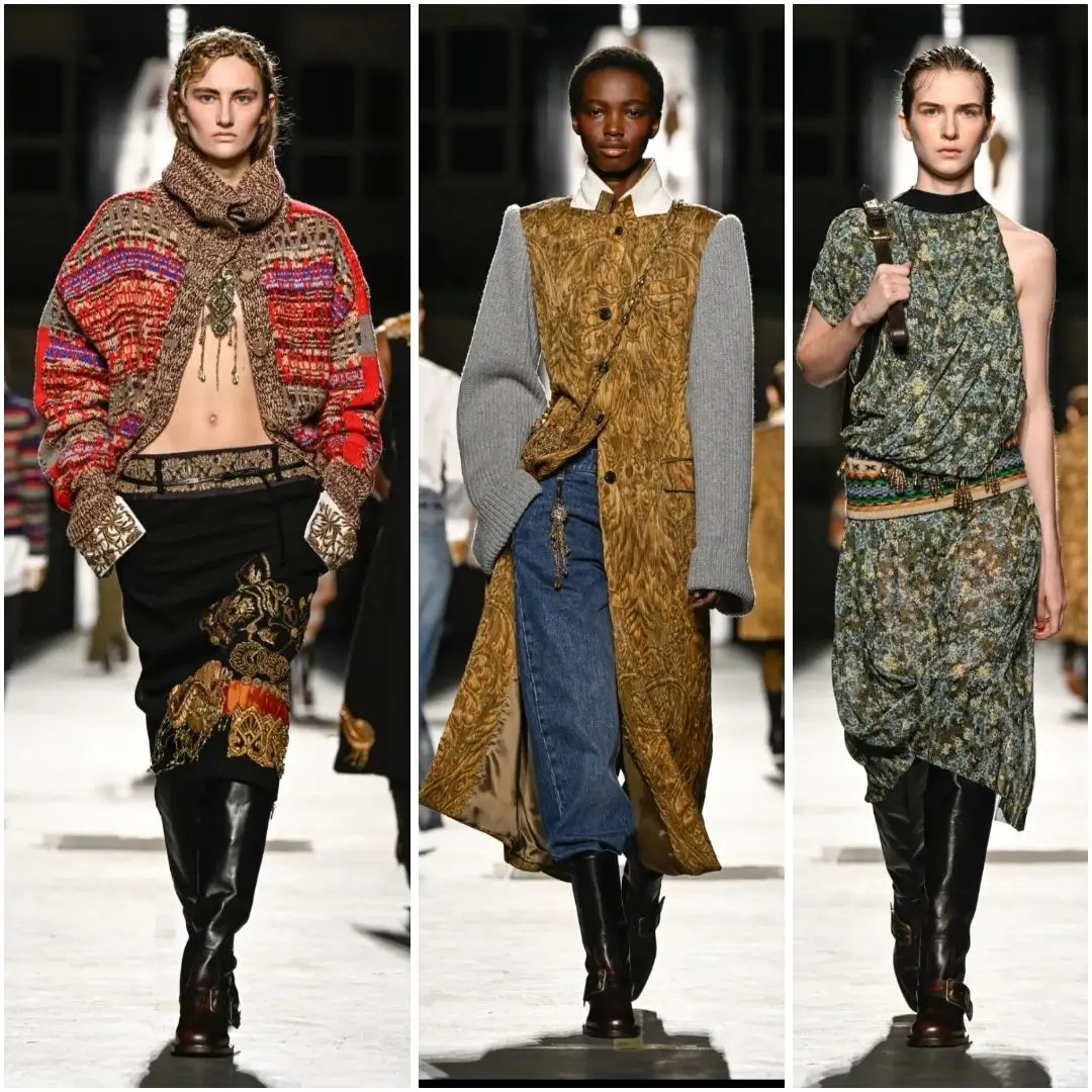
There was also a running interest in the specific ways teenagers try to break out of a uniform rather than simply wear it. Klausner worked colorful tapestry patches onto jackets and skirts, an obvious echo of the patches, pins and embroidery kids add to a blazer to make it their own, a small act of rebellion built into the garment rather than added after the fact. It is a detail that could have felt gimmicky in less careful hands, but it landed as one of the more thoughtful ideas in the show, a designer translating a genuinely observed teenage habit into couture level handwork rather than simply illustrating the idea of youth from a distance.
That instinct extended to accessories, where a handful of bags carried the same patched, layered treatment as the jackets above them, and to the way individual pieces were styled rather than simply presented. A blazer buttoned crookedly, a scarf tied too long, a collar left half undone under a jumper, these were small styling choices rather than construction details, but they mattered to the collection’s overall argument. Klausner was not proposing a tidy, market ready school uniform. He was proposing the version of it that exists five minutes after the final bell, already coming apart at the edges in ways that felt more honest than aspirational.
flow
The second reference point pulled the collection somewhere entirely different, back roughly four centuries to Antwerp, the city where Dries Van Noten himself trained and where the house remains based. Klausner has described Antwerp’s 16th and 17th century heyday as a kind of multicultural treasure box, a trading city where goods, patterns and ideas from across the world passed through and left their mark on the art being made there. Flemish still life painting, with its close, almost obsessive attention to fruit, flowers, birds and insects, became the collection’s second language, running alongside the schoolyard references rather than replacing them.
Two specific paintings from the 1680s anchored the print work: a still life of two peaches and a butterfly resting on a stone plinth, and a companion piece built around flowers and insects. Rather than reproducing those paintings as literal, framed prints, Klausner distorted them, working with pixelated fragments of the original images across the fronts of coats finished with stand up collars. The effect read less like a museum reproduction and more like a collage, magpie fragments of a painting rearranged into something new, which suited a collection already built around the idea of taking inherited codes and picking them apart.
The choice of subject matter was not incidental. Flemish still life painting of that period built its whole visual language around excess kept just barely in order, more fruit than a table could plausibly hold, more insects than a single flower would attract, arranged with a precision that made the abundance feel deliberate rather than chaotic. That is close to a description of Dries Van Noten’s own house language across four decades, and pulling directly from a 17th century source rather than a more familiar 20th century one gave the reference a weight that felt earned rather than decorative. Antwerp itself, the city both Klausner and the house’s founder trained and worked in, sat shh behind the whole idea, a trading port whose historical wealth and diversity Klausner has pointed to directly as the treasure box that shaped his thinking for the season.
View this post on Instagram
Gold pulled the two halves of the collection together more than any other single element. Klausner drew the color and the sense of ornament directly from the Flemish paintings and used it to build wide, shimmering embellished belts, worn over faded denim and long top coats in a combination that made an obviously luxurious detail feel almost accidental, as if it had been found rather than designed. That same gold edging turned up on jackets and on patchwork bustier tops, a schoolyard silhouette given a jeweled finish that pushed it firmly back into eveningwear territory.
Jewelry did further, shh work across the show, small gold pieces that read as costume treasure rather than fine jewelry, the kind of thing a teenager might dig up in a grandmother’s drawer and decide, correctly, was worth wearing to school despite the rules against it. Combined with the embellished belts and the tapestry patchwork, the gold running through the collection kept nudging the schoolyard references back toward something richer and stranger, a reminder that Klausner was never proposing an actual uniform, only borrowing its shape.
done
The most technically ambitious material in the show was gobeline, a jacquard weave that mimics the look of a hand woven tapestry, the kind of textile more commonly seen on a wall than a body. Klausner used it across a run of long coats, some finished with toggle fastenings and hoods that gave them a slightly monastic, oversize quality, and across gold edged jackets that brought the tapestry reference back in line with the collection’s schoolyard tailoring. The fabric turned up again in a coat, trouser and duffel style bag set built around a magnified rose pattern, an image blown up to a scale that made the flower read almost abstract rather than botanical, and in satin padded jackets with wide collars carrying a distinctly Japanese cut and proportion, a detail that fits a house whose fabric research has long ranged well beyond Europe.
Weaving a jacquard at the scale needed for a full length coat is not a fast or forgiving process. The pattern has to be programmed into the loom before a single length of usable fabric comes off it, and any change to scale or color midway through a season means starting the setup over. Choosing to build an entire closing sequence around that fabric, rather than saving it for one or two showpieces, was a statement about how much production time and cost Klausner and the house’s ateliers were willing to commit to a single, unifying idea. It paid off in the room. The gobeline pieces carried a density and a hand to them that the earlier plaid and jersey looks, deliberately, did not, and that shift in weight gave the show’s closing stretch the feeling of an ending rather than simply a final rack of looks.
By the time the show closed, the two reference points, a school hallway and a four hundred year old painting, had folded into each other rather than sitting side by side. A plaid dress with a Flemish inspired gold belt, or a baseball jacket rendered in tapestry weave, made the point better than any single look could have on its own: that a school uniform and an old master painting are both, in their own way, sys of order that a teenager, or a designer, eventual finds a way to push against. Klausner’s Fall 2026 collection for Dries Van Noten spent an hour doing exactly that, treating history and adolescence as two versions of the same restless impulse to dress against the rules while still working inside them.
Read Drift’s related feature, Dries Van Noten Spring Summer 2026 Runway Pieces.
Related Articles

Fragment and Mammut Bring the Barryvox Back in Glacier Blue
Hiroshi Fujiwara’s second Mammut avalanche beacon leaves the Barryvox S2’s rescue brain untouched and changes […]