Jack Pierson’s “I’m Sorry” (2011): A Meditation in Found Letters
DRIFT AUDIO
Listen to this story
Choose a voice, then press play.
the weight
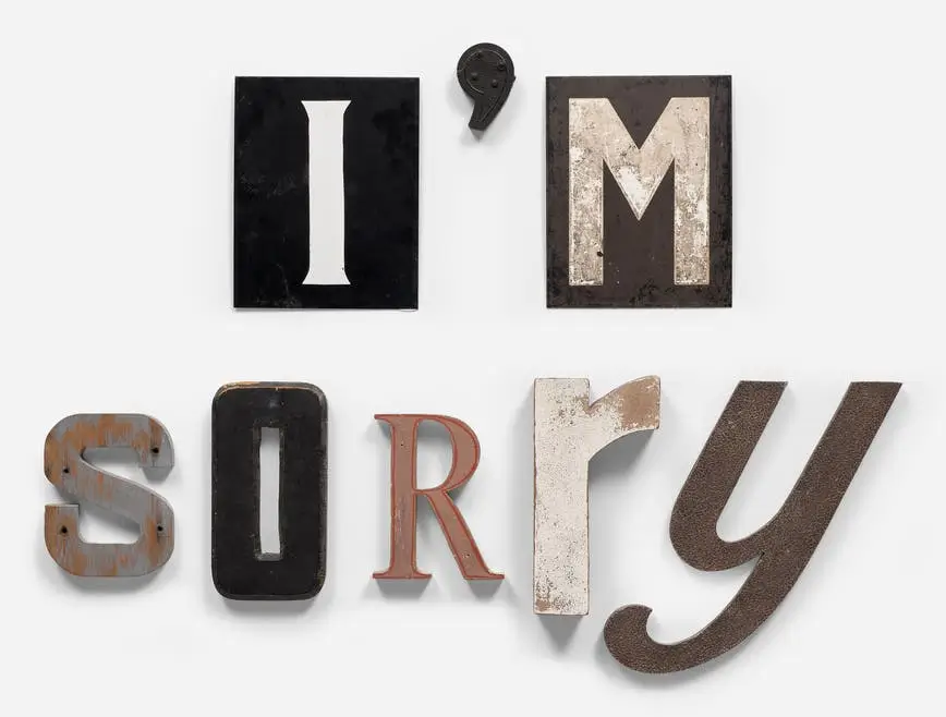
Jack Pierson’s “I’m Sorry” operates with the kind of emotional directness that contemporary art rarely allows itself anymore. The phrase is simple, almost painfully ordinary, yet the work refuses to stay ordinary because Pierson builds the apology out of fragments already abandoned by American culture itself.
Constructed in 2011 in 29 Palms, California, the sculpture assembles salvaged metal, wood, and plastic letters into a phrase that feels simultaneously intimate and public. The physicality matters. These are not pristine fabricated characters. They are weathered remnants of signage once designed to advertise, persuade, illuminate, or seduce. Their chipped paint, dents, oxidized surfaces, and mismatched typography carry the exhaustion of former lives. Pierson does not erase that history; he preserves it, allowing the apology itself to appear worn down by time.
decay
That tension between language and material has always been central to Pierson’s practice. Emerging from the Boston School generation alongside artists such as Nan Goldin and Mark Morrisroe, Pierson developed a view vocabulary rooted in longing, glamour, disappearance, and emotional residue. His word sculptures, first begun in the early 1990s, transformed discarded commercial lettering into emotionally loaded statements. In “I’m Sorry,” the phrase becomes less a sentence than an atmosphere.
The sculpture’s scale intensifies that feeling. At roughly 28 by 37 inches, it avoids monumentality. It does not dominate the viewer like a billboard. Instead, it approaches the body conversationally, almost vulnerably. The apology feels close enough to whisper. Pierson understands that intimacy often becomes more powerful when stripped of spectacle. The modest dimensions force attention onto texture, spacing, and emotional cadence rather than sheer view.
assemble
What makes the work especially affecting is the contradiction embedded inside its typography. Many of the salvaged letters likely originated from mid-century commercial signage — theaters, diners, motels, roadside Americana. Those original contexts were built around aspiration and view. Signs once promised entertainment, comfort, glamour, excitement, or escape. Pierson repurposes those same viewable languages into an admission of failure or regret. The result is melancholic but never cynical.
The desert context of 29 Palms deepens that atmosphere considerably. The town’s stark geography — expanses of emptiness, military presence, heat, faded architecture, roadside isolation — aligns uniquely with Pierson’s recurring fascination with the exhausted edges of American mythology. The sculpture feels shaped by that environment. It carries the dryness of abandoned motels and forgotten highways, where language survives longer than intention.
flow
There is also an unresolved quality to the phrase itself. Pierson never specifies who is apologizing or why. That ambiguity allows the work to remain emotionally open. One viewer may read romantic remorse. Another may see societal collapse, cultural exhaustion, or even an artist apologizing for participating in systems of glamour and illusion. The sculpture becomes a vessel for projection precisely because the statement is so universally recognizable.
The material discord among the letters strengthens that emotional fragmentation. No character truly belongs beside the others, yet together they form coherence. Different eras, fonts, textures, and weights collide into a single sentence. Pierson turns typographic inconsistency into emotional realism. Regret rarely arrives cleanly or symmetrically.
impression
Within the broader trajectory of Pierson’s work, “I’m Sorry” feels especially distilled. Many of his sculptures explore desire, fame, beauty, and collapse through similarly salvaged language, but this piece removes performative excess. There is no grandeur in the phrase. Only admission. That restraint gives the work unusual gravity.
The sculpture also exists within a larger lineage of artists who transformed found material into emotional archaeology. One can trace echoes of Robert Rauschenberg’s combines, Kurt Schwitters’ assemblages, or even conceptual text practices associated with Jenny Holzer and Lawrence Weiner. Yet Pierson diverges from colder conceptual traditions through sentiment. His work never abandons feeling. The romance remains intact, even when filtered through decay.
Related Articles
Joël Andrianomearisoa Finds More Than One Black in a Square of Buttons
In La Guerre des Boutons I, a field of ordinary fasteners turns a modest textile […]