Uplnd Presents: Ramverk Backpack 21L — A Framework for Intentional Carry
April 24, 2026
It started with a whisper—not a campaign, not a celebrity sighting, not a viral TikTok, but a question passed from designer to developer, architect to editor, across Berlin, Tokyo, Brooklyn: “Where’d you get that bag?”
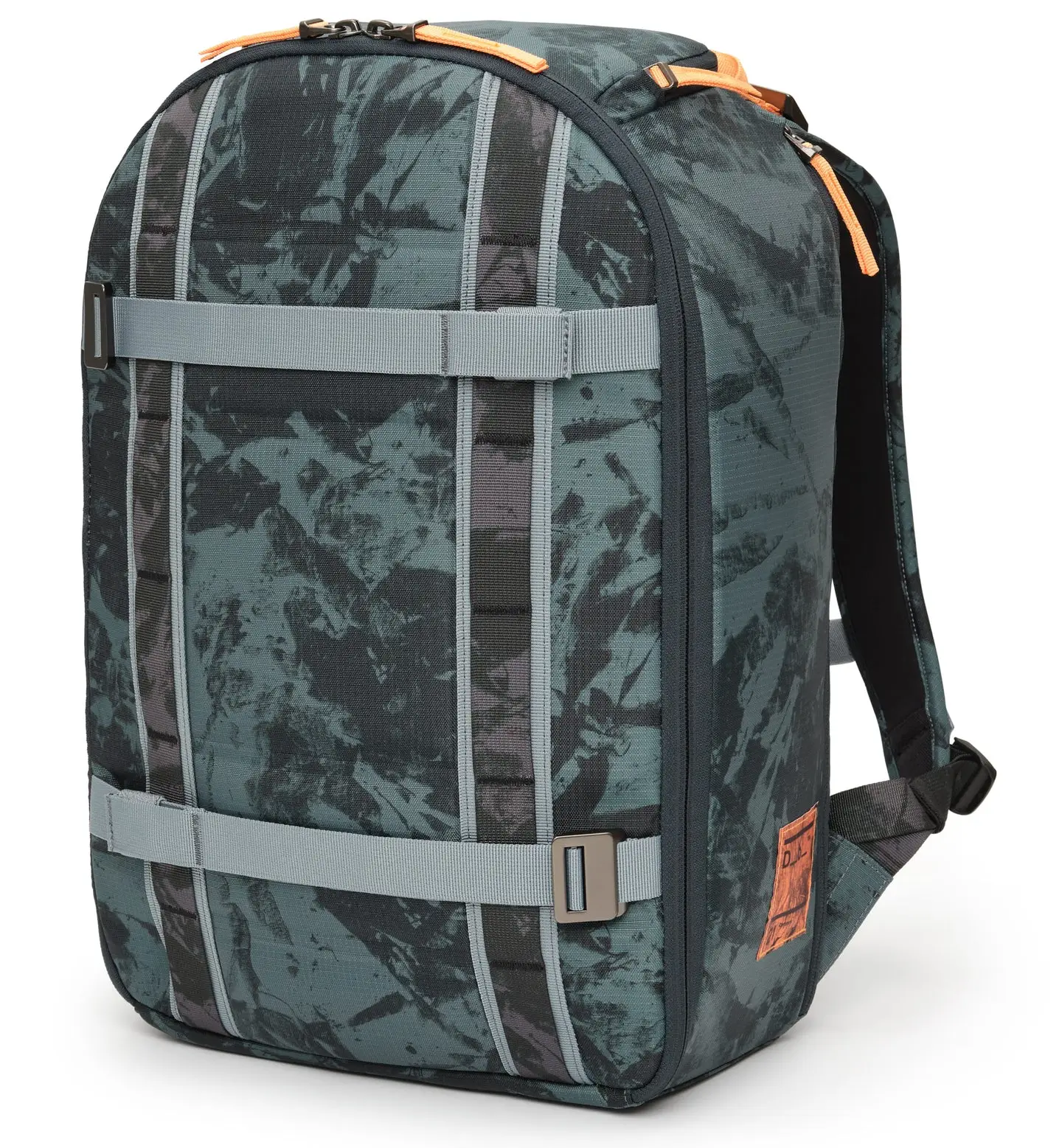
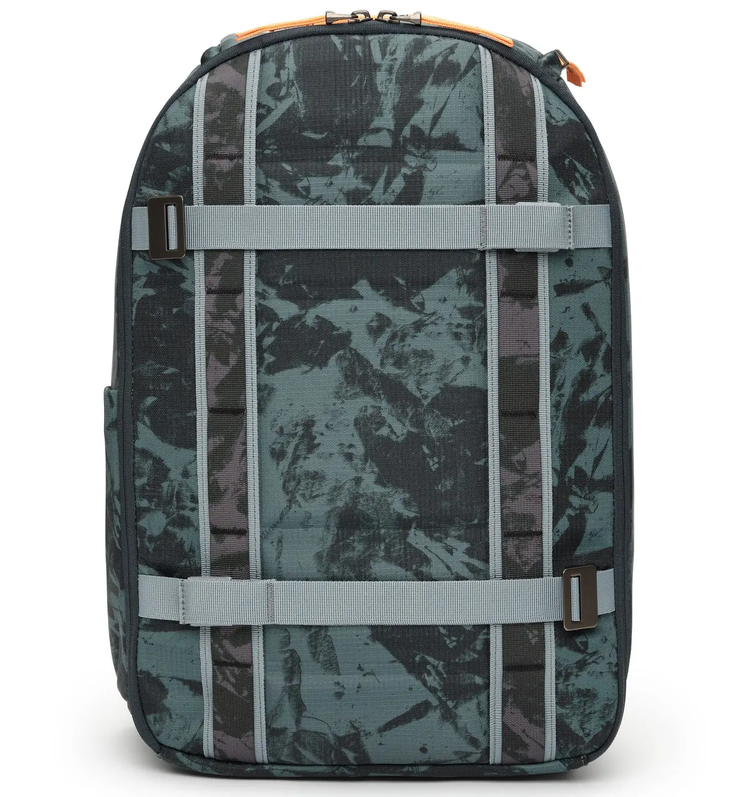
No logo. No hype. No waiting list. Just a sleek, charcoal-gray backpack that looked like it had been designed by someone who actually used it. Its name: Ramverk 21L—a Swedish word for “framework.” Not “backpack,” not “rucksack,” not “urban carry solution.” Framework. And in a year when fashion is drowning in logos, drops, and digital flexing, that kind of quiet precision reads less like restraint and more like rebellion.
The Ramverk 21L isn’t just a bag; it’s a quiet rejection of everything we’ve been told to want. No influencer collabs, no limited editions, no app integrations, no QR codes to “unlock” anything. Just a 21-liter system, built to last, sold directly, and slowly building a following among people who move through cities with intent. After six weeks of testing—rain, rush hour, conversations with users—the conclusion isn’t just that it works. It’s that it signals a shift. A recalibration of what we expect from the objects we carry, and by extension, how we choose to move through space.
View this post on Instagram
stir
For decades, the “it bag” operated as a status object—Chanel, Hermès, Prada, Goyard—designed to be seen, priced to be recognized, circulated to signal belonging. It was less about utility and more about view, a shorthand for access and aspiration. But that model is fraying. The cycle of release, hype, saturation, and obsolescence has accelerated to the point of fatigue.
In 2026, status is no longer about what you carry, but why you carry it. Increasingly, the answer isn’t sawn—it’s function. The Ramverk 21L embodies that shift: minimal, structurally deliberate, limited to three colors and one size, built around a single promise—it will work, every day.
What once read as absence—no logo, no distinction—now reads as control. A refusal to participate in the economy of constant signaling. A decision to opt out, quietly.
flow
The 21-liter capacity isn’t arbitrary; it’s a threshold. Too small sacrifices utility, too large invites excess. At 21L, the bag enforces a kind of daily editing: a 15-inch laptop, a tablet, a notebook, a light jacket, a water bottle—essentials only. Nothing else.
This constraint isn’t limiting—it’s corrective. It reshapes behavior. Where larger bags become repositories for accumulation—unused cables, expired cards, objects carried out of habit rather than need—the Ramverk 21L resists that drift. It introduces friction at the point of excess, forcing decisions before the day even begins.
Subtraction becomes the feature. Not as aesthetic minimalism, but as operational clarity. The result is not just a lighter bag, but a more intentional one—where every item has a role, and nothing is carried without reason.
shape
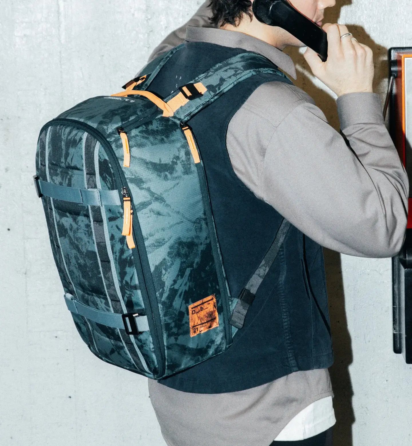
The Ramverk wasn’t designed for the feed—it was designed for the real conditions of movement: rain-soaked commutes, crowded subways, bike rides, last-minute meetings, carry-on-only travel. It operates in environments where reliability matters more than perception.
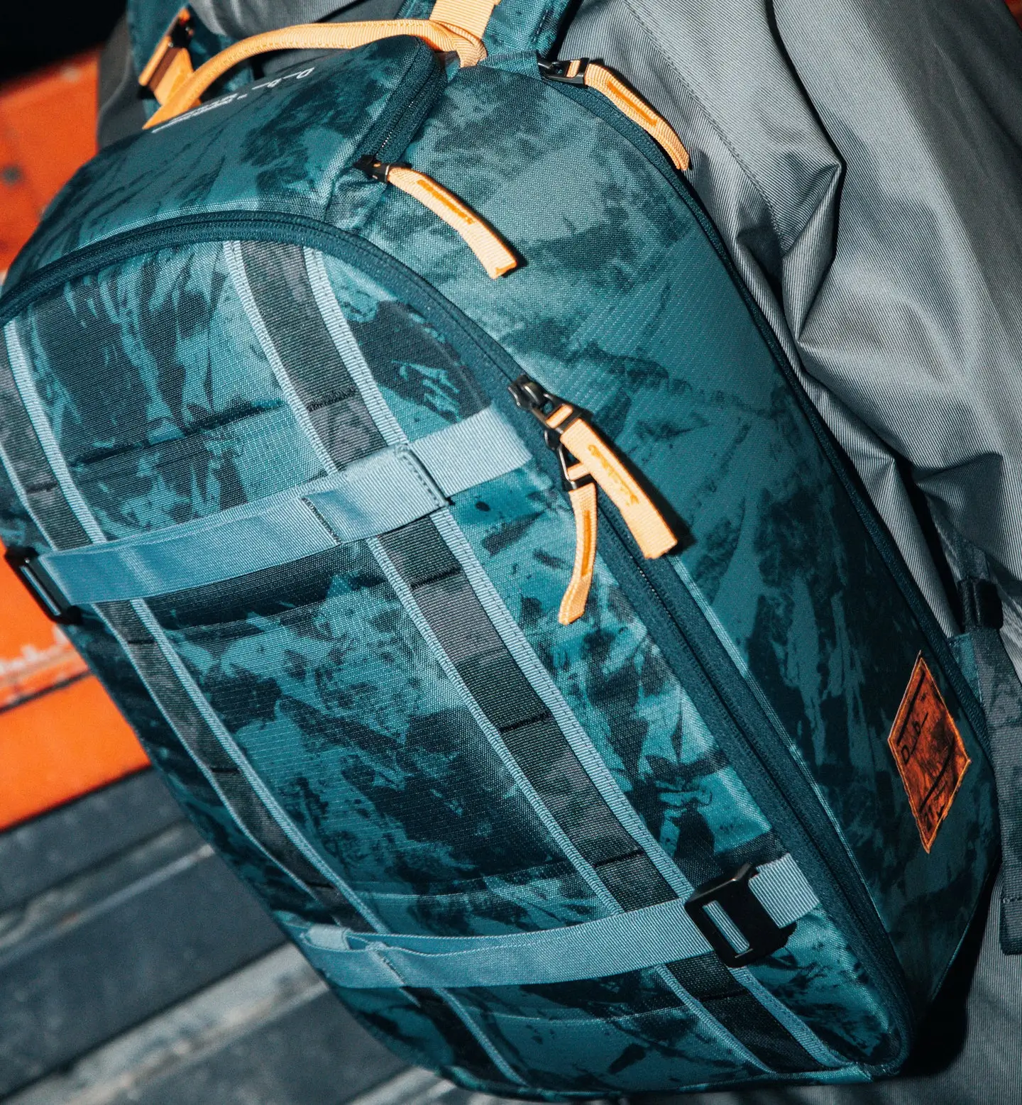
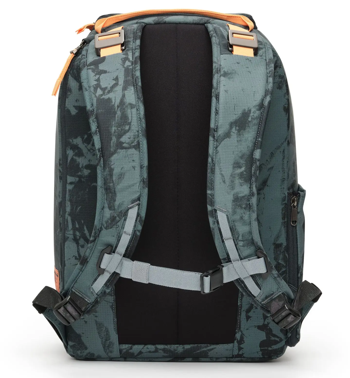
The materials reflect that orientation. High-tenacity recycled nylon resists abrasion and sheds water without performance theatrics. YKK reverse-coil zippers move cleanly, without snag or resistance. A structured back panel maintains form over long wear, preventing collapse and discomfort. An integrated rain cover, concealed at the base, deploys quickly when conditions shift.
In the city, a bag is not just a container—it’s exposure. The Ramverk answers quietly: hidden RFID-blocking storage protects against digital skimming; lockable zippers add a layer of physical security; tuck-away straps transform the silhouette when needed; a luggage pass-through integrates travel without interruption; internal cable routing reduces friction between devices.
Nothing here is speculative. Nothing is designed to impress at first glance. The intelligence reveals itself over time, through use.
extend
The most radical aspect isn’t the design—it’s the lifespan. The Ramverk 21L is built to last, and more importantly, built to be repaired. A lifetime warranty on manufacturing defects, paired with a repair program for wear, reframes the relationship between user and object.
A broken strap is replaced, not discarded. A failed zipper is fixed, not worked around. A torn seam is restored, not ignored. The logic is simple, almost obvious—and yet, in a market structured around planned obsolescence, it feels unfamiliar.
This is not sustainability as messaging. It is a sustain as structure. A system that assumes longevity rather than replacement, continuity rather than churn. And in doing so, it restores a kind of trust—between product and user, between design and time.
fin
The people carrying it reflect the shift—not influencers or hype-driven consumers, but architects, developers, writers, students, travelers—individuals who prioritize movement over display. The bag doesn’t announce itself; it integrates. It becomes part of a system rather than a statement within one.
It also exists within a broader movement—one that values durability, restraint, and clarity over novelty. Brands are beginning to step away from acceleration and toward permanence, from cycles to systems. The Ramverk 21L sits comfortably within that shift, not as a leader, but as a clear example.
And maybe that’s why it resonates now. Because the fatigue is real—of clutter, of noise, of objects that fail too quickly and demand replacement too often. What’s emerging in response isn’t minimalism as view language, but minimalism as function. Less, not for the sake of aesthetics, but for the sake of performance.
The Ramverk 21L isn’t rare. It isn’t positioned as luxury in the traditional sense. But it is correct. And in a landscape increasingly defined by excess, correctness becomes its own form of haute.
Related Articles
Stussy x Our Legacy VOL. 10: Handmade Reworked Treasures Drop Today, Blending LA Edge with Stockholm
recall The Evolution of a Transatlantic Partnership Dissecting the Collection: Standout Pieces and Craft Details […]