DRIFT AUDIO
Listen to this story
Choose a voice, then press play.
In June 2025, Ronald McDonald House Charities quietly announced one of the most overdue view identity refreshes in the nonprofit sector. By October, chapters worldwide began rolling out the new brand: a simplified name—Ronald McDonald House—and a warmer, more contemporary logo that retains the emotional core of the original while shedding decades of dated design. For an organization synonymous with McDonald’s golden arches yet striving for independent impact, this change feels less like cosmetic surgery and more like a long-overdue deep breath.
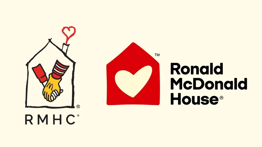
The old logo, largely unchanged since the 1970s, featured a simple black-outlined house with a red heart emerging from the chimney. It was charming in a hand-drawn, childlike way—friendly and approachable, but increasingly stuck in time. In an era of sleek tech nonprofit aesthetics (think modern sans-serifs and min icons from organizations like St. Jude or Make-A-Wish), it risked looking quaint rather than compelling, especially to younger donors.
View this post on Instagram
stir
The refresh, led by Interbrand, delivers a thoughtful evolution rather than a radical reinvention. The new symbol keeps the house motif but renders it in a bolder, more inviting red with a clean white hand-drawn heart at its center—symbolizing families at the heart of care. The typography shifts to a custom font family called “Audrey,” named after founder Dr. Audrey Evans, offering a softer, more human touch while maintaining professionalism.
The tincture palette expands dramatically: McDonald’s signature red and gold remain for continuity, but they’re joined by soft white, lavender, aqua, and lime—creating a vibrant yet soothing spectrum that feels optimistic and healing rather than purely commercial. New icons, expressive shapes, and refined photography guidelines round out the system, making the brand feel dynamic across digital platforms, merchandise, and facility signage.
This isn’t just about looking prettier. It’s strategic. Ronald McDonald House aims to double the number of families it serves by 2030. That ambitious goal requires broader appeal, particularly to millennial and Gen Z donors who prioritize transparency, emotional connection, and brands that feel authentic rather than corporate-adjacent. The old identity, while beloved by longtime supporters, carried too much view baggage from its fast-food origins. The redesign creates healthy distance while honoring the McDonald’s partnership that made the network possible.
flow
Ronald McDonald House has always been about more than lodging. Since the first House opened in 1974 near Philadelphia’s Children’s Hospital, the organization has provided free or low-cost housing, meals, and support to families with seriously ill children receiving treatment far from home. Today, it operates over 400 Houses and Family Rooms in more than 60 countries, serving hundreds of thousands of families annually.
The “Family Stays” platform accompanying the rebrand emphasizes this core promise: keeping families together during medical crises so they can focus on healing rather than logistics. Research consistently shows that family proximity improves patient outcomes—reducing stress, enhancing compliance with treatment, and supporting emotional well-being. The new brand identity view reinforces this message of warmth, stability, and hope.
weigh
Critics of charity rebrands often worry about wasted donor dollars on superficial changes. In this case, the investment appears justified. The previous logo had served admirably for half a century, but view fatigue is real. Nonprofit branding experts note that organizations updating every 15–25 years tend to see improved engagement, especially digitally.
The redesign maintains strong continuity: the house-and-heart combination remains instantly recognizable. It simply feels more polished and scalable. This evolution mirrors successful refreshes by other mission-driven groups that modernized without alienating core supporters—think the American Red Cross or UNICEF’s periodic identity tweaks.
Importantly, the McDonald’s connection stays intact. The company remains the charity’s primary corporate partner and “charity of choice,” contributing significantly through customer donations, sponsorships, and employee volunteering. The new look actually strengthens this relationship by presenting a more professional, independent-facing partner organization.
philanth
Early indicators from chapters that adopted the brand first are positive. Merchandise featuring the new logo has sold well, and digital campaigns show improved engagement metrics. Younger audiences, in particular, respond better to the warmer tincture palette and human-centric photography that focuses on real families rather than generic stock imagery.
The rebrand also addresses a subtle but persistent challenge: public confusion about the organization’s independence. While deeply intertwined with McDonald’s, Ronald McDonald House operates as a separate nonprofit with its own governance. A fresher identity helps clarify this distinction, potentially opening doors to new corporate and foundation partners who might have previously viewed it as too closely tied to one brand.
fin
As rollout continues through 2027, the full impression will become clearer. The organization faces real challenges: rising operational costs, varying healthcare systems globally, and the need for sustained funding growth to meet expansion targets. A stronger brand is only one piece of the puzzle—but an important one in attracting the next generation of donors, volunteers, and advocates.
The redesign succeeds precisely because it doesn’t try too hard. It honors the childlike wonder and comfort that defined the original while presenting a more mature, inclusive face to the world. In a crowded philanthropic landscape where attention spans are short and competition for charitable dollars is fierce, clarity and emotional resonance win.
For an organization born from a clown mascot and fast-food roots, evolving into “Ronald McDonald House” with a logo that finally feels contemporary is more than cosmetic. It signals confidence in its mission and readiness for the next 50 years of keeping families close when it matters most.
The McDonald’s charity logo didn’t just need a redesign—it needed this one. Warm, hopeful, and human, it perfectly captures the heart of what has always made Ronald McDonald House special: the simple but profound idea that no family should face a child’s serious illness alone.
Related Articles

Garage Italia’s Electric Spiaggina Puts the Fiat 500’s Riviera Years on Battery Power
Ten kilowatts, rattan seats and a €85,000 starting price: Garage Italia's 500 Spiaggina rebuilds Ghia's 1958 beach car for the yacht crowd.