DRIFT AUDIO
Listen to this story
Choose a voice, then press play.
Nine reissues, one MoMA curator’s read on nostalgia, and the decade Italian design keeps returning to for answers.
Walk through almost any Milan showroom this year and the same decade kept turning up under different names. Not the 1950s, whose optimism has been picked over for a gen, and not the 1960s, whose plastics and pop tincture have their own well establish resale market. It was the 1970s, a period Italian design has historic treat with more suspicion than affection, that supplied the raw material for a wave of new reissues in 2026. Furniture houses, light brands and even a bathroom fitting company all went back to the same decade this year, and the pattern was consistent enough that it stopped looking like coincidence.
Visualizza questo post su Instagram
stir
The decade’s reputation was largely shaped by a single exhibition. In 1972, the Museum of Modern Art staged “Italy: The New Domestic Landscape,” a show that took stock of the design explosion that follow Italy’s postwar industrial boom, right as that momentum started to curdle into something more uneasy. Paola Antonelli, MoMA’s senior curator of architecture and design, has pointed to that unease as the throughline connecting the decade to now. Italian design, she has argued, was already excellent by the 1970s, but this era carried an undertone of anxiety that the 1950s and 1960s didn’t share, a byproduct of the political and social turbulence running through the country at the time.
That anxious streak is part of what makes the decade feel legible again today. Antonelli has described the period as one shaped by a culture genuinely worried about the future of society, and there’s an obvious resonance in bringing those objects back at a moment defined by its own uncertainty. Nostalgia, in this reading, isn’t just an aesthetic reflex. It’s a way of reaching for design that already knew how to hold anxiety and ambition at the same time. Antonelli has also pointed out that the era’s real innovation went beyond how things looked. Designers were folding individual objects into a larger idea of domestic life itself, treating a chair or a tap as part of an entire ecosystem rather than a standalone product, a shift she has called a moment of real fervour concerned less with products than with new ways of living.
That frame matters because it separates this year’s activity from a simple retro trend. A trend implies surface, a look borrowed because it photographs well against a certain kind of interior. What happened across Milan Design Week and the wider product calendar in 2026 looked more like a set of brands indie decide that the underlying ideas from fifty years ago were still unresolve, and worth finish. Some reissues came wrapped in explicit anniversary frame, others surface almost shh, folded into a brand’s regular new season announce as if they had never really left. Either way, the throughline held: these were not costume pieces borrow for a moment, but function object being ask to do their original job again, in rooms that look nothing like the ones they were designed for.
flow
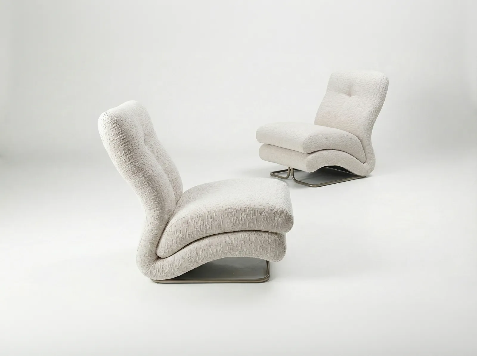
Among the pieces to resurface this year, the Cigno chair by Vittorio Varo made one of the more pointed reappearances. Originally designed in the early 1970s for IPE, the company that would later become Visionnaire‘s parent, Cigno was brought back into circulation as part of Deja Vu, a listening room curated by Marco Morandini during Milan Design Week 2026 built specifically around the decade’s cultural mood, pairing period furniture with music from the same years.
View this post on Instagram
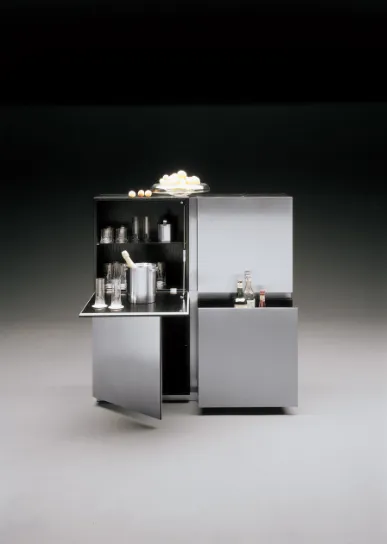
Storage got its own moment through Acerbis‘ Parioli cabinet, a 1971 design by company founder Lodovico Acerbis that treats a piece of casegoods almost like a small building. A wooden frame in ash or walnut sits behind satin stainless steel doors, and it’s the geometry of those doors, rigorous but not static, that gives the cabinet its architectural presence rather than anything happening at the level of the wood itself. Where a lot of 1970s storage furniture leaned on ornament, Parioli got its character from restraint, which may be exactly why it reads as current rather than dated nearly five decades on.
Neither piece needed much reworking to justify its return. That’s a detail worth sitting with, because it says something about how differently these two objects were engineered compared with a lot of what passed for cutting edge furniture in the decade that followed. Cigno and Parioli were both designed to solve a problem, seating that could hold a body comfortably through long conversations, storage that could organize a room without dominating it, rather than to make a statement that would need updating once the statement went out of fashion. Their reissues lean on that original restraint instead of fighting it.
a show
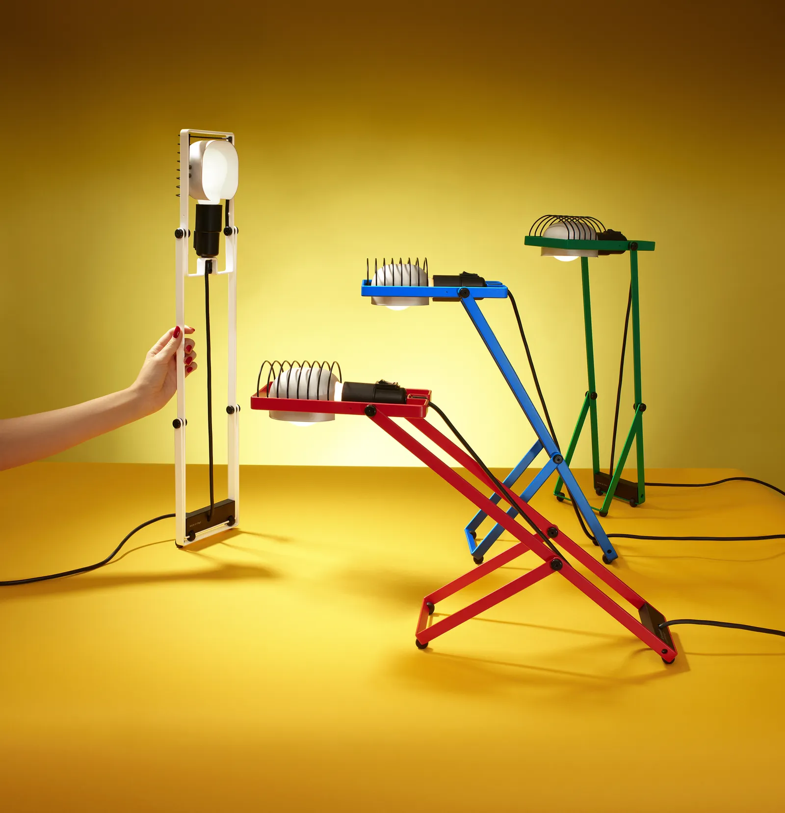
Lighting supplied two of the year’s more significant returns, both from Artemide. Sintesi was the first lamp designed by company founder Ernesto Gismondi himself, and it strips lighting design down to almost nothing: a small number of essential components, arranged so that two intersecting profiles create a standing fixture, with a wall mounted version built on the same underlying system. Gismondi has described landing on that kind of reduction as something close to alchemy, a magic formula that isn’t guaranteed to reveal itself no matter how hard a designer looks for it.
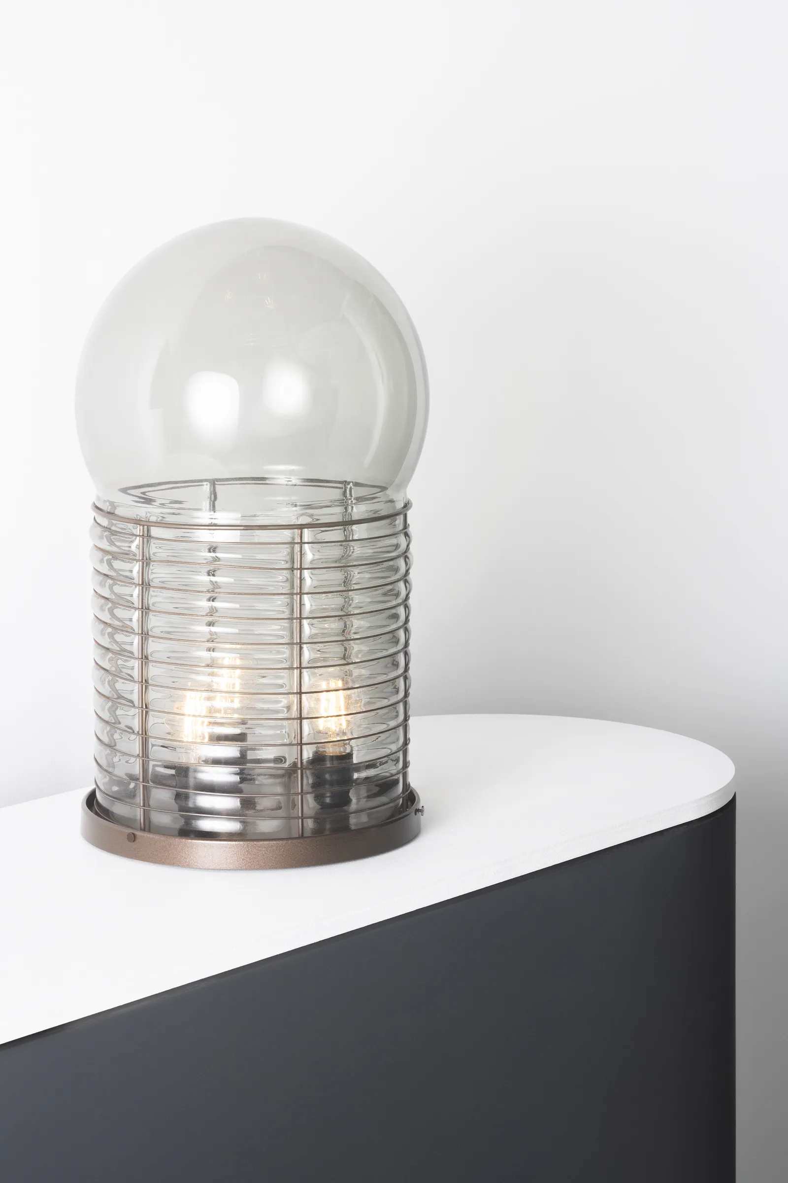
The second Artemide piece came from a different sensibility entirely. Alcinoo, designed by Gae Aulenti in 1975, pairs a mouth blown glass sphere with a metal cylinder base, letting an artisanal object sit directly on top of an industrial one rather than disguising the seam between them. Gismondi has recalled Aulenti as a difficult but ultimately right collaborator on the piece, someone whose strong opinions turned out to be justified the moment the lamp was switched on and the light diffused through the glass in what he described as tiny traces filling the room. Aulenti’s broader career, which stretched from furniture and lighting into major museum architecture, gave her a particular authority when it came to designing objects meant to hold and shape light rather than simply emit it.
Placing Sintesi and Alcinoo side by side this year made an argument Artemide didn’t necessarily need to spell out. One lamp is pure engineering logic, its form generated almost entirely by the intersection of two profiles. The other starts from a craft object, a hand blown glass sphere, and lets industrial materials build a frame around it. Both approaches came out of the same design department in the same decade, and both still hold up as distinct, coherent ideas rather than as two versions of the same trend. That range is arguably the clearest evidence that the 1970s in Italian light design wasn’t operating from a single playbook.
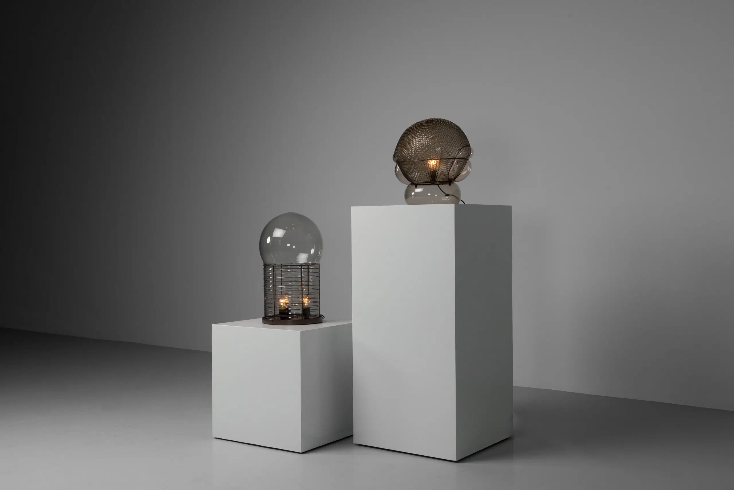
Sculpture Glass And Metal Lamps Displayed On White Pedestals In A Minimal Gray Interior
anniv
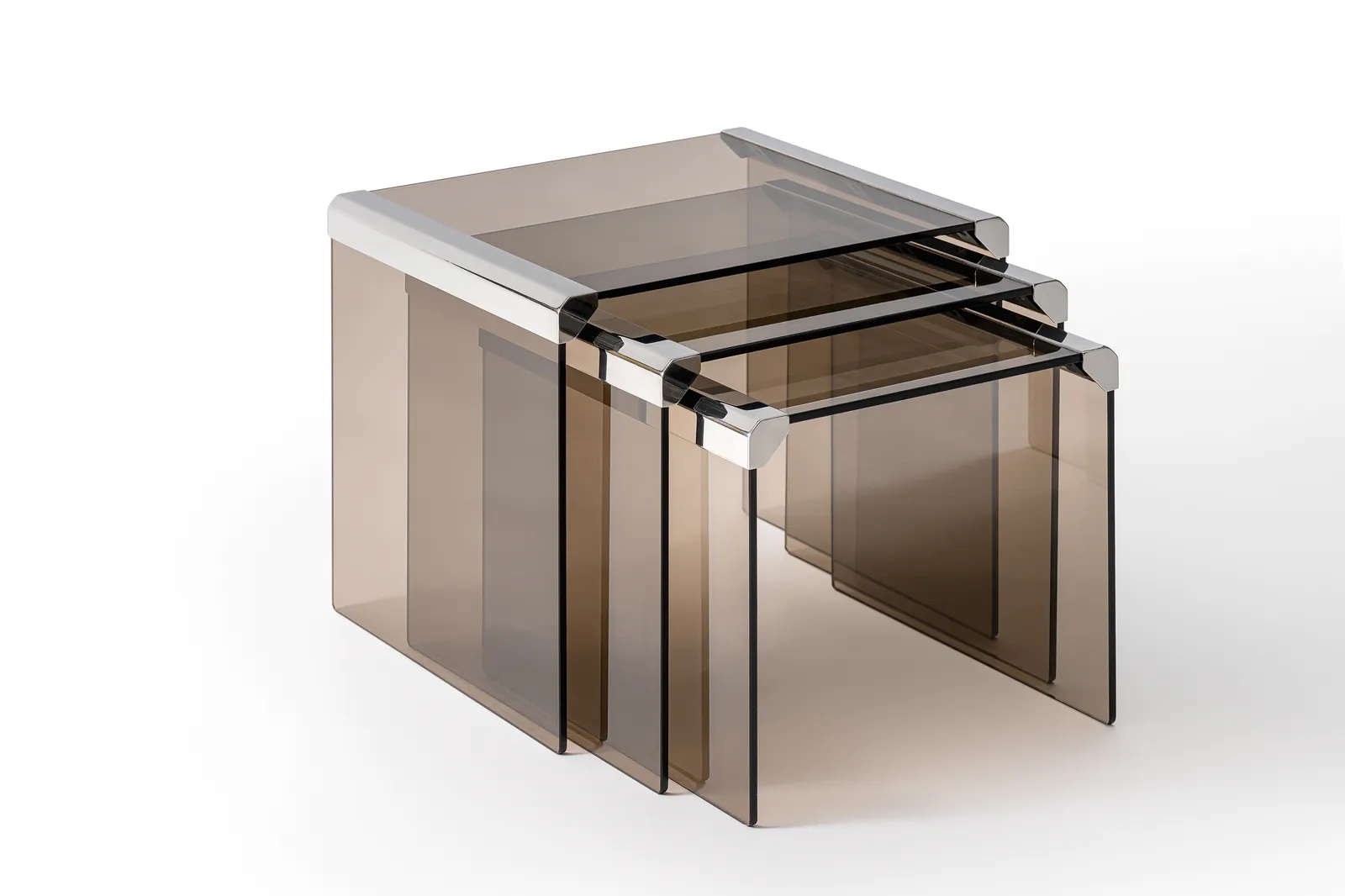
Gallotti e Radice marked its 70th anniversary at Milan Design Week this year, and the milestone gave the brand a reason to revisit the technical breakthrough that defined its own 1970s. In 1975, the company developed a way of joining panes of glass with a simple stainless steel connector, a method that made larger and more structurally ambitious glass furniture possible for the first time. The T35 Trio, a three part coffee table set designed that same year by Pierangelo Gallotti, put that joint to direct use, and the anniversary edition reworks it in bronze tinted tempered glass paired with brushed silver travertine. What reads as a fairly restrained coffee table today was, in its original context, closer to a proof of concept, evidence that Italian glassmaking could be pushed into new structural territory rather than staying decorative.
saw
Two of the year’s reissues leaned into the decade’s more play register. Codiceicona‘s reissue of Cini Boeri’s Papero, first conceived in 1971, takes its name and sil from a duck, built from two impact resistant opal polystyrene shells connected by a chrome plated steel plate finished with a black PVC profile. Boeri’s own reputation rested largely on rigorous, functionally driven design, which makes Papero’s whimsy feel like a deliberate exception rather than a departure from form, proof that even the decade’s more serious designers allowed themselves a joke.
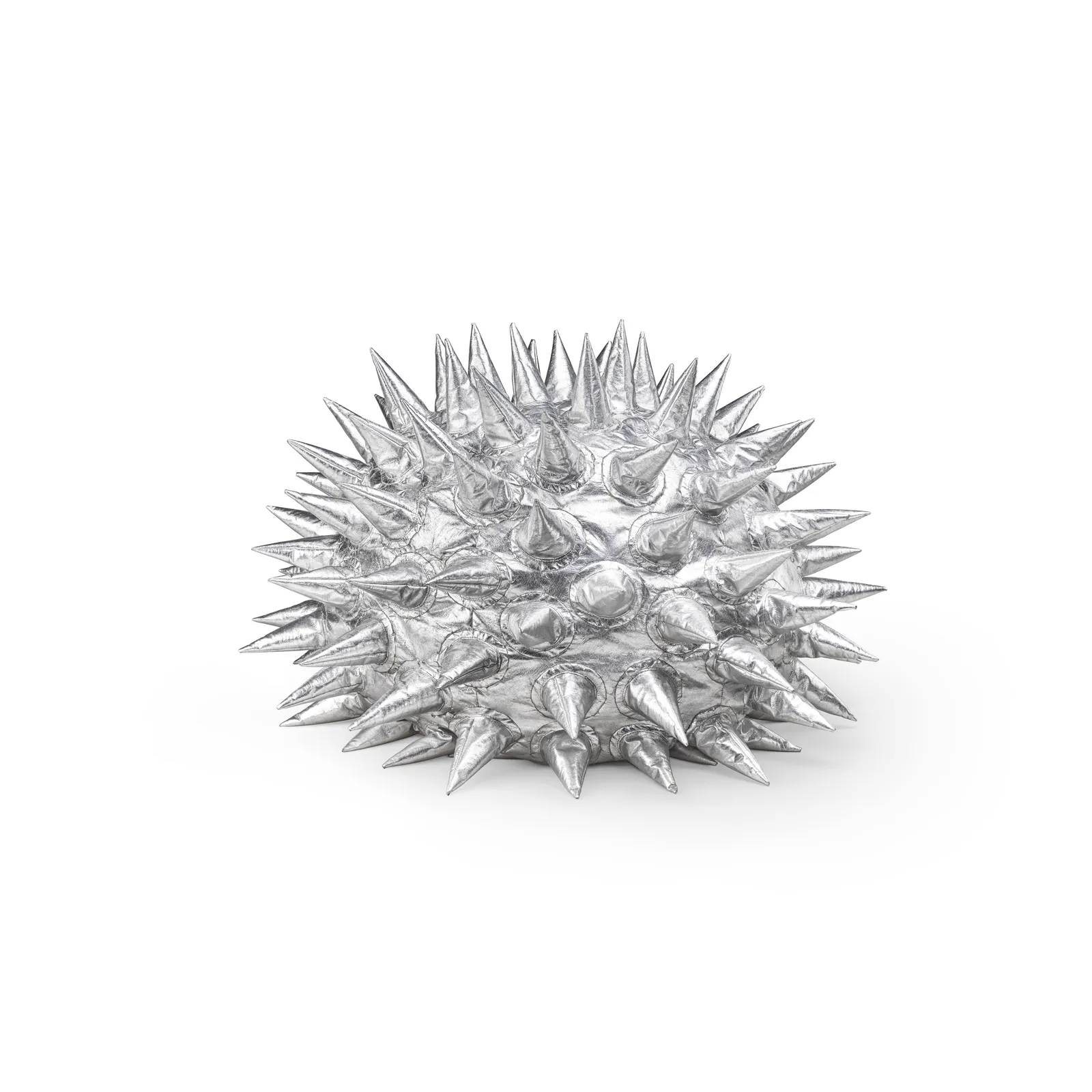
Gufram‘s Fachiro, designed by Marzio Cecchi in 1975, sits at the more theatrical end of that same spectrum. The armchair looks aggressive at first glance, its silhouette spiked and sculptural, but the soft leather construction makes it genuinely comfortable to sit in, a contradiction that was reportedly informed by two very different influences in Cecchi’s own life: his mother’s work as a couturier and his ongoing interest in how natural forms could be translated into furniture. Gufram has spent decades cultivating a reputation for objects that refuse to behave like conventional furniture, and Fachiro’s reissue slots neatly into that lineage.
View this post on Instagram
fin
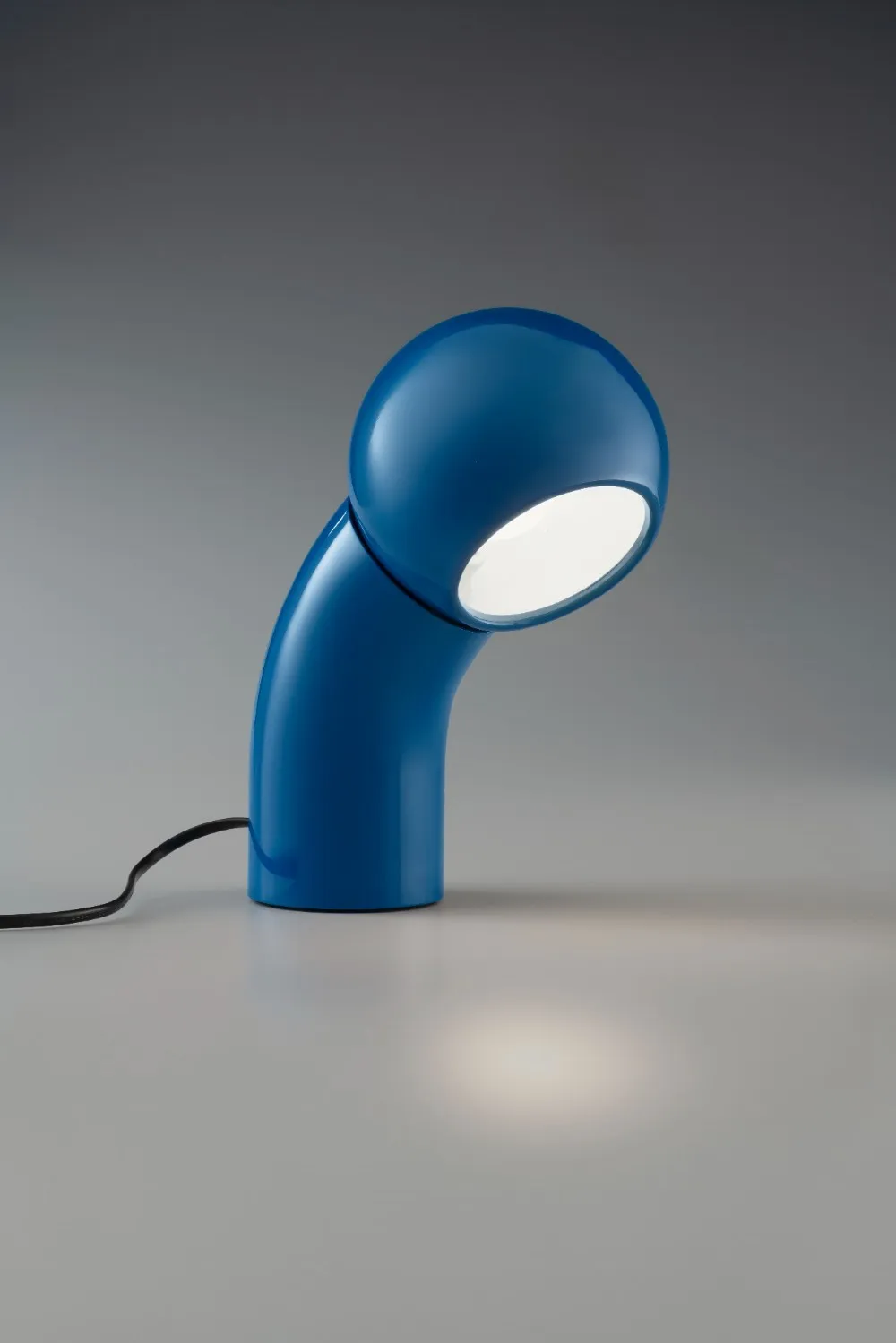
Martinelli Luce brought back Pallino, a 1970s lamp by company founder Elio Martinelli that its own designer once called a curious lamp, its rounded form suggesting something closer to a character peering into a room than a fixture. Emiliana Martinelli, the company’s current president, has described the reissue as a way of returning a specific kind of formal lightness and chromatic boldness to contemporary homes, framing Pallino less as a retro object and more as a piece with a story that keeps evolving alongside the people who own it.
The most conceptually loaded reissue of the year, though, may be the smallest. Joe Colombo‘s bathroom taps, brought back into production by fittings brand Mamoli, come out of a design philosophy that treated every object in a house as equipment integrated into livable space rather than decoration applied on top of it. Colombo’s Total Furnishing Unit, first shown at the same 1972 MoMA exhibition that framed the whole decade, argued that even something as utilitarian as a tap deserved to be considered part of the domestic experience itself, not an afterthought bolted onto a bathroom. Mamoli’s version updates the design only slightly for modern plumbing standards, which is precisely the point: the original idea needed almost no correction to still make sense.
Taken together, the nine pieces sketch a decade that was never as anxious or unresolved as its reputation suggests, at least not in the objects it left behind. What connects a listening room chair, a storage cabinet, four lamps, a coffee table and a bathroom tap is a shared conviction that design could hold both function and feeling without apologizing for either. Fifty years on, that conviction is apparently still exactly what a room needs.
None of this happened because a single trend forecaster called it early. It happened because nine separate companies, working in furniture, lighting and bathroom fittings, arrived independently at the same archive and found designs that still made sense on their own terms. That kind of convergence is harder to manufacture than a marketing campaign, and it’s a large part of why this particular wave of reissues has felt less like nostalgia for its own sake and more like a decade finally getting the second look it deserved.
From the DRIFT archive: PANTONE’s 2026 Color of the Year Takes Shape With Play-Doh and Post-It Editions
Related Articles
Four-Fifths of a Giant Killer: Hedley Studios Builds an Electric Porsche 550 J
Porsche opened its archive to a workshop in Bicester. What came back is a two-seat, […]