DRIFT AUDIO
Listen to this story
Choose a voice, then press play.
A Japan-based artist who moved from Cray-Pas to digital in 2000 issues a 2026 portrait in an edition of two, built on empty space, anonymity and muted heritage color.
Two copies exist, and that number carries most of the weight. Pop Luxe Expression No.202, a 2026 digital portrait by the Japan-based artist Luxette Kana, is issued as a limited edition of two. Each copy measures 17.1 by 22.8 inches, roughly 43.4 by 57.9 centimeters, and each leaves Japan rolled in a tube with a certificate of authenticity. The listed price is $26,480 with shipping included, and because the work is an edition, the sale is final.
What the artist is selling, by the artist’s own account, is a pause. Pop Luxe Expression is described as a portrait series built on open space, anonymity and stillness, one concerned with “the moment just before emotion rises.” It is a strange thing to promise from a portrait, a form that has spent most of its history trying to fix a face at its most legible. Kana’s series works the other way, holding its subjects at the threshold of a feeling and declining to show the feeling itself.
Signal. What happened: Japan-based digital artist Luxette Kana has issued Pop Luxe Expression No.202, a 2026 portrait from the ongoing Pop Luxe Expression series, as a limited edition of two. Exact object: Pop Luxe Expression No.202 (2026), a digital work measuring 17.1 by 22.8 inches (about 43.4 by 57.9 cm), edition of 2, sold with a certificate of authenticity, listed at $26,480 with shipping included. When and where: available now through an online gallery listing, shipping rolled in a tube from Japan, with final-sale terms that apply to editions. Source: the artwork’s own sales listing and the artist’s published statement. Why it matters: the work sits at the meeting point of pop graphics, portraiture and Japan’s tradition of muted, coded hue, and its edition of two pushes a reproducible digital file about as close to a unique object as an edition can go.
View this post on Instagram
stir
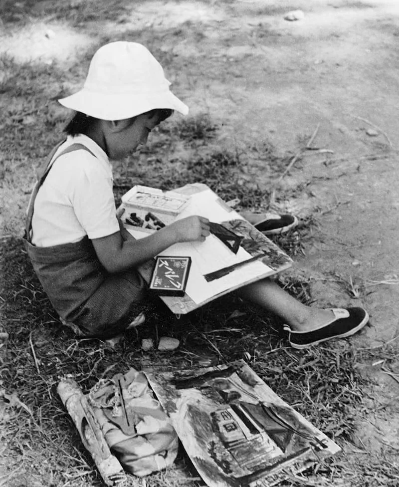
The practice did not begin on a screen. Kana’s English-lang statement says the work started with acrylic and crayon, but the Japanese version of the same statement is more specific: クレパス, or Cray-Pas, the oil pastel that Sakura Color Products introduced in Osaka in 1925. Sakura designed it as a softer, blendable cross between crayon and pastel so that schoolchildren could draw from feeling rather than copy from models, and it went on to become a staple of Japanese school art rooms. The first batches were finicky, too hard in winter and too soft in summer, so Sakura briefly sold separate seasonal versions before settling on an all-season formula in 1928. The material turned 100 in 2025. For an artist trained in Japan, naming it is a little like naming a childhood.
The artist’s account of formal training is brief: foundational work in a painting studio, followed by an unbroken digital portrait practice from 2000 onward. That date matters. In 2000, digital drawing was still a specialist’s pursuit, more than a decade before tablets and phone-based painting apps made it the default way a generation learns to draw. Twenty-six years of continuous digital portraiture is a long apprenticeship by any standard, and it shows in how stripped back the series is. Economy of line tends to arrive late in a practice, not early.
Travel shaped the sensibility as much as training. Kana describes moving widely, sketching portraits of the people met along the way and keeping illustrated travel journals, and credits those habits with a particular sensitivity to what the statement calls quiet presence and restrained expression. A traveler drawing strangers learns to work fast and to read people at a distance, often without a shared language. The resulting portraits tend to record posture, attention and mood more than identity, which is close to the territory Pop Luxe Expression now occupies on purpose.
The public record of the work is thinner than the practice behind it. The artist reports ongoing participation in solo exhibitions at galleries in Japan since 2016, though the gallery names are not published. Online, Kana’s catalogue on the listing platform opened in 2026 and already runs past 240 works, a large body of work for a catalogue in its first year.
show
The series title promises pop, and pop has historically been loud. Andy Warhol repeated faces until they flattened into icons; Roy Lichtenstein blew up comic panels until the printing dots became the subject. Both treated the face as something to amplify. Kana keeps pop’s graphic clarity, its flat planes and clean contour, and turns the volume almost all the way down.
The artist names three working principles: anonymity, spacious composition and minimal, refined line. Anonymity is the most consequential of the three. A portrait without a specific identity stops being a record of a person and becomes a surface onto which a viewer projects one, which is part of why the series sits comfortably between portraiture and character illustration. The listing classifies No.202 under both portraiture and cartoon, and the description of the series reflects that double nature: it is said to rebuild the lightness of pop and the calm of luxury through spare line work, with a small sign within the composition offering what the artist frames as a gentle note of affirmation.
Space does the rest. A composition built around emptiness asks the viewer to supply the event that the image withholds. That is the logic behind the series’ interest in the instant before emotion arrives: a held breath is more open to interpretation than a laugh or a tear, because the viewer has to decide what comes next.
No.202 also belongs to a long, numbered run. Works in the series appear with numbers ranging from No.004 to No.205, and No.202 sits in a cluster numbered 201 through 205. Numbering on this scale reads less like a set of discrete images than like a sustained study, the same question asked again and again with small variations, in the way a musician might log takes of a single phrase.
scope
The title also carries an echo, intended or not. In 1986, the American design writer Thomas Hine published Populuxe, a book that coined a word for the consumer design of 1950s and 1960s America: tailfins, boomerang shapes, chrome and atomic-age optimism. The Oxford English Dictionary records the term as a blend of popular and luxe, and quotes Hine’s own joke that the word ends in “a thoroughly unnecessary ‘e'” purely to give it class. Hine’s Populuxe was about abundance on display, ordinary people living in a way they had never lived before and wanting everyone to see it.
Pop Luxe Expression inverts that equation. Where Hine’s populuxe meant luxury made loud and accessible, Kana’s version treats luxury as restraint: fewer lines, more space, softer color, less said. Nothing in the artist’s published statement points to Hine’s book, and the resonance may be coincidental. But the contrast is useful, because it locates the series within a much older argument about what luxury looks like, and that argument has a distinctly Japanese answer.
extend
Kana’s statement credits the series’ muted heritage tones to traditional Japanese color sensible, 日本の伝統色 in the Japanese text. Japan’s traditional palette runs to hundreds of named hues drawn from plants, minerals, seasons and crafts, and many of its most distinctive members are not bright at all.
The reason is partly legal. During the Edo period, the shogunate’s sumptuary laws barred townspeople from flamboyant dress, and dyers responded by working deeper into the colors still permitted: browns, grays and indigos. The era produced a phrase, shijuhatcha hyakunezumi, meaning forty-eight browns and one hundred grays, which was less a literal count than a boast about how finely those muted families could be divided. Out of that constraint grew iki, the Edo ideal of understated sophistication, in which style lives in the slightest difference and the boldest color is often hidden in a kimono’s lining.
The Honolulu Museum of Art has framed exactly this history under the title Quiet Luxury: Subversive Fashion in the Edo Period, a phrase that lands neatly beside today’s fashion-world vocabulary. The museum’s account of muted outer layers, stylish stripes and vivid hidden linings describes a culture in which luxury was legible only to those trained to see it. One work it highlights, a hand-painted scene by the ukiyo-e master Torii Kiyonaga, dresses three women in permitted shades with names like senzai-cha, a muted greenish brown, and ginnezumi, a silvery light gray, while a flash of safflower-red lining shows at their cuffs. The rule was observed on the outside and shh broken underneath.
That lineage gives Pop Luxe Expression a sharper outline. A series that pairs pop graphics with a heritage palette of subdued tones is, in effect, doing what Edo dyers did: working inside a narrow range and treating the narrowness as the point. The luxury in the title is not gold leaf or saturation. It is the confidence to leave things out.
define
A digital file can be copied endlessly at no cost and with no loss, which makes any edition of a digital work a promise rather than a physical limit. Walter Benjamin’s 1935 essay on mech reproduction argued that copying strips an artwork of its aura, its singular presence in one place and time. Editions are the art market’s long-running answer to that problem: a declared ceiling on supply, backed by signatures, numbering and certificates.
Edition size shapes how a work is understood. Warhol’s 1981 Myths screenprints ran to 200 copies each; the Bourgeois handkerchief made for Tate Modern ran to 1,000. Both are multiples in the full sense, designed to circulate. An edition of two is something else, closer to a unique work with a single twin. It concedes that the image could exist in more than one place, then caps that number at the smallest possible plural.
The listing details fill in how No.202 exists as an object. Its medium is given as digital on an unspecified support, it ships rolled rather than stretched or framed, and it arrives with a certificate of authenticity, leaving presentation to the collector. Editions purchased through the listing are final sale. The asking price, $26,480, is set for a work that is one of only two in existence, and it places No.202 well above the price range typical of open or large-run digital prints.
Pop Luxe Expression No.202 is listed for sale now, one of two copies, shipping from Japan.