
BEAMS JAPAN x Tupera Tupera — Where Japanese Engimono Meets Cut-Paper Imagination
April 16, 2026
frame
A decade is long enough for a concept to settle into identity, but not so long that it becomes fixed. That tension—between continuity and reinvention—sits at the center of BEAMS JAPAN’s 10th anniversary. Since April 2016, the project has functioned less as a retail extension and more as a cultural translation device, taking elements of Japanese craft, tradition, and everyday life and reframing them for both domestic and global audiences.
The anniversary does not arrive as a retrospective. It does not lean on archive-heavy nostalgia or attempt to reconstruct past successes. Instead, BEAMS JAPAN moves forward with a series of monthly releases throughout 2026, each acting as a fragment of a broader narrative. April’s installment, anchored by the collection with tupera tupera, sets the tone: playful, referential, and structurally aware of what “Japan” represents—not as a fixed identity, but as something continually reinterpreted.
View this post on Instagram
lang
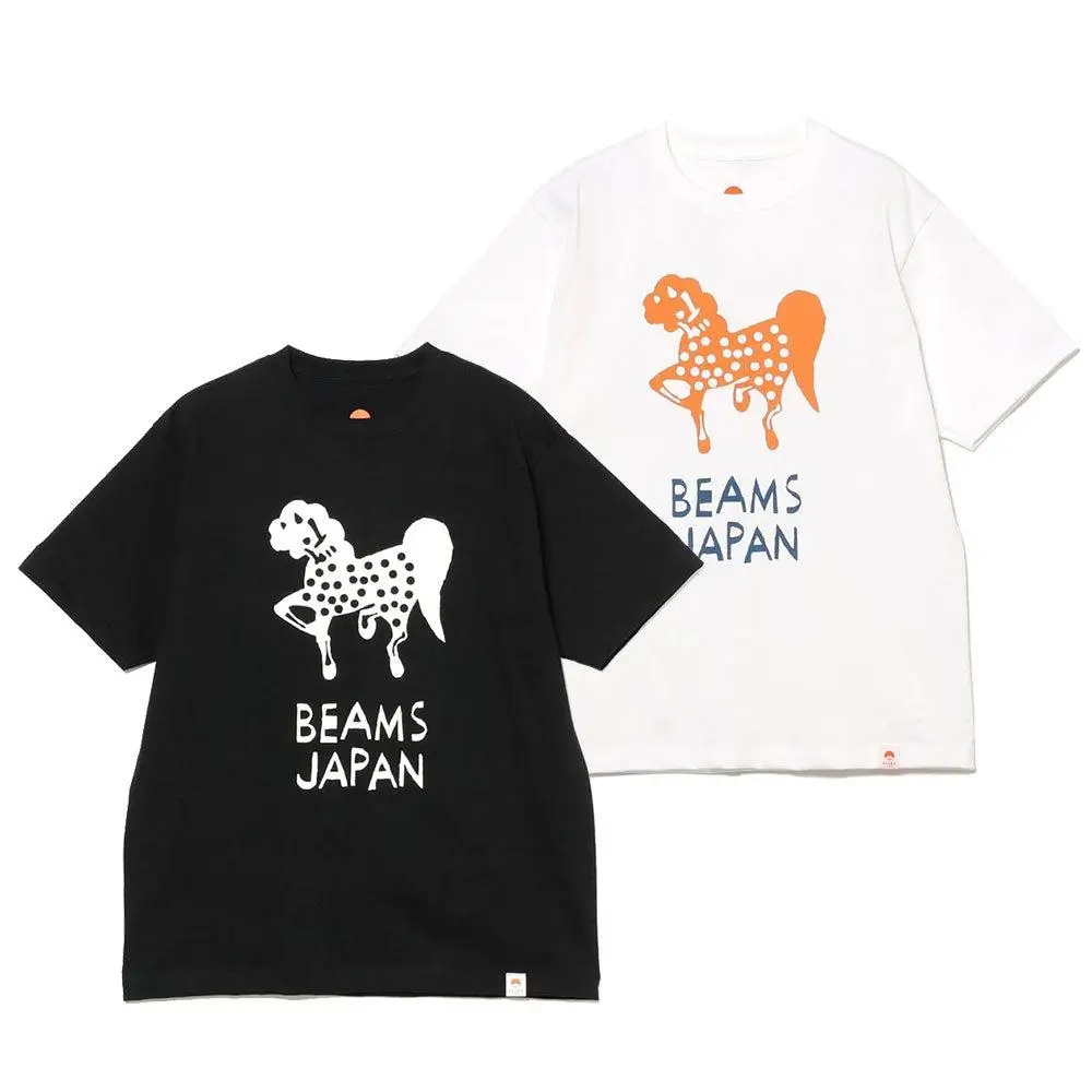
At the center of this collection is tupera tupera, the creative unit formed by Tatsuya Kameyama and Atsuko Nakagawa. Their work has long operated at the intersection of illustration, design, and storytelling, often using cut-paper techniques to construct visual worlds that feel both childlike and precise.
There is a deceptive simplicity to their practice. Shapes are reduced. Colors are direct. Figures are outlined in ways that feel immediate. But within that simplicity is a layered understanding of composition. Each element exists not in isolation but as part of a system—balanced, repeated, and recontextualized.
For BEAMS JAPAN, this visual language becomes a tool for rethinking traditional motifs. Rather than reproducing symbols in their conventional forms, tupera tupera translates them into something more fluid. The result is not a reinterpretation that distances itself from tradition, but one that allows tradition to move.
View this post on Instagram
flow
The collection is built around the idea of “engimono”—Japanese lucky charms or auspicious objects. These are not abstract symbols. They are embedded in daily life, appearing in shops, homes, and seasonal rituals.
The maneki-neko, with its raised paw, signals invitation and prosperity. The daruma, with its blank eyes, holds space for intention and perseverance. Mount Fuji, beyond its geographic presence, operates as a visual shorthand for endurance and national identity.
In their traditional forms, these objects carry weight. They are tied to specific meanings, often used in contexts that are ceremonial or deliberate. What tupera tupera does is shift that weight without removing it. The symbols are rendered in bright colors, arranged in dynamic compositions, and placed into contexts that feel less formal.
This does not dilute their meaning. It redistributes it.

sys
One of the key reference points for the collection is the souvenir jacket—an item that sits at the intersection of military history, tourism, and fashion. Originally produced as mementos, these jackets often featured embroidered maps of Japan, along with symbolic imagery such as eagles, dragons, and landscapes.
The souvenir jacket is, in many ways, an early example of cultural translation. It takes elements of place and compresses them into a wearable format, designed to be carried beyond its origin.
BEAMS JAPAN’s approach builds on this logic but expands it. Instead of a single garment acting as the canvas, the collection distributes its imagery across multiple items: T-shirts, bandanas, and glassware. The map of Japan becomes a structural element, a base layer onto which other motifs are placed.
This creates a system rather than a singular object. Each item participates in the same visual language, allowing the collection to function as a cohesive whole rather than a set of isolated pieces.
flow
The use of paper-cut artwork as the foundation for the graphics introduces a specific kind of texture—both visual and conceptual. Paper-cutting is inherently tactile. It involves removal, precision, and an understanding of negative space.
In translating these works onto fabric and glass, something interesting happens. The physicality of the original medium is preserved in the graphic. Edges remain slightly irregular. Shapes retain a sense of being constructed rather than digitally smoothed.
This matters because it introduces a human element into the final product. The items do not feel overly processed or detached from their origin. They carry traces of the hand, even as they exist within a commercial framework.
idea
Tincture conjures a central role in how the collection communicates. Traditional representations of lucky objects often adhere to established palettes—red for daruma, gold for prosperity, white for purity.
Tupera tupera expands this palette. Colors are intensified, juxtaposed, and distributed in ways that feel more contemporary. The result is not a rejection of tradition, but an amplification.
The use of color also creates rhythm across the designs. Repetition of certain hues ties disparate elements together, allowing the viewer to move across the composition without losing coherence.
In this sense, color is not decorative. It is structural.

mention
One of the defining characteristics of this collection is its ability to move between contexts. A T-shirt can be worn casually, but it also carries a set of references that extend beyond fashion. A bandana functions as an accessory, but its design connects it to a broader visual system. A glass object exists in the domestic space, yet it carries the same symbolic language as the apparel.
This fluidity is intentional. BEAMS JAPAN has always operated with an understanding that culture is not confined to a single category. By distributing the collection across different types of objects, it reinforces that idea.
The items are not meant to be experienced in isolation. They are part of a larger environment.
conjure
There is a risk, when working with culturally specific symbols, of reducing them to surface-level aesthetics. The collection avoids this by maintaining a sense of play that does not undermine the source material.
The play quality comes from arrangement, color, and scale—not from caricature. The symbols are not exaggerated to the point of distortion. They remain recognizable, grounded in their original forms.
This balance is difficult to achieve. It requires an understanding of both the cultural significance of the symbols and the ways in which they can be recontextualized.
Tupera tupera’s involvement is key here. Their practice has always navigated this space, allowing them to approach the project with a level of sensitivity that feels embedded rather than imposed.
role
BEAMS JAPAN’s role in this collection is not simply that of a retailer or distributor. It acts as a mediator—between tradition and contemporary design, between local specificity and broader accessibility.
Over the past decade, the project has built a framework for this kind of mediation. It has developed relationships with artisans, designers, and cultural institutions, creating a network through which ideas can move.
The 10th anniversary collection is a continuation of that framework. It does not attempt to redefine BEAMS JAPAN’s role. It reinforces it.
move
The decision to release anniversary items monthly throughout 2026 introduces a different kind of pacing. Instead of a single, comprehensive collection, the narrative is fragmented across time.
This fragmentation allows each release to carry its own focus while contributing to a larger whole. April’s collection with tupera tupera becomes one chapter in a broader story.
This approach mirrors the way culture itself operates. It is not static or singular. It unfolds, accumulates, and shifts over time.

distrib
The collection will be available starting April 23, 2026, at BEAMS JAPAN stores and through the official online shop. As with many limited or collaborative releases, availability may vary by location.
This variability introduces an element of movement. The collection does not exist in a single, centralized space. It is distributed, encountered differently depending on where and how it is accessed.
fwd
While the collection is framed within the context of a 10th anniversary, its significance extends beyond that marker. It reflects a broader approach to design—one that values translation over replication, system over singularity, and play over rigidity.
For tupera tupera, it represents an expansion of their practice into new mediums and contexts. For BEAMS JAPAN, it reinforces a decade-long commitment to exploring what “Japan” can mean within contemporary design.
clue
The “Lucky Japan Collection” does not attempt to fix meaning in place. It allows symbols to move—across mediums, across contexts, across interpretations.
This movement is what gives the collection its durability. It does not rely on a single reading or a single moment. It remains open.
In marking ten years, BEAMS JAPAN does not look backward. It continues forward, carrying with it a set of ideas that remain flexible, adaptable, and, above all, alive.
Related Articles

A 1.2 Million Pound Machine Is Making Grown Men Cry, and Nobody Warned the Midwest
Union Pacific’s Big Boy No. 4014 is deep into a coast to coast tour, and […]