DRIFT AUDIO
Listen to this story
Choose a voice, then press play.
’47 pairs with 31 Ice Cream on a debut headwear line built from six flavors and three profiles, arriving August 13 with a kids range made for matching.
There is a certain logic to putting a scoop shop’s shade palette on a baseball cap, even if nobody had done it with this particular scoop shop until now. On August 13, ’47 puts out its first collide with 31 Ice Cream, the Japanese branding under which the international ice cream chain operates, and the result collection reads less like a novelty tie-in than like two identity systems, one built on stitched wool and the other on hand-scooped color, sit next to each other and find they match.
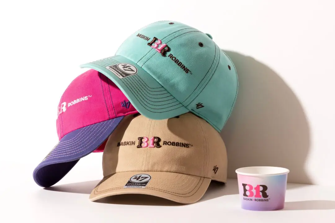
Three Baskin-Robbins x ’47 caps in mint, pink-purple, and tan stacked beside a branded ice cream cup.
stir
’47’s origin story has been told often enough that it has settle into shorthand: twin brothers Arthur and Henry D’Angelo, Italian immigrants, sell sports memorabilia on the sidewalk outside Fenway Park in 1947. Eight decades later the company is a licensed headwear and apparel brand carrying official partners across MLB, NFL, NBA, and NHL, along with more than 650 college programs, and it operates in Japan through New Era Japan LLC, the entity that issued this rel. That lineage, all stadium gates and franchise licensing, is not an obvious match for an ice cream retailer, which is precisely what makes the pairing worth noting rather than assuming.
31 Ice Cream is the name under which Baskin-Robbins has operated in Japan since the chain’s arrival there in 1974, run domestically by B-R 31 Ice Cream Co. The brand refreshed its logo and color identity in 2026, and this collide is built directly on top of that refresh rather than pulling from the chain’s older view history. It is worth being plain about what has and has not been confirmed here: the rel describes this as the two companies’ first collision, full stop, with no prior joint rel ref in the material New Era Japan put out, and nothing in the wider coverage of the drop suggests otherwise.
The collection sits in Fashion rather than food or hospitality coverage because that is what it actually is: headwear, sized and priced and distributed the way any ’47 release would be, that happens to borrow its color story from a dessert counter instead of a sports franchise. The novelty is the premise. The execution is standard ’47 product development.
’47 has been building out a Japanese retail footprint for long enough that a release like this one no longer needs to lean on a licensed team logo to justify shelf space. The brand runs its own stores in Nagano, Okinawa, and Fukuoka, sells through its own online store, and stocks a wider network of partner retailers across the country, all of which points to a company treating Japan as a market for its own lifestyle line rather than simply a distribution point for MLB and NFL merchandise. A combo with a domestic ice cream chain fits that position better than it would have fit ’47’s earlier identity as primarily a stadium goods company. It is a bet that the brand’s name now carries enough weight on its own to support a partner outside of professional sports entirely.
31 Ice Cream, for its part, has been present in Japan since 1974, long enough that most Japanese consumers encounter the brand as a fixture of shopping malls and station buildings rather than as an import. B-R 31 Ice Cream Co. runs the chain domestically, and the 2026 logo and color refresh referenced in this release is a broader brand update rather than something built specifically for the ’47 partnership, meaning the connection is really an early, view use case for that refreshed identity rather than the reason it exists. Seeing a decades-old convenience brand’s updated palette show up first on a cap, ahead of packaging or storefront signage most people would notice, is itself a small piece of how brand refreshes now tend to roll out.
View this post on Instagram
flow
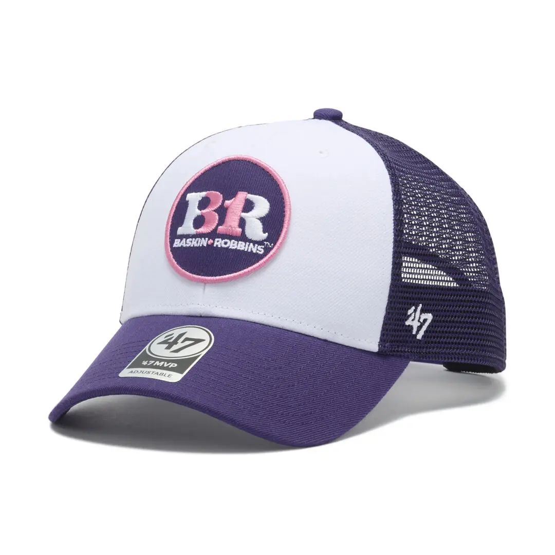
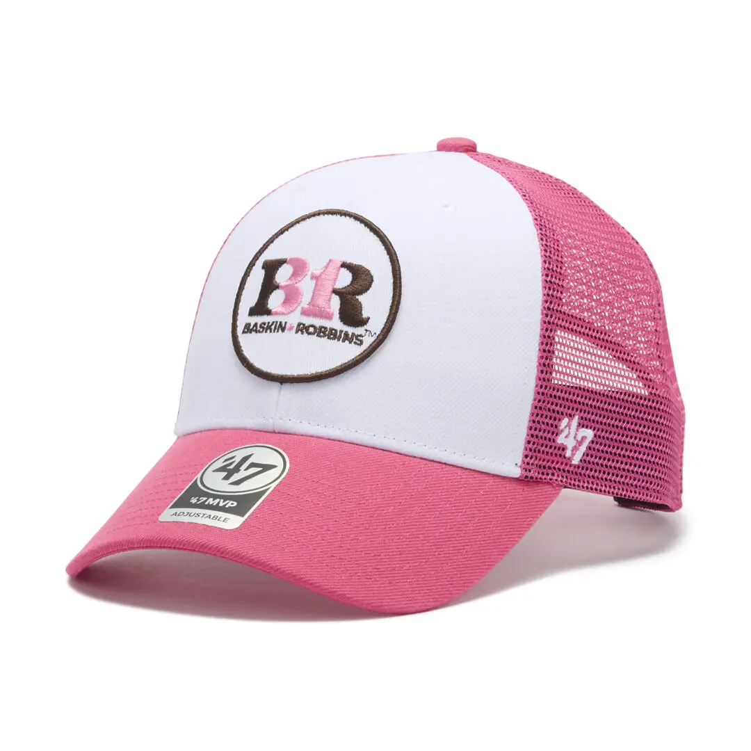
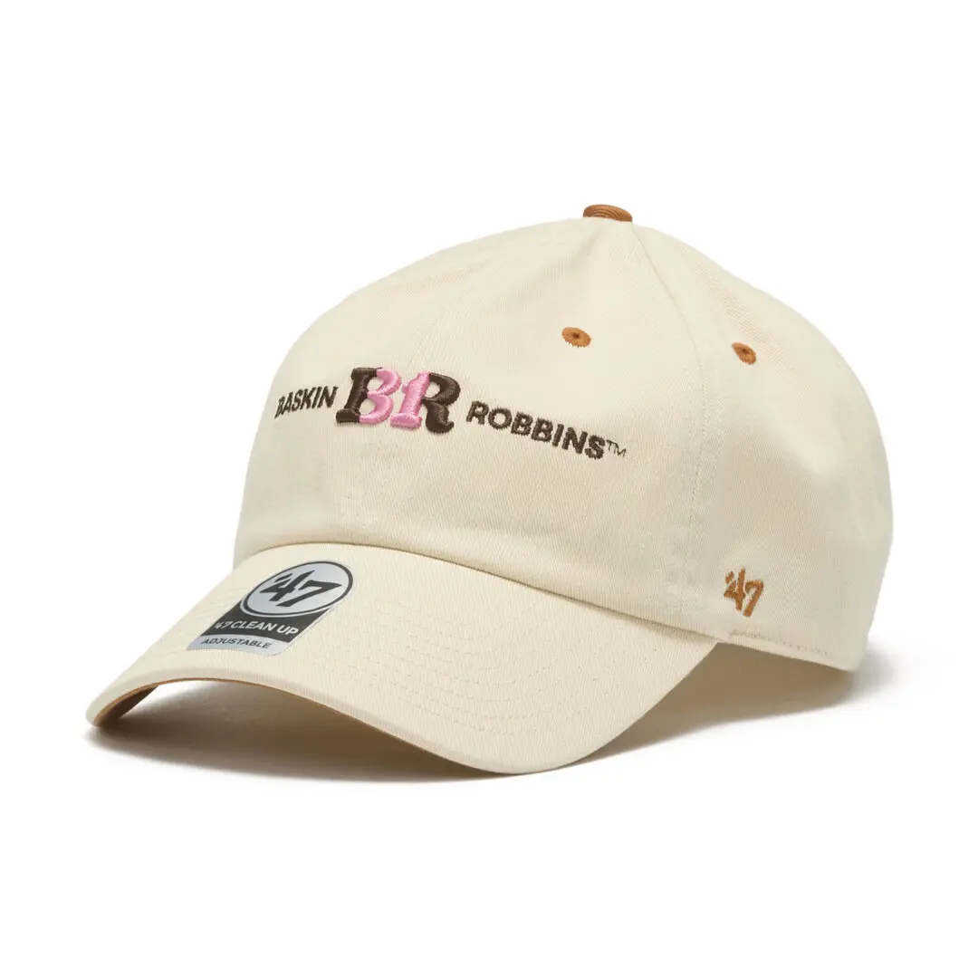
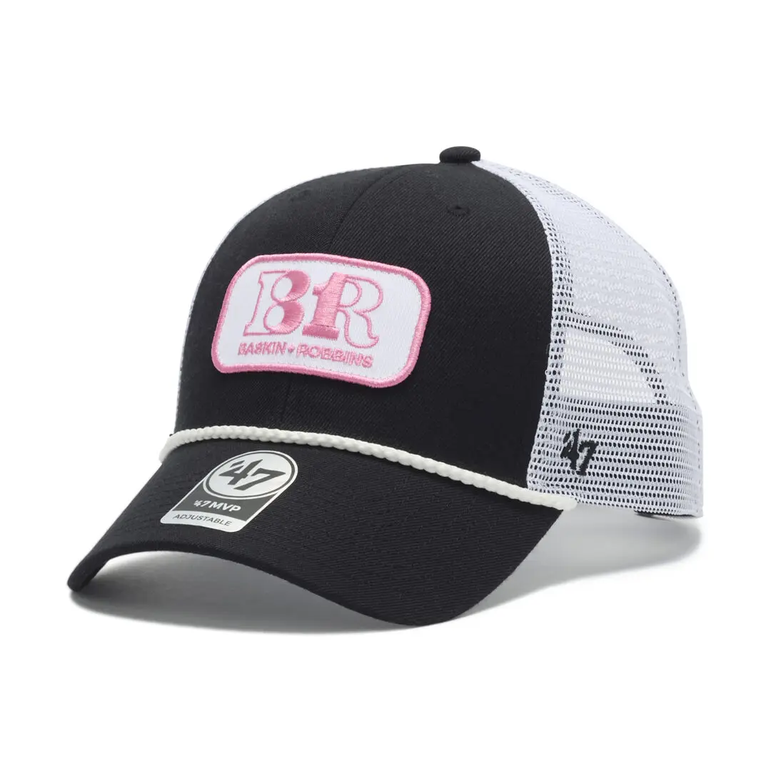
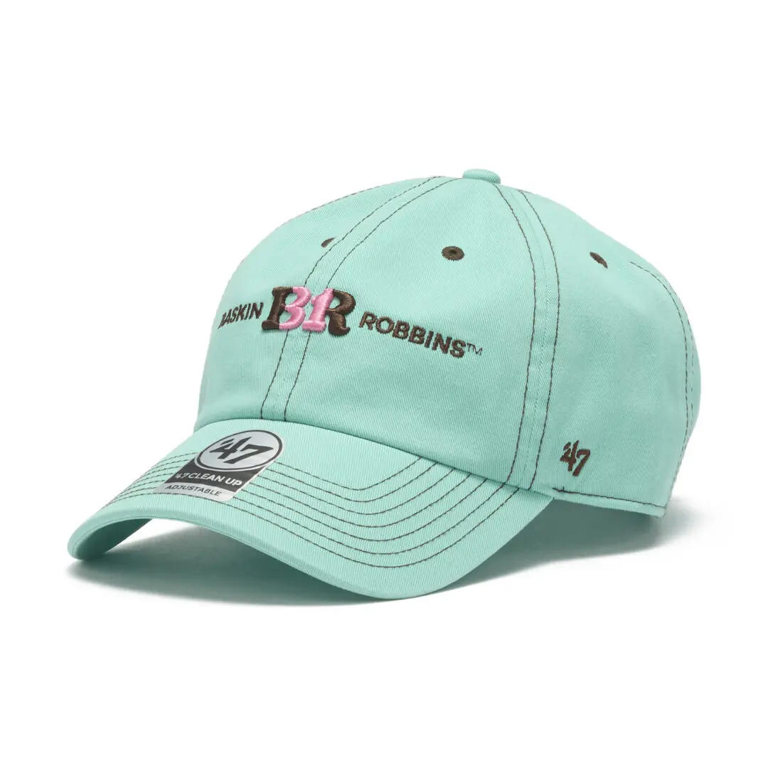
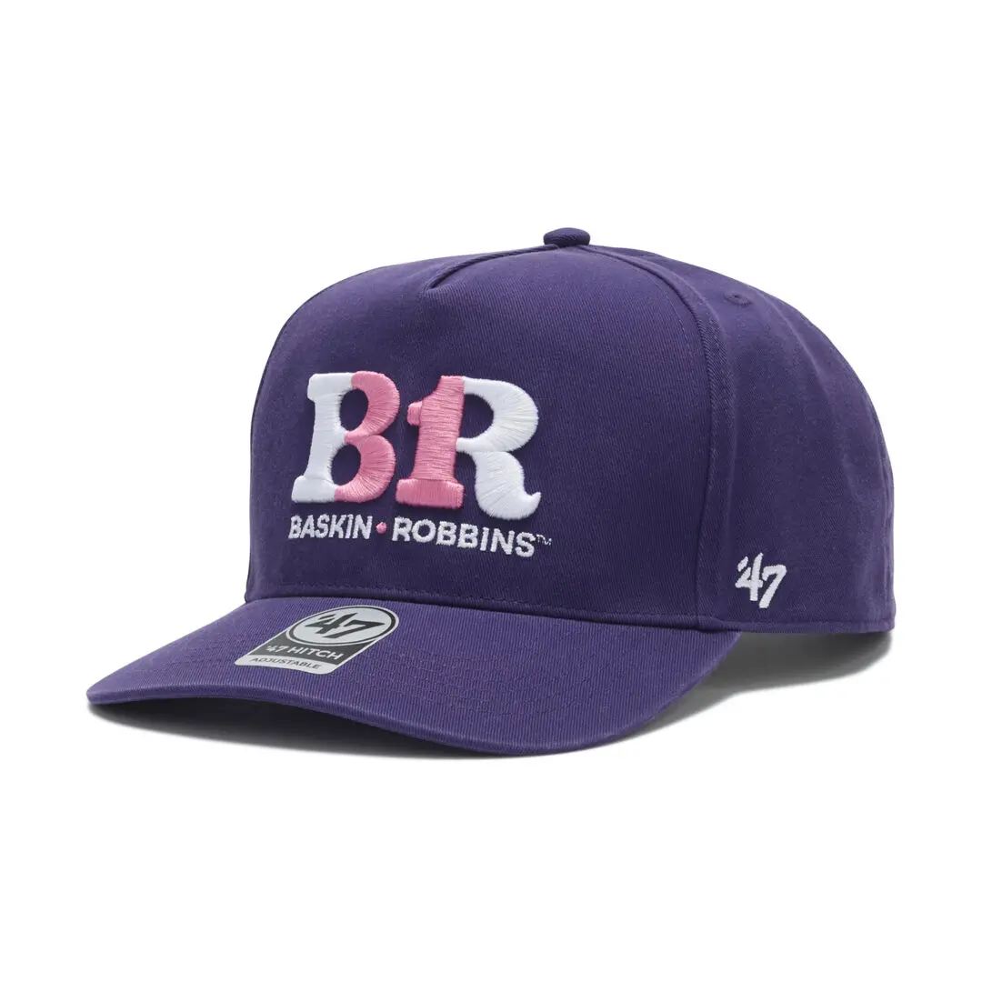
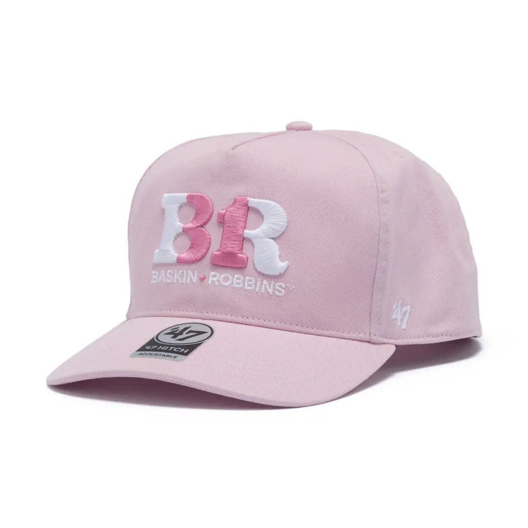
The collection spans three cap constructions, each one already part of ’47’s standing lineup rather than a shape invented for this rel. MVP is the brand’s classic style, structure with a front panel that sits up rather than curving down, priced at 4,620 yen. CLEAN UP is the softer, unstructured version of the same basic idea, built for a looser fit on the head, priced at 4,400 yen for adult sizing. HITCH rounds out the trio as a five-panel construction, the shape most associated with a slightly more casual, less baseball-specific silhouette, priced at 4,950 yen.
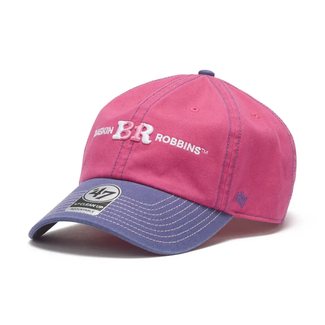
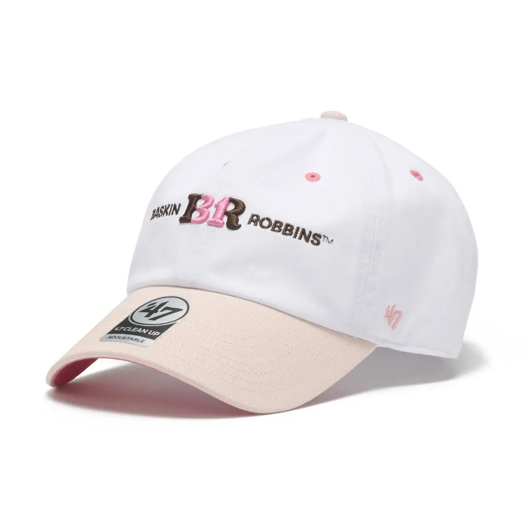
What ties the three shapes together is the color story pulled from 31 Ice Cream’s 2026 branding: a base built primarily around pink and brown, the two colors most associated with the chain’s current identity, applied across the different silhouettes rather than reserved for one hero piece. That restraint, using the same two-color foundation across MVP, CLEAN UP, and HITCH instead of giving each shape its own separate palette, is what keeps a six-flavor, three-profile collection from reading as scattered. The individual flavor callouts sit on top of that shared pink-and-brown base rather than replacing it.
The pricing spread across the three shapes is narrower than a person might expect given how differently the caps are built. MVP, the structured classic style, and CLEAN UP, the soft unstructured version, sit only 220 yen apart despite using noticeably different crown constructions, one holding its shape with buckram backing, the other collapsing softly the way a worn-in cap does. HITCH, as the five-panel option and generally the shape ’47 treats as its most casual offer, actually carries the highest price of the three at 4,950 yen, which suggests the five-panel construction or its trims cost more to produce than the brand’s two more traditional baseball outline, rather than pricing simply following a hierarchy of formality. None of the three shapes is presented as more premium than the others in the release material; they read as equal options within the same collection, priced according to their own construction rather than according to any ranking.
View this post on Instagram
show
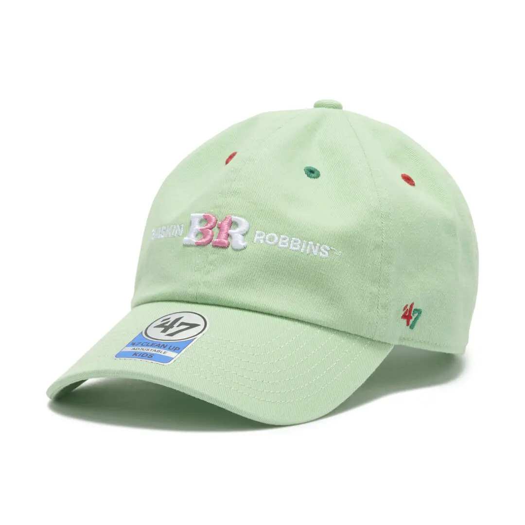
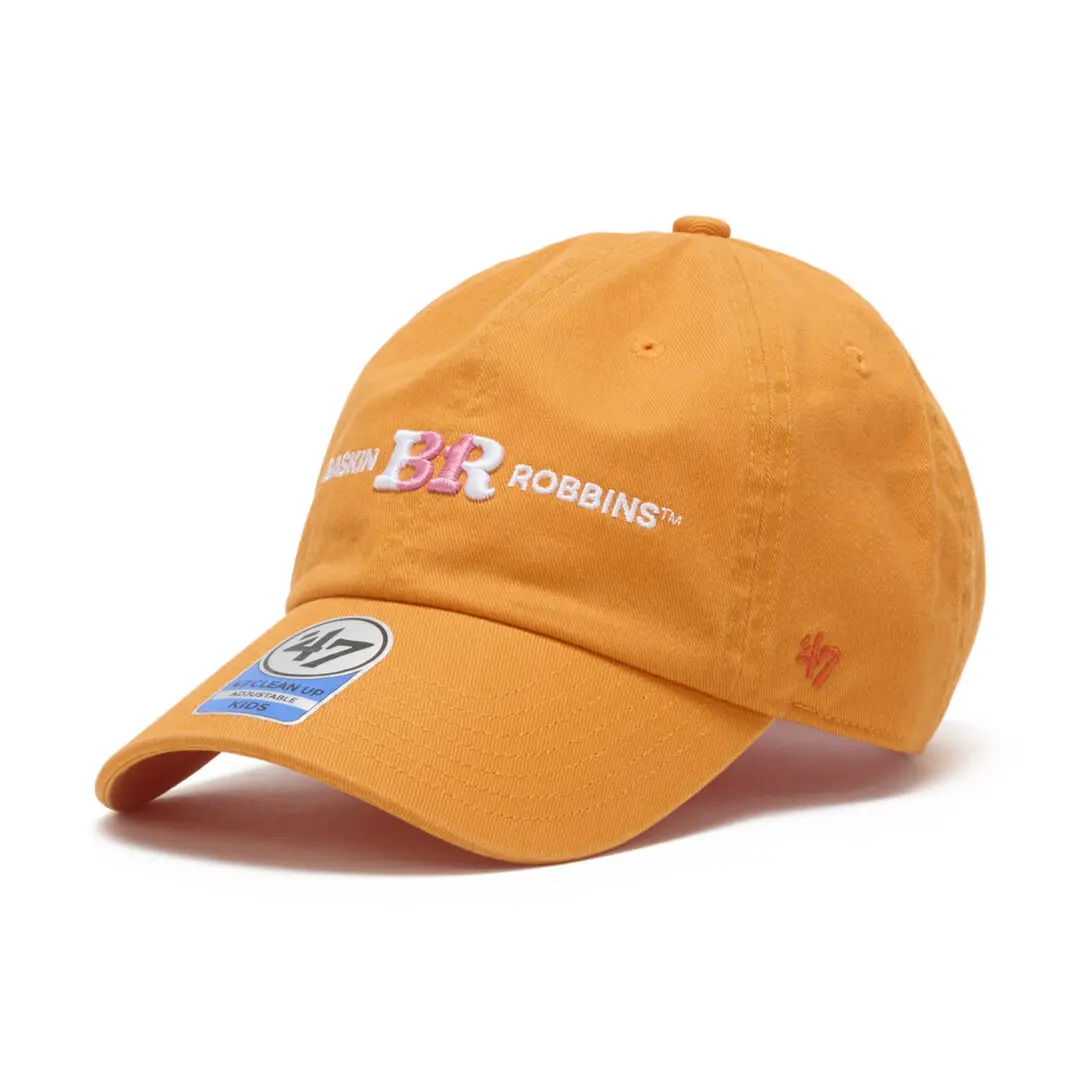
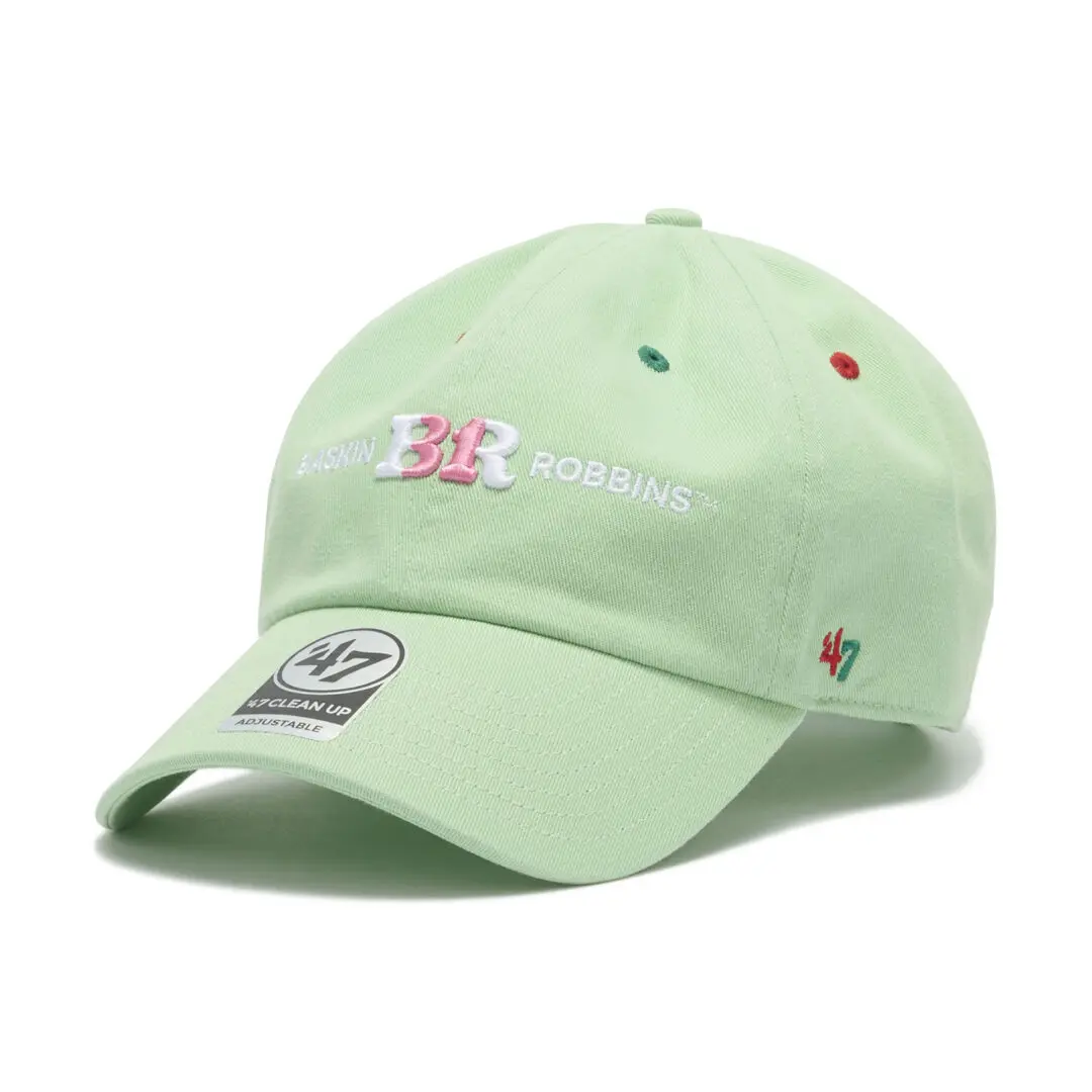
The flavor-specific designs are where the converge does its most literal work, and the release singles out one for a genuine design breakdown rather than a name check. Popping Shower, one of 31 Ice Cream’s recognizable flavors, becomes a cap built on a soft mint green base, with small red and green embroidery worked across it meant to read as scattering popping candy, the kind of literal-minded translation that either commits fully or falls flat, and here it commits. The other adult CLEAN UP colorways, Love Potion #31, Caramel Ribbon, Chocolate Mint, Cotton Candy, and Chopped Chocolate, are named and pictured in the release material without the same level of construction detail given to Popping Shower, so anyone drawn to a specific flavor beyond that one is better served checking the product photography directly than taking a secondhand hue description here.
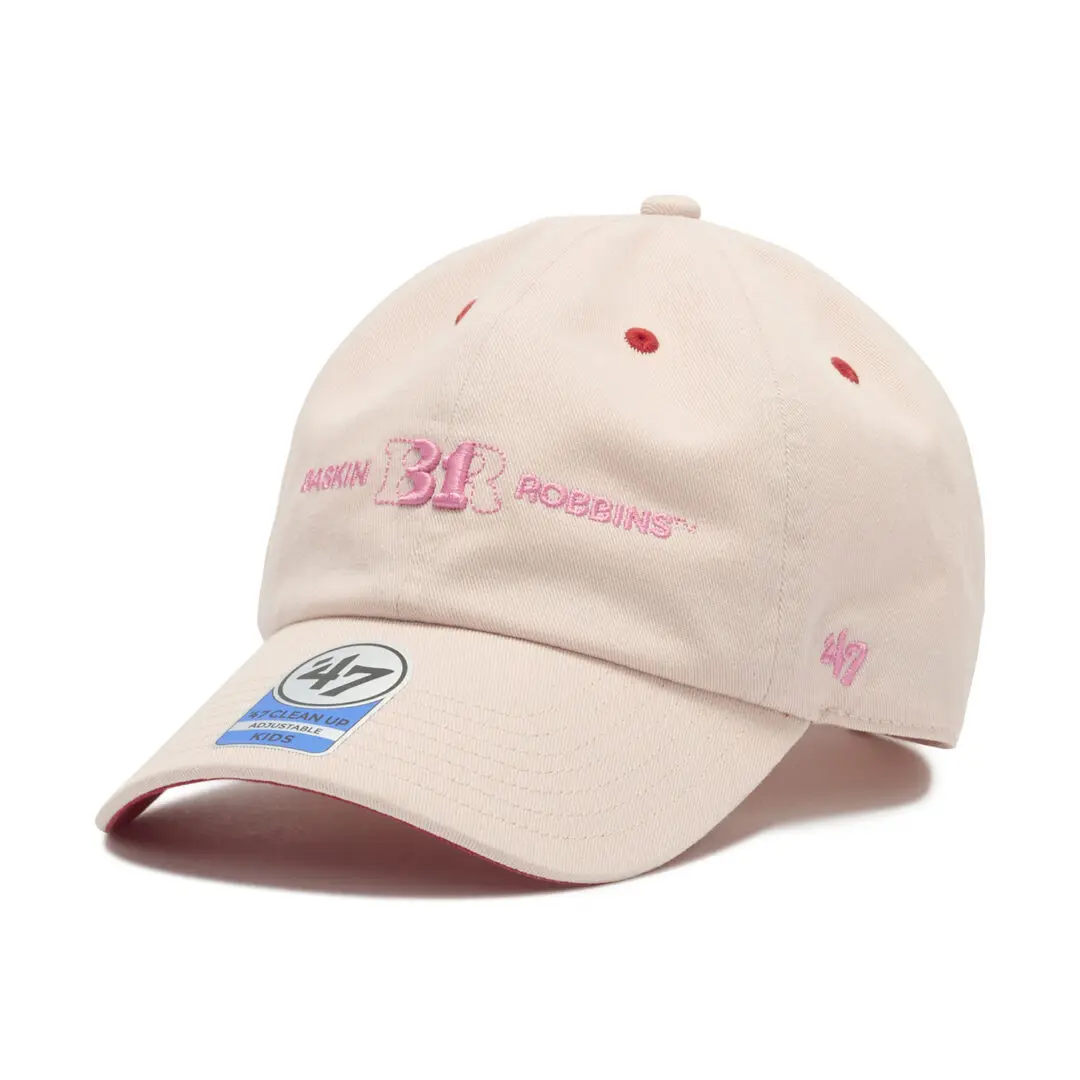
MVP and HITCH carry their own flavor-inspired treatments as well, built from the same pink-and-brown foundation, though the release leans harder into the CLEAN UP line for individual flavor storytelling, which tracks with CLEAN UP also being the contour that carries the kids sizing discussed below. Six named flavors across three adult sil, plus a separate kids range, adds up to one of the more expansive single-rep collides ’47 has run in the Japanese market this year, at least by flavor count alone.
The six flavors chosen are not obscure picks pulled from a seasonal rotation; Popping Shower, Love Potion #31, Caramel Ribbon, Chocolate Mint, Cotton Candy, and Chopped Chocolate are all names regular 31 Ice Cream customers in Japan would recognize on sight, which matters for a collaboration like this one. A cap collection built around flavors nobody remembers would ask a customer to learn a new lang before they could appreciate the joke. Building it instead around the chain’s more familiar names means the design references are legible immediate, whether or not a given shopper has ever set foot in a 31 Ice Cream store recently. That legibility is arguably doing more work for the collaboration’s appeal than the cap construction itself.
It is worth noting what the rel does not do, too. There is no attempt here to name a single “signature” flavor cap the way some collaborations build an entire campaign around one hero colorway. Popping Shower gets the fullest design writeup, but it is not positioned as the flagship piece, and the other five colorways appear with equal billing in the product photo. That flat structure, six flavors treated as six equally valid entry points rather than one lead item and five support ones, mirrors how a physical 31 Ice Cream counter actually works: a customer picks whichever flavor they want, not whichever one the chain is pushing hardest that month.
rel
The full collection goes live August 13, a Thursday, through ’47’s official Japanese online store and through ’47 retail locations nationwide, with the release specifically naming the Nagano, Okinawa, and Fukuoka locations among the stores carrying it at launch. Pricing across the line runs from 3,960 yen for kids CLEAN UP up to 4,950 yen for HITCH, with MVP at 4,620 yen and adult CLEAN UP at 4,400 yen sitting between the two.
Related Articles
Journal Standard’s Thick Wale Work Jacket Arrive Already Worn In
A ¥19,800 boxy corduroy jacket with metal snaps and faded hue lands in Journal Standard […]