DRIFT AUDIO
Listen to this story
Choose a voice, then press play.
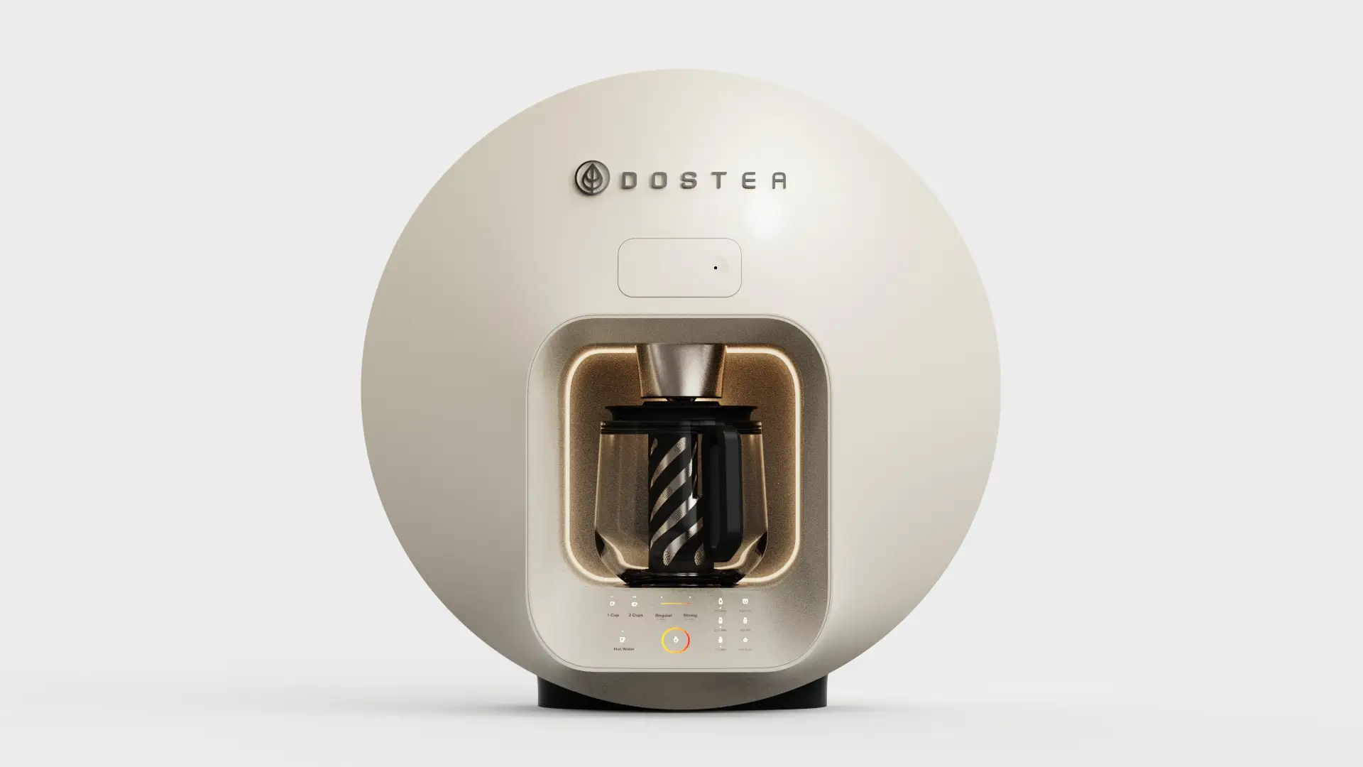
Analogy Design spent years shaping Dostea, a compact chai maker that automates the pour without erasing the ritual coffee machines never had to protect.
Milk climbs slowly toward a boil. Loose tea and crushed spices steep directly in the liquid rather than sealed off in a bag or basket. The color deepens by degrees until foam finally rises to the surface, which is the household signal that the cup is ready. That sequence has defined how Dostea chai gets made for generations, and it has resisted the kind of dedicated hardware that transformed how people drink coffee. Pour over kits, espresso machines, capsule brewers and bean to cup countertop units all found their form over the past several decades. Chai stayed on the stovetop, watched over by whoever happened to be in the kitchen, made a little differently every time by whoever was making it.
View this post on Instagram
That inconsistency is part of what people love about the drink. It is also what makes it a difficult brief for a product designer. A coffee machine can standardize a shot pull because espresso has an accepted technical definition. Chai does not travel the same way. Strength, spice ratio, and milk to water proportion vary from household to household, sometimes from morning to morning inside the same household. Any appliance that tried to flatten that variation into a single fixed setting would solve a problem nobody who actually drinks chai regularly was asking to have solved.
The company behind Dostea is a small hardware startup founded in the United Kingdom, built around the shared frustration of trying to recreate an authentic cup away from the stovetop setups people grew up with. Turning that frustration into a manufacturable countertop object required bringing in a design partner who could hold two competing demands at once: automate enough of the process to make one touch brewing genuinely convenient, while leaving enough of the process open that the drink still tasted like something a person made on purpose.
That gap between household habit and available hardware is not a niche complaint. Chai is consumed daily across South Asian households worldwide and has followed diaspora communities into kitchens in London, Toronto, and Los Angeles that were never built around a stovetop pot in the first place. Smaller apartments, shared kitchens, and busier mornings all put pressure on a method that assumes someone has the time and the stove space to stand over a pan until the foam rises. None of that pressure had produced a dedicated appliance before, which left an open lane for a small team willing to take the brief seriously rather than bolt a “chai setting” onto an existing coffee machine as an afterthought.
stir
In 2021, that task landed with Analogy Design, an industrial design studio based in India with a portfolio that runs across housewares, smart home hardware, and consumer electronics. Analogy’s engagement covered the project from industrial design through product development and manufacturing planning, a full span that meant the studio was shaping not just the shell of the machine but how it would eventually be built at scale.
There was no existing chai appliance to study or improve on, which put the team in the position of defining a category rather than iterating inside one. Divya Rao, co-founder of Analogy, has described the goal not as simplifying the ritual itself but as protecting what people already valued about it while making the process fit more naturally into a modern kitchen. That framing shaped nearly every subsequent decision, from the shape of the housing down to how many buttons the final control panel would carry.
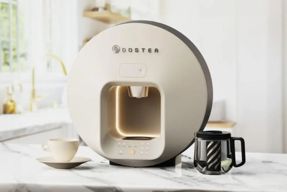
Cream DOSTEA tea machine with illuminated brewing chamber and glass carafe displayed on a marble kitchen counter.
Part of the challenge was also emotional rather than purely mechanical. A drink this tied to daily domestic life carries expectations that a purely functional appliance can violate without meaning to. Analogy’s approach was to design something people would choose to leave out on the counter rather than store away between uses, treating visibility as part of the product’s job rather than an afterthought handled by packaging or marketing photography later.
flow
Coffee’s dedicated equipment leans on a fairly narrow visual language: brushed steel, matte black, occasional pops of chrome borrowed from espresso bar aesthetics. Analogy worked without that kind of template to draw from, which the studio treated as an opening rather than an obstacle. The resulting form favors rounded volumes and a restrained material and color palette, with detailing that nods to Indian craft traditions on one side and contemporary European minimalism on the other, rather than leaning fully into either.
The control surface reflects that same restraint. Because chai is something many households make daily, sometimes multiple times a day, the interface needed to disappear into muscle memory quickly rather than demand a learning curve every time someone new in the household wanted to use it. Rao has said the intent was for the final object to feel rooted in the warmth and familiarity of chai while still reading as a clean, contemporary piece of kitchen hardware, a balance that shows up in the finished unit’s soft curves paired with a genuinely minimal button count.
None of that warmth came from decoration layered on afterward. It came from constraint: fewer visible parts, fewer competing finishes, fewer places for the eye to land besides the carafe itself and the glow of the machine doing its work.
That same restraint extends to the finishes available on the exterior. Rather than chasing a wide color range the way many small appliance brands do at launch, the direction stayed close to two or three variations built around neutral, warm tones, letting the shape of the object carry most of the view interest instead of a palette of finishes competing for attention on a shelf. It is a quieter approach than most countertop appliance launches take, and it puts more pressure on the form itself to hold up on repeated daily use rather than on a marketing photo taken once under studio lighting.
solve
Underneath the shell, the harder design problem was not the housing at all. Analogy engineered the brewing mechanism alongside the shell rather than treating the two as separate workstreams, paring down the internal part count so the whole system could fit inside a compact, countertop-scaled footprint without the machine growing into something bulkier than a drip coffee maker.
The more persistent challenge sat upstream of any single component. Preserving one touch convenience while still letting a household dial in its own strength, milk ratio, or brewing style meant the mechanism needed enough adjustability to feel personal, without stacking on so many settings that the appliance stopped feeling simple. Rao has pointed to that tension between customization and convenience as one of the harder problems the team worked through during development, and the resulting machine keeps that flexibility intact rather than forcing every cup toward one standardized result.
That distinction matters more for chai than it would for most other beverage categories. A household that has been adjusting its own spice blend and milk ratio for years is not going to accept an appliance that quietly overrides those choices in the name of consistency. The mechanism had to bend to the user’s habits instead of the other way around.
Reducing part count inside a housing this compact also has a manufacturing dimension that rarely makes it into finished product photography. Fewer moving components generally mean fewer failure points, simpler assembly lines, and a more forgiving path through design for manufacturing review before a product ever reaches a factory floor. For a small startup working toward its first production run, that kind of internal discipline is not a stylistic choice so much as a practical requirement for keeping unit costs and defect rates within reach of a viable retail price.
transition
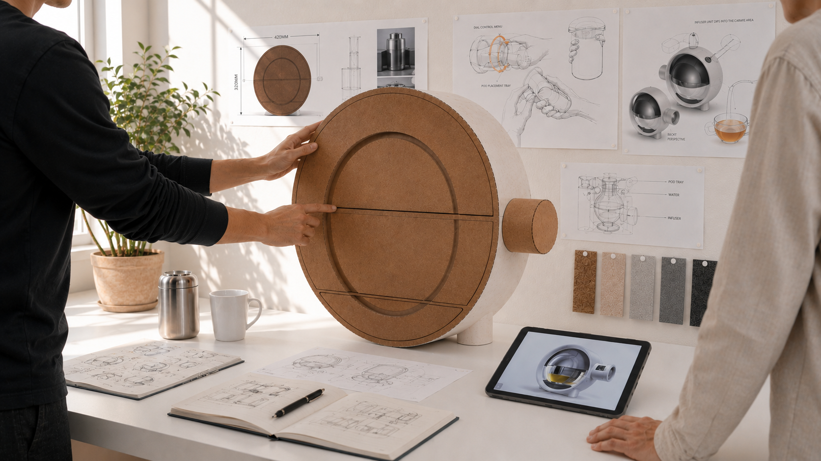
Analogy’s process moved through the usual stages of hardware development: early cardboard mockups used to test proportion and scale, followed by working prototypes built to validate the brewing mechanism itself, before the project moved toward manufacturing planning and design for production. What is notable is how visible that process was allowed to stay in the studio’s own documentation of the project, down to photographs of the team gathered around an unfinished cardboard shell with sketches and material samples spread across the table.
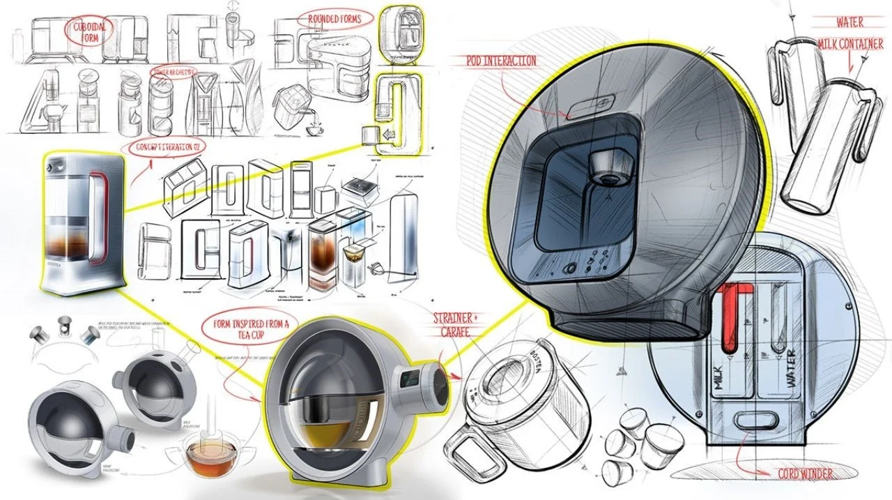
DOSTEA tea machine design board featuring concept sketches, rounded prototypes, pod interaction studies, carafe designs, and internal water and milk compartments.
That kind of transparency is not universal in hardware design coverage, where finished renders tend to arrive with little sense of how many earlier versions were rejected along the way. Here, the gap between a taped together cardboard volume and a finished glass and polymer appliance sitting on a kitchen counter reads as the more honest version of what industrial design work actually looks like in practice: iterative, occasionally unglamorous, and dependent on getting the internal mechanics right long before the exterior finish gets locked.
fin
Coffee’s equipment category built itself over generations, from stovetop moka pots through espresso machines, pour over systems, and eventually capsule brewers, each generation of hardware normalizing dedicated countertop space for the drink. Chai never went through that same evolution at scale, staying tied to a pot, a strainer, and someone standing at the stove keeping watch. Dostea is a bet that the same appetite for dedicated equipment exists on the chai side of the counter, provided the hardware respects what made the stovetop version worth keeping in the first place.
Whether that bet plays out at scale will depend on manufacturing, pricing, and distribution decisions well outside a design studio’s control. What Analogy’s work demonstrates on its own terms is a case for restraint as a design strategy: a compact form, a pared down control surface, and a mechanism built to protect variation rather than eliminate it. The project’s development is documented on the Design Milk feature by Hayley Arsenault, which traces the collaboration between Dostea’s founding team and Analogy Design from early concept through prototype.
Dostea previously ran a crowdfunding campaign on Kickstarter to help move the appliance from prototype toward a wider production run, part of the same trajectory that carried the machine from an early cardboard shell to the object now shown in Analogy’s photography. For a beverage this personal, that trajectory is the more interesting story than the appliance’s specs on their own: a small team of designers spending years figuring out how much of a daily ritual they were allowed to automate, and how much of it they needed to leave alone.
It also says something about where industrial design work is increasingly happening. A UK founded startup crossing paths with a Bangalore based studio to solve a distinctly South Asian domestic ritual is not an incidental detail; it reflects how hardware development for culturally specific products now routinely draws on design teams who understand the ritual from the inside rather than approaching it as an unfamiliar market opportunity. That familiarity shows up less in any single visible feature than in the restraint of the whole object, in the decision to leave a mechanism flexible rather than lock it down, and in a control panel with just enough buttons to get out of the way of the drink itself.
n
From the DRIFT archive: PANTONE’s 2026 Color of the Year Takes Shape With Play-Doh and Post-It Editions
Related Articles

The White Violet That Refuses to Pick a Side: Inside Le Labo’s VIOLETTE 30
Le Labo’s first Classic Collection addition of 2026 is built on a flower the Victorians […]