DRIFT AUDIO
Listen to this story
Choose a voice, then press play.
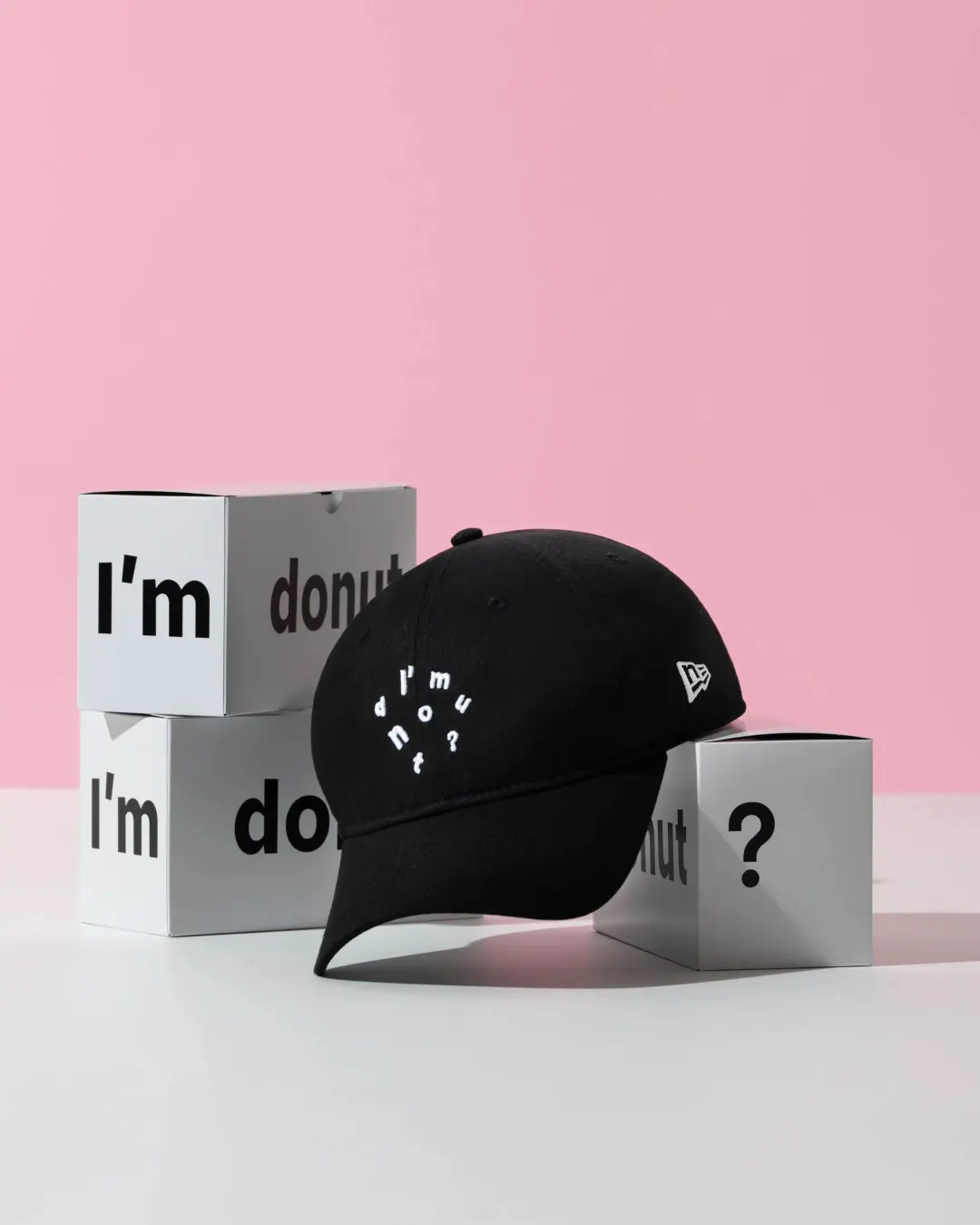
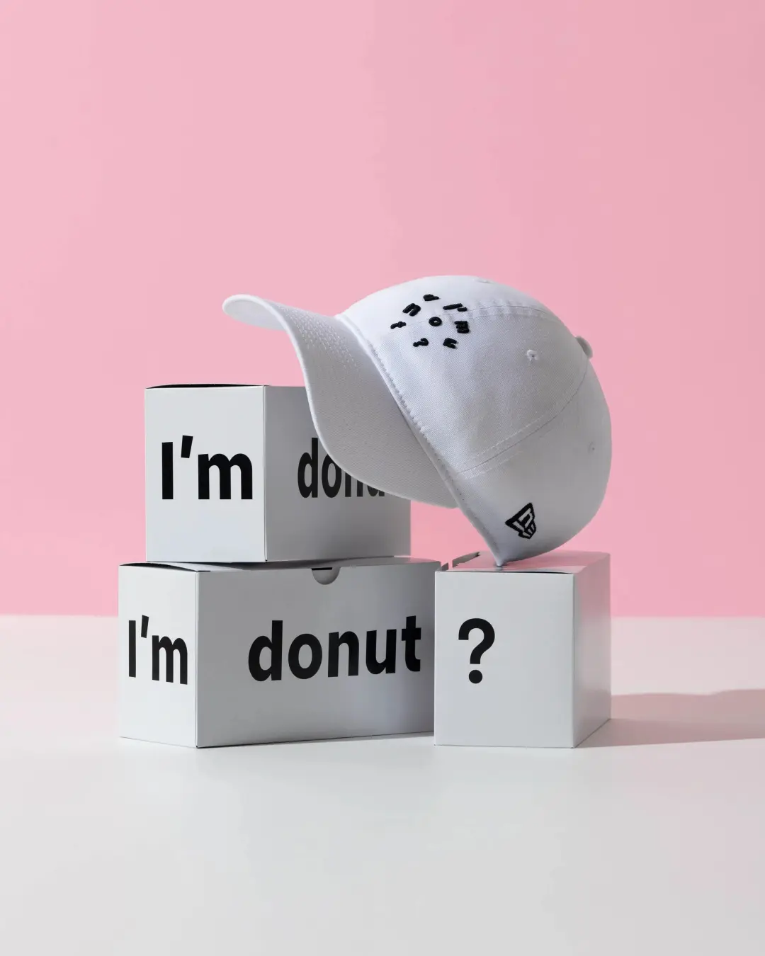
New Era is putting I’m donut?’s stitched wordmark on the 9TWENTY, and the cap lands in stores and online on August 1.
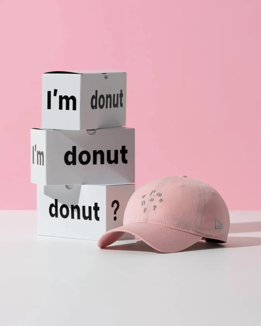
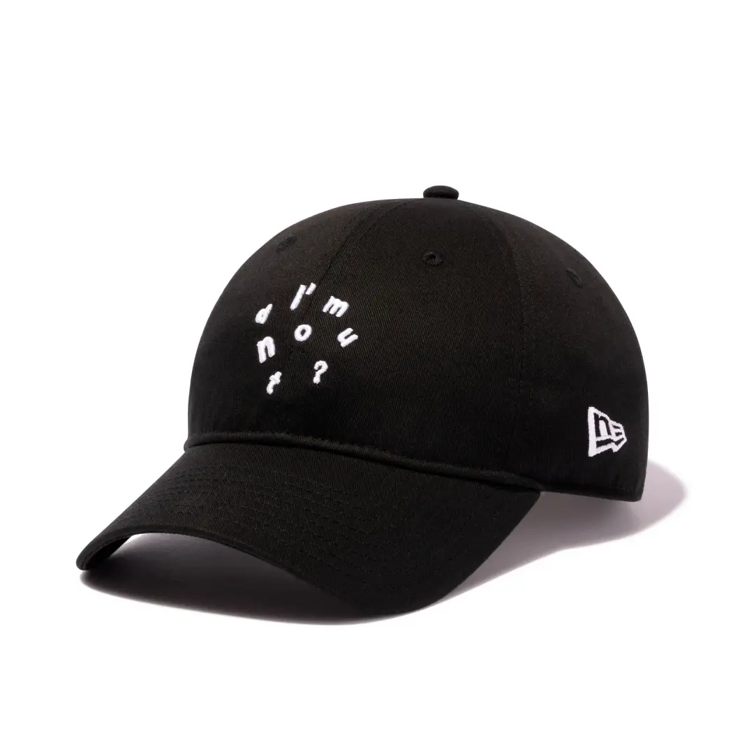
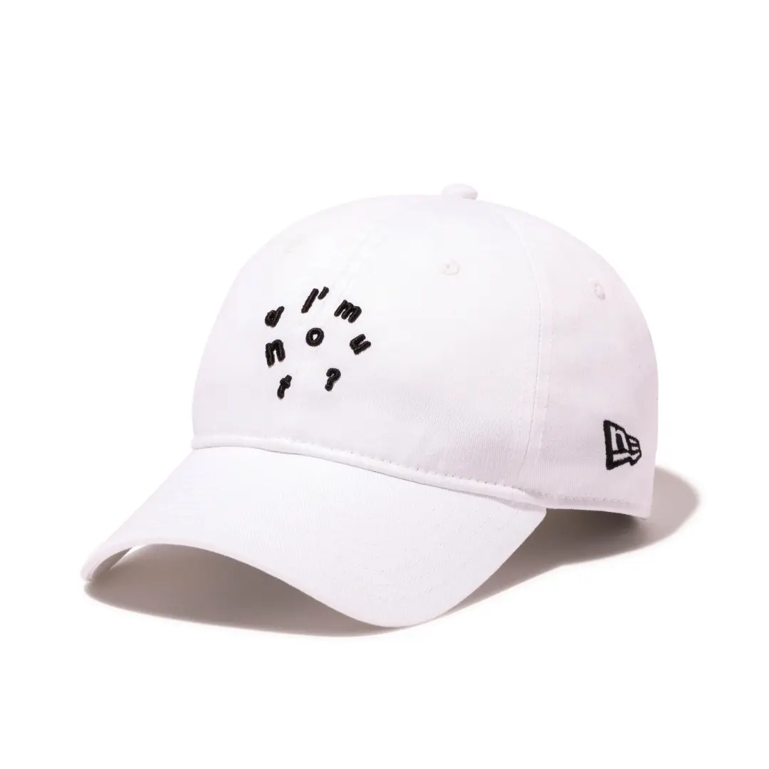
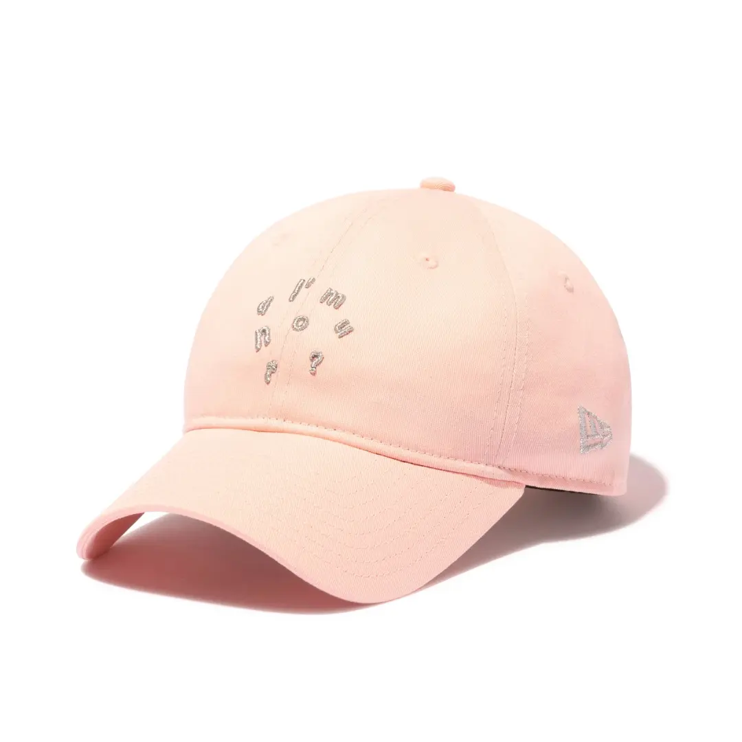
There is a particular kind of Tokyo retail chaos that only a handful of names can generate on a weekday morning, and I’m donut? has spent three years near the top of that list. On July 27, New Era confirmed a collision headwear release with the fresh donut chain, set to arrive on August 1 across I’m donut?’s own stores and New Era’s official Japan online store, according to Fashionsnap’s report on the drop. The base model is New Era’s curved visor 9TWENTY, and the treatment is simple by design: the words “I’m donut?” raised in dimensional embroidery across the front panel, a technique that gives the lettering a slight puffed relief rather than sitting flat against the twill.
View this post on Instagram
Three colorways are confirmed: black, white, and pink, each priced at 6,050 yen. That price point sits squarely in New Era’s standard 9TWENTY tier in Japan, which tells its own story here. Nobody is dressing this release up as some limited capsule with premium materials or a story about provenance. It is a straightforward cap collaboration between a headwear company and a food brand that has, somewhat improbably, become one of Tokyo’s more reliable generators of queue photography.
There is also a certain logic to the timing. August 1 lands in the thick of Japan’s summer retail calendar, a stretch when New Era typically layers multiple collaboration drops across a single week rather than spacing them out, and when foot traffic through I’m donut?’s Tokyo locations tends to swell with both domestic customers on summer break and visiting tourists working through a checklist of viral food stops. Releasing a wearable version of the brand at that exact moment turns a single purchase, one donut, one photo, into something that leaves the store on a customer’s head rather than just in a paper bag.
look
The 9TWENTY silhouette itself is New Era’s unstructured, six-panel take on the curved brim, built without the stiff buckram front panel that defines the brand’s 59FIFTY fitted line. It sits lower and softer on the head, closer to a broken-in trucker cap than a fresh-from-the-box fitted. That looseness matters for a collaboration like this one, since the appeal of I’m donut? has never been about hard branding or logomania. The shop’s own visual identity leans toward pastel color and a slightly whimsical, almost storybook tone, and a soft-crowned cap gives the embroidered wordmark room to read as playful rather than corporate.
Beyond the raised front embroidery and the three colorways, New Era has not detailed additional trims, strap hardware, or under-brim treatments in the initial release materials. That is consistent with how the brand tends to handle food and lifestyle tie-ins domestically: the story is the name on the front, not a deep specification sheet.
The choice to render the wordmark as raised, dimensional stitching rather than a flat embroidered patch is worth sitting with for a second, because it mirrors something about the product the shop actually sells. I’m donut?’s signature nama donuts are prized for a kind of puffed, airy relief, dough that looks almost sculptural once it comes out of the fryer, glossy and slightly domed rather than flat. A raised embroidery technique on the cap front picks up on that same visual language without anyone needing to spell it out. It reads as a donut shape long before it reads as a logo.
Color choice follows a similar logic. Black and white give the cap enough neutrality to function as a daily accessory rather than a souvenir piece, while the pink option leans directly into the pastel, slightly candy-coated palette that has defined I’m donut?’s store interiors and packaging since the Nakameguro flagship opened. Anyone who has stood in one of the brand’s lines has likely noticed the pink signage, the pale wood fixtures, and the way the donuts themselves are displayed less like bakery inventory and more like a small gallery show.
stem
I’m donut? is the creation of chef Ryota Hirako, who built his reputation at AMAM DACOTAN, a bakery he opened in Fukuoka’s Roppommatsu neighborhood that became known nationally for helping ignite Japan’s maritozzo boom, the cream-stuffed brioche bun trend that swept the country’s bakery scene a few years back. Hirako had a habit of treating bread dough as raw material for ideas outside the category, and the donut concept grew out of that same instinct: an original brioche-style dough blended with roasted pumpkin puree, fermented slowly at low temperature, then fried quickly at high heat.
View this post on Instagram
The result is what’s now widely called a “nama donut,” or fresh donut, a term that describes both the ultra-soft, almost raw-feeling texture of the dough and the fact that many varieties are packed with fresh cream rather than the drier, cakier crumb of a standard American-style donut. I’m donut? opened its first shop under train tracks in Nakameguro, Tokyo, in March 2022, and the lines started almost immediately. The brand has since expanded to Omotesando, Harajuku, Shibuya, Ikebukuro, Jiyugaoka, Kyoto, Yokohama, Karuizawa, and back to its Fukuoka home turf, alongside international outposts in Seoul, Taiwan, and New York’s Times Square.
Hirako’s earlier work at AMAM DACOTAN gives useful context for how he approaches a category he did not grow up in. Before he was known for donuts, he was already known for reworking a European pastry into something distinctly his own, and that same instinct shows up in how the donut menu rotates. Individual I’m donut? locations do not simply replicate the same eight or so flavors nationwide. Each shop leans into its neighborhood, offering different combinations of sweet and savory options, with menus at the flagship Fukuoka and Shibuya locations running well past twenty varieties at a time, according to food writers who have tracked the brand across multiple visits. That refusal to standardize is part of why the shop keeps generating fresh coverage years after its opening, rather than fading the way many viral food concepts do once the initial wave of curiosity passes.
The shop’s earlier press cycle in Japan also leaned into a lighter, almost theatrical side of the brand. A 2022 feature on the original AMAM DACOTAN operation noted that staff uniforms drew visual inspiration from a Dragon Quest style priest costume, a small detail that fits the overall sense that Hirako treats retail presentation as part of the product rather than an afterthought. That same instinct for staging, the pastel interiors, the stacked donut displays, the costume touches, is likely part of what made the brand legible enough as a visual identity to translate onto a cap in the first place.
why
The instinct to dismiss a food-and-headwear tie-up as a novelty item misses what has actually made I’m donut? valuable as a brand partner. This is a company whose main export has become the queue itself. Reports of two-hour waits are common even for the Fukuoka flagship, and each location varies its menu by neighborhood rather than running identical stores, giving the brand a sense of place that few nationally scaled food operations bother to build. That combination of visual identity, cult devotion, and genuine scarcity is exactly the profile that headwear collaborations chase, and New Era in Japan has increasingly built a pipeline of releases that pair its core silhouettes with cultural properties well outside sport, from anime franchises to bakery brands to menswear labels working in specialty fabrics.
For I’m donut?, a cap collaboration is a low-friction way to put its wordmark into daily rotation on people’s heads rather than confined to a takeout bag or an Instagram grid. For New Era, it is a bet that a brand this recognizable in Tokyo street style circles can move headwear the same way a streetwear label or a ballclub does.
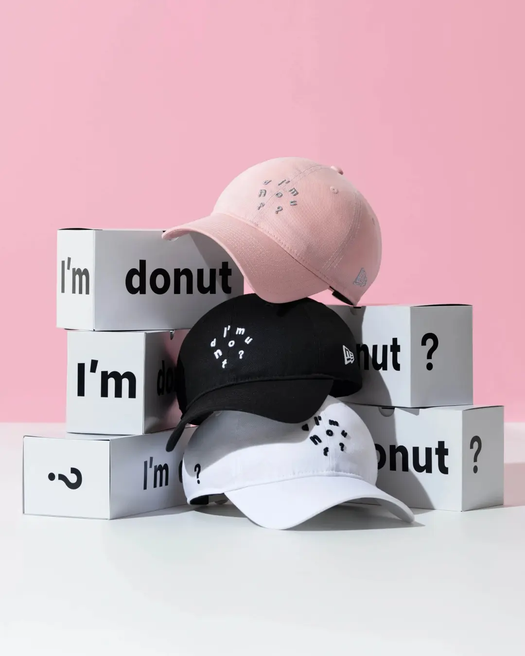
The I’m donut? × New Era 9TWENTY collection pairs the Japanese bakery’s playful visual identity with New Era’s relaxed, unstructured baseball cap sil August 1, 2026 release.
New Era’s food and beverage tie-ins in Japan are not new territory, but they tend to cluster around either heritage confectionery brands or franchises with decades of nostalgia built in. A shop that is only three years old sitting alongside that lineup says something about how quickly a food concept can accumulate cultural weight in Tokyo when the wait time itself becomes part of the appeal. Reports of two hour lines at the Fukuoka flagship, even on days when the crowd looks thin from a distance, have become a recurring detail in food coverage of the brand, the kind of anecdote that keeps circulating because it reads as slightly absurd and completely believable at the same time.
That queue culture matters commercially in a way that is easy to underestimate. A cap does not require anyone to stand in line, does not melt, and does not need to be eaten within a day of purchase. It gives a customer who has already invested time waiting for donuts a second, more durable way to signal that investment. And it gives New Era a partner whose fan base is already primed to treat a purchase as something worth documenting and sharing, which is precisely the behavior headwear brands spend marketing budgets trying to manufacture from scratch.
canvas
New Era has leaned on the 9TWENTY repeatedly this year as its preferred base for collaborations that need a softer, more casual read than the fitted 59FIFTY provides. The silhouette turned up earlier this year in a Yohji Yamamoto sub-label tie-in built from decine fabric, in a trio of Mobile Suit Gundam faction caps for the STRICT-G apparel line, and in a Barbour collaboration reworking the cap in waxed, weatherproof material. What connects those releases to the I’m donut? cap is less about fabric or construction and more about tone: the 9TWENTY reads as an everyday object rather than a showpiece, which suits a brand whose core appeal is also built on everyday ritual, a specific donut on a specific morning, rather than hype-cycle collecting.
Compare that to how New Era typically handles its 59FIFTY fitted line, which the brand still reserves largely for Major League Baseball licensing, structured streetwear collaborations, and higher profile fashion crossovers where a crisp, boxy front panel does more visual work. The 9TWENTY, by contrast, has become something closer to New Era Japan’s default vehicle for partnerships that want to feel approachable rather than aspirational. Lacoste’s own 9TWENTY collaboration with the brand, announced just days before the I’m donut? release, leaned on jersey materials for a golf-adjacent, off-duty feel rather than a formal fitted structure, reinforcing the sense that the silhouette has become shorthand across the Japan market for collaborations built around comfort and cultural specificity over hard branding.
rel
The I’m donut? x New Era 9TWENTY releases Saturday, August 1, at I’m donut?’s physical locations and through New Era’s official Japan online store. All three colorways, black, white, and pink, are priced at 6,050 yen (tax included). No word yet on per-store purchase limits or either the release will extend to I’m donut?’s international locations in Seoul, Taipei, or New York.
For a brand whose entire retail experience is built around scarcity and a countdown clock, holding onto the exclusivity of a cap release, at least for now, to Japan alone fits a pattern the shop has followed since its first store opened under those Nakameguro train tracks. Whether that stays true past August 1 is something only the next few weeks of foot traffic will answer.
Related Articles
Nubian Put Distressed Cotton Jersey On Needles Track
20th Exclusive Vol.7. Needles. Four shapes. Black and grey. 19 September 2026. All NUBIAN doors […]