DRIFT AUDIO
Listen to this story
Choose a voice, then press play.
Kanemasa Phil’s autumn and winter drop turns a knit gauge trick into a shirt whose grid seems to bleed at the edges, out from mid August.
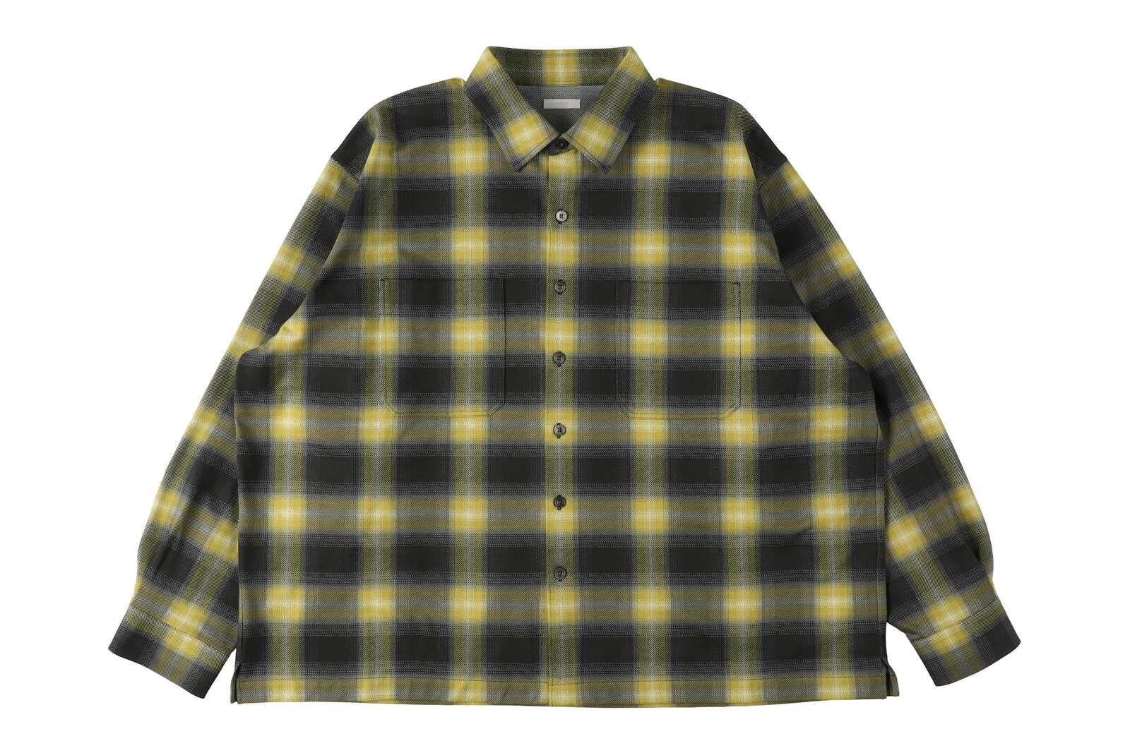
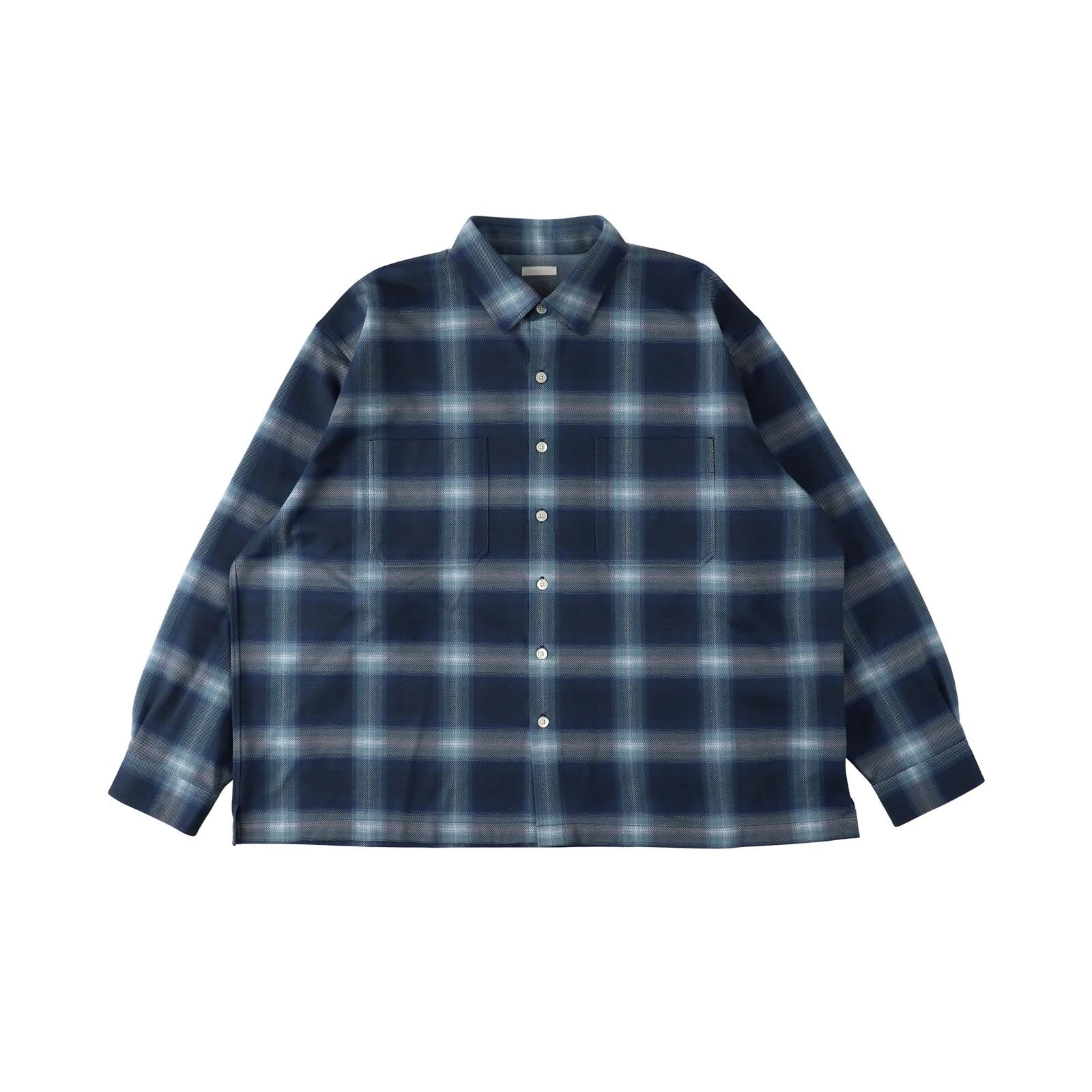
The piece drawing the most attention from Kanemasa Phil‘s new season is a shirt that plays a small trick on the eye. Called the Balise Shirt, it takes a standard check, the kind woven the same way for decades, and runs a second, vertical print over the top of the horizontal knit pattern underneath it. The result is a check that does not sit still the way checks usually do. Instead of clean, even lines, the grid seems to soften and blur toward certain edges, closer to what a check pattern would look like if the dye had not quite finished drying. Kanemasa Phil calls the effect an ombre check, and it is easy to see why once a photograph of the shirt is in front of you, the pattern reads as deliberate rather than as a printing flaw, a small distortion built into the weave on purpose.
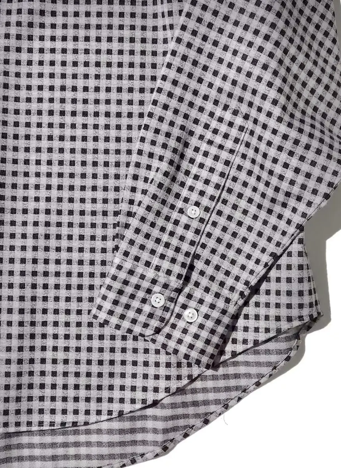
The shirt itself sits in a 28 gauge knit, dense enough to carry a bit of structure and a light sheen without losing the stretch that makes it comfortable against the skin. The brand describes the fit as loose enough to work either buttoned as a proper shirt or thrown open over something else as a light layer, splitting the difference between the roughness of a work shirt and the polish of a dress shirt rather than committing fully to either. It is also treated for easy care, resistant enough to creasing that it can go straight from a bag into an outfit without much fuss, a detail aimed squarely at anyone who wants the look of a considered piece without the maintenance one usually comes with.
Four colorways are shipping: a navy blue version, a charcoal paired with yellow, a pink paired with beige, and a black paired with white. Each pairing follows the same underlying idea, taking two colors that would normally sit at a clear contrast to each other and letting the ombre effect blur the line between them, so the check reads less like two colors stitched together and more like one color fading into the next. The mustard and charcoal pairing in particular has already drawn comment for how far it pushes the technique, since the yellow threads through the gradient in a way that keeps shifting depending on the angle a photograph catches it from, brighter in direct light and closer to a warm gold in shade.
It is worth sitting with how unusual this approach actually is within shirting more broadly. Most check patterns, whether woven into the cloth or printed onto it, are built around precision, the whole appeal resting on how cleanly the lines intersect. Kanemasa Phil’s ombre check works against that instinct on purpose, treating the slight imprecision of a bleeding line as the entire point rather than as something to be corrected in a later sample. That kind of choice tends to read either as a small, easily missed detail or as the single thing someone notices first about a shirt, and early reactions to the piece suggest it is landing closer to the second category.
stir
None of this happened in isolation. The ombre check shirt belongs to a wider autumn and winter collection that Kanemasa Phil has said draws directly from Nordic and European mid century furniture, the kind of design period defined by wood, curved lines, and fabric chosen as much for comfort as for looks. That reference point shows up across the season in ways that go beyond any single print. The color story leans on deep blues, mustard, terracotta, and olive, tones lifted more or less directly from the kind of upholstery fabric you would find on a mid century armchair rather than from a typical clothing palette, and the brand has talked about wanting pieces that settle into a room the way a well chosen piece of furniture does rather than standing apart from it.
That furniture led thinking also explains why knitwear takes up more space in this collection than it has in past seasons. Kanemasa Phil built its reputation on shirting, and the shirt remains the anchor of the brand, but this season pushes further into denim like textures and leather like finishes built entirely from knit construction, a way of working that suits a brand more interested in how a fabric behaves on the body than in following whichever material convention a garment is traditionally supposed to use.
The brand has described the wider collection as reflecting the kind of functional beauty found in furniture designed for everyday living rather than for display, the sort of chair or side table built to be used constantly rather than admired from a distance. That framing carries through into pieces beyond the shirt and pants covered here, including a boxy, collarless jacket and a rounded bomber jacket, both worked in the same knit heavy vocabulary and both leaning on the season’s core palette of blues, mustard, terracotta, and olive. A blouson finished to look like leather rounds out that part of the lineup, built through a special coating process followed by an embossed texture meant to mimic the fine grain of real hide, all achieved without leaving the knit base the rest of the collection is built around.
idea
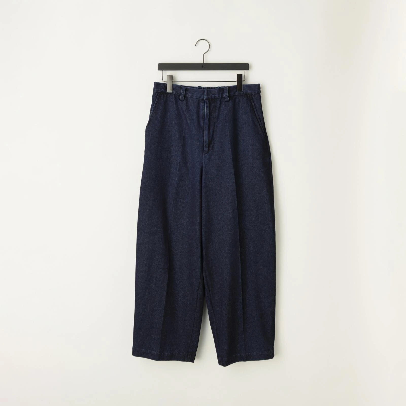
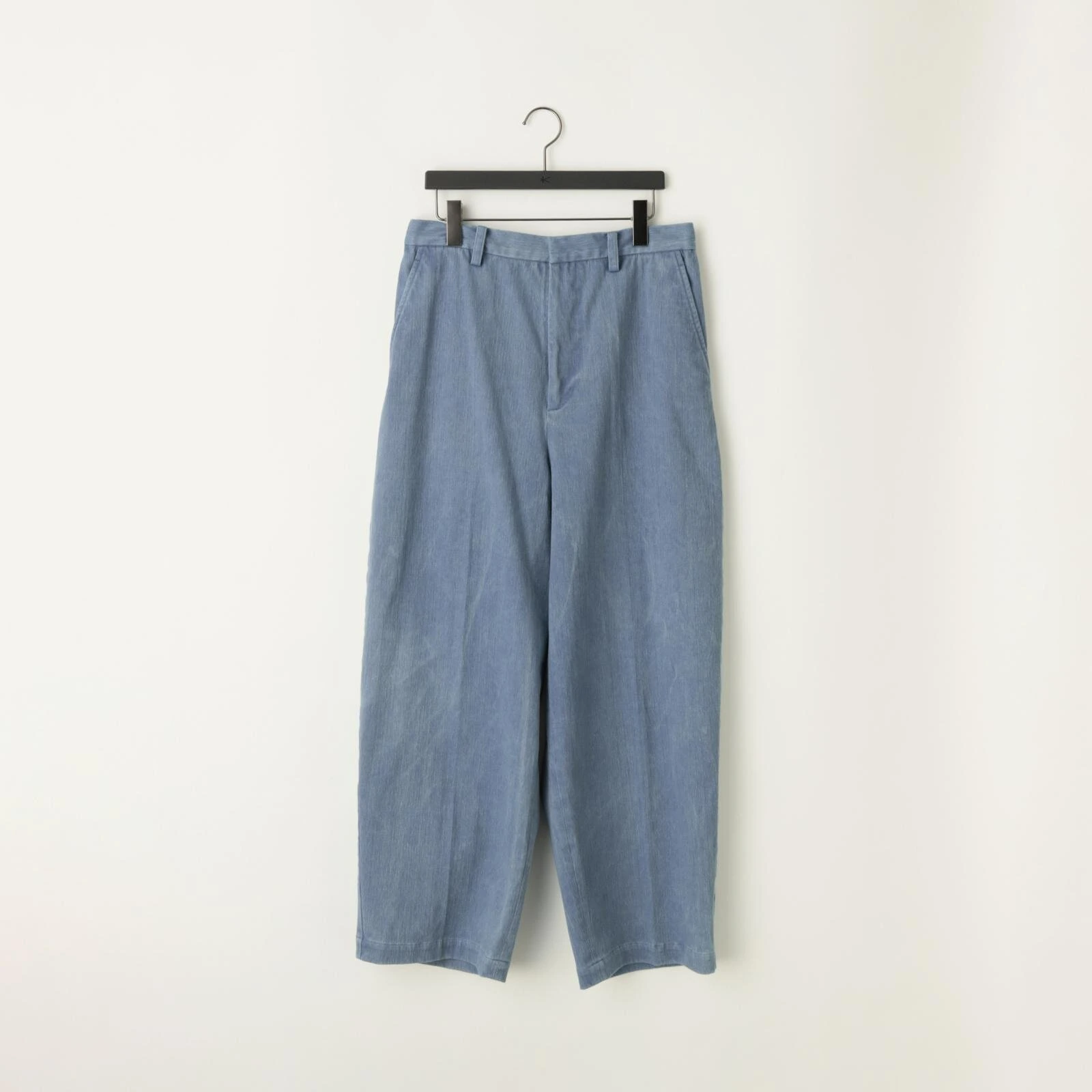
The clearest expression of that thinking sits in a new pair of pants that, at a glance, looks exactly like ordinary denim. The 32G Denim Pants are not woven at all. They are knit, built on a high density gauge that pulls in the visual texture of real denim while keeping the give and softness that only knitwear can offer. Worn over time, the fabric fades the way genuine denim does, meaning the pair will develop its own wear patterns and color loss the longer someone actually lives in them, a detail the brand is clearly proud of given how directly it gets called out in the release material.
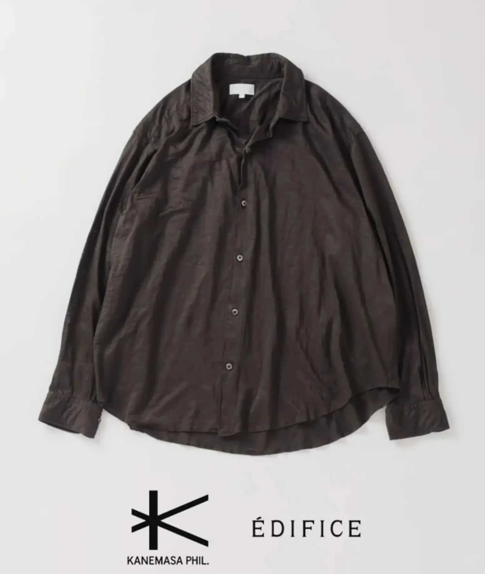
The KANEMASA PHIL. × ÉDIFICE oversized shirt combines a relaxed silhouette with a lightweight textured fabric, understated detailing, and a deep brown finish, reflecting the minimalist design language shared by both Japanese labels.
The silhouette avoids the standard five pocket jeans shape most people would expect from something described as denim. Instead it leans wide and easy through the leg, built closer to the lines of a pair of slacks, a choice that pushes the pants toward a dressier register even while the fabric itself nods toward something much more casual. Kanemasa Phil frames this as the pants doing two jobs at once, carrying the roughness people associate with denim alongside the tidiness people associate with tailored trousers, an odd pairing on paper that reads as coherent once you see how deliberately the rest of the collection sets up the same kind of contrast.
Three washes are available at launch, a bio wash, a bleach wash, and a one wash, each landing at a different point on the spectrum between a crisp, newly made look and something closer to a pair that has already been broken in. Bio wash sits closest to a lightly worn feel straight off the shelf, bleach wash pushes further toward a faded, sun bleached look, and one wash keeps the deepest, most saturated color of the three, closest to what a completely untouched pair of raw denim jeans would look like before anyone has worn them at all.
What stands out about the pants once you set the fabric trick aside is how ordinary they are willing to look. Kanemasa Phil could easily have leaned into the novelty of knit denim as a talking point on its own, letting the pants announce themselves as a technical achievement first and a garment second. Instead the finished piece reads, at a glance, as a fairly restrained pair of wide trousers, the kind of thing that would not necessarily draw a second look until someone gets close enough to notice the fabric does not behave the way woven denim usually does.
flow
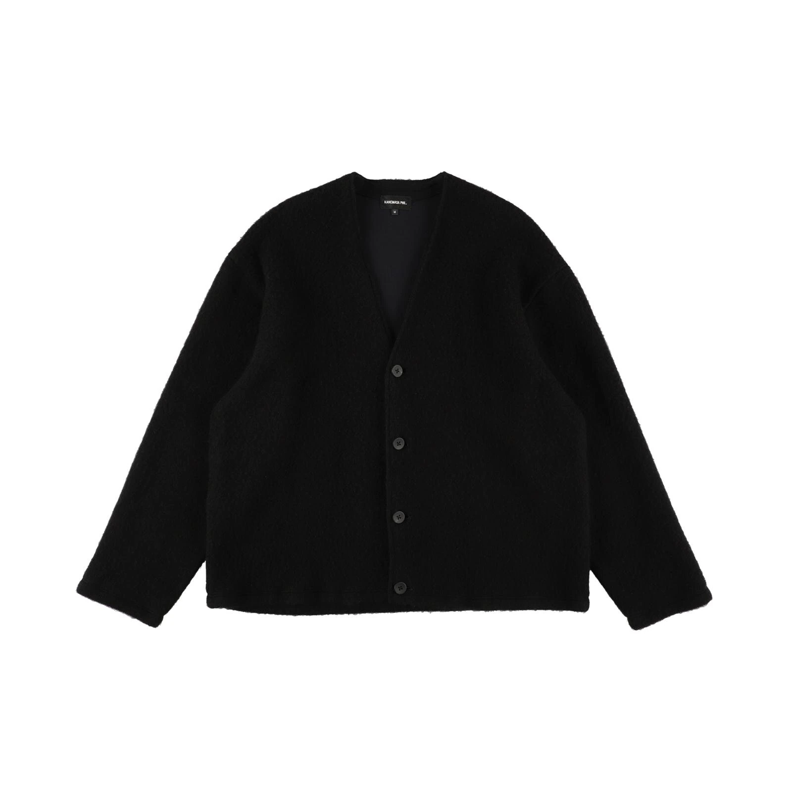
Not everything in this release lands on shelves at the same time. A cashmere cardigan, built with a 5 gauge outer layer paired with a 22 gauge inner layer, holds back until October, arriving roughly two months after the shirt and pants. The outer face uses cashmere, brushed to raise the fibers and add both softness and warmth, while the inner layer switches to cotton, chosen specifically so the cardigan can be worn comfortably without any separate lining underneath it. Only one colorway, black, is planned for the initial release.
Where the ombre check shirt and the knit denim pants both lean on a visible technical idea, something you can point to and explain, the cardigan works more quietly. Its appeal sits almost entirely in how it feels rather than in how it looks, a deliberately simple silhouette built to let the material itself carry the piece. The brand has said the goal was volume without heaviness, a cardigan that reads as generously proportioned in a photograph but sits lighter on the body than its size would suggest, achieved by raising the surface fibers of the cashmere face rather than adding extra bulk to the knit structure underneath it. Positioned against the rest of the season, it reads like the collection’s softer counterpoint, arriving once the weather has properly turned rather than at the same moment as everything built around print and texture.
fit
The rollout happens in two stages. The Balise Shirt and the 32G Denim Pants begin shipping to Kanemasa Phil stockists from mid August 2026, priced at 35,200 yen for the shirt and 39,600 yen for the pants. The cashmere cardigan follows in early October at 69,300 yen. All three pieces are part of the brand’s broader 2026 to 2027 autumn and winter collection, which first showed its full range, including leather like blousons and rounded bomber jackets built from the same furniture inspired thinking, back in July.
For anyone tracking the brand closely, the timing lines up with how Kanemasa Phil has released collections in past seasons, showing the full range early and then following up with individual item drops as fabric runs are finished and stock reaches stores. The brand followed a similar staggered pattern with its spring and summer 2026 range and its previous autumn and winter release, both of which opened with a full lookbook months ahead of any single item actually reaching a store shelf. It means the ombre check shirt, despite being the piece most likely to catch attention in a photograph, is really just the first properly finished result of a season built around a much bigger idea about furniture, texture, and how fabric can be made to do things it was never originally built to do.
n
From the DRIFT archive: Toile de Jouy Sauvage 90 Square Scarf — Ivory and Navy Blue Silk Twill · Stüssy x Tekla Black Plaid Duvet Cover: Soft, Modern Comfort
Related Articles
Nubian Put Distressed Cotton Jersey On Needles Track
20th Exclusive Vol.7. Needles. Four shapes. Black and grey. 19 September 2026. All NUBIAN doors […]