DRIFT AUDIO
Listen to this story
Choose a voice, then press play.
Nine cars in the paddock at this year’s Goodwood Festival of Speed show what racing livery looked like before sponsorship crowded out the design.
The Cathedral Paddock at the Goodwood Festival of Speed puts visitors close enough to historic racing cars to study the details most people only ever see blurred past on a track. Cars sit at rest between runs up the hillclimb, engines cooling, paint catching daylight rather than motion blur, and that stillness turns out to be the best possible condition for noticing how much design work went into a livery long before it ever turned a wheel in anger. At this year’s event, held at Goodwood House in West Sussex, that proximity became the starting point for a walk through nine cars spanning the early 1960s to the late 1990s, each one a small case study in how colour and lettering did work that today gets split across a dozen competing sponsor logos.
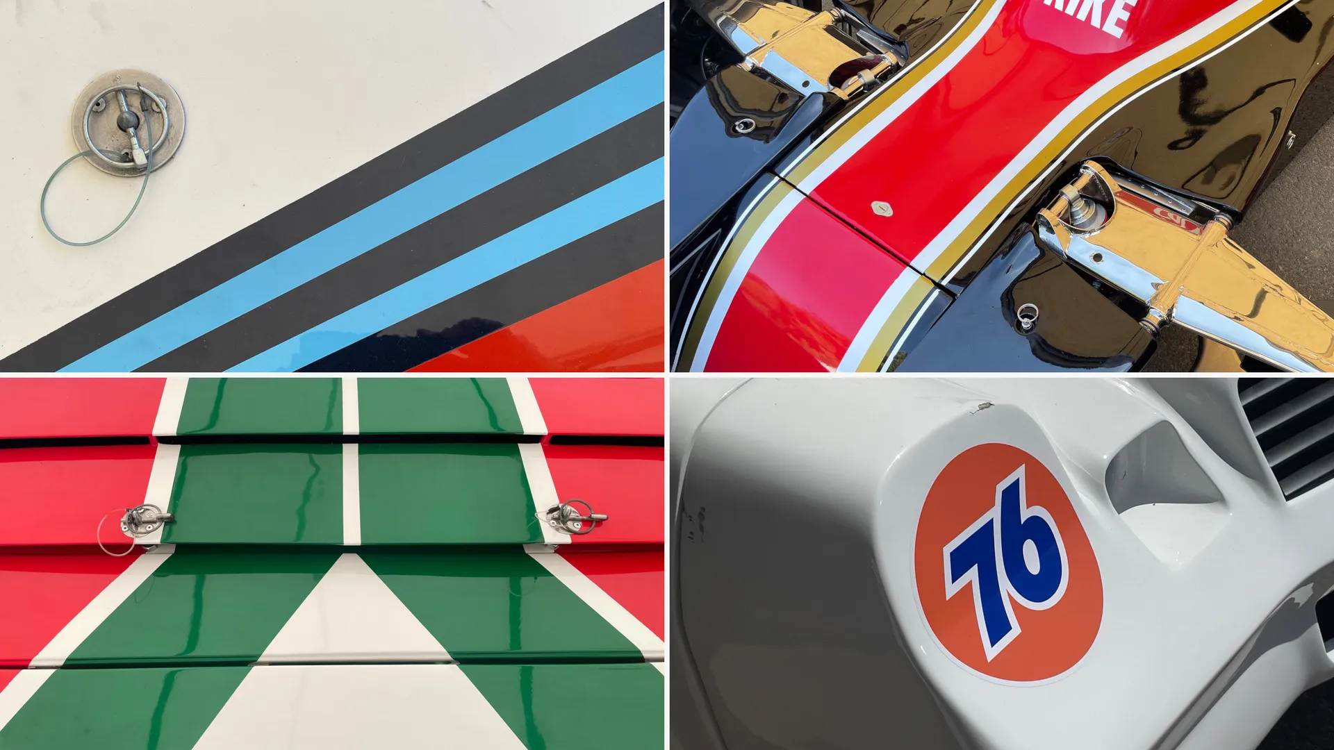
Collage Of Classic Racing Liveries Featuring Stripes, Number Graphics And 76 Branding
That stretch of decades happens to track almost exactly with the rise of commercial sponsorship in motorsport. Racing liveries in the early 1960s were still largely dictated by national colours, British Racing Green, Italian racing red, French blue, a convention that left comparatively little room for brand identity beyond the occasional oil company or fuel supplier’s mark. By the time cigarette and drinks sponsors arrived in force through the 1970s and 1980s, that national palette gave way to something closer to rolling billboards, though the best of them, Martini’s stripes or Alitalia’s tricolour on the Lancia Stratos, still managed to work with a car’s shape rather than simply sitting on top of it. Walking the nine cars gathered here in roughly chronological order makes that shift genuinely visible rather than just a line in a design history footnote.
There is a practical argument buried inside the aesthetic one. A well-designed livery was never just decoration: at speed, and especially at night, a clean number font and a carefully placed sponsor mark are what let officials, rivals and spectators actually track a car’s position on the road. That tension between legibility and branding has only gotten harder to manage as sponsorship deals have multiplied, a point a senior car designer at a brand with an active current motorsport programme raised in conversation around this year’s event, describing the ongoing difficulty of fitting several sponsors’ worth of logos onto a car while still trying to make it look as memorable as the machines gathered in Goodwood’s paddock. It is a problem largely absent from every car on this list, built in an era when a sponsor’s logo had to have a genuine motorsport connection to appear at all, leaving room for the car’s own shape and number to carry most of the visual weight.
1960 scarab-offenhauser f1
The Scarab-Offenhauser never delivered much on track, an American-built Formula 1 entry that struggled against the European teams dominating the grid at the turn of the 1960s. Built by Californian racer and constructor Lance Reventlow, the Scarab was one of the few genuinely American attempts to compete at the top level of European Grand Prix racing during a period when the sport was becoming increasingly specialised and increasingly dominated by British and Italian teams. What it did deliver was one of the clearest number treatments in the paddock: a bold “99” set high and forward on the nose, uncluttered by any of the sponsor logos that would later crowd onto every available panel. That clarity was partly a product of the era’s own rules rather than pure design restraint, since regulations at the time limited sponsor branding to companies with a genuine motorsport connection, leaving far more surface area for the number itself to do the talking.
1963 watson-offenhauser
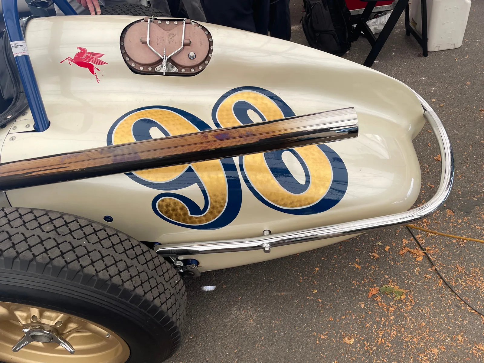
Victory at the 1963 Indianapolis 500 belonged to this front-engined Watson roadster, and the reward for a closer look is in the rear end rather than the front. Gold wheels pick up the same tone as the car’s number 98, a small but deliberate colour match that ties the whole rear three-quarter view together, while a red Pegasus mark from Mobil sits quietly on the bodywork, denoting the team’s choice of lubricant rather than shouting for attention. It is the kind of restraint that feels almost quaint set against the branding density of a modern GT car, and it rewards exactly the sort of close-range paddock walk Goodwood makes possible: from a distance the car reads as pure racing hardware, but up close it is unmistakably a piece of considered graphic design, built by chassis specialist A.J. Watson, whose front-engined roadsters dominated Indianapolis through much of the late 1950s and early 1960s before rear-engined cars took over the field.
1965 ford gt mkII
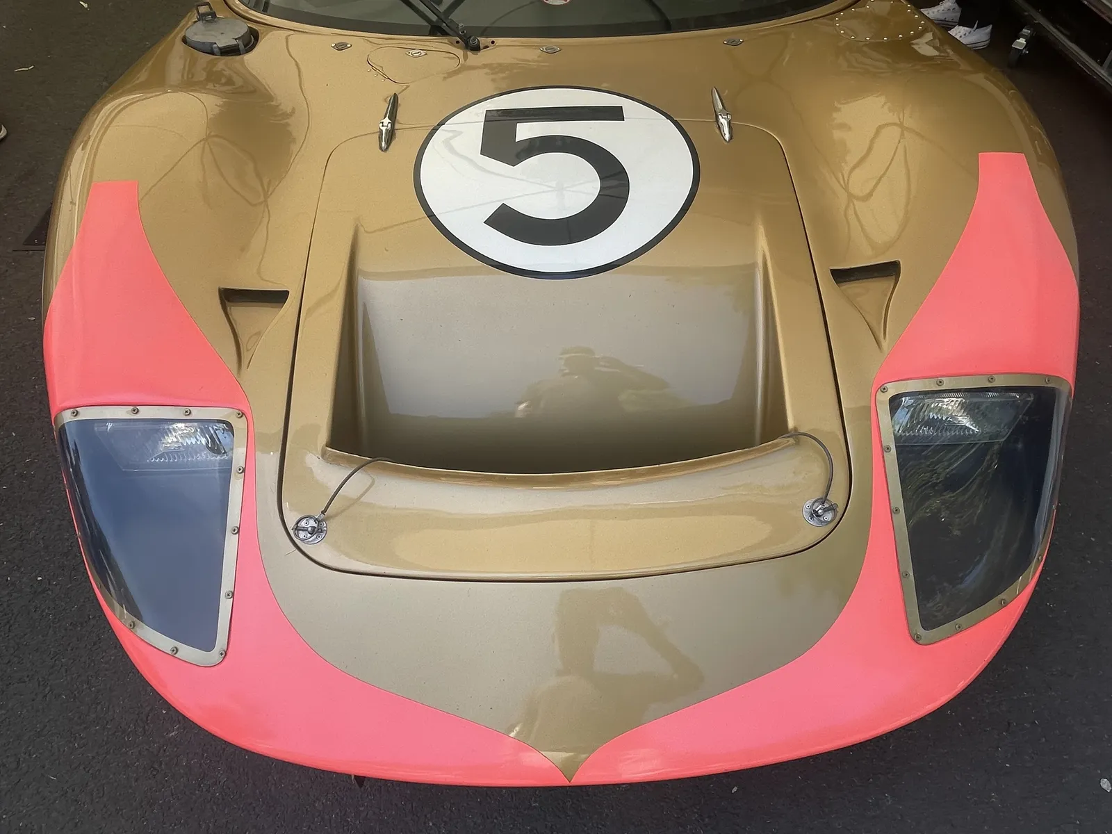
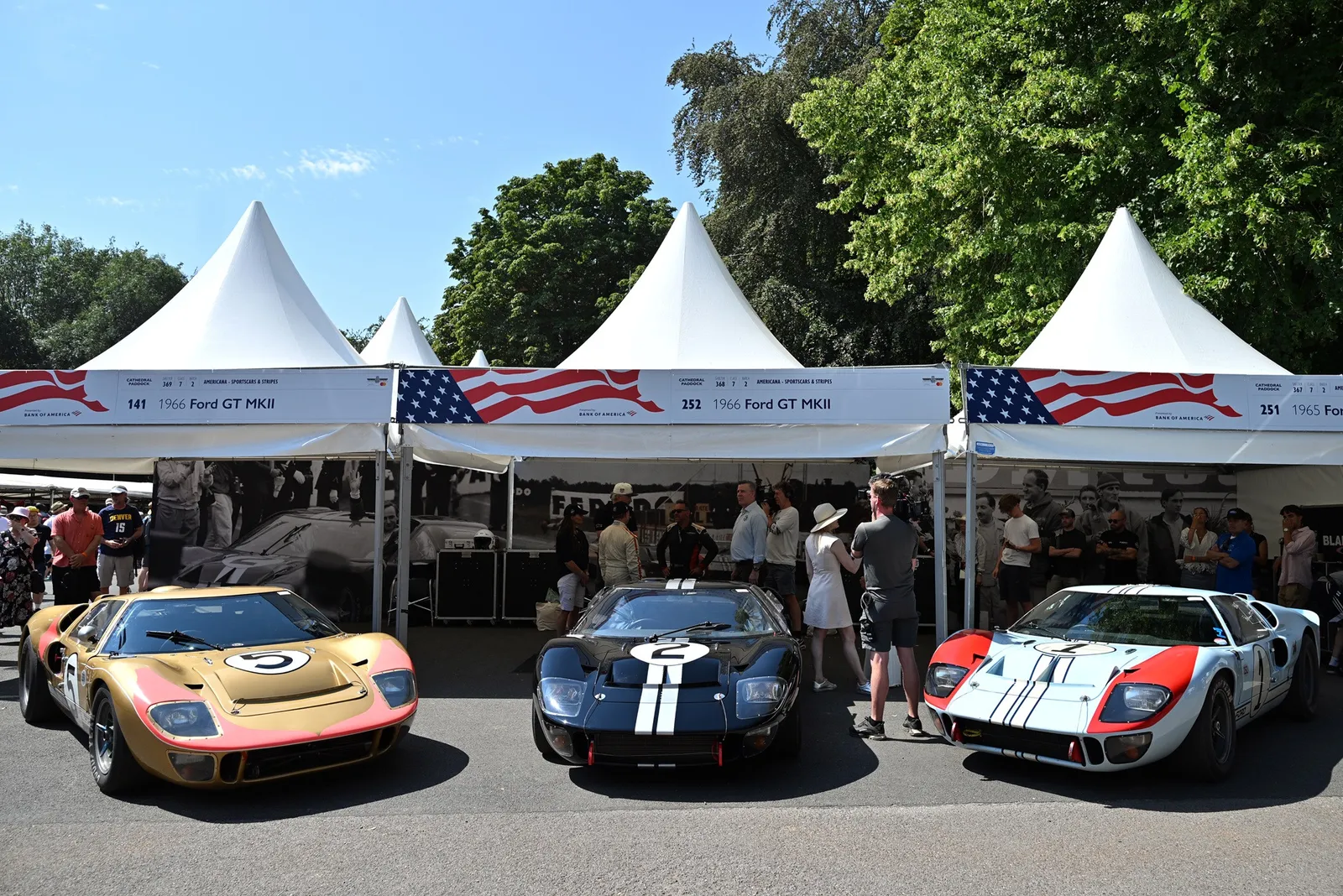
Ford’s 1966 sweep of the top three places at Le Mans, later dramatised in the 2019 film Ford v Ferrari, tends to get remembered through its winning car rather than the ones that finished behind it. That victory was itself the product of a very expensive corporate grudge, Ford’s response to a collapsed takeover attempt of Ferrari earlier in the decade, and the GT40 programme that resulted became one of the most consequential engineering efforts in postwar motorsport. This particular GT MkII came third that year, yet its gold and pink colourway arguably outshines its more famous stablemates on pure looks alone. The combination reads as unlikely on paper, a muscle car built to endure twenty-four hours of punishment dressed in a palette closer to a fashion house than a race team, and that is precisely what makes it stand out against the more conventional red, white and blue liveries Ford ran elsewhere that season.
1975 shadow cosworth dn5
Results were modest for the Shadow Cosworth DN5, a fourth-place finish at the 1975 Spanish Grand Prix standing as its best outing despite a genuinely strong Cosworth engine under the bodywork. The car’s lasting appeal has more to do with its sponsor than its results: Lucky Strike’s cigarette branding, with its distinctive roundel, was the work of Raymond Loewy, one of the twentieth century’s most influential industrial designers, a figure also responsible for Studebaker’s automotive branding and its ambitious but commercially unsuccessful 1963 Avanti. Seeing that same roundel logic applied to a Formula 1 car is a reminder that some of the era’s most enduring motorsport graphics came from designers who never set foot in a race team’s own studio.
1976 chevrolet camaro iroc
Where some liveries from this era have aged into curiosities, the Chevrolet Camaro built for the 1976 International Race of Champions still reads as genuinely tough. Its orange and blue “76” mark, borrowed from the US petrol station chain of the same name, sits cleanly on the front right wing without fighting the car’s own bodywork for attention, proof that a single well-placed logo can carry more weight than a car plastered in branding. The result backed up its looks with substance: AJ Foyt drove this Camaro to the 1976 IROC title, a series built specifically to pit leading names from NASCAR, IndyCar and other disciplines against one another in identically prepared machinery.
View this post on Instagram
1976 lancia stratos
Few cars in the paddock carry as much design pedigree as the Lancia Stratos, a car whose wedge-shaped silhouette was purpose-built for rallying by Marcello Gandini while working at Bertone, one of the defining car designers of the twentieth century, whose other credits include the Lamborghini Countach and Miura. First shown as a concept in 1971 before entering production a few years later, the Stratos was unusual among rally cars of its time for being conceived from the outset as a purpose-built competition machine rather than a road car pressed into rally service. Speaking about the car’s origins, Gandini has described wanting to create something that would draw people in regardless of its results on track, reasoning that a car built purely to win risked losing its appeal the moment it stopped winning, whereas a genuinely well-designed shape holds up on its own terms. That approach did not cost the Stratos on track either: it took three consecutive manufacturers’ World Rally Championship titles across the mid-1970s, and this 1976 example wears the green, red and white colours of Italian airline sponsor Alitalia with the same careful balance the car’s shape was built around.
1977 porsche 934/5
The unusual name on this Porsche comes from its own upgrade history rather than any marketing decision: built as a 934 and later widened into something closer to a 935 through broader wheel arches, larger wheels and an enlarged rear wing, the car earned its split “934/5” designation honestly. Porsche’s 934 and 935 programmes were themselves a response to a wave of new FIA Group 4 and Group 5 regulations in the late 1970s, and cars that fell between the two official specifications, like this one, occupy a genuinely unusual place in the model’s history rather than representing a simple trim variation. Raced in the United States under the memorably named Desperado Racing banner, only ten examples were ever built, and surviving cars now change hands for sums that can run into seven figures. The livery itself leans into that scarcity, using bold, high-contrast graphics that make the widened bodywork look intentional rather than like a mid-life modification bolted on after the fact.
1983 lancia rally 037 evo II
Few sponsor liveries from any era match Martini Racing‘s navy, light blue and red stripes for sheer clarity, a combination the Turin-born vermouth maker carried across multiple partnerships during motorsport’s era of alcohol and tobacco sponsorship. Martini’s association with Porsche through the 1970s gave way to a similarly prominent partnership with Lancia through the 1980s, visible here on a 1983 Lancia Rally 037 Evo II. The 037 itself has its own claim to fame as the last rear-wheel-drive car to win the World Rally Championship’s manufacturers’ title, taking that honour in 1983 against a new generation of four-wheel-drive rivals from Audi and others that would define the remainder of the decade’s Group B era. The Martini stripes running across its bodywork remain one of the most recognisable liveries to come out of that period, a design so effective it has been revived on countless tribute cars and limited-edition Porsches in the decades since, long after the vermouth brand’s own presence in the sport faded.
1997 panoz esperante gtr-1
Closing out the paddock’s timeline, the Panoz Esperante GTR-1 represents a genuinely unusual piece of engineering dressed in a livery built to match. Dan Panoz’s team raced this 6.0-litre V8 car across Europe and the United States in 1997, campaigning it in both the American Le Mans Series and at Le Mans itself as one of the smaller independent manufacturers willing to take on established names like Porsche and McLaren in top-level sports car racing. Its front-engine layout, positioned behind the front axle rather than ahead of it, was unusual enough for the period that the three bonnet vents up front were not just styling flourishes: they were functional cooling elements dictated directly by that unconventional engine placement. Painted in a scheme that plays up the car’s front-heavy stance, the nostril-like vents read as almost animalistic, a fitting way to end a walk through liveries where function and graphic identity were rarely treated as separate problems.
Read Drift’s related feature, NISMO Puts Four Decades Of Nissan Racing Livery On A Set Of Custom Grillz.
From the DRIFT archive: Cornell Team Develops Ultrablack: The “Darkest Fabric Ever” That Reflects Close to No Light · Tactical Elegance: Inside Bramford London Aqua Blue Three-Pocket Watch Roll
Related Articles
Four-Fifths of a Giant Killer: Hedley Studios Builds an Electric Porsche 550 J
Porsche opened its archive to a workshop in Bicester. What came back is a two-seat, […]