review: Nike GYAKUSOU — Reading the HO26 Marker as Design, Not Nostalgia
April 22, 2026

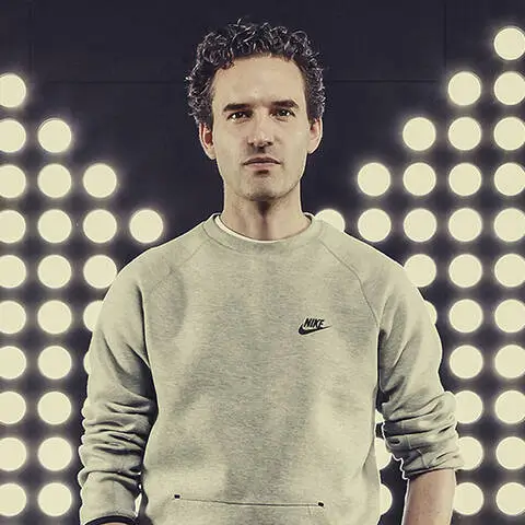
A single image—quiet, almost incidental—has sent a ripple through both fashion and running culture. In a recent feature spotlighting Nike’s Chief Design Officer Martin Lotti, attentive observers noticed something peripheral: a translucent plastic container, faintly labeled “GYAKUSOU HO26.” For those attuned to one of the most revered performance collides in modern sportswear, it read less like background detail and more like signal. A whisper, but unmistakably directional. The question forms almost instantly—could Jun Takahashi’s GYAKUSOU be returning in 2026?
The timing feels less coincidental than aligned. Running culture is not simply active—it is expanding, reorganizing itself into something global and generational. Participation rates continue to climb, particularly among Gen Z and Millennials, with a growing majority planning race entries in the coming year. The market has scaled accordingly, now exceeding $15 billion, while independent run clubs reshape urban movement culture from Tokyo to Berlin. Within this context, the reappearance—however subtle—of GYAKUSOU reads not as nostalgia, but as potential recalibration.
stir
GYAKUSOU never operated like a conventional collide. Introduced in 2010, it emerged from the lived routine of Jun Takahashi, founder of UNDERCOVER. A committed runner, Takahashi identified a gap that felt increasingly visible: performance gear engineered for function, yet absent of design authorship. In partnership with Nike’s experimental division, the line materialized not as branding exercise, but as extension of practice.

The name itself—GYAKUSOU, loosely translating to “running backwards”—signaled intent. It suggested resistance to linear progression, a reconsideration of how performance apparel could be constructed and experienced. Each garment was field-tested within Takahashi’s own running collective, grounding the line in lived conditions rather than abstract innovation. The resulting aesthetic resisted excess: restrained palettes, precise silhouettes, functional asymmetry. Pieces moved fluidly between environments—urban, athletic, transitional—without requiring redefinition.
idea
Across a decade, GYAKUSOU developed less as a series of drops and more as a system. Each release iterated on the last, refining material choices, adjusting patterning, integrating ventilation without disruption to form. Apparel prioritized movement—articulated construction, responsive fabrics—while maintaining a visual language that remained consistent, almost architectural in its restraint.
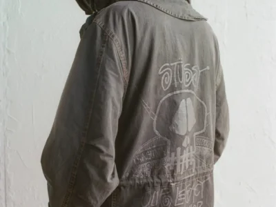
(Nike X Gyakusou Undercover Laser Light Breath Running Jacket NikeLab XS)
Footwear followed a similar trajectory. Reworked versions of performance models such as the Free RN and Lunaracer balanced responsiveness with visual clarity, avoiding unnecessary embellishment. Even adjacent projects—like the SFB Jungle Dunk or the UNDERCOVER Daybreak—echoed the same design logic: hybridization without compromise.
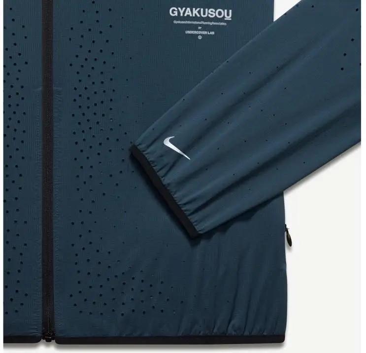
The 2021 ZoomX Vaporfly Next% GYAKUSOU edition marked a kind of culmination. Its palette—deep reds, greens, muted burgundies—paired with structural reinforcements and adaptive detailing, read as both technical object and design statement. It did not announce an ending, but in retrospect, it carried the weight of one.
convention
Later that year, the shift was formalized. GYAKUSOU would conclude as a dedicated line, with Takahashi’s focus moving toward broader collaborations within Nike’s ecosystem. The decision aligned with evolving creative structures, yet it left a distinct absence. GYAKUSOU occupied a space few others could sustain—it was neither fashion applied to sport, nor sport diluted for fashion. It existed between, fully resolved.
Now, the reappearance of “HO26” complicates that closure. Whether production code or intentional marker, its placement—within proximity to Martin Lotti—invites interpretation. Nike’s current direction, increasingly centered on heritage, narrative, and experimental presentation, only reinforces the plausibility. Recent conceptual exhibitions and material explorations suggest a renewed openness to lines that operate beyond standard product cycles.
theory
The conditions surrounding performance culture have shifted meaningfully since 2021. Running is no longer framed as solitary discipline—it functions as social infrastructure, cultural identifier, and wellness framework simultaneously. Participation has accelerated, marathons reach capacity earlier, and digital platforms extend the experience beyond physical events.
Within this landscape, GYAKUSOU’s original proposition feels less niche and more essential. Its emphasis on utility without aesthetic compromise aligns directly with current expectations. The idea of its return does not require reinvention—only translation. Updated materials, adaptive textiles, and integrated technologies could extend the original framework without disrupting its core philosophy.
View this post on Instagram
fin
Even absent confirmation, GYAKUSOU’s influence remains embedded across contemporary sportswear. The convergence of design and performance—once peripheral—now defines the category. Convergences between designers and athletic brands increasingly operate within the territory GYAKUSOU helped establish.
The container, then, functions less as evidence and more as provocation. It reopens a conversation that never fully resolved. Whether “HO26” signals a full return, a limited expression, or simply an internal reference, it repositions GYAKUSOU within current discourse.
And perhaps that is the point. GYAKUSOU was never about forward momentum alone. It was about reconsideration—about looking back, adjusting course, and moving again with greater clarity. If it returns, it won’t arrive as revival. It will arrive as continuation.
Related Articles

MELISSA x DIESEL: Exclusive Collection Part 2 Lands – Brazilian Craft Meets Italian Edge
recall A Partnership Rooted in Reinvention What’s New in Part 2 Styling the MELISSA x […]