The Shh Architect of Kawaii: OSAMU GOODS Turns 50 at Sogo Museum of Art
June 27, 2026
recall
- A Department Store Museum Reopens an American Daydream
- Who Was Osamu Harada
- 1976: Mother Goose, Koji Honpo, and the Birth of Dusty Miller
- The Philosophy: Cute With a Hidden Ache
- Inside the Exhibition: 4,000 Objects and the Fan-Club Ephemera Nobody Else Kept
- The Other Harada: Potato Boy, Mister Donut, and Hyo-chan
- Visiting the 50th Anniversary OSAMU GOODS Exhibition
- Why a 1976 Fancy-Goods Line Still Matters
stir
Most retrospectives of a “kawaii” icon end up living in a gallery built for contemporary art. This one lives on the sixth floor of a department store, which feels correct. From August 1 through August 31, 2026, the Sogo Museum of Art inside Sogo’s Yokohama flagship will host The 50th Anniversary OSAMU GOODS Exhibition, a career-spanning look at the character-goods line illustrator Osamu Harada built out of Mother Goose nostalgia, American drugstore packaging, and a very specific, very studied idea of what “cute” should feel like. The museum is opening its own Suzuki Shintaro collection alongside the goods, too — Harada was a quiet admirer of the Western-style painter, and the institution is pairing a handful of landscapes and still lifes from its permanent holdings with the OSAMU GOODS material as a kind of visual footnote on where his eye actually came from.
The Yokohama run is the opening leg of a planned national tour, and it lands on a real anniversary: OSAMU GOODS the brand turned 50 in 2026, fifty years removed from the cosmetics-company side project that became one of the most quietly influential character-goods lines in modern Japanese design.
whom
Osamu Harada was born in 1946 in Tsukiji, central Tokyo, the kind of postwar neighborhood where American GIs, imported magazines, and a half-Americanized streetscape collided with old Tokyo daily life. He studied painting privately as a child under Minoru Kawabata before going through Aoyama Gakuin’s junior and senior high schools and graduating from Tama Art University’s graphic design department. After a year-plus stretch living in the United States and traveling Europe, Harada came home with a portfolio of New York sketches that caught the eye of art director Seiichi Horiuchi, who put his illustrations in the launch issue of an・an magazine in 1970. That debut opened the door to a career across magazines and advertising, and it’s where the Americanized, slightly melancholic visual voice that would define OSAMU GOODS first showed up in public.
Harada died in 2016 at age 70. He spent his later years writing essay collections — Boku no Bijutsu-cho among them — running the Palette Club School he founded in 1997 to train illustrators, editors, and picture-book artists, and watching a brand he designed in his twenties get rediscovered by a generation of collectors who weren’t alive when it launched.
1976
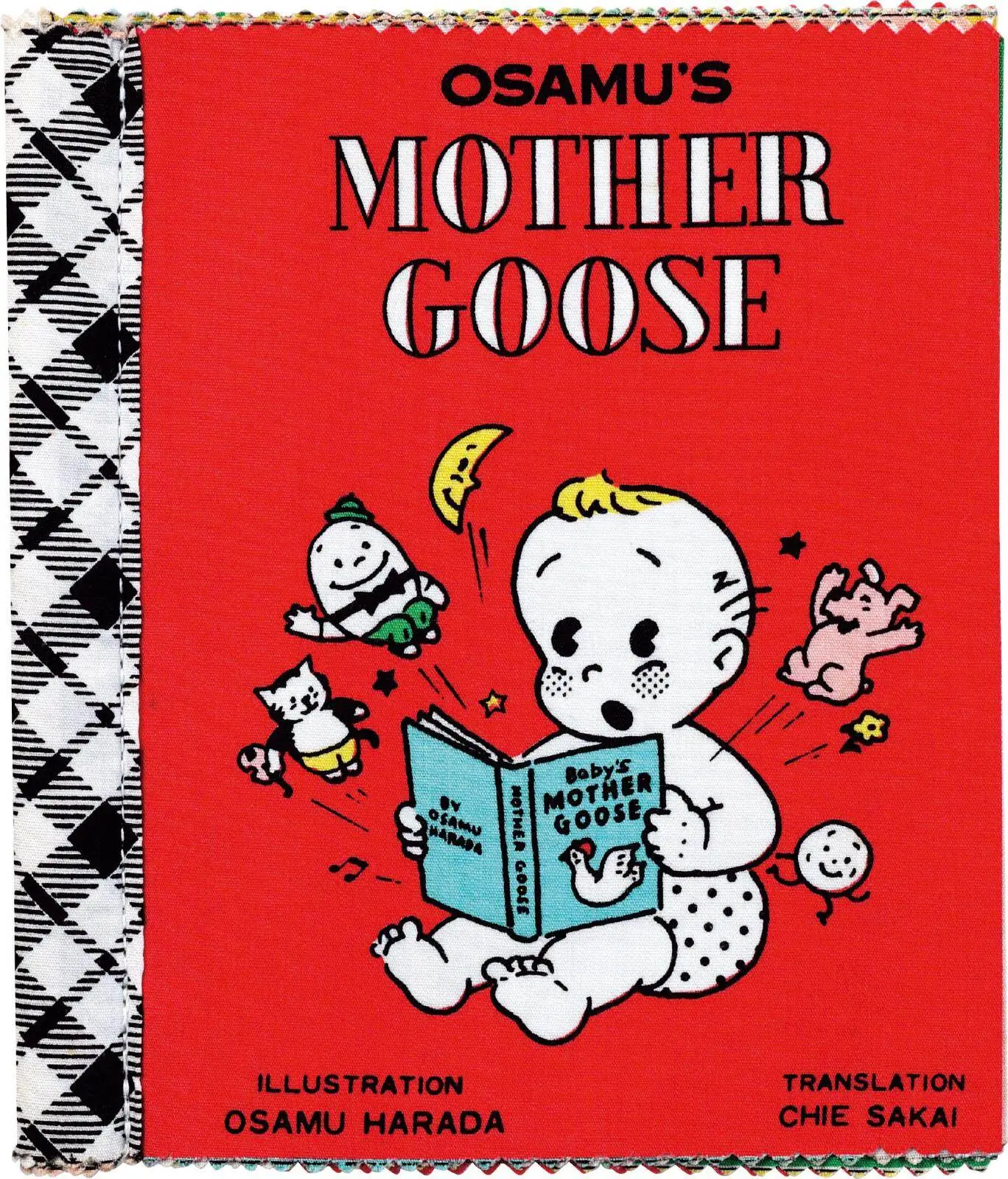
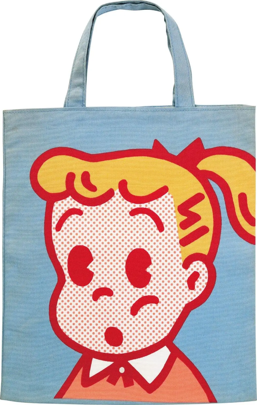
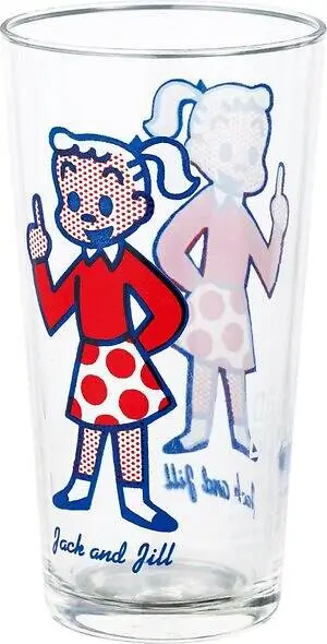
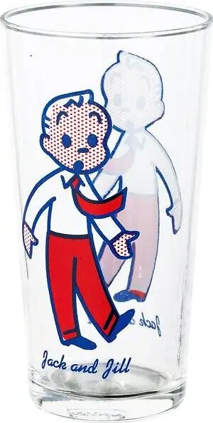
The actual origin story is corporate in a way that’s almost funny given how personal the resulting brand feels. In the mid-1970s, cosmetics manufacturer Koji Honpo commissioned Harada to design a character line, reportedly at the suggestion of a Koji Honpo employee, Shizuo Ishii. Harada turned to the British nursery-rhyme collection Mother Goose for source material, producing the illustrated book OSAMU’S MOTHER GOOSE in 1976. The characters from that book — Jack and Jill chief among them — became the visual backbone of a new commercial line that Koji Honpo named OSAMU GOODS, manufacturing the products in-house while spinning up a dedicated sales subsidiary called Dusty Miller, named for the silvery, fuzzy-leafed garden plant also known as silver ragwort.
Harada wasn’t a hired illustrator handing off finished art and walking away. By most accounts he was involved end to end — selecting items, approving materials, refining shapes, signing off on packaging and logotype. Early pieces frequently carried the credit line “PRODUCED BY DUSTY MILLER TOKYO NEWYORK,” a detail that sounds like branding fantasy but wasn’t entirely invented: Koji Honpo kept a small office in New York at the time. At the line’s peak, Harada and his team were reportedly turning out twenty to thirty new item designs a month. Over the run of the original Dusty Miller era, the catalog is said to have swelled past 4,000 distinct items — school bags, stationery, enamelware, bath goods, bookends, LP totes, ceramics, and the fabric-bound OSAMU’S MOTHER GOOSE picture book that started it all.
Cosmo Merchandising has held the OSAMU GOODS license since 1997, and contemporary product no longer carries the Dusty Miller mark — which has turned the original, Dusty Miller-stamped pieces into a genuine secondary-market category of their own, the kind of thing collectors specifically hunt estate sales and auction sites for.
a know
Harada articulated his own definition of “kawaii” with unusual precision for a commercial illustrator: a bright, untroubled, healthy expression, with the faintest seasoning of loneliness or sadness tucked just beneath it. That tension is the whole trick of OSAMU GOODS. The characters read instantly as cheerful — round-faced kids, a loyal little dog, candy-bright color palettes pulled from American drugstore signage and Hollywood backlots — but there’s a wistfulness sitting underneath, an awareness that the “good old America” being referenced was already gone by the time Harada was drawing it.
He was working from memory and media, not direct experience: the imagery came from American teen magazines like Seventeen that he encountered in the 1960s, from actresses in Hollywood films, and from the everyday objects surrounding them — the props of a lifestyle Harada was observing from Tokyo rather than living. That secondhand, slightly nostalgic relationship to its own reference material is arguably what kept OSAMU GOODS from aging into kitsch. It was never really about America. It was about the feeling of looking at an idealized version of it through a magazine page.
show
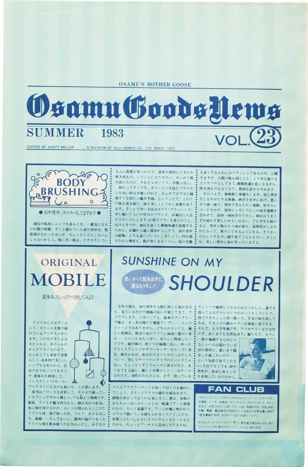
The Yokohama show is built around the sheer volume of what Dusty Miller produced, and the exhibition’s organizers are leaning into that scale rather than curating it down to a tidy greatest-hits wall. Expect early pieces like the cloth-bound 1976 edition of OSAMU’S MOTHER GOOSE, the 1982 school bag built around the Jack-and-Jill characters, and a run of shop bags — including a 1983 example numbered vol. 23 — that doubled as both packaging and reading material, with the reverse side laid out like an English-language newspaper column covering seasonal style and short essays.
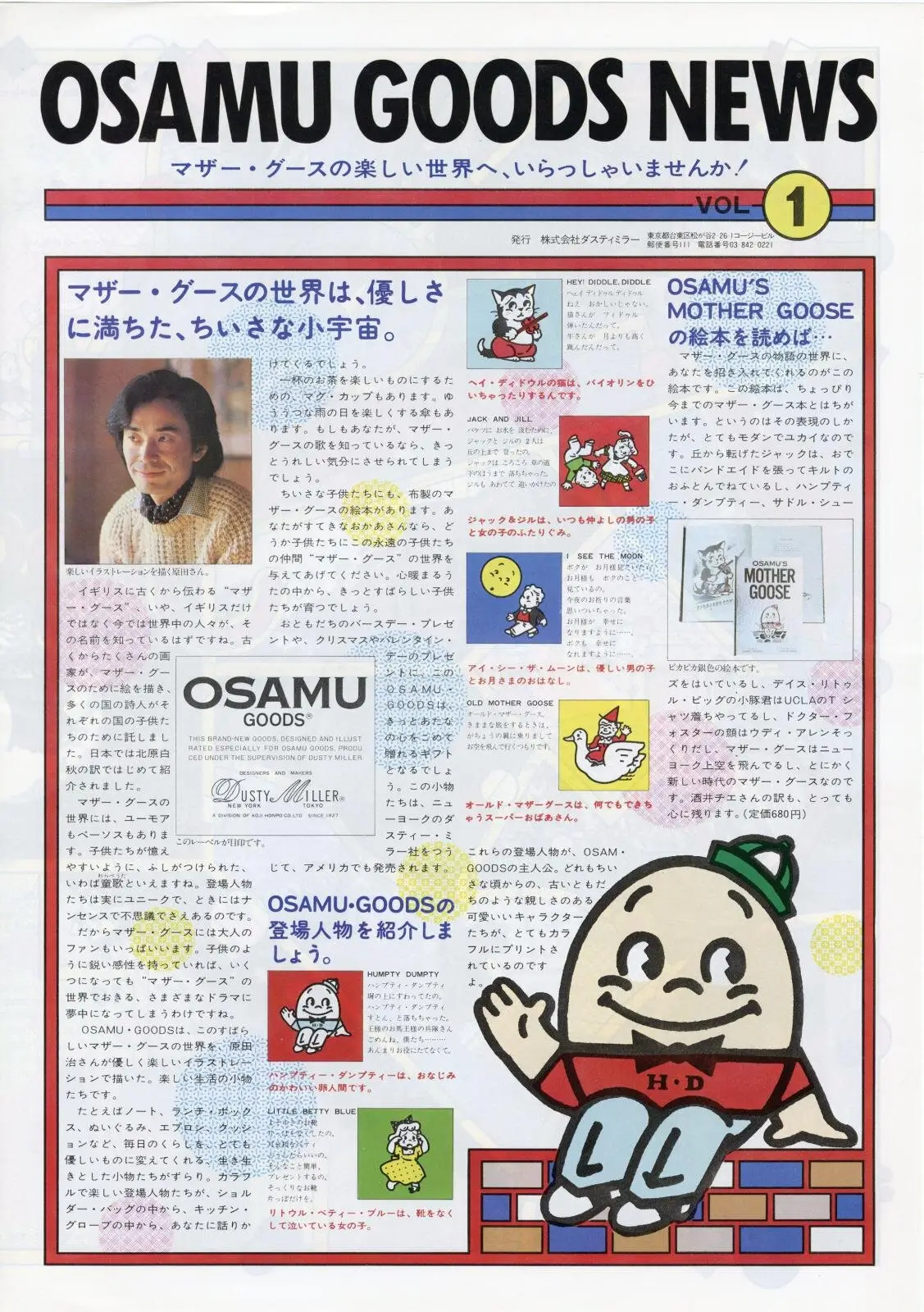
What separates this retrospective from a standard product-line survey is the inclusion of the brand’s direct-to-fan communications: the 1991 debut issue of the OSAMU GOODS NEWS newsletter and the 1992 fan-club magazine OSAMU GOODS STYLE, which Harada edited, designed, and shot the cover photography for himself. Those publications were explicitly modeled on American magazines like LIFE, folding tributes to that visual tradition in with glimpses of everyday life lived alongside the goods themselves. It’s a reminder that OSAMU GOODS was never purely transactional — Harada was building a relationship with a specific, mostly teenage and twenty-something female fan base, and the correspondence ran in both directions.
For visitors who grew up with the brand in its late-1970s-through-1990s commercial peak, the exhibition functions less like a design-history survey and more like an inventory of a specific adolescence — the school bag a friend carried, the shop bag a first purchase came home in.
other
OSAMU GOODS is the headline act, but it wasn’t Harada’s only character work, and the Sogo show’s biographical material reportedly touches on the rest of the résumé. Harada drew the original “Potato Boy” mascot for Calbee’s potato chip packaging in 1976, the same year OSAMU GOODS launched. He produced premium illustrations for Mister Donut starting in 1984, a campaign that became its own pop-culture moment and is, by most accounts, the work that made his style recognizable to people who’d never bought a single piece of Dusty Miller merchandise. In 1988, he designed “Hyo-chan,” the character on Kiyoken’s soy-sauce dispenser bottles — a piece of restaurant-table ephemera so ubiquitous in the Yokohama area that most people who’ve used one have no idea who designed it.
None of those properties are OSAMU GOODS in the legal or commercial sense — they’re separately licensed, separately owned characters — but they share the same hand, the same line weight, the same instinct for a round, friendly face. Seeing them mentioned alongside the main collection underlines how much of Japan’s everyday visual landscape in the 1980s ran through one Tsukiji-born illustrator without most people clocking it.
visit
The exhibition runs daily for its full month at Sogo Museum of Art, located on the sixth floor of Sogo’s Yokohama store at 2-18-1 Takashima, Nishi-ku, Yokohama. Hours run 10:00 a.m. to 8:00 p.m., with last entry 30 minutes before close, and the museum notes hours are subject to the department store’s own operating schedule.
General admission is listed at ¥1,400, with university and high school students at ¥1,200; junior high school age and younger get in free. Buying an official online ticket through the museum by July 31 drops those rates to ¥1,200 and ¥1,000 respectively, and Club On / Millennium cardholders showing their card or app during the run get the same discounted pricing at the door. A limited run of online-only tickets bundled with an original museum tote bag is available for ¥3,500 while supplies last. Holders of disability certificates and one companion each are admitted free. Official tickets are available through the museum’s online ticketing page.
A separate, ticketed gallery talk is planned for July 31 from 5:00 to 7:00 p.m., priced at ¥1,000 with capacity for 100 attendees and advance purchase required through the same online system — worth flagging for anyone planning a trip specifically around programming rather than just the open exhibition dates.
why
It’s tempting to file OSAMU GOODS under straightforward nostalgia — a 50-year-old fancy-goods brand getting its flowers in a department-store museum. But the through-line from Harada’s drugstore-pharmacy fascination and his self-aware definition of cute runs directly into the visual logic of character merchandising as Japan still practices it: a friendly, slightly melancholic face attached to an enormous catalog of small, collectible objects, sold with as much attention to the packaging and the fan correspondence as to the product itself. That’s the OSAMU GOODS playbook, and it’s recognizably the same playbook running under a huge amount of contemporary Japanese character licensing.
Harada never got to see this particular anniversary. The 50th-anniversary exhibition is the first major Yokohama-area survey to treat that catalog — and the man who obsessively designed every corner of it — as a complete body of work rather than a string of nostalgic SKUs. For a publication that spends as much time in BE@RBRICK boxes and Rick Owens runway notes as it does in auction houses, OSAMU GOODS is a useful reminder that “cute” was never an accident in Japanese design. Somebody was sitting with the proofs, deciding exactly how much sadness was allowed to show.
Related Articles
Willie Cole Turns A Pile Of Saxophones Into Something That Wants To Fly – JazzBird
recall The Piece Itself A Practice Built On Found Objects From Kansas City’s Skies To […]