DRIFT AUDIO
Listen to this story
Choose a voice, then press play.
A sheet metal object built around a single icon, and the custom mould it took to get the fold right.
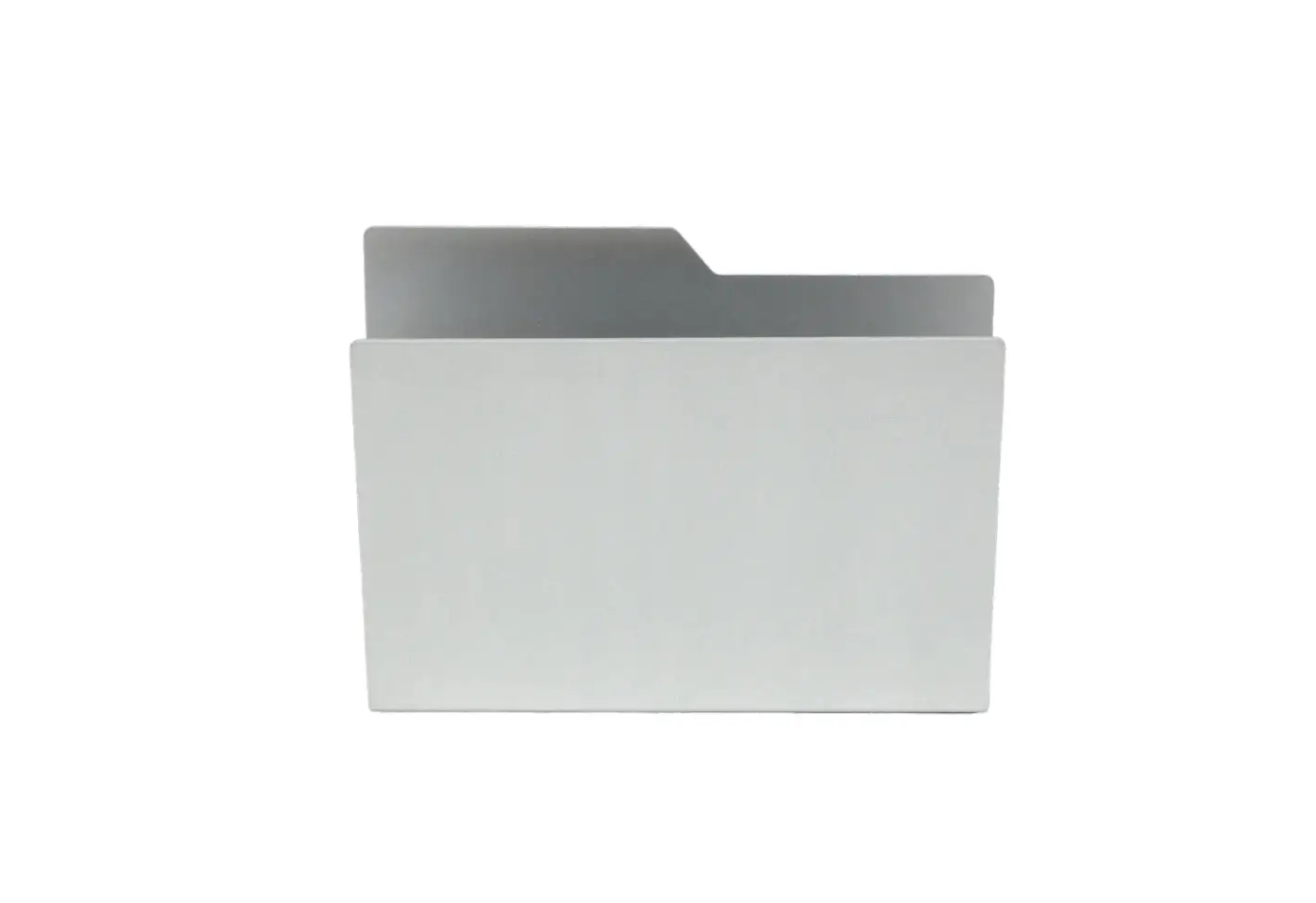
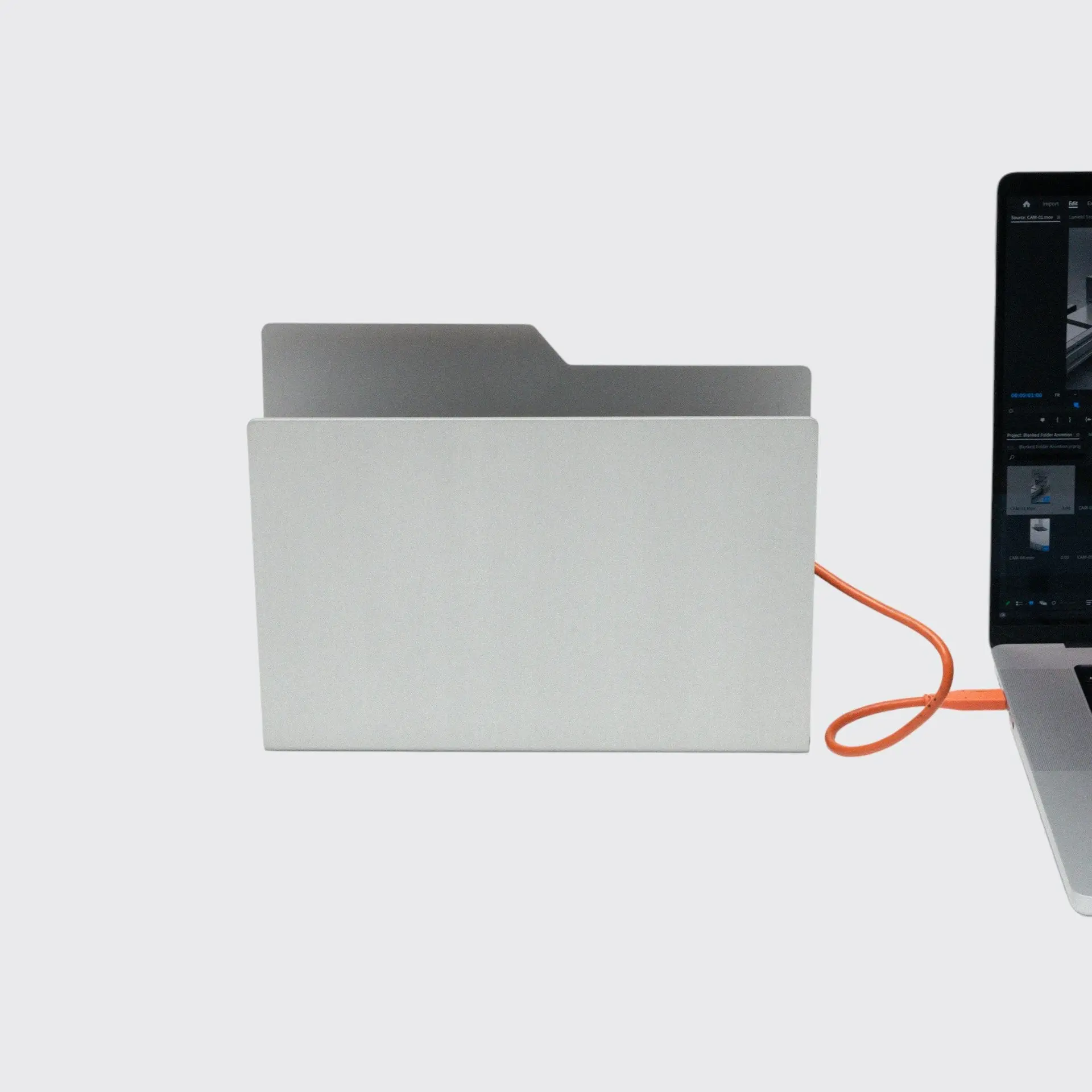
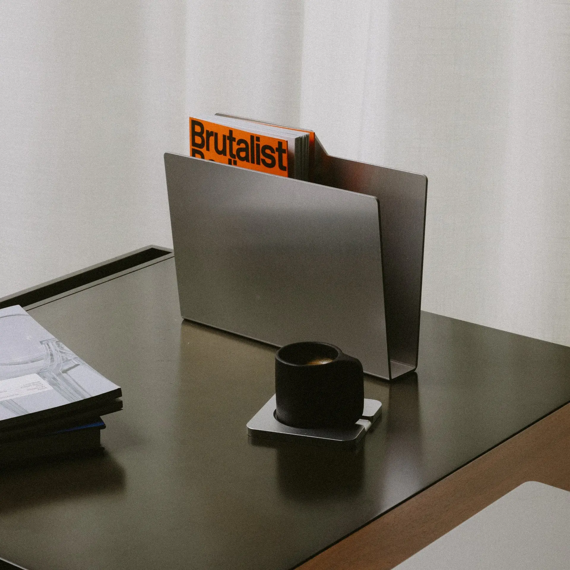
A folder icon has sat in the corner of computer desktops for four decades without anyone thinking much about what it would look like as a physical thing. BlankedStudios decided to find out. The Los Angeles based object studio’s Desktop Folder takes the 📁 emoji, one of the most recognized pictograms in digital interface design, and rebuilds it as a piece of custom molded sheet metal measuring 10.25 by 2.5 by 8 inches. It ships in matte silver or matte black anodized finishes, priced at $135, and it is meant to sit on a desk holding notebooks, hard drives, or whatever else tends to accumulate near a keyboard.
The idea reads as a joke at first. Icons are shorthand, built to be legible at sixteen pixels and forgotten the moment they’re clicked. Turning one into a standalone object risks looking like a novelty, the kind of desk trinket that photographs well and does nothing else. BlankedStudios avoids that trap by treating the folder shape as a genuine design problem rather than a punchline, and the resulting object holds up as something closer to a small sculpture that happens to be useful.
stir
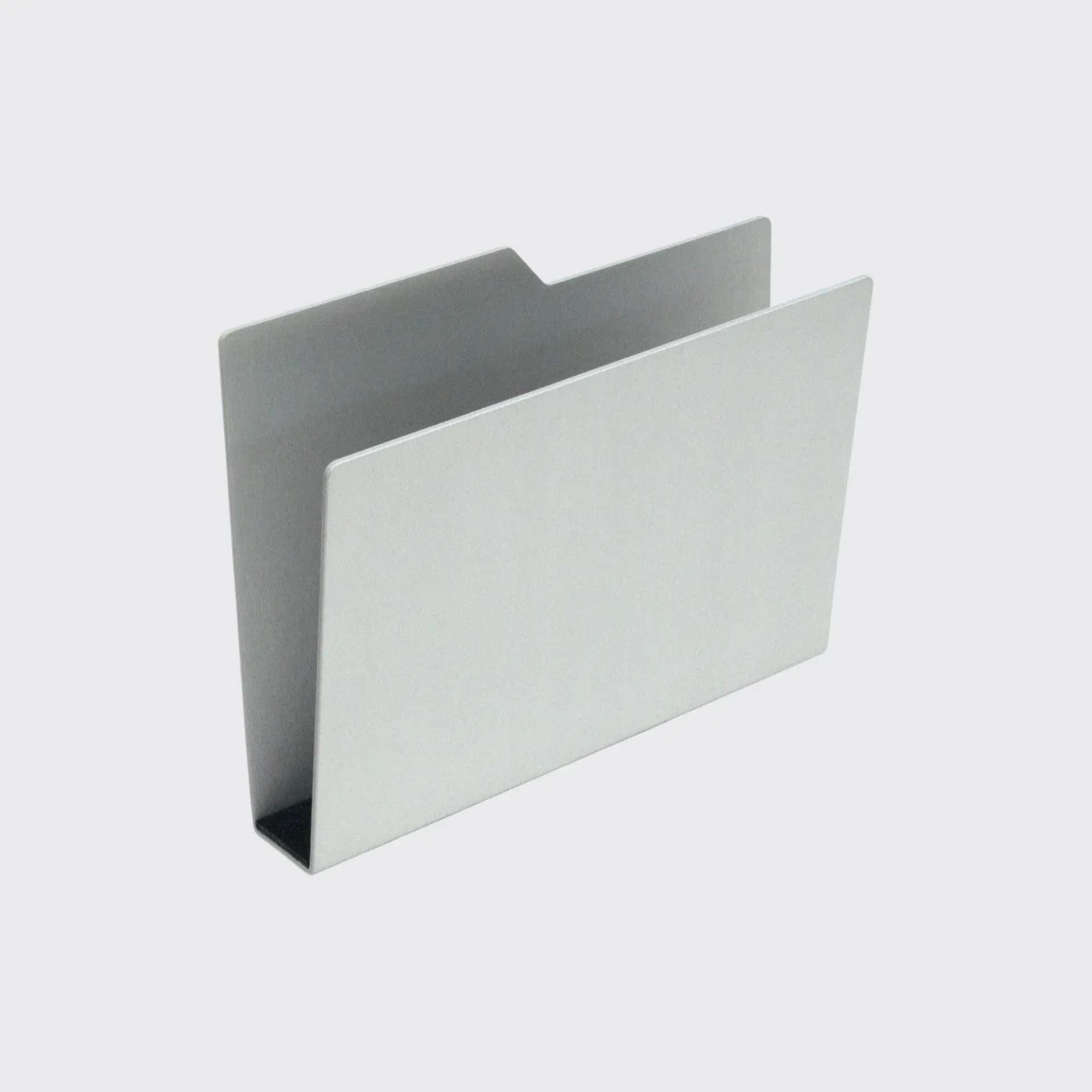
The Desktop Folder emoji has a specific geometry: a flat rectangular base with a tab cut into the top edge and the whole shape leaning back at a steep angle, as though the folder were caught mid tilt. That lean is the entire view sig of the icon, and it is also the hardest part to translate into a rigid material. Paper folds along a crease without resistance. Sheet metal does not.
View this post on Instagram
BlankedStudios’ description of the piece is direct about this tension. Traditional bending techniques cannot achieve the distinct steep fold, which led the studio to develop a custom mold, and the perspective shifts depending on the angle it’s view from, transform a 2D icon into a tangible object. That last point is doing real work. The object is not a static replica of the emoji. Move around it and the sil changes, the flat planes catching light differently depending on where you’re standing, which is closer to how a piece of furniture or sculpture behaves than how a desk accessory usually does.
mould
Most small metal objects at this price point are stamped or press braked, processes that rely on a die pressing a flat blank into a new shape along a straight line. That approach works fine for shallow angles. It does not work for a bend as steep as the one the folder icon demands, where standard tooling would either crack the material at the crease or fail to hold the angle once the pressure releases.
BlankedStudios’ response was to build a mold specific to this one form, an investment that is easy to undervalue from the outside. A custom mold means commit to a shape before knowing whether the market will support the run, and it means the tooling itself becomes a sunk cost that only pays off through at scale. For a young studio, that’s a real bet on a single object, and it signals that the fold was treated as non negotiable rather than as something to approximate.
The result is a bend sharp enough that the object reads as folded rather than bent, which matters more than it sounds. A gentler curve would have softened the whole piece into something more generically “desk organizer,” losing the specific graphic quality that makes the icon recognizable in the first place. The steep angle is the difference between an object that quotes the emoji and one that merely gestures at it.
It’s worth sitting with how unusual that decision is for an object at this scale. Custom tooling is the kind of cost that larger manufacturers reserve for products they expect to sell in the thousands, where the mold’s price gets absorbed across a long production run. A small studio committing to the same process for a single sixty dollar increment on top of what a stamped equivalent might cost is a bet that the shape itself is the product, not an afterthought bolted onto a cheaper process. Seen that way, the fold isn’t just a design detail. It’s the reason the object exists in metal at all rather than as a cheaper injection molded plastic version that could have hit the same silhouette without the fabrication headache.
straddle
Surface treatment carries a lot of the object’s presence. Beneath the matte anodized finish sits an underlying hand-brushed surface texture, a detail that is easy to miss in photographs but changes how the piece reads in person. Anodizing alone tends to produce a uniform, slightly cold surface. Brushing the metal first and anodizing over it keeps a directional grain visible under the matte coat, so the folder catches light unevenly rather than reflecting it flat, giving the surface a texture rather than a shine.
The interior tells a different material story. Wool felt lines the interior for object protection, softening what would otherwise be a bare metal cavity and protecting whatever’s stored inside it, whether that’s a notebook, a stack of index cards, or a set of external drives. A 3M silicone base provides anti-slip stability underneath, keeping the object planted on a desk despite its lean rather than sliding when nudged. Both choices are functional rather than decorative, but they also reinforce the sense that this is an object built to be handled and used daily, not just displayed.
Silver Metal Desktop Folder Organizer Isolated On A White Background
fx
For all the attention paid to its sil, the Desktop Folder is still described by the studio primarily as storage. It functions as both a storage object and a sculpture desktop presence</cite>, and the dimensions back that framing up. At 10.25 inches wide and 8 inches tall, there’s real interior volume behind that tilted front face, enough to hold a stack of notebooks, a small external drive collection, or loose desk clutter that would otherwise spread across a work surface.
That dual identity, storage piece and sculpture object, is where a lot of small object design tends to fail. Objects built purely for view impression often turn out awkward to actually use, while objects built purely for function rarely earn a second look. The Desktop Folder’s core bet is that the same steep fold doing the view work also create a functional pocket, so the two goals reinforce each other instead of competing. Whether that bet pays off in daily use will depend on how deep that interior cavity actually is relative to what people try to stuff into it, something photography alone can’t fully answer.
There’s also a practical case for why a folder shape works so well as a desk object in the first place, independent of the emoji reference. A tilted, open faced form is easier to load and unload one handed than a closed box or a drawer, since nothing needs to be lifted or slid out from underneath a lid. That’s part of why physical folders and magazine racks have used a similar leaning geometry for decades, long before the digital icon existed. BlankedStudios’ version borrows the emoji’s proportions, but the underlying logic of the shape, an angled opening that stays accessible without extra moving parts, predates the pictogram it’s referencing.
vocab
The Desktop Folder isn’t an isolated gesture from BlankedStudios. The studio’s catalog leans consistently toward taking mundane, overlooked forms and rendering them in unexpected materials: a concrete holder built around a “leaning” balance point that reportedly went through five prototypes before land on its final proportions, and a liquid metal series exploring contrast between industrial metal surfaces and the warmth of wood. Across that range, the pattern holds. BlankedStudios isn’t inventing new shapes so much as noticing shapes that already exist everywhere, in software interfaces, in everyday materials, and asking what happens when they’re rebuilt with more care than the original context ever demanded.
That’s also where the studio’s own framing lands. Its site describes simplicity as not the absence of work, but the result of it, with every object shaped through reduction as materials are studied, forms are tested, and proportions are refined through repetition until only what is essential remains. The Desktop Folder is a clean example of that philosophy in practice. The emoji itself is already about as reduced as a folder can get, a handful of pixels standing in for a physical object. Rebuilding that reduction in metal, rather than adding detail back in, keeps the object honest to its source rather than over-designing it into something the icon never suggested.
scope
The Desktop Folder also fits into a wider pattern that has been building across independent object and furniture design for the past few years, where designers pull directly from digital interfaces rather than from architecture, nature, or historical furniture references, the sources object design has typically leaned on. A loading spinner rendered as a coffee table, a browser tab reimagined as a bookend, a battery icon turned into a lamp: the specific examples vary, but the underlying move is the same one BlankedStudios makes here, treating an interface element that most people process without conscious thought as a legitimate starting point for physical form.
Part of what makes this approach effective is how thoroughly interface icons have already been reduced before a designer even touches them. App and operating system icons go through years of iteration aimed at maximum legibility at minimum size, which means the shapes that survive tend to be extremely economical, carrying only the details necessary for instant recognition. That makes them unusually well suited as starting points for minimalist object design, since most of the reduction work has already happened. The design challenge shifts from “how do I simplify this” to “how do I build this simplified thing in a material that wasn’t designed to hold that shape,” which is exactly the problem BlankedStudios solved with its custom mold.
fin
The Desktop Folder sits at a specific intersection of design object and desk accessory that has gotten more crowded in recent years, as more studios chase the same audience of people willing to pay a premium for objects that look considered rather than mass produced. What separates this piece from a lot of that crowd is the specificity of its reference. It isn’t a vague riff on min or an abstract geometric form. It’s a direct, literal translation of one recognizable icon, executed with enough fabrication rigor that the joke of the premise gives way to genuine object design once you look closely at how the fold was achieved.
Whether that’s worth $135 to any individual buyer depends on how much weight they put on the story behind an object versus its raw utility as storage. But the underlying lesson holds regardless of price point. Minimal design doesn’t require starting from an abstract or ambitious brief. Sometimes it starts with the most mundane symbol imaginable, sitting unnoticed in the corner of a screen, and the only real design challenge left is committing to build it properly rather than approximating it. A custom mold for a single steep fold is a strange thing to invest in for a $135 object. It’s also exactly the kind of decision that separates an object with a story behind it from one without.
From the DRIFT archive: PANTONE’s 2026 Color of the Year Takes Shape With Play-Doh and Post-It Editions · Lara Croft’s Dual Guinness Records Cement an Icon: How a Digital Explorer Became a Cultural Artifact Herself
Related Articles

Four-Fifths of a Giant Killer: Hedley Studios Builds an Electric Porsche 550 J
Porsche opened its archive to a workshop in Bicester. What came back is a two-seat, […]