DRIFT AUDIO
Listen to this story
Choose a voice, then press play.
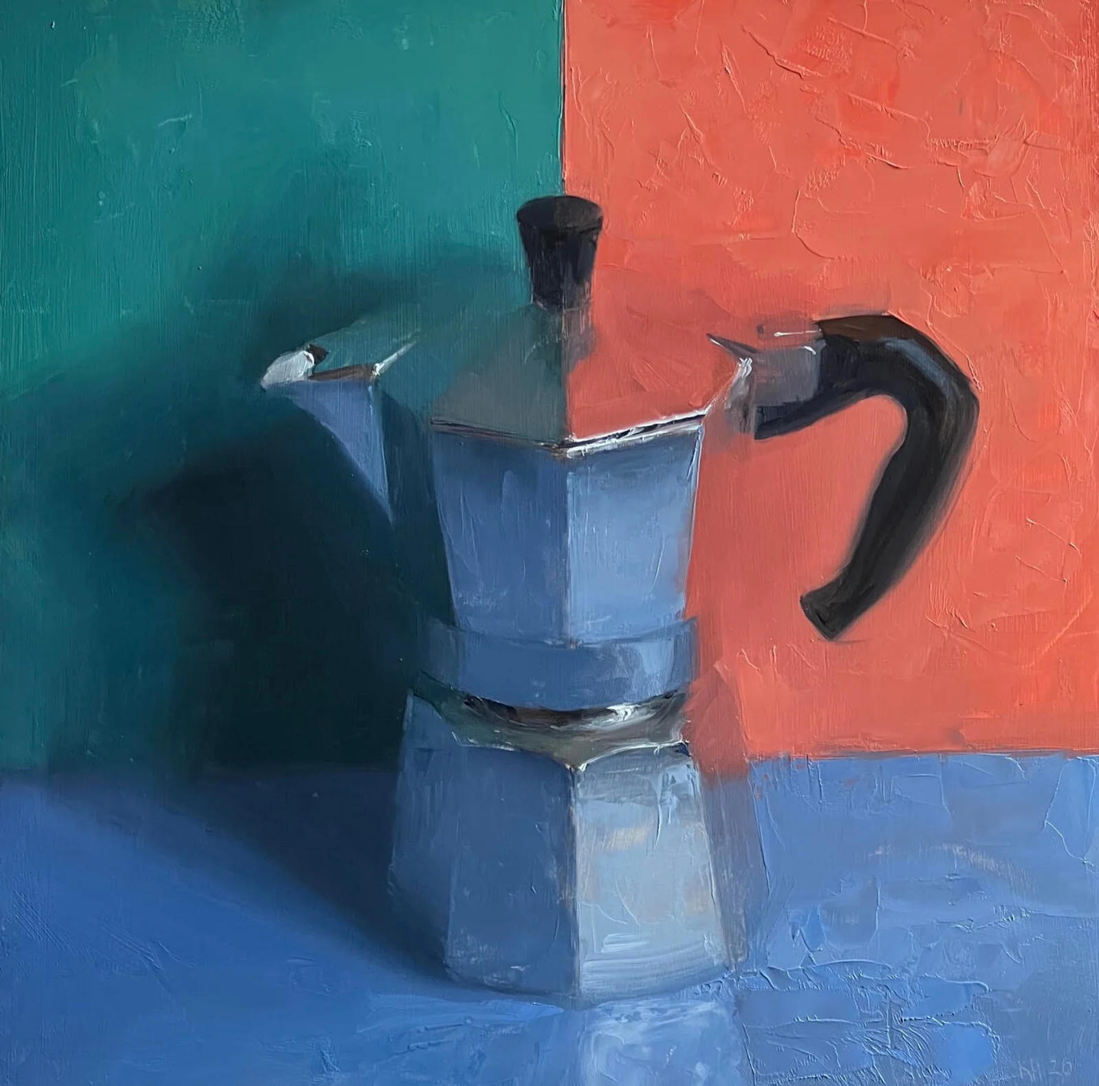
Kenny Harris has spent years painting the same aluminum coffee pot in different light. His newest version, Moka with Turquoise, Coral and Kings Blue, continues that experiment.
Kenny Harris did not set out to build a body of work around a coffee maker. The object found him the way most of his subjects do, through paying close attention to something ordinary until it stopped looking ordinary. The moka pot, an octagonal aluminum vessel first sold by Bialetti in 1933 and named for the Yemeni city of Mokha, has become the anchor of an ongoing series that now includes dozens of paintings, each one built around the same faceted form rendered in a different combination of color. Moka with Turquoise, Coral and Kings Blue, dated 2026, is the latest entry.
What makes the series work as a body of work rather than a repeated exercise is the specificity of the light in each canvas. Harris has described his interest in the pot as almost entirely about how color behaves on its surface rather than the object itself. “I find delight in searching for harmonies, lost edges, and texture variation,” he has said of the series, a description that applies as much to how turquoise sits against coral in the newest painting as it does to any of the dozen or so color pairings that came before it. The metal itself barely changes from canvas to canvas. What changes is everything reflected in it.
The moka pot itself is a strange object to build a painting practice around, mostly because it was never designed to be looked at this closely. Alfonso Bialetti built the first version in 1933 as a practical solution to a domestic problem, a way to get espresso style coffee out of a stovetop without the pressurized machinery of a cafe bar. The octagonal shape came from manufacturing convenience as much as design intent, easier to cast and easier to grip than a rounded form. Harris did not invent the idea of painting a coffee pot, still life painters have used kitchenware as subject matter for centuries, but he found something in this particular object’s geometry that most painters who have handled it never fully exploited: eight flat facets, each one catching light and color from a slightly different angle, effectively turning a single object into a small grid of separate color studies that still reads as one coherent thing.
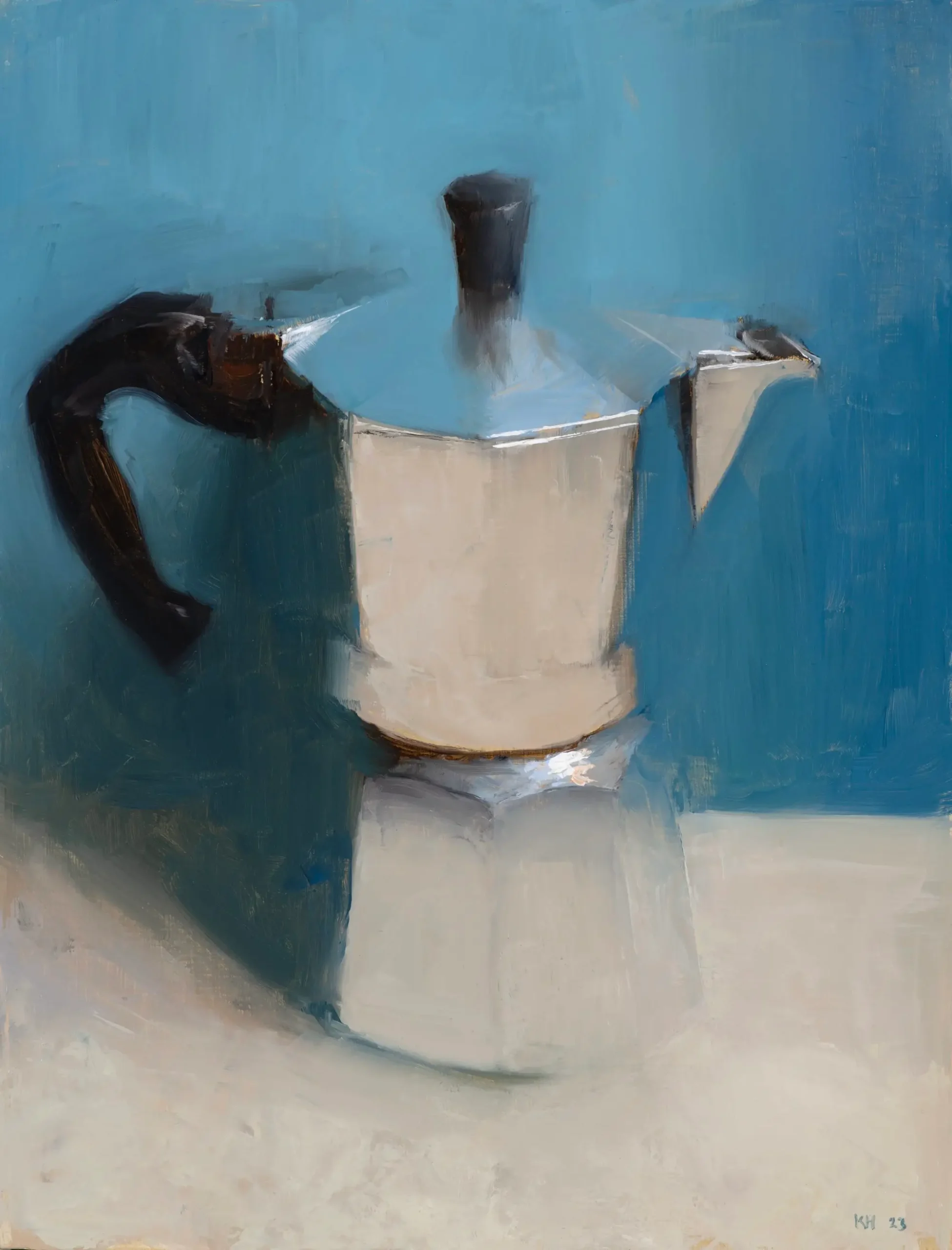
Oil painting of a silver stovetop moka pot with a black handle against a textured blue background.
transition
Harris was born in Palo Alto, California in 1974 and raised in the Bay Area before earning his BA in fine art from Colorado College. A junior year semester in Florence became the hinge point of his training, where he studied Renaissance art history and classical figure drawing at the atelier of Charles Cecil, a program built around the observational drawing methods used by nineteenth century academic painters. That grounding in classical technique followed him to New York, where he studied under the painter Frank Mason at the Art Students League, and later resurfaced formally when he completed an MFA in painting at Laguna College of Art and Design between 2015 and 2017, where he now teaches as an assistant professor.
In 2001 Harris left New York for Central America, painting his way through Honduras, Guatemala and the Yucatan before landing in Venice Beach, California, where he has lived and worked ever since. Travel has stayed central to his practice in the years since. Bodies of work have come out of trips through Cuba, Istanbul, China, and extended stretches in Italy, including recent residencies in Tuscany at Borgo Finocchieto and Monteverdi that fed directly into his still life paintings. He has spoken about being drawn to the specific, often irregular qualities of old European interiors, the kind of three foot thick stone or plaster wall that simply does not exist in most American construction, and the way uneven light falls across surfaces like that.
That restlessness shows up in how varied his exhibition history has been by geography without ever losing a consistent visual language. A 2020 show titled Ireland, staged at George Billis Gallery locations in both Los Angeles and New York, grew out of a trip through the Irish countryside and focused on interiors and landscapes rather than the coastal cliché most painters reach for when working in that setting. Earlier shows pulled from Southern Tuscany, Seattle era interior work under the title Interior Worlds, and two person exhibitions alongside the painter Judy Nimtz that paired their differing approaches to observational painting. Across all of it, whether the subject is a Roman stairwell or a kitchen counter in Venice Beach, the throughline has been Harris’s insistence on painting empty spaces and quiet objects rather than people, and trusting that light alone can carry the emotional weight of a composition.
show
That same sensitivity to light is what makes the moka paintings work as something more than a novelty subject. Realist technique gives Harris the tools to render the pot’s geometry with precision, but the paintings depend on something closer to abstraction in how color gets distributed across that geometry. Each facet of the pot catches and bends its surround different, so a single canvas can hold a dozen small passages of pure color reflection sitting inside one recognizable object. Writers covering the series have placed it in a lineage that runs through Josef Albers and Albert Moore, artists whose work also used a repeated, stable form as a vehicle for studying how colors interact when placed next to each other, rather than treating color as secondary to subject matter.
Harris has been direct about that framing himself, describing the series as “hue explorations” built on “reiteration of the same forms with different tint combinations.” It is a working method that borrows the rigor of a scientific study, holding one variable steady while another shifts from painting to painting, but the result reads as anything but clinical. The surfaces stay loose and gestural, built up with visible brushwork and passages of impasto that keep the paint itself present as material rather than disappearing entirely into illusion.
There is also a practical logic behind why this particular object has sustained a series this long. A moka pot is small, portable, and endlessly repeatable as a studio setup, which means Harris can control lighting conditions with a precision that would be far harder to manage with a full interior or a cityscape. He can move a single light source a few degrees and produce an entirely different set of reflections without traveling anywhere or waiting for a specific hour of daylight. That control has let the series become something closer to a controlled experiment repeated with different variables than a single sustained observation, which is part of why individual entries can be discussed almost like a scientist would discuss trial results, each one testing what happens when a new pair of colors meets the same fixed geometry.
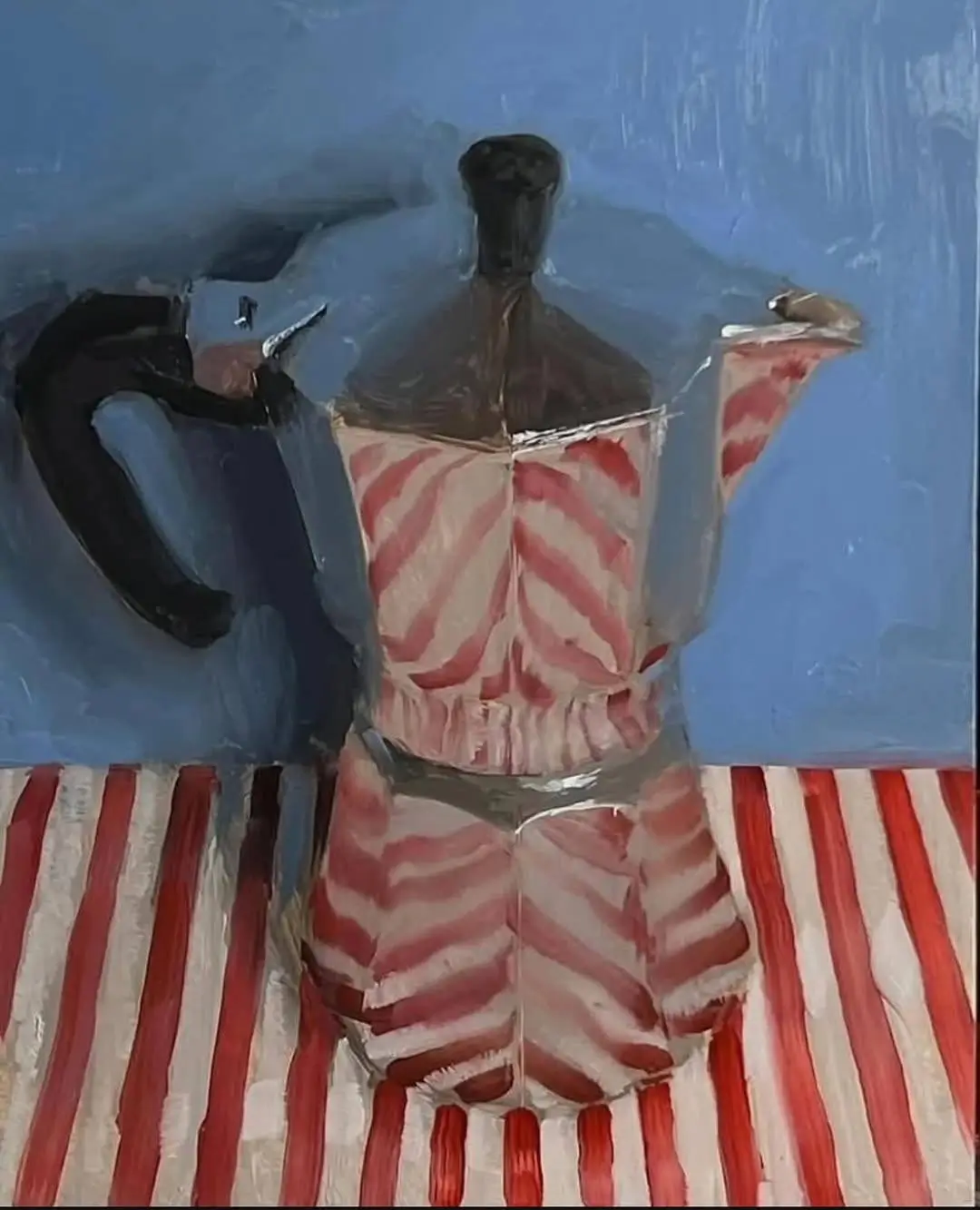
Oil painting of a moka pot decorated with red and white stripes against a textured blue background.
series
The specific pairing in the 2026 painting sits within a much longer list of color combinations Harris has already worked through in this series, including versions built around blue and violet, teal and Venetian red, pink and green, and chartreuse on its own. Kings blue, the pigment referenced in the title, is a historic term for a particular cobalt based blue that carries slightly more weight and depth than a standard ultramarine, and pairing it with coral and turquoise gives this canvas a warmer, more saturated register than some of the cooler blue and violet pairings that came before it in the series.
Harris’s gallery representation has grown alongside the series’ popularity. Billis/Williams Gallery in Culver City mounted a solo show titled Venice in March 2026, and Galerie Mokum in Amsterdam presented a solo exhibition titled Passage in the fall of 2025, both venues where recent moka paintings and pieces from his Tuscan and European interior series have appeared alongside each other. His auction record, set in 2024 when Moka with Teal and Venetian Red sold at Bonhams Los Angeles for $3,600, sits at the higher end of a secondary market that has generally placed his work between roughly $375 and that figure, according to auction tracking on MutualArt.
The series has also found an audience well beyond traditional gallery walls. Individual moka paintings circulate widely online, turning up on art blogs and social feeds where people who will never bid at a Los Angeles auction house still spend time looking closely at a single canvas. One blogger writing about an earlier entry in the series described the pot as being given “the dignity of a sacred object,” noting that the paintings turn something most people walk past in their own kitchen without a second look into an object worth pausing over. That kind of reception speaks to how the series functions differently depending on who is looking at it: a collector might track it through auction results and gallery representation, while a casual viewer online is more likely to respond to the simple, almost meditative pleasure of watching color behave in an unexpected way across a familiar shape.
fin
The moka series represents one strand of a practice that has always centered on close observation, whether the subject is a coffee pot on a table or a Venice Beach interior. Harris has cited an interest in what he calls conditions of light and space that carry a sense of isolation, reflection, or atmospheric perspective, themes that run through his interior scenes, his cityscapes, and the shh figure paintings he has produced over two decades of exhibiting. His work has avail in institutions and galleries on both coasts, include a long relationship with George Billis Gallery in New York, and it has been written about in pub including Fine Art Connoisseur and The Art Newspaper. In 2016 he received the Elizabeth Greenshields Grant, an award given to fig and representational painters early enough in a mature career to benefit from direct financial support.
What ties the moka paintings to the rest of that body of work is not subject matter but method. Harris paints spaces that are almost always empty of people, letting light and surface do the work that a figure might otherwise do in another artist’s composition. The coffee pot series simply compresses that same interest into the smallest possible object, using a faceted aluminum form the way another painter might use a window or a hallway, as a device for capturing how a particular set of colors behaves under a particular condition of light.
It is worth noting how unusual it is for a single recurring subject to sustain a working artist’s output for this many years without collectors or gallerists losing interest in it. Series painting carries real risk for an artist’s market, since repetition can just as easily read as a lack of new ideas as it can read as sustain focus. What appears to have kept the moka pot paintings from tip into that territory is the fact that each entry genuinely looks different from the last one, not through variation in subject or composition, but purely through the shifting relation between hue. A viewer who has followed the series across its blue and violet phase, its teal and Venetian red phase, and now this turquoise, coral and kings blue pairing is not watching an artist repeat himself. They are watching him ask the same question with a new set of terms each time, which is closer to how a musician might work through vary on a single theme than how a painter typically approaches a subject meant to be finished and set aside.
n
From the DRIFT archive: The Art of the Can: Chaz Bojórquez’s Hand-Signed MTN Spray Paint Edition