DRIFT AUDIO
Listen to this story
Choose a voice, then press play.
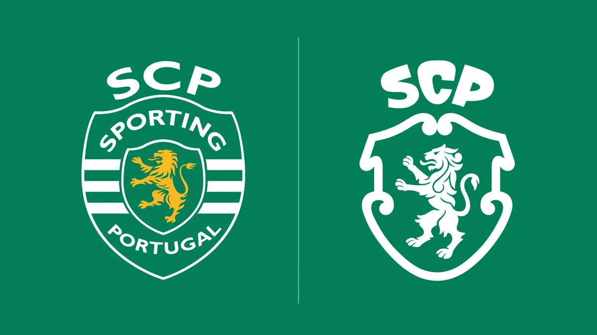
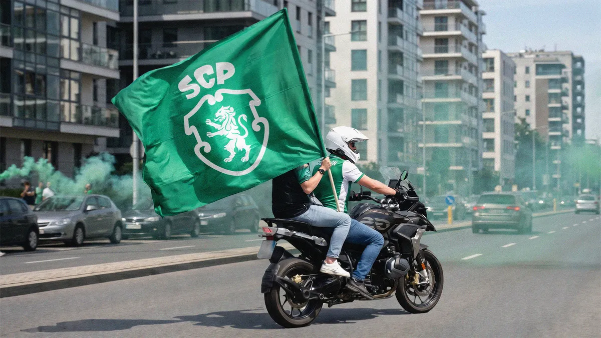
Sporting Clube de Portugal celebrated its 120th anniversary by unveiling its first major view identity overhaul in 25 years. Developed with JKR, the rebrand looks to the club’s own history—drawing from its 1945 crest, historic architecture, and archive typography—to create a modern identity designed for a global audience while honor its roots.
In This Story
- A Milestone That Demanded More Than a New Badge
- Digging Up the Crest Fans Never Stopped Asking For
- A Typeface Built From the Letters Above the Old Shield
- The Stadium Gate Woven Into Every Surface
- From Signet Rings to Stadium Walls: Where the System Lives
- The Business Case Behind a Members-Owned Rebrand
- A Legacy Restored, Not Replaced
Founded on July 1, 1906, Sporting Clube de Portugal has grown into one of the “Big Three” clubs that have never been relegated from the Primeira Liga, alongside Benfica and Porto. But SCP is more than its football team: the club also runs programs in futsal, handball, volleyball, and rink hockey, and it operates as a members-owned institution with more than 180,000 members and 200 delegations spread across five continents. That structure matters to how this rebrand came together, since the push for change came from the members themselves rather than from a marketing department chasing a trend.
The last time Sporting touched its primary crest was in 2001, and the badge that’s carried the club through two of its most decorated decades, including Ronaldo’s rise through its academy, has now been retired. In its place is a new identity developed over roughly six years of member research and interviews, conducted by the club’s own strategy team before JKR was ever brought in. According to André Bernardo, Sporting’s chief strategy and operations officer, the driving idea behind the whole project traces back to the club’s founding motto: develop the human, then the athlete. Members wanted a brand that reflected Sporting as a personal-development community first and a football club second, one built to travel as the club continues expanding its global membership base.
View this post on Instagram
Sporting’s crest has changed hands more often than most casual fans realize. The club’s earliest teams played in plain white shirts before adopting the green-and-white “Stromp” kit in 1908, named for co-founder Francisco Stromp, and the crest itself has been redrawn across several distinct eras since the club’s founding. That churn is part of why the 1945 version carries so much weight among today’s membership: it’s the badge that stayed in place the longest, spanning more than five decades of Sporting’s football history, including the club’s dominant runs through the mid-20th century, before being replaced in 2001 with a flatter, more streamlined mark built for an era when clubs were first starting to think seriously about global licensing and broadcast rights rather than terrace culture. Bringing it back isn’t simple nostalgia so much as a bet that the crest fans have quietly preferred for 25 years is also the one best equipped to travel internationally as Sporting looks to grow its membership base well beyond Portugal.
stir
The single most requested change to come out of that research, according to Bernardo, was a full return to the badge Sporting used between 1945 and 2001: a roaring lion set inside a shield built from interlocking curved lines. Even after 25 years away, that emblem remained the version most fans consider definitive, more so than the flatter, more graphic crest it was replaced with in 2001.
JKR’s creative director on the project, Jennie Potts, described the approach as less about designing something new and more about auditing everything Sporting had already used. Her team studied the lion from every crest the club has carried across its history, pulling the details worth keeping from each one and discarding the rest. The result keeps the spirit of the 1945 mark intact while refining its execution: the lion’s midsection has been slimmed, its fur rendered in smoother curves rather than jagged lines, and its tail nudged into an “S” shape as a quiet nod to the club’s own name. Potts also pointed to the curved shield shape itself as something rooted well beyond football, noting that the same swirling forms turn up across traditional Portuguese tilework and signage, which gives the crest a sense of place beyond the sport.
The club unveiled the finished crest under the campaign banner “Evolution from the Essence,” a framing that runs through most of the launch materials and gets at what makes this rebrand different from a typical badge swap. Rather than positioning the new mark as a break from the past, Sporting and JKR have been careful to present it as a recovery, an argument that the 2001 crest was the aberration and the 1945 lion was always the club’s true visual center. That framing matters for a fanbase that, by the club’s own research, never fully let go of the older badge in the first place; merchandise featuring the 1945-era lion has circulated among supporters for years despite it not being the club’s official mark.
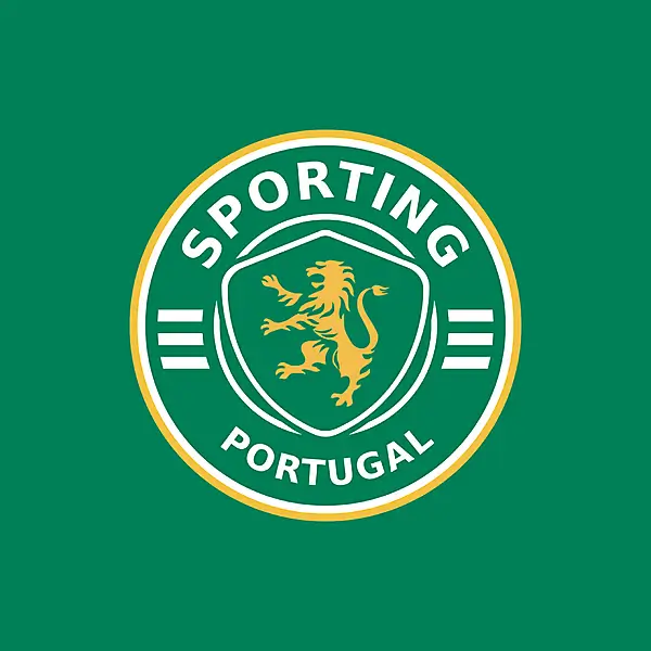
Sporting CP’s historic circular crest, a longtime symbol of the club’s identity before its 2026 visual rebrand, featuring the iconic golden lion and classic green-and-white design.
flow
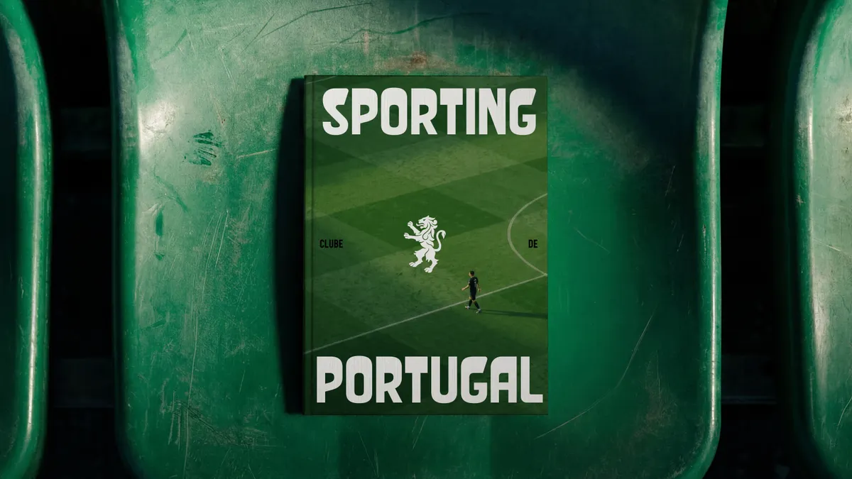
One detail from the 1945 crest ended up shaping far more of the new identity than the badge itself. Above the original shield, the letters “SCP” were arranged into a crown, rendered in a chunky, slightly irregular lettering style. JKR pulled that lettering, along with other typographic scraps from the club’s archive, and worked with type foundry F37 to turn it into a full custom typeface named Sporting Sans. The finished font pairs thick, almost swollen uppercase strokes with thinner connecting stems, and every corner has been rounded off, giving it a look that reads as strikingly current despite tracing back to lettering more than eight decades old.
That crown motif now sits directly on top of the redrawn shield in the new crest, doing double duty as both a historical reference and a literal rendering of the club’s initials. In practice, Sporting Sans is designed to carry the brand well beyond the badge itself, showing up bold and oversized across social templates, campaign type, and matchday graphics in a way the club’s previous identity never really attempted.
Typefaces have become one of the more quietly important battlegrounds in football branding over the past decade, since a distinctive font is often what separates a club’s social presence from the dozen other accounts posting matchday graphics in the same generic sans-serif. Manchester City, Arsenal, and several Bundesliga clubs have all commissioned bespoke lettering for similar reasons in recent years, but Sporting’s approach stands out for sourcing its typeface from an artifact that already existed in the club’s own history rather than briefing a foundry to design something from a blank page. F37, the type foundry JKR partnered with on Sporting Sans, has previously built custom fonts for brands ranging from fashion labels to broadcasters, and the finished typeface leans into exactly the kind of oversized, slightly eccentric character shapes that read well when blown up across a phone screen rather than shrunk down onto a shirt collar.
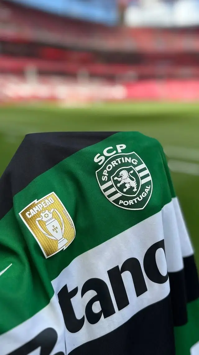
A detailed look at Sporting CP’s 2026–27 home shirt, highlighting the iconic lion crest and reigning Liga Portugal champions patch ahead of the new season.
scope
The final core asset in the new system comes from an unexpected source: a set of decorative tiles that once framed Porta 10-A, the players’ entrance at Sporting’s original stadium, the same gate Ronaldo and Figo both walked through as academy prospects. JKR isolated that tile pattern, rendered it in the club’s signature green, and turned it into a flexible graphic asset that now appears alongside the crest, lion, and typeface across the wider identity.
Potts has described the gate’s pattern as carrying a distinctly Portuguese feel while echoing the same curved geometry found in the crest, which lets it slot naturally into backgrounds, campaign photography, and stadium signage without ever feeling like a bolt-on graphic device. It’s the piece of the rebrand most clearly designed to function as texture rather than symbol, giving the identity a background pattern that Sporting hasn’t had before in any consistent, branded form.
The choice of Porta 10-A specifically is a deliberate one for a club whose modern reputation rests heavily on its academy output. Sporting’s youth system has produced an unusually long list of players who went on to define eras of the sport internationally, and both Ronaldo and Figo passed through that same gate as teenagers before making their names elsewhere. Building a core brand asset around the literal threshold those players crossed gives the identity a piece of storytelling that a crest or typeface alone can’t carry, tying the club’s commercial ambitions directly back to the development pipeline that made its name in the first place.
union
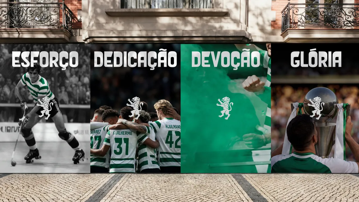
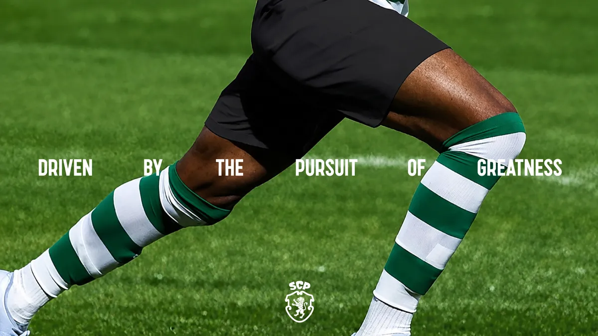
Where the rebrand distinguishes itself from a typical crest refresh is in how far JKR pushed its applications. The agency’s mockups show the shield isolated as a framing device for player highlight clips on social media, the tile pattern used as a backdrop for editorial-style campaign photography, and the lion embroidered onto premium merchandise including a signet ring and jacket, pieces that read closer to a fashion label’s product drops than typical club merchandise. Sporting also released a limited-run 120th-anniversary Nike kit to coincide with the launch, based on Nike’s current Vapor V template and restricted to 1,906 numbered units in reference to the club’s founding year.
Potts has framed the goal as building a system SCP’s fanbase would want to represent them personally, not merchandise people buy purely out of club loyalty. That distinction matters commercially: Sporting’s five core symbols, the Porta 10-A pattern, the stripes, the shield, the crown, and the lion, are designed to be used independently or in combination, giving the club a far larger design vocabulary to draw from across campaigns, kit collections, and country-specific marketing than a single static crest could ever provide.
The 120th-anniversary Nike kit gives an early, tangible look at how the system cardinals out on actual product. Beyond its numbered production run, the shirt carries the club’s updated crest as its primary marking, a signal that the new badge is already the version stitched onto official product rather than a campaign-only asset waiting for a future season to catch up. Sporting has also rolled the new identity into its wider pre-match and training collection, with pieces like a dark grey jacket finished in contrasting white panelling built around Nike’s Total 90 branding alongside the refreshed crest, suggesting the rollout is intended to touch the club’s full retail range rather than a single hero product.
O 40.º aniversário de uma Lenda do Futebol Mundial #MadeInSporting, o melhor jogador português de sempre e o Sócio 100 mil do nosso grande amor 💚
Parabéns, @Cristiano 🐐👑 pic.twitter.com/7FxYINtSkE
— Sporting CP (@SportingCP) February 5, 2025
move
Because Sporting is collectively owned and operated by its membership rather than a private ownership group, the rebrand needed buy-in that a typical football club wouldn’t necessarily require. Bernardo’s team spent years gathering member sentiment before JKR was engaged specifically to avoid the kind of backlash that has hit other clubs attempting similar exercises, Leeds United’s abandoned 2018 crest redesign is frequently cited in design circles as a cautionary tale, while Juventus’s stark 2017 minimalist overhaul remains the more commonly cited example of a club successfully pushing modernization at the cost of some traditional identity.
Sporting’s approach splits the difference: nothing about the new crest, typeface, or pattern is invented from scratch, all three pull directly from documented moments in the club’s own 120-year archive, but the execution and breadth of application are built for a football landscape where identities now have to work as hard on merchandise drops and Instagram templates as they do stitched onto a matchday shirt. JKR’s global executive creative director, Sean Thomas, has framed the brief as building a system flexible enough to carry Sporting’s identity forward without limiting it, while staying recognizably loyal to what existing supporters already valued about the club.
This heritage-first approach also reflects a broader shift happening across football branding right now. A wave of clubs have spent the past year or two reverting to older, more traditional crests rather than pushing toward the stripped-back min at defined the previous decade of sports rebrands, a trend industry observers have connected to fans pushing back against overly commercial-feeling redesigns. Sporting’s own project sits comfortably within that pattern, though its execution goes considerably further than a simple crest revival by building an entire typeface and pattern system around the same historical source material rather than stopping at the badge.
leg
Sporting’s broader fanbase embraces the new identity as warmly as the members consulted during its development remains to be seen, crest redesigns in football are notoriously unpredictable in how supporters receive them, even when the underlying research is sound. But the SCP rebrand arrives with a genuine point of difference: rather than smoothing away the club’s history in favor of something more universally palatable, JKR built the entire system out of pieces Sporting already owned, a crest fans never stopped preferring, lettering that had been sitting unused for 80 years, and a stadium gate that generations of players, Ronaldo included, walked through on their way into the first team. For a 120-year-old institution looking to grow its global footprint without losing what made it recognizable in the first place, that’s a considerably safer bet than starting over.
Related Articles
Under Rue de Castiglione, Liaigre Gives Hôtel Costes a Spa With No Hard Corners
A 20-meter lap pool, eight treatment rooms and not one sharp angle: Studio Liaigre’s spa […]