DRIFT AUDIO
Listen to this story
Choose a voice, then press play.
Ed Roth’s snarling mascot gets a Tokyo reissue, filtered through decades of denim know how.
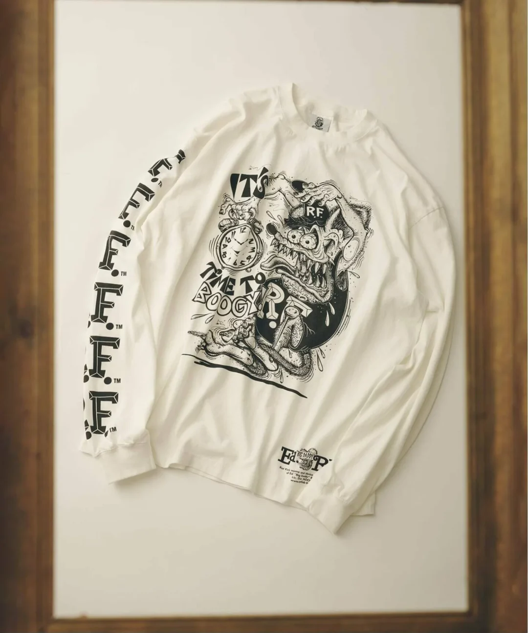
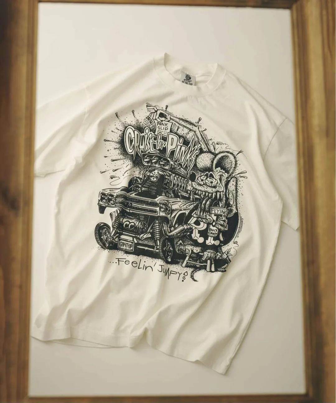
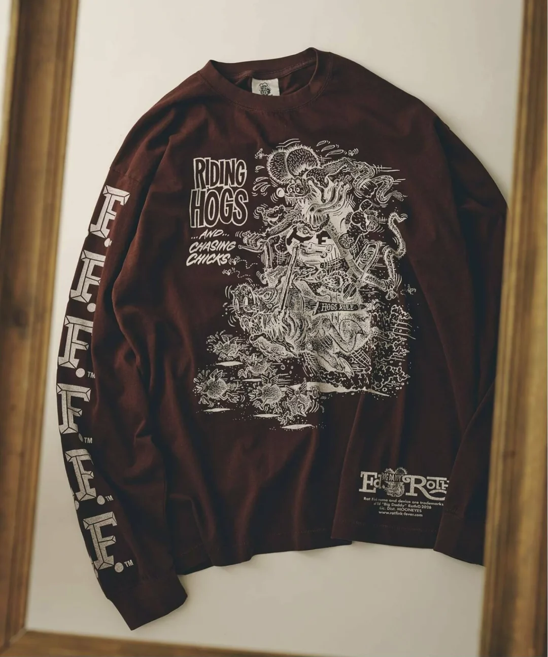
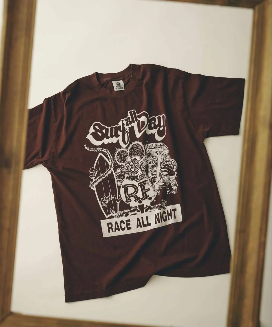
Baycrew’s, the Shibuya based retail group behind JOURNAL STANDARD relume, confirmed a collaboration tee pairing the label with two very different names: REMI RELIEF, the Okayama founded processing specialist, and Rat Fink, the bug eyed hot rod mascot dreamed up by an American cartoonist in the middle of the last century. The press release landed on February 9, framing the shirt as a relume exclusive, meaning it will not surface through REMI RELIEF’s own retail channels or general wholesale, only through relume’s own stores and Baycrew’s online storefront.
relume
That kind of exclusivity is not incidental. relume has built its identity around exactly this move: taking a brand with its own cult following and asking it to make something that only exists inside relume’s four walls. It worked with Champion on a reverse weave series that sells out on a loop, and it has leaned on Levi’s for a run of seasonal reissues. The Rat Fink shirt slots into that same playbook, just with a much stranger character at the center of it.
stir
REMI RELIEF has spent years building a reputation less on sil and more on surface. The brand’s calling card is what it calls SP processing, a treatment designed to replicate the exact way cloth fabric loses tincture over decades of wear. According to the brand’s own explain of the technique, the fading seen on genuine vintage sweats through the 1930s into the late 1960s came from a chemical reaction, direct and sulfur based dyes bonding with oxygen in the air, then breaking down further as that bond interacts with the amino acids holding the dye in place. Rather than bleach a shirt to fake that look, REMI RELIEF re-creates the same slow oxidization with old formula dyes, letting the fabric age on its own clock instead of forcing the effect chemically overnight.
The brand is upfront that this process leaves marks most companies would call defects: pinholes, uneven patches, whitened seams where the fabric has been worked, and occasionally small stone particles left behind from the wash itself, all of which are expected to wear off with a few home launderings. Baycrew’s calls this out directly in the release notes, treating what looks like damage as the entire point rather than something to apologize for.
It is a fitting technique to apply to Rat Fink, a character whose entire view lang was built on grime, exaggeration, and the sense that it had been dragged out of a garage rather than a design studio.
REMI RELIEF has applied this same processing logic across a wide catalog of its own sweats, jackets, and military inspired basics for years, building a following among shoppers who specifically seek out clothing that looks like it has a history before they have even worn it once. That focus on process over sil is part of why the brand tends to show up inside other labels’ connection calendars rather than run its own constant hype cycle. A partner brings the graphic or the license, REMI RELIEF brings the finish, and the resulting product reads less like a simple co-branded item and more like an artifact that happens to carry two names on the tag. The Rat Fink shirt follows that exact formula: relume supplies the retail context and the character rights, REMI RELIEF supplies the decades of chemistry knowledge, and neither element overwhelms the other on the finished garment.
View this post on Instagram
flow
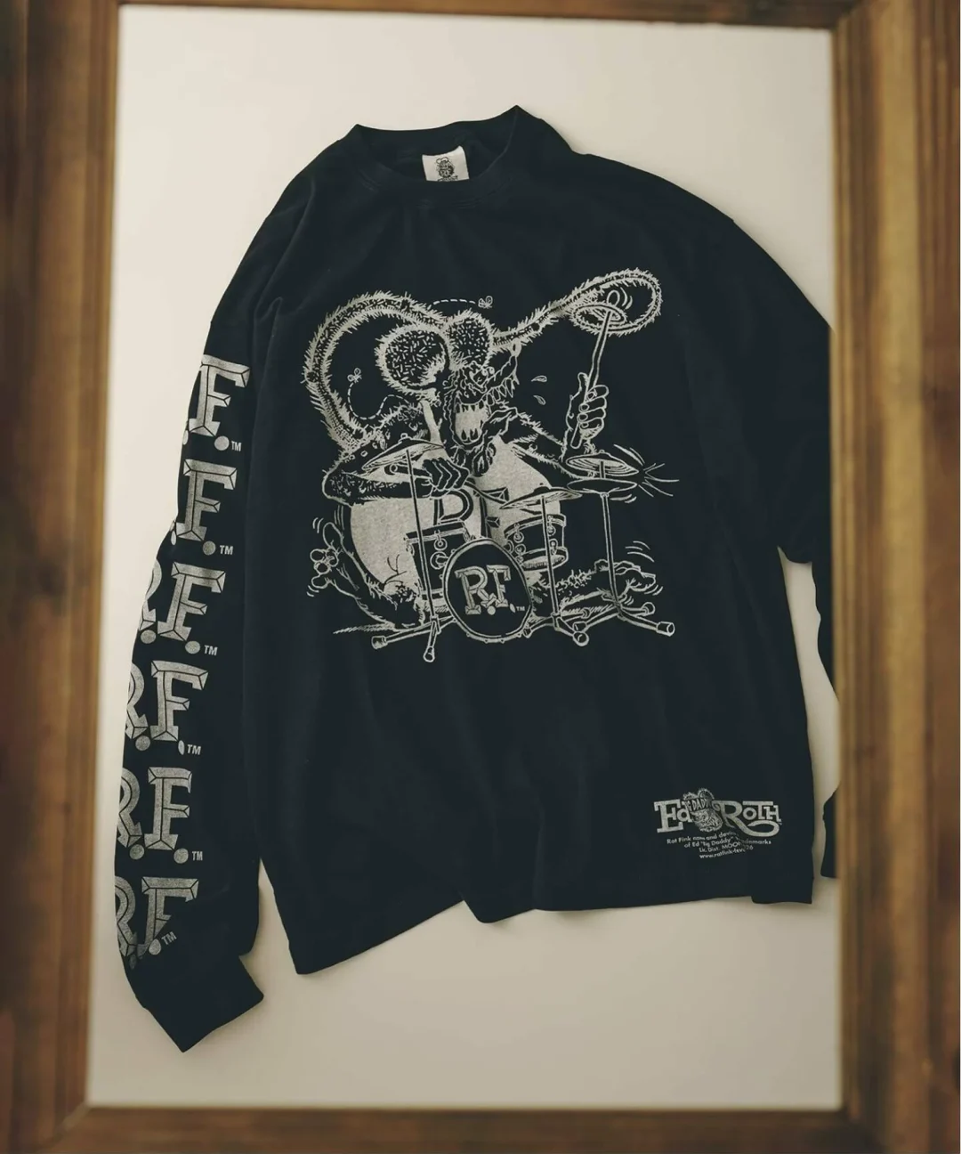
Rat Fink was born in the late 1950s, the creation of American hot rod artist Ed “Big Daddy” Roth. Roth built and customized cars, but he made his name airbrushing what he called weirdo shirts at car shows and inside the pages of publications like Car Craft, a habit that by 1959 had turned into something close to a movement among hot rod fans. Rat Fink itself, a bulging eyed, sharp toothed, permanently furious looking rodent in red overalls, first showed up in a Car Craft advertisement in July 1963, sold in that ad as “the rage in California.” The same year, Revell released a plastic model kit of the character, a kit that has been reissued in various forms ever since.
Roth conceived the character as a direct rebuttal to Mickey Mouse, a deliberately ugly, deliberately unlicensed answer to corporate cartoon cheer. That contrarian streak is part of why Rat Fink has survived so long inside lowbrow art and kustom kulture circles: it was never meant to be cute, and six decades on it still is not. relume’s own copy leans into that history directly, describing the character as an icon of lowbrow art and calling the connection an attempt to rebuild its venom through REMI RELIEF’s fabric work, language that treats Rat Fink less as a licensed graphic and more as a genuine subculture artifact.
The character has outlived nearly every fad that came up alongside it in postwar American car culture, in large part because it was never tied to a single product category. Roth’s original weirdo shirts gave way to model kits, then patches, then decals sold out of the back pages of hot rod magazines, then eventually a full toy and apparel ecosystem that persists in car show parking lots to this day. An annual gathering in Utah still draws builders and fans together specifically to mark Roth’s legacy, complete with car show awards and airbrush demonstrations, a sign of how durable the character’s underground fan base has remained decades after Roth’s own death. That longevity is exactly what makes Rat Fink an unusual choice for a Tokyo retail label built around understated, grown up basics. relume’s collaborations tend to lean toward heritage American workwear or classic band merchandise, not outsider car culture caricature, which is part of what makes this particular pairing stand out on the label’s release calendar rather than blending into it.
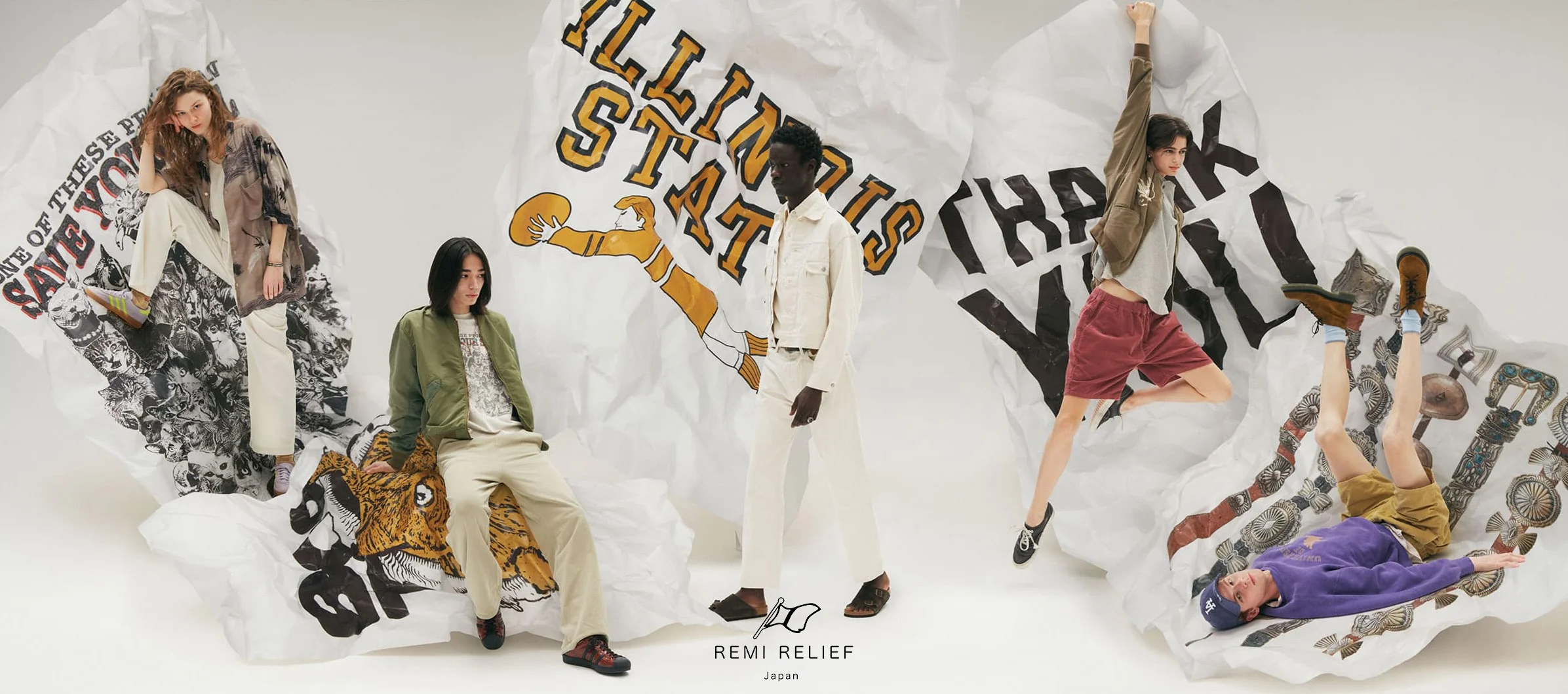
REMI RELIEF leans into its signature print-heavy, distressed styling for this Japan campaign, pairing oversized workwear sil with graphic backdrops that nod to collegiate sportswear and western leatherwork.
in
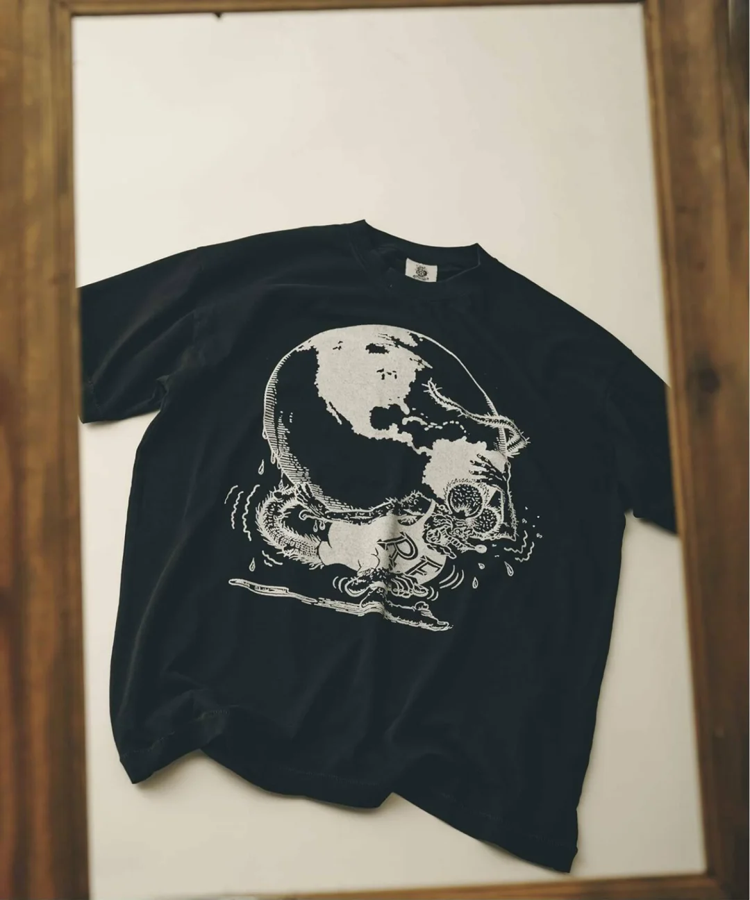
The garment itself is a short sleeve tee cut with a wide body, described in the release as a silhouette with generous room through the chest, built specifically so the Rat Fink graphic reads as the obvious focal point whether the shirt is worn alone or layered under something heavier. The print sits across the chest in the character’s classic pose, rendered through REMI RELIEF’s aged treatment so that even a shirt fresh off the shelf carries the view weight of something pulled out of a closet decades after purchase.
Two colorways make up the run, black and white, both priced at 14,300 yen including tax, and both offered in a two size run of M and L rather than a fuller size curve. That narrower sizing is consistent with how relume has handled a number of its smaller batch union this year, treating them closer to a limited capsule than a mainline restock. It also reads as a signal about who the shirt is built for: a customer already comfortable with a boxier, oversized fit rather than someone hunting for a precise, tailored graphic tee. Between the wide body cut and the two color, two size structure, this is a garment designed to be worn loose, likely layered under a jacket or over another long sleeve piece during the cooler months, rather than treated as a standalone summer basic.
Price also places the shirt above where a typical graphic tee collide tends to land. At 14,300 yen, the cost sits closer to what shoppers might expect from a REMI RELIEF sweatshirt than a simple printed cotton tee, a gap that reflects how much of the retail value here is tied to the processing itself rather than the raw materials or the graphic license. Buyers are effectively paying for the aging process as much as they are paying for the artwork on the front, a positioning that only really works if the audience already understands and values what SP processing represents.
rel
The shirt is being sold through JOURNAL STANDARD relume’s physical locations and through Baycrew’s own online store, with online pre-orders opened in advance of the in-store arrival. Customer inquiries for the release have been routed specifically through the brand’s Jiyugaoka location rather than a general customer service line, a detail that lines up with how relume has handled a number of its smaller, more collectible gathers, treating a single flagship store as the point of contact even when the product ships nationwide.
For a character built in a garage sixty some years ago, ending up filtered through a Japanese processing specialist and sold as a relume exclusive is a strange kind of afterlife, though not an unfamiliar one. Rat Fink has spent decades away between mediums, from model kits to decals to shirts of every possible quality tier, always retained by the same small, fiercely loyal corner of car culture that first embraced Roth’s original joke at Mickey Mouse’s expense. This version simply happens to have gone through a Japanese label’s idea of what old cotton should feel like before it reaches a customer.
n
From the DRIFT archive: Ssstufff Reversible Shirt Down Puffer: A Dual-Identity Layer Redefine
Related Articles
Nubian Put Distressed Cotton Jersey On Needles Track
20th Exclusive Vol.7. Needles. Four shapes. Black and grey. 19 September 2026. All NUBIAN doors […]