DRIFT AUDIO
Listen to this story
Choose a voice, then press play.
A 140 year old brand just spent months studying its own archive to figure out how to look more like itself, and the results are now rolling out across 200 markets.
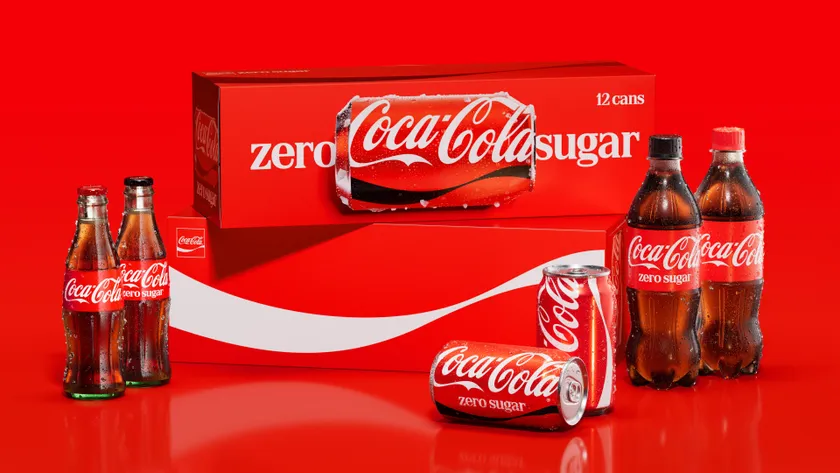
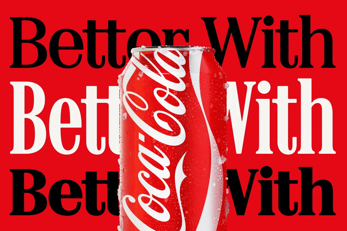
The Coca-Cola Company has unveiled a global identity refresh built around a brief that Rapha Abreu, the company’s Global Vice President of Design, describes as “surprisingly simple”: make Coca-Cola more Coca-Cola, everywhere. Not a new logo. Not a fresh tincture. Not a rethink of what the brand stands for. Just a harder, clearer, more consistent version of the thing that has already been sitting on shelves since the 1880s.
The agency handed that brief was Jones Knowles Ritchie, the London founded, now globally spread branding studio that has built a reputation on exactly this kind of work: taking heritage brands apart and figuring out which pieces are actually doing the heavy lifting. Tosh Hall, JKR’s Global Chief Creative Officer, and Dave Balsamello, one of the agency’s Creative Directors, led the project alongside Abreu and Arnab Roy, President of Coca-Cola’s Global Category division.
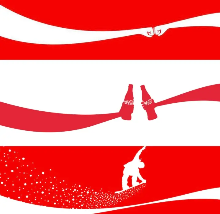
Coca-Cola’s iconic ribbon reimagined through connection, celebration, and movement.
The scale of what they were asked to unify is hard to overstate. Coca-Cola sells across more than 200 markets, through packaging, vending equipment, retail coolers, digital ads, motion content, in-store photography, and platforms that do not exist yet. Keeping a single visual signature intact across all of that, without flattening it into something generic, was the actual engineering problem behind the friendly sounding brief.
stir
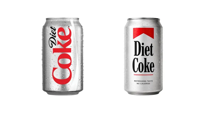
Nobody redrew the logo. The four elements JKR chose to sharpen were already the load bearing walls of the identity: the Spencerian script (the looping, handwritten style logotype that has barely changed in a century), the Dynamic Ribbon (the white swoosh that has wrapped around Coca-Cola packaging since the 1960s), the Arden Square (a red panel device used to frame the wordmark), and the specific, exact shade of red and white that most people could pick out of a lineup without thinking twice.
Each of those assets got pulled apart, examined, and pushed to see how far it could stretch before it stopped reading as Coca-Cola. How large can the script get before it looks like a parody of itself. How tightly can the ribbon be cropped and still feel like a ribbon. How small can the Arden Square shrink on a vending machine panel and remain legible from across a room. Those were the actual working questions inside the studio, according to Balsamello, and the answers became the rules baked into the new system.
The result is not a rupture. It is closer to a tuning exercise: existing instruments, played louder and in tighter unison.
View this post on Instagram
huh
Hall’s framing of the challenge is the most quietly interesting part of the whole story. Close your eyes and picture Coca-Cola, he suggests. The version in your head is probably cleaner, bolder, and more consistent than the version that actually exists across a global shelf set. At 140 years old, operating in every market on earth, small inconsistencies creep into any brand. A slightly different red here, a cropped ribbon there, a script rendered at an awkward size on one regional pack. Over decades, the brand people carry around in their memory and the brand as it is physically printed on cans start to drift apart.
JKR’s job, in Hall’s telling, was never to change what Coca-Cola means to people. It was to close that gap between memory and reality. “More Coca-Cola” became shorthand for finding the most distinctive version of every element and making sure that version shows up with the same clarity everywhere, every time a person encounters it, whether that is a fridge in Manila or a phone screen in Manchester.
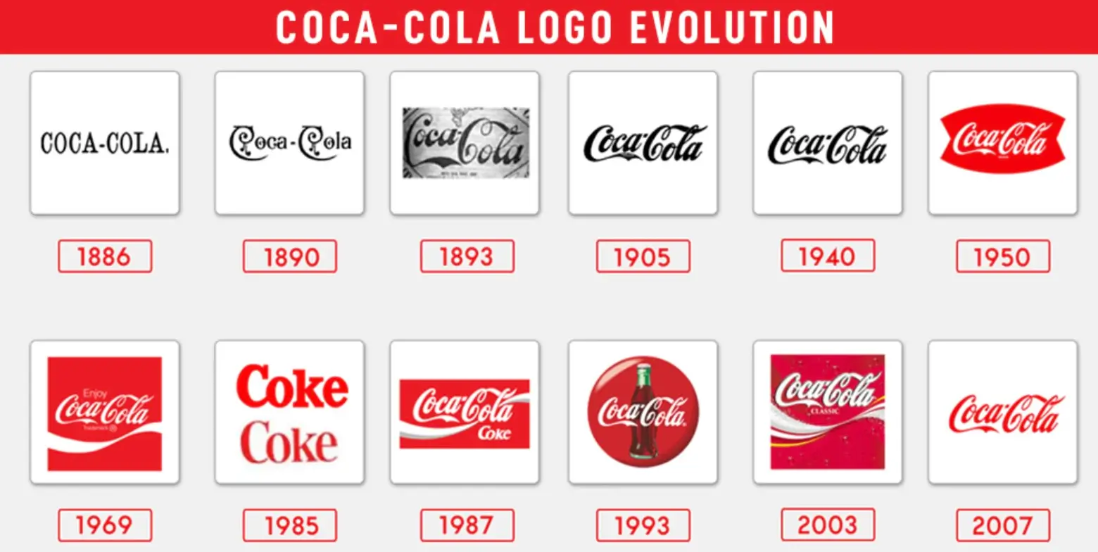
A show timeline tracing more than a century of Coca-Cola logo evolution from 1886 to 2007.
dig
Every heritage rebrand claims to start with research into the archive, but the specific artifact Balsamello points to is a nice, concrete detail: an investor book from the 1970s, the era when the Arden Square and the Dynamic Ribbon were first formally introduced into the system. That document became a touchstone for the whole project, not because JKR wanted to recreate a 1970s look, but because that period marked the moment Coca-Cola properly became a global culture icon, and the ribbon in particular carried an uplifting, optimistic energy that the team wanted to recover for a brand now competing across far more screens and surfaces than existed fifty years ago.
The process, as Balsamello describes it, involved a lot of pulling on threads: exploring how far a design idea could stretch, then editing it back to something disciplined enough to survive translation into hundreds of local executions, seasonal campaigns, and category variants.
xp
Coca-Cola and JKR worked initially with the design studio SUPERULTRARARE on packaging before scaling the project into something far larger than a can redesign. Every element of the identity was, in Balsamello’s words, taken apart “icon by icon” and stress tested against real world constraints. What is the correct Coca-Cola red across print, screen, and vending equipment. At what point does the script stop being recognizable if it is cropped too aggressively. How does the Arden Square behave across seasonal packaging versus a permanent retail cooler.
That process surfaced something the team had not fully appreciated going in: how much flexibility actually lives inside the Arden Square specifically. Simple as the device looks, it turned out to be capable of feeling both timeless and, in Balsamello’s phrase, “super timely,” which is presumably why it earned a starring role in the refreshed system rather than getting shh retired.
show
The view identity work, scripts, ribbons, red panels, is really the surface layer of a much bigger infrastructure project. Alongside the design refresh, Coca-Cola has rolled out an immersive Brand Center and a Design Intelligence tool, both intended to function as an internal operating system for how the identity gets applied by internal teams and outside agency partners around the world.
That software layer builds on groundwork Coca-Cola laid with Adobe through a project previously known as Project Fizzion, a system designed to translate brand guidelines into adaptive, machine readable assets that could, according to the company, help teams produce localized content dramatically faster than a traditional manual approval process allows. What began as a pilot has effectively become the backbone of this global rollout: a design system that is not just documented in a style guide but built to be queried, applied, and checked programmatically at a scale no single creative team could manage by hand across 200 markets.
retro
Any conversation about Coca-Cola changing anything about itself eventually runs into 1985, whether anyone in the room brings it up out loud or not. That was the year the company reformulated its flagship drink into New Coke, dropped the original recipe entirely, and triggered a consumer backlash loud enough that the classic formula was back on shelves within three months, rebranded as Coca-Cola Classic. It remains one of the most cited cautionary tales in American marketing, and it looms over every subsequent attempt to touch anything about the brand, visual identity included.
This project reads, deliberately or not, as the anti New Coke. Nothing about the core symbols people already associate with Coca-Cola was discarded. The script survived. The ribbon survived. The red survived. What changed was discipline: making sure those elements show up with the same precision on a vending machine in Jakarta as they do on a billboard in Times Square, rather than drifting into slightly different versions of themselves market by market. It is a far less dramatic story than a flavor swap gone wrong, but the underlying lesson JKR and Coca-Cola both seem to have absorbed from that earlier episode is the same one: with a brand this deeply wired into people’s memories, the risk sits less in staying the same and more in changing the wrong thing.
extend
Reaction to the announcement has split along a fairly predictable line. Design press and much of the branding industry have treated it as a disciplined, confident piece of stewardship: a rare example of a legacy brand resisting the urge to reinvent itself for the sake of looking busy, choosing instead to protect what already works and simply apply it with more rigor.
Business and finance coverage has been a little more clinical about the timing. Some commentary has framed the refresh less as a design story and more as infrastructure dressed up as creative work, arriving in the same window as Coca-Cola’s second quarter earnings release, with analysts reportedly expecting earnings per share near 92 cents on revenue around 13.1 billion dollars, alongside management guidance of 4 to 5 percent organic sales growth for the year. Whether or not that timing is meaningful, the underlying point in that coverage is a fair one: a bolder ribbon does not sell a single extra can on its own. What it can do, at least in theory, is reduce the cost and friction of producing consistent brand assets across an enormous global footprint, which is its own kind of return even if it never shows up as a headline on a can.
fin
JKR has also released a behind the scenes “making of” film documenting how the identity was developed, drawing on archival material and retro imagery from across Coca-Cola’s history to show the throughline between the brand’s older visual language and the refreshed system. It is a useful companion piece to the interviews above for anyone curious about how a project this size actually gets built, rather than just what it looks like once it ships.
Abreu put the ambition behind all of it in plain terms: no matter where someone encounters Coca-Cola, on a shelf, on a phone, in a retail aisle or at a live event, it should immediately register as the same icon people already know. Balsamello’s version of that same idea is blunter and, in its own way, more honest about what a piece of branding is actually trying to do. The dream, he said, is that people see it and think one word: Coca-Cola. And then they want one.
n
From the DRIFT archive: Tactical Elegance: Inside Bramford London Aqua Blue Three-Pocket Watch Roll