
KitKat and Ogilvy Turned “Have a Break” into Literal Digital Detox Tech
May 16, 2026
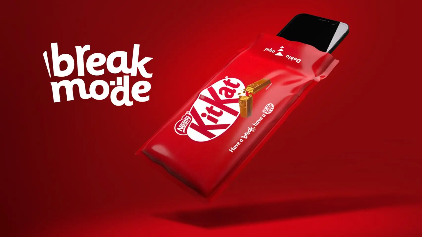
In an age where smartphones function as extensions of identity itself, the simple act of disconnecting has become almost radical. That tension sits at the center of KitKat’s new “Break Mode” packaging initiative, developed through a connection between Ogilvy Colombia, KitKat Panama, and Nestlé. Introduced in April 2026, the limited-edition wrapper transforms the brand’s iconic “Have a break, have a KitKat” slogan into something physically functional: a portable Faraday cage capable of blocking cellular, Wi-Fi, Bluetooth, and GPS signals once a smartphone is sealed inside.
Rather than existing as a novelty stunt, Break Mode reframes packaging as behavioral infrastructure. The ritual is intentionally simple. Unwrap the chocolate bar, enjoy the familiar snap of the wafer fingers, then repurpose the oversized conductive wrapper by placing your phone inside. The outside world continues uninterrupted, but notifications vanish, calls are muted into voicemail, and the constant vibration of digital presence temporarily dissolves.
build
The brilliance of the concept lies in how naturally it extends KitKat’s historic brand language into a contemporary problem. The slogan “Have a break, have a KitKat,” first introduced in the late 1950s, originally reflected small moments of pause during working life. Early campaigns showed office workers and students stepping away from stress for brief moments of pleasure and calm. The physical act of snapping apart the bar mirrored the mental reset the chocolate symbolized.
But the culture meaning of a “break” has changed dramatically over the last two decades. Smartphones transformed downtime into fragmented attention. Even moments intended for rest became saturated with doom-scrolling, incoming alerts, social media loops, and workplace accessibility. The average consumer no longer fully disconnects; instead, breaks themselves became mediated through screens.
That cultural contradiction became the conceptual foundation for Break Mode. Rather than telling consumers to disconnect, KitKat engineered a physical mechanism that enforces temporary absence from the digital stream. The campaign avoids reliance on apps, productivity tools, or willpower-based “screen time” settings. Instead, it embraces analog interruption.
flow
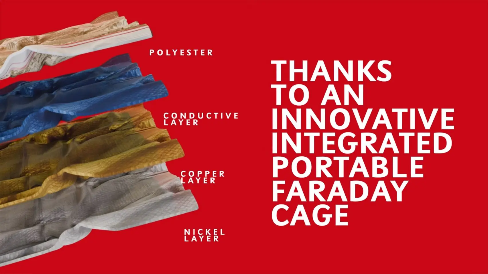
Technically, the packaging operates through the principles of a Faraday cage, using conductive materials including copper and nickel layered within polyester and polypropylene structures. These materials distribute electromagnetic signals around the exterior surface, preventing radio frequencies from penetrating the enclosure. The result is an object that view resembles oversized confectionery packaging while functioning as signal-blocking hardware.
Visually, the wrapper retains KitKat’s recognizable red-and-white identity, which is critical to the campaign’s effectiveness. Nothing about it initially appears aggressive or hyper-technological. Instead, the technological intervention is hidden beneath the familiar language of comfort and indulgence. That contrast gives the project much of its emotional resonance.
idea
What elevates Break Mode beyond packaging innovation is its psychological intelligence. Behavioral researchers frequently emphasize that meaningful habit change often requires introducing friction. Most digital wellness applications fail because they remain easy to override. Break Mode inserts physical inconvenience into the cycle of compulsive phone checking. Once the device is sealed away, retrieving it requires conscious interruption of the ritual itself.
This transforms the wrapper into something far more symbolic than a snack accessory. It becomes an object of resistance against perpetual availability.
The campaign’s resonance with younger consumers particularly reflects growing exhaustion around hyperconnectivity. Activations across Panama, including concerts, technology expos, and university campuses, reportedly generated strong reactions from participants who described feelings of relief and calm after using the pouch.
Social media amplification further accelerated the campaign’s view. Videos depicting users slipping their phones into the wrapper during meals, study sessions, or family gatherings reinforced the idea that disconnection itself could feel safe and even opulent. Rather than positioning absence from technology as punishment, Break Mode frames silence as indulgence.
infra
From a branding perspective, the initiative demonstrates an increasingly important shift in contemporary marketing. Traditional campaigns sell products. Experiential campaigns sell emotion. Break Mode goes one step further by creating infrastructure around the emotional promise itself. The packaging becomes the service.
It also signals new possibilities for the future of packaging design more broadly. Packaging historically evolved from protection to view branding, then toward sustainability messaging and digital interactivity. Break Mode introduces another layer entirely: behavioral functionality.
That evolution opens provocative questions about where consumer goods may head next. Could beverage packaging eventually regulate device interaction? Could physical retail products begin incorporating environmental or psychological interventions directly into their design language? Break Mode feels significant because it quietly expands the definition of what packaging can accomplish culturally.
shh
At the same time, the campaign is not without limitations or criticism. Questions around scalability, environmental complexity, and practicality remain. Conductive materials inherently complicate recycling systems compared to traditional wrappers, even with separable layered construction. Additionally, signal blocking can vary depending on device strength, enclosure sealing, and surrounding infrastructure.
There is also the broader know criticism that no wrapper can meaningfully solve systemic digital dependency. Yet perhaps that critique misunderstands the campaign’s ambition. Break Mode does not attempt to “cure” technological overload. Instead, it reframes the value of small interruptions. The power lies in ritual, not permanence.
fin
That is why the campaign feels unusually emotionally coherent. The snap of the KitKat fingers, the physical insertion of the phone, and the sudden quiet that follows create a synchronized multisensory experience. Chocolate becomes intertwined with silence itself.
Few contemporary advertising campaigns achieve that level of conceptual unity between product, behavior, and cultural context.
Ultimately, Break Mode succeeds because it revitalizes one of advertising’s most enduring slogans without abandoning its original spirit. “Have a break” no longer simply describes a snack moment; it becomes a literal interruption of digital saturation. The campaign transforms a decades-old tagline into a functioning cultural tool.
In doing so, KitKat positions itself not merely as confectionery, but as a companion to intentional pause. That distinction may ultimately define why the project has resonated so deeply. In a culture increasingly unable to stop scrolling, a chocolate wrapper that manufactures silence feels strangely profound.
Related Articles

The Frame Disappears: Inside Oakley’s Infiniloop
Oakley reduces the frame to a single continuous line with the Infiniloop, a limited-edition sil […]