Pepe Jeans London and the Art of Saying Less: Rewriting Premium Through Presence
April 21, 2026
In a market conditioned to equate volume with value, restraint can feel almost subversive. The modern fashion landscape—crowded with monograms, algorithm-chasing collabs, and hyper-view branding—has trained consumers to expect immediacy, saturation, and spectacle. Yet at a recent international line meet, Pepe Jeans London chose a different register entirely. Not a pivot toward louder messaging or sharper provocation, but a deliberate step into quiet.
What emerged was not simply a collection, nor a rebrand in the conventional sense. It was a recalibration of how a legacy label communicates—through material, atmosphere, and narrative rather than amplification. A gesture that suggests confidence is no longer performed through excess, but through clarity.
This is where the story begins: not with disruption, but with subtraction.

flow
Founded in 1973 along Portobello Road, Pepe Jeans London was never conceived as a quiet brand. Its early identity was kinetic, embedded in the rhythms of London street culture—punk, rock, and a certain improvisational individuality that resisted uniformity. Denim, in this context, was not neutral. It was expressive, almost confrontational.
That energy carried the brand across decades. But legacy, if left unexamined, risks hardening into aesthetic shorthand. By the mid-2020s, the same codes that once signaled authenticity began to read as archival—valuable, but static. Growth in global markets, particularly under the leadership of Ashok Kanojia, reinforced scale, but also sharpened a perception challenge: accessibility drifting toward ubiquity.
For design lead Swet Sinha, the issue was not erasure but translation. Heritage, in its raw form, does not automatically resonate. It must be rearticulated—decoded for a present that values emotional authenticity over visible reference points.
The question became less about what Pepe Jeans was, and more about how it could feel again.
View this post on Instagram
shh
The pivot toward “quiet premium” was not aesthetic minimalism for its own sake. It emerged from observation. Contemporary consumers—particularly those navigating fashion through digital ecosystems—are experiencing a form of saturation fatigue. Every brand is visible. Every product is framed for immediate recognition. The result is paradoxical: increased exposure, diminished meaning.
Within this context, silence operates differently. It is not absence, but contrast. It creates space.
At trade shows—arguably the most overstimulated environments in fashion—the decision to lower the volume becomes strategic. Instead of competing within the same sensory spectrum, Pepe Jeans London repositioned itself outside of it. The goal was not to attract attention instantly, but to sustain it once given.
Calm, in this formulation, becomes a form of haute.
lang
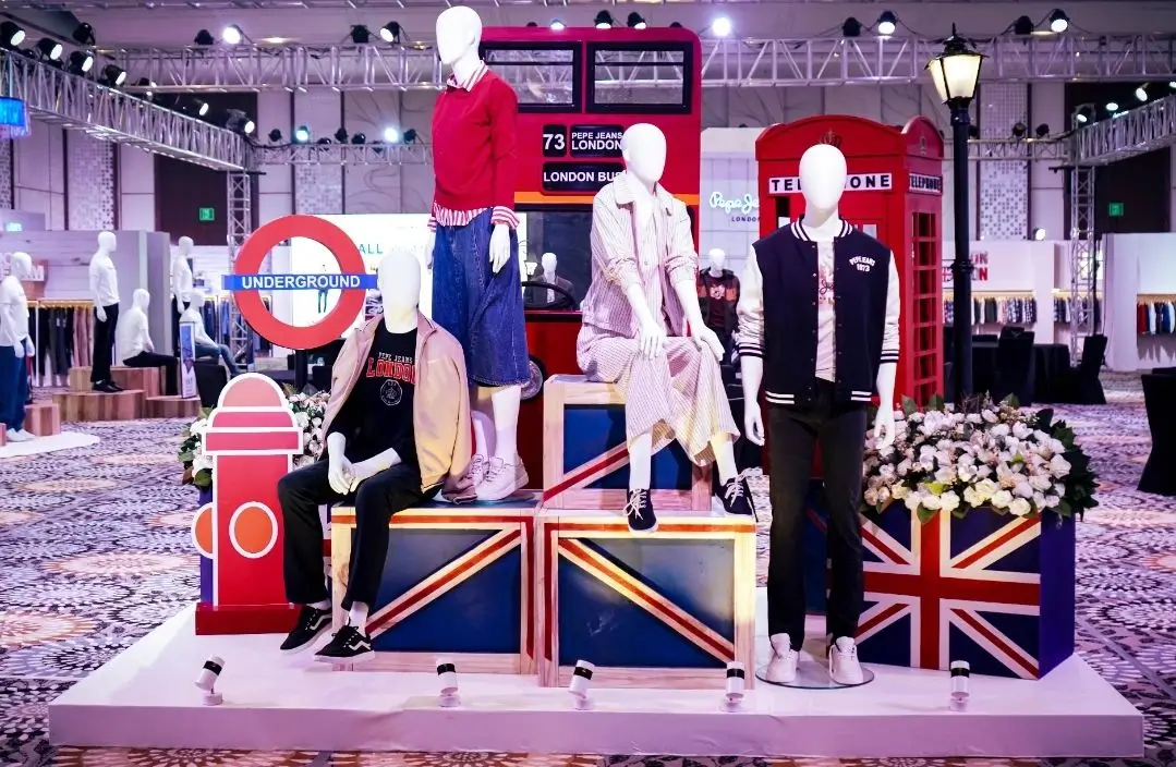
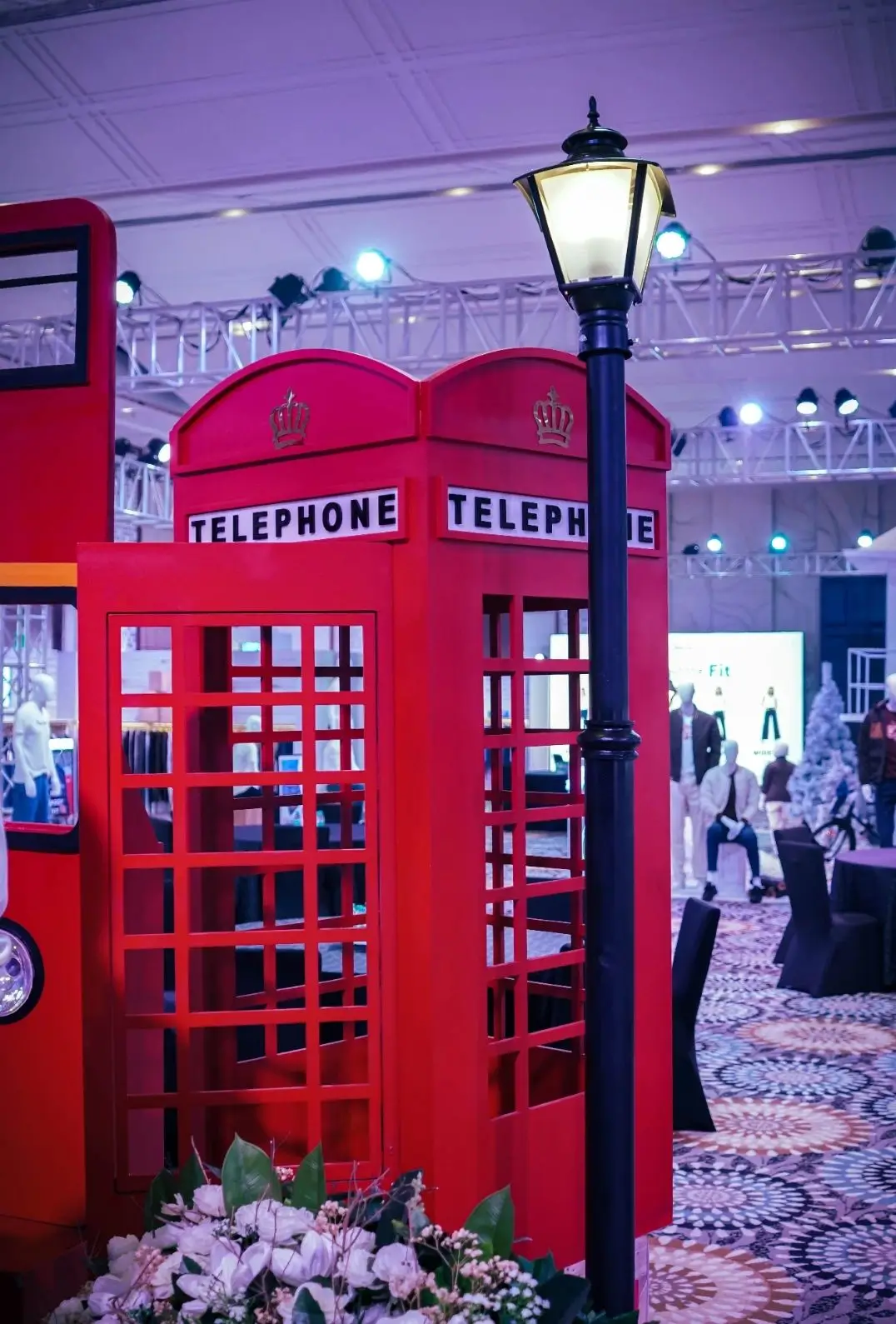
The physical presentation embodied this philosophy with precision. Rather than constructing a booth, the brand composed an environment. The reference was not retail, but hospitality—more private members’ club than showroom.
Color operated first. Oat, charcoal, navy, and heritage green replaced the expected palette of seasonal brightness. These tones did not compete for attention; they absorbed it. They anchored the space in familiarity while allowing texture to emerge as the primary visual language.
Materials extended this logic. Reclaimed oak flooring introduced a sense of continuity—grain patterns acting as subtle reminders of time. Brushed brass added warmth without gloss. Linen and wool diffused light, softening edges and eliminating harsh contrast. Each element was selected not for statement, but for atmosphere.
Even the arrangement resisted conventional retail logic. Garments were given space—displayed on low rails and minimalist plinths that encouraged proximity rather than distance. Lighting followed suit: directional, focused, almost intimate. It guided the eye toward craftsmanship rather than silhouette.
Details, however, carried the narrative weight. Stitching motifs derived from British workwear were embedded into display surfaces. A Union Jack appeared not as graphic, but as pattern—visible only upon close inspection. QR codes disguised as care labels linked to artisan processes, shifting storytelling from marketing copy to lived practice.
Nothing announced itself. Everything revealed itself.
archive
The collection mirrored the environment’s restraint. Rather than overt references to British identity, the garments internalized it.
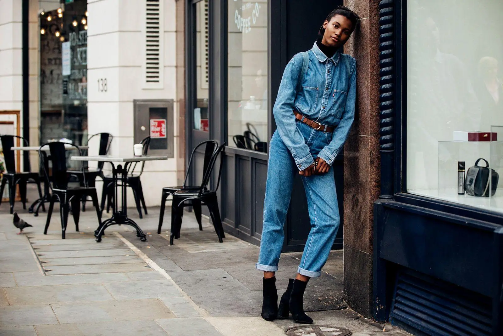
A trench coat—rooted in archival design—was reconstructed in water-resistant cotton gabardine, its structure familiar yet refined. A denim shirt, indigo-dyed with selvedge detailing, elevated everyday wear through precision rather than embellishment. A blazer, unstructured and soft, carried a lining repurposed from previous collections—embedding continuity within the garment itself.
These pieces did not rely on logos. They relied on recognition—of quality, of proportion, of intent.
Material choices reinforced this direction. Organic cotton, TENCEL™ blends, and recycled fibers introduced sustainability not as an add-on, but as integral to the product’s value. Even care labels became narrative devices, featuring GPS coordinates of the original Portobello location. Each garment, in effect, carried its own origin story.
This is where heritage shifts from aesthetic to language. It is no longer referenced externally; it is embedded internally.
xp
Perhaps the most radical departure lay in how the collection was presented to buyers. The traditional trade show dynamic—transactional, time-constrained, outcome-driven—was replaced by something slower.
Staff were not positioned as sales agents, but as guides. Conversations unfolded without urgency. The absence of pressure created a different kind of engagement—one rooted in curiosity rather than conversion.
Sensory elements supported this approach. Music, drawn from British artists, played softly through vinyl systems—introducing imperfection and texture. A bespoke scent, described as “London after dusk,” added an atmospheric layer without overpowering the space. Fabric books invited touch, reintroducing tactility into a process increasingly mediated by screens.
Interactive components were present, but understated. A digital customization station allowed exploration without commitment. A heritage wall contextualized the brand’s cultural footprint without nostalgia. Short films of artisans reframed production as craft rather than supply chain.
The result was a shift in perception. Buyers did not feel addressed; they felt included.
theory
Quantifying such an approach is inherently complex. Yet the outcomes suggest that restraint can translate into measurable impact.
Increased dwell time indicated not just interest, but comfort. Higher order values suggested deeper engagement with the product. Expanded international interest reflected the universality of the approach—quiet, it seems, travels.
Feedback reinforced this interpretation. Buyers described the experience not in terms of efficiency, but discovery. The absence of pressure allowed the product to articulate itself.
For Ashok Kanojia, this aligns with a broader shift in consumer behavior. Value is no longer solely defined by price or visibility, but by emotional resonance. The ability to create a moment—rather than a message—becomes a competitive advantage.
frame
What distinguishes this evolution is its treatment of heritage. Rather than mining the past for recognizable symbols, Pepe Jeans London approached it as a living system.
Britishness, in this context, is not iconography. It is sensibility. It is the weight of fabric, the cut of a coat, the interplay of texture and restraint. It exists in nuance, not declaration.
Sustainability follows a similar logic. By integrating responsible materials into the core of the product, the brand avoids the performative aspects often associated with eco-conscious design. It becomes less about signaling virtue, more about embedding responsibility.
This dual approach—heritage as language, sustainability as structure—positions the brand within a contemporary definition of premium. One that values coherence over spectacle.
stir
The implications extend beyond a single presentation. Planned flagship spaces in London, Mumbai, and Dubai aim to translate this philosophy into permanent environments—retail as experience, not display.
Product development continues along the same axis. Footwear, accessories, and limited releases are envisioned not as extensions, but as iterations—each carrying the same emphasis on subtlety and narrative.
Digital platforms, often the most saturated channels, are being reconsidered. Features such as “quiet mode” interfaces and heritage-driven drops suggest an attempt to align online experiences with the brand’s physical ethos.
The ambition is clear: to occupy a space that resists easy categorization. Not luxury in the traditional sense, not streetwear in its current form, but something adjacent—grounded, intentional, and culturally aware.
show
What ultimately defines this shift is not aesthetic, but philosophical. In choosing to reduce noise, Pepe Jeans London is not withdrawing. It is asserting a different kind of authority.
Presence, in this context, is not about visibility. It is about impact. It is the ability to hold attention without demanding it, to communicate without exaggeration.
For Swet Sinha, this reflects a deeper confidence—one that does not rely on validation through volume. When a brand understands its own language, it no longer needs to translate it into spectacle.
fin
In a culture defined by immediacy, quietness can feel unfamiliar. It requires time. It asks for attention. It resists scrolling.
But it also offers something increasingly rare: clarity.
The experiment undertaken by Pepe Jeans London suggests that the future of premium may not lie in amplification, but in articulation. In knowing what to say—and what to leave unsaid. Because the most enduring statements are not always the loudest.
They are the ones that stay with you, long after the noise fades.
Related Articles

Birkenstock Unveils Its 13th Japanese Store and Sixth Concept Space
recall A New Landmark for Birkenstock in Tokyo Why Shibuya Was the Natural Choice Inside […]