DRIFT AUDIO
Listen to this story
Choose a voice, then press play.
A cartoon mouse, a household gloss brush, and a charity auction turned into one of the strangest collisions in contemporary art collecting.
Damien Hirst has spent four decades making objects that argue with themselves: pickled sharks, diamond skulls, medicine cabinets arranged like reliquaries. So when he picked up a can of household gloss and painted a cartoon mouse, the art world noticed for reasons that had nothing to do with subtlety. The piece, titled simply “Mickey,” was unveiled for a single purpose: to be sold at auction and hand the proceeds to a children’s charity. Hirst told the press at the time that the mouse reminded him of something plain and personal, the feeling of being a kid, before qualifying that sentiment with the kind of self awareness that has followed him since the Young British Artists scene of the late 1980s.
The painting went under the hammer at Christie’s, with the sale benefiting Kids Company, a UK charity supporting vulnerable children that would later collapse under financial and governance scandal, a footnote that now sits awkwardly next to the work’s origin story. Francis Outred, who ran Christie’s post war and contemporary art department in Europe at the time, framed the picture as a meeting of two icons rather than a novelty crossover. Mickey Mouse had already survived interpretations by Andy Warhol, Roy Lichtenstein, and Claes Oldenburg, so Hirst joining that lineage was treated less as a stunt and more as an inevitability. A cartoon that has been reproduced more than almost any image in modern visual culture was always going to end up on a British artist’s canvas eventually, and it happened to be Hirst’s turn.
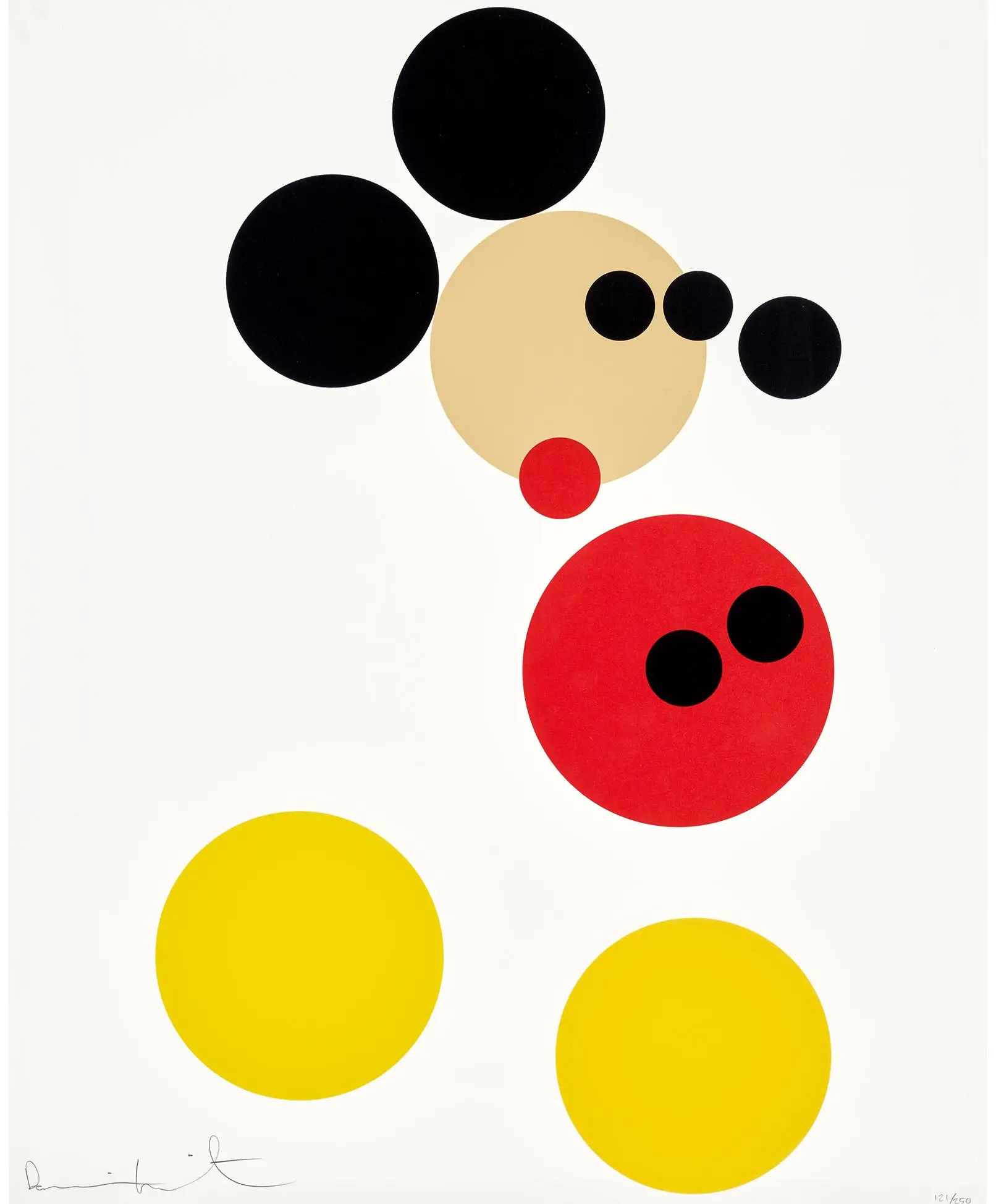
What made the picture recognizably his, despite the subject matter being about as far from a shark tank as art gets, was the treatment. Hirst reduced Mickey’s sil down to a grid of individual dots, each one a flat circle of tincture, arranged so that the overall shape only resolves at a distance. Up close, the painting reads as abstraction. Step back, and the ears, the face, the unmistakable outline snap into focus. It is a trick Hirst had already spent thirty years refining through his spot paintings, a body of work stretching back to 1986 that now numbers in the thousands of individual canvases, some painted by his own hand and many produced by assistants under his direction, a studio practice he has never hidden and has occasionally defended outright.
stir
To acknowledge why “Mickey” works as a Hirst piece and not just a licensing exercise, it helps to know what a spot painting actually is in his practice. The format is deceptively simple: a grid of circles, evenly spaced, each painted in a color that never repeats elsewhere on the same canvas. Hirst has described the spots as a way of trapping the joy of color within a strict, almost clinical system, a contradiction he has leaned into throughout his career. The pharmaceutical paintings, arguably his most recognized body of work in this vein, use the same underlying grammar to comment on medicine, mass production, and the illusion of order that packaging gives to chaos.
Applying that grammar to a cartoon character does something slightly different. Instead of abstraction for its own sake, the dots become a kind of pixelation, a low resolution rendering of an image everyone already has memorized. The effect works on Mickey precisely because the character’s silhouette is so overlearned by the collective eye that even a fragmented, dotted version reads instantly. Try the same exercise on a less iconic image and the trick collapses. Hirst was betting on decades of Disney marketing to do half the work for him, and it paid off.
flow
The original painted “Mickey” was a one off, made for a single charity sale. What followed a few years later was a different animal: a formal, Disney sanctioned print series. Around 2016, Hirst was commissioned directly by Disney to reinterpret Mickey Mouse for a limited edition run of silkscreen prints, this time expanding the palette to include glitter as a physical medium rather than just a visual effect. The resulting editions, most produced in runs of 150, use the same spotted silhouette but embed the piece with actual glitter particles pressed into the screenprint, so the surface catches light differently depending on the viewing angle.
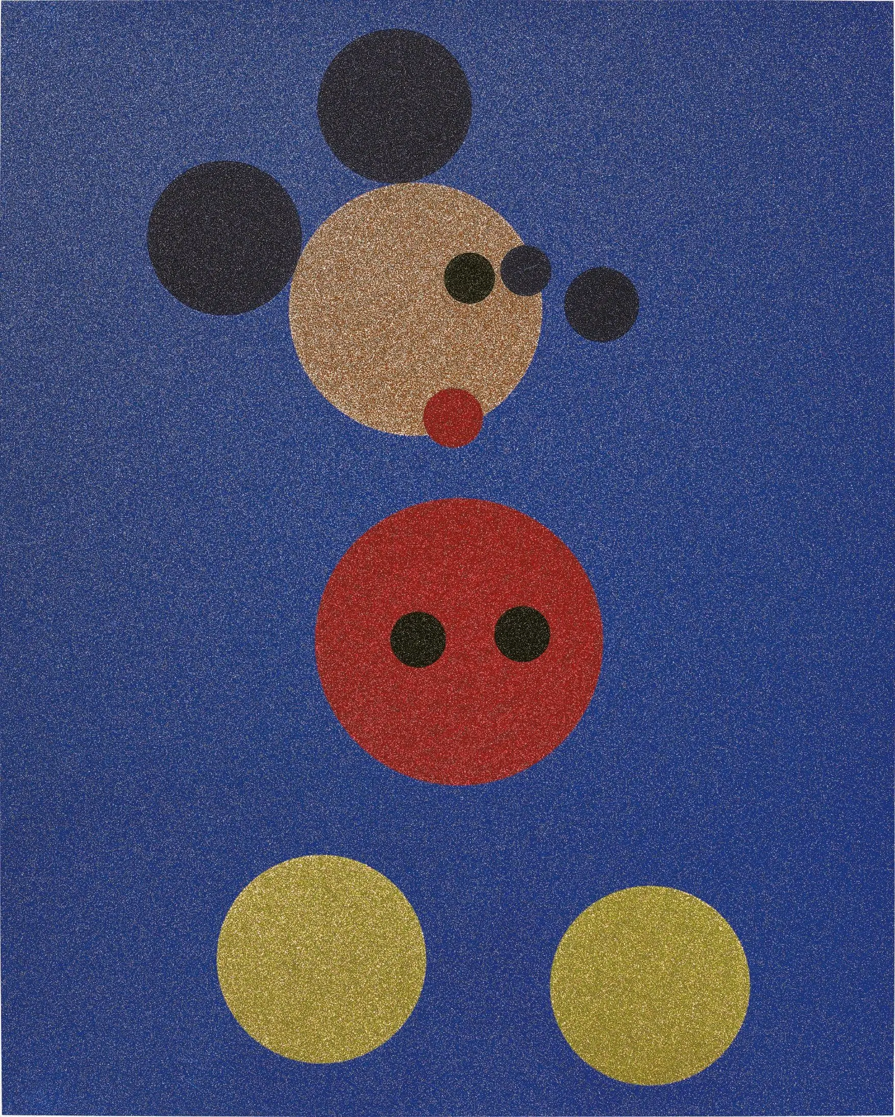
Damien Hirst, Mickey (Blue Glitter), 2016. Screenprint in colors with glitter on wove paper, published by Other Criteria, London, as part of the artist’s limited-edition Mickey and Minnie series.
These prints exist in several configurations. There is a large format and a small format of the standalone Mickey image, and there are matched pairs sold as sets alongside a companion Minnie print. Collectors and dealers listing these works consistently describe the surface as heavily encrusted, with the glitter application thick enough to register as texture rather than shimmer alone. Framed dimensions for the large editions run close to a meter across, putting them solidly in the category of statement wall pieces rather than small collectibles.
The publisher behind the print run was Other Criteria, the company Hirst co-founded specifically to handle the production and distribution of his editioned works, prints, and multiples outside the gallery system. That structure matters for understanding how a piece like this circulates. Unlike a unique painting that passes through a single owner’s hands, an edition of 150 spreads across dozens of collectors, dealers, and eventually secondary market listings, which is exactly the ecosystem where “Mickey” now lives most visibly.
follow
Hirst rarely released Mickey without also producing a matching Minnie Mouse print, and the pairing is worth understanding on its own terms rather than as an afterthought. The Minnie print mirrors the same spotted construction technique but swaps the color scheme, typically rendered against a pink glitter ground rather than Mickey’s cobalt blue. Sold together, the two prints function as a diptych, numbered to match so that a single collector’s Mickey and a single collector’s Minnie share the same edition number.
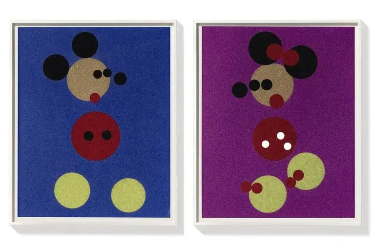
Damien Hirst, Mickey & Minnie, 2016. Framed matched pair of glitter screenprints on wove paper, published by Other Criteria as a limited edition.
Dealers who handle the secondary market for these editions, including several New York and Miami based galleries that specialize in prints and multiples, tend to list the pair together more often than either print individually, which suggests collector demand favors the complete set over a single half. That preference has held up in listings that have appeared steadily since the original 2016 release, with condition, glitter integrity, and verso signature all factored into how a given example is priced.
scope
It is worth pausing on why an artist known for shock, formaldehyde, and confrontational subject matter would reach for something as gentle as a Disney mouse, and the honest answer involves precedent as much as sentiment. Warhol painted Mickey Mouse as part of his Myths series in 1981, treating the character alongside Superman and Uncle Sam as a piece of American folklore worth preserving in silkscreen. Lichtenstein’s engagement came earlier still, filtered through his comic strip aesthetic in the 1960s. Oldenburg approached the character through sculpture rather than print, staying consistent with his interest in oversized, soft versions of everyday objects.
Hirst’s version slots into that lineage without pretending to reinvent it. What he adds is his own signature system, the spot, applied to a subject that had already proven itself durable across sixty years of prior reinterpretation by other major names. Critics discussing the piece at the time of its charity debut framed it less as Hirst breaking new ground and more as Hirst claiming his place in a conversation that had already been running for decades, a conversation about what happens when fine art borrows directly from mass entertainment rather than pretending the two are separate categories.
extent
Nearly a decade on from the original print release, the Mickey and Minnie editions remain active on the secondary market, and recent results give a useful snapshot of where collector appetite currently sits. A “Beautiful Mickey” print sold through Rago Auctions in June 2026 for 21,760 dollars, a figure that sits comfortably within the range these glitter editions have historically achieved when they appear at auction rather than through private gallery sale. Listings from dealers including Guy Hepner and MyArtBroker continue to track and value individual examples, with prices varying based on edition size, framing, and whether a piece is sold solo or as part of the matched Minnie pair.
That the work still moves steadily through auction houses and specialist print dealers, nearly ten years after its release, says something about how Hirst’s market operates more broadly. His editions tend to hold value better than some of his more experimental unique works, largely because the print market rewards recognizability and condition over conceptual novelty. A glittered Mickey Mouse, whatever one thinks of it as art, is instantly identifiable on a wall or in a listing photo in a way that a more abstract Hirst work sometimes is not, and that legibility appears to translate into sustained demand.
hint
It would be easy to dismiss “Mickey” as a licensing cash grab dressed up in gallery lang, and plenty of critics have made exactly that argument since the piece first appeared. But the more interesting reading sits in what the work exposes about the relationship between fine art and corporate intellectual property in the twenty first century. Disney commissioning Hirst directly, rather than simply licensing his aesthetic after the fact, formalizes a transaction that used to happen more shh, through unauthorized appropriation or after the fact settlement. Warhol’s Mickey Mouse prints were produced under a similar licensing arrangement decades earlier, so the model itself is not new, but Hirst’s version arrived at a moment when the boundaries between blue chip contemporary art and branded merchandise had already been worn thin by a decade of designer collaborations, sneaker drops, and gallery gift shops selling limited run objects that split the difference between artwork and product.
Seen that way, the spotted Mickey is less a joke and more a document. It records a specific point where a mouse that started as a 1928 cartoon short became, through Hirst’s grid of dots, a certified piece of contemporary fine art with an auction record, a publisher of record, and a market that still checks in on it a decade later. Whether that transformation says more about Hirst, about Disney, or about how thoroughly the two economies of art and entertainment have merged is a question the work raises without answering, which might be the most honest thing about it.
Read Drift’s related feature, Damien Hirst: Decoding Pharmacy London Boxed Set (2002).
n
From the DRIFT archive: Andy Warhol’s Superman (1981): A Diamond-Dust Resurrection of the American Myth · The Art of the Can: Chaz Bojórquez’s Hand-Signed MTN Spray Paint Edition
Related Articles
fnnch Revives the Honey Bear Hunt for Halloween, No Tape Required
San Francisco’s honey bear artist is turning porch season into a scavenger hunt again, five […]